k-nearest neighbor algorithm using Sklearn - Python
Last Updated : 11 Jul, 2025
K-Nearest Neighbors (KNN) works by identifying the 'k' nearest data points called as neighbors to a given input and predicting its class or value based on the majority class or the average of its neighbors. In this article we will implement it using Python's Scikit-Learn library.
1. Generating and Visualizing the 2D Data
- We will import libraries like pandas, matplotlib, seaborn and scikit learn.
- The make_moons() function generates a 2D dataset that forms two interleaving half circles.
- This kind of data is non-linearly separable and perfect for showing how k-NN handles such cases.
Python from sklearn.datasets import make_moons import matplotlib.pyplot as plt import seaborn as sns import pandas as pd # Create synthetic 2D data X, y = make_moons(n_samples=300, noise=0.3, random_state=42) # Create a DataFrame for plotting df = pd.DataFrame(X, columns=["Feature 1", "Feature 2"]) df['Target'] = y # Visualize the 2D data plt.figure(figsize=(8, 6)) sns.scatterplot(data=df, x="Feature 1", y="Feature 2", hue="Target", palette="Set1") plt.title("2D Classification Data (make_moons)") plt.grid(True) plt.show() Output:
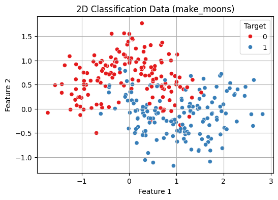 2D Classification Data Visualisation
2. Train-Test Split and Normalization
- StandardScaler() standardizes the features by removing the mean and scaling to unit variance (z-score normalization).
- This is important for distance-based algorithms like k-NN as it ensures all features contribute equally to distance calculations.
- train_test_split() splits the data into 70% training and 30% testing.
- random_state=42 ensures reproducibility.
- stratify=y maintains the same class distribution in both training and test sets which is important for balanced evaluation.
Python from sklearn.model_selection import train_test_split from sklearn.preprocessing import StandardScaler # Normalize the features scaler = StandardScaler() X_scaled = scaler.fit_transform(X) # Split into train and test X_train, X_test, y_train, y_test = train_test_split( X_scaled, y, test_size=0.3, random_state=42, stratify=y )
3. Fit the k-NN Model and Evaluate
- This creates a k-Nearest Neighbors (k-NN) classifier with k = 5 meaning it considers the 5 nearest neighbors for making predictions.
- fit(X_train, y_train) trains the model on the training data.
- predict(X_test) generates predictions for the test data.
- accuracy_score() compares the predicted labels (y_pred) with the true labels (y_test) and calculates the accuracy i.e the proportion of correct predictions.
Python from sklearn.neighbors import KNeighborsClassifier from sklearn.metrics import accuracy_score # Train a k-NN classifier knn = KNeighborsClassifier(n_neighbors=5) knn.fit(X_train, y_train) # Predict and evaluate y_pred = knn.predict(X_test) print(f"Test Accuracy (k=5): {accuracy_score(y_test, y_pred):.2f}") Output:
Test Accuracy (k=5): 0.87
4. Cross-Validation to Choose Best k
Choosing the optimal k-value is critical before building the model for balancing the model's performance.
- A smaller k value makes the model sensitive to noise, leading to overfitting (complex models).
- A larger k value results in smoother boundaries, reducing model complexity but possibly underfitting.
This code performs model selection for the k value in the k-NN algorithm using 5-fold cross-validation:
- It tests values of k from 1 to 20.
- For each k, a new k-NN model is trained and validated using cross_val_score which automatically splits the dataset into 5 folds, trains on 4 and evaluates on 1, cycling through all folds.
- The mean accuracy of each fold is stored in cv_scores.
- A line plot shows how accuracy varies with k helping visualize the optimal choice.
- The best_k is the value of k that gives the highest mean cross-validated accuracy.
Python from sklearn.model_selection import cross_val_score import numpy as np # Range of k values to try k_range = range(1, 21) cv_scores = [] # Evaluate each k using 5-fold cross-validation for k in k_range: knn = KNeighborsClassifier(n_neighbors=k) scores = cross_val_score(knn, X_scaled, y, cv=5, scoring='accuracy') cv_scores.append(scores.mean()) # Plot accuracy vs. k plt.figure(figsize=(8, 5)) plt.plot(k_range, cv_scores, marker='o') plt.title("k-NN Cross-Validation Accuracy vs k") plt.xlabel("Number of Neighbors: k") plt.ylabel("Cross-Validated Accuracy") plt.grid(True) plt.show() # Best k best_k = k_range[np.argmax(cv_scores)] print(f"Best k from cross-validation: {best_k}") Output:
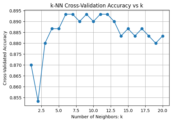 Choosing Best k
Best k from cross-validation: 6
5. Training with Best k
- The model is trained on the training set with the optimized k (Here k = 6).
- The trained model then predicts labels for the unseen test set to evaluate its real-world performance.
Python # Train final model with best k best_knn = KNeighborsClassifier(n_neighbors=best_k) best_knn.fit(X_train, y_train) # Predict on test data y_pred = best_knn.predict(X_test)
6. Evaluate Using More Metrics
- Calculate the confusion matrix comparing true labels (y_test) with predictions (y_pred).
- Use ConfusionMatrixDisplay to visualize the confusion matrix with labeled classes
Print a classification report that includes:
- Precision: How many predicted positives are actually positive.
- Recall: How many actual positives were correctly predicted.
- F1-score: Harmonic mean of precision and recall.
- Support: Number of true instances per class.
Python from sklearn.metrics import confusion_matrix, classification_report, ConfusionMatrixDisplay # Confusion Matrix cm = confusion_matrix(y_test, y_pred) disp = ConfusionMatrixDisplay(confusion_matrix=cm, display_labels=["Class 0", "Class 1"]) disp.plot(cmap="Blues") plt.title(f"Confusion Matrix (k={best_k})") plt.grid(False) plt.show() # Detailed classification report print("Classification Report:") print(classification_report(y_test, y_pred, target_names=["Class 0", "Class 1"])) Output:
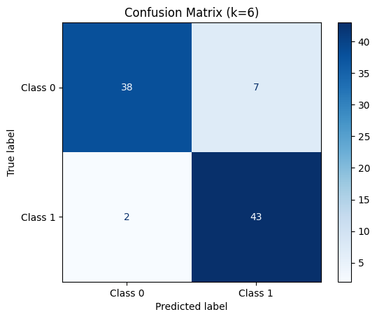 Confusion Matrix for k = 6
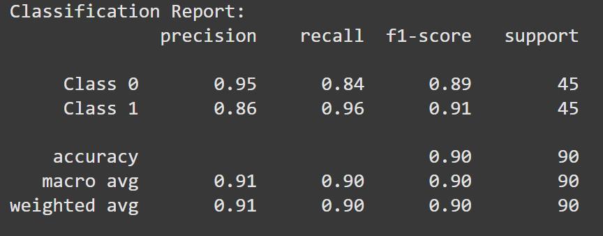 Classification Report
7. Visualize Decision Boundary with Best k
- Use the final trained model (best_knn) to predict labels for every point in the 2D mesh grid (xx, yy).
- Reshape the predictions (Z) to match the grid’s shape for plotting.
- Create a plot showing the decision boundary by coloring regions according to predicted classes using contourf.
- Overlay the original data points with different colors representing true classes using sns.scatterplot.
Python # Predict on mesh grid with best k Z = best_knn.predict(np.c_[xx.ravel(), yy.ravel()]) Z = Z.reshape(xx.shape) # Plot decision boundary plt.figure(figsize=(8, 6)) plt.contourf(xx, yy, Z, cmap=plt.cm.coolwarm, alpha=0.3) sns.scatterplot(x=X_scaled[:, 0], y=X_scaled[:, 1], hue=y, palette="Set1", edgecolor='k') plt.title(f"Decision Boundary with Best k = {best_k}") plt.xlabel("Feature 1 (scaled)") plt.ylabel("Feature 2 (scaled)") plt.grid(True) plt.show() Output:
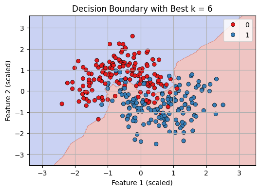 Decision Boundary with best K = 6
We can see that our KNN model is working fine in classifying datapoints.
Explore
Machine Learning Basics
Python for Machine Learning
Feature Engineering
Supervised Learning
Unsupervised Learning
Model Evaluation and Tuning
Advanced Techniques
Machine Learning Practice
My Profile