EDA - Exploratory Data Analysis in Python
Last Updated : 10 May, 2025
Exploratory Data Analysis (EDA) is a important step in data analysis which focuses on understanding patterns, trends and relationships through statistical tools and visualizations. Python offers various libraries like pandas, numPy, matplotlib, seaborn and plotly which enables effective exploration and insights generation to help in further modeling and analysis. In this article, we will see how to perform EDA using python.
Key Steps for Exploratory Data Analysis (EDA)
Lets see various steps involved in Exploratory Data Analysis:
Step 1: Importing Required Libraries
We need to install Pandas, NumPy, Matplotlib and Seaborn libraries in python to proceed further.
Python import pandas as pd import numpy as np import matplotlib.pyplot as plt import seaborn as sns import warnings as wr wr.filterwarnings('ignore') Step 2: Reading Dataset
Download the dataset from this link and lets read it using pandas.
Python df = pd.read_csv("/content/WineQT.csv") print(df.head()) Output:
 First 5 rows
Step 3: Analyzing the Data
1. df.shape(): This function is used to understand the number of rows (observations) and columns (features) in the dataset. This gives an overview of the dataset's size and structure.
Python Output:
(1143, 13)
2. df.info(): This function helps us to understand the dataset by showing the number of records in each column, type of data, whether any values are missing and how much memory the dataset uses.
Python Output:
 info()
3. df.describe(): This method gives a statistical summary of the DataFrame showing values like count, mean, standard deviation, minimum and quartiles for each numerical column. It helps in summarizing the central tendency and spread of the data.
Python Output:
 describe()
4. df.columns.tolist(): This converts the column names of the DataFrame into a Python list making it easy to access and manipulate the column names.
Python Output:
 column names
Step 4 : Checking Missing Values
df.isnull().sum(): This checks for missing values in each column and returns the total number of null values per column helping us to identify any gaps in our data.
Python Output:
 Missing values in each column
Step 5 : Checking for the duplicate values
df.nunique(): This function tells us how many unique values exist in each column which provides insight into the variety of data in each feature.
Python Output:
 nunique()
Step 6: Univariate Analysis
In Univariate analysis plotting the right charts can help us to better understand the data making the data visualization so important.
1. Bar Plot for evaluating the count of the wine with its quality rate.
Python quality_counts = df['quality'].value_counts() plt.figure(figsize=(8, 6)) plt.bar(quality_counts.index, quality_counts, color='deeppink') plt.title('Count Plot of Quality') plt.xlabel('Quality') plt.ylabel('Count') plt.show() Output:
 Bar Plot
Here, this count plot graph shows the count of the wine with its quality rate.
2. Kernel density plot for understanding variance in the dataset
Python sns.set_style("darkgrid") numerical_columns = df.select_dtypes(include=["int64", "float64"]).columns plt.figure(figsize=(14, len(numerical_columns) * 3)) for idx, feature in enumerate(numerical_columns, 1): plt.subplot(len(numerical_columns), 2, idx) sns.histplot(df[feature], kde=True) plt.title(f"{feature} | Skewness: {round(df[feature].skew(), 2)}") plt.tight_layout() plt.show() Output:
 Kernel density plot
The features in the dataset with a skewness of 0 shows a symmetrical distribution. If the skewness is 1 or above it suggests a positively skewed (right-skewed) distribution. In a right-skewed distribution the tail extends more to the right which shows the presence of extremely high values.
3. Swarm Plot for showing the outlier in the data
Python plt.figure(figsize=(10, 8)) sns.swarmplot(x="quality", y="alcohol", data=df, palette='viridis') plt.title('Swarm Plot for Quality and Alcohol') plt.xlabel('Quality') plt.ylabel('Alcohol') plt.show() Output:
 Swarm Plot
This graph shows the swarm plot for the 'Quality' and 'Alcohol' columns. The higher point density in certain areas shows where most of the data points are concentrated. Points that are isolated and far from these clusters represent outliers highlighting uneven values in the dataset.
Step 7: Bivariate Analysis
In bivariate analysis two variables are analyzed together to identify patterns, dependencies or interactions between them. This method helps in understanding how changes in one variable might affect another.
Let's visualize these relationships by plotting various plot for the data which will show how the variables interact with each other across multiple dimensions.
1. Pair Plot for showing the distribution of the individual variables
Python sns.set_palette("Pastel1") plt.figure(figsize=(10, 6)) sns.pairplot(df) plt.suptitle('Pair Plot for DataFrame') plt.show() Output:
 Pair Plot
- If the plot is diagonal , histograms of kernel density plots shows the distribution of the individual variables.
- If the scatter plot is in the lower triangle, it displays the relationship between the pairs of the variables.
- If the scatter plots above and below the diagonal are mirror images indicating symmetry.
- If the histogram plots are more centered, it represents the locations of peaks.
- Skewness is found by observing whether the histogram is symmetrical or skewed to the left or right.
2. Violin Plot for examining the relationship between alcohol and Quality.
Python df['quality'] = df['quality'].astype(str) plt.figure(figsize=(10, 8)) sns.violinplot(x="quality", y="alcohol", data=df, palette={ '3': 'lightcoral', '4': 'lightblue', '5': 'lightgreen', '6': 'gold', '7': 'lightskyblue', '8': 'lightpink'}, alpha=0.7) plt.title('Violin Plot for Quality and Alcohol') plt.xlabel('Quality') plt.ylabel('Alcohol') plt.show() Output:
 Violin Plot
For interpreting the Violin Plot:
- If the width is wider, it shows higher density suggesting more data points.
- Symmetrical plot shows a balanced distribution.
- Peak or bulge in the violin plot represents most common value in distribution.
- Longer tails shows great variability.
- Median line is the middle line inside the violin plot. It helps in understanding central tendencies.
3. Box Plot for examining the relationship between alcohol and Quality
Python sns.boxplot(x='quality', y='alcohol', data=df)
Output:
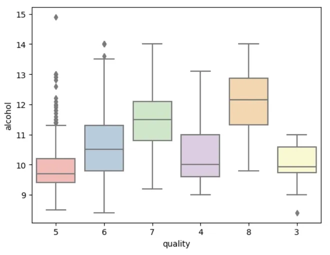 Box Plot
Box represents the IQR i.e longer the box, greater the variability.
- Median line in the box shows central tendency.
- Whiskers extend from box to the smallest and largest values within a specified range.
- Individual points beyond the whiskers represents outliers.
- A compact box shows low variability while a stretched box shows higher variability.
Step 8: Multivariate Analysis
It involves finding the interactions between three or more variables in a dataset at the same time. This approach focuses to identify complex patterns, relationships and interactions which provides understanding of how multiple variables collectively behave and influence each other.
Here, we are going to show the multivariate analysis using a correlation matrix plot.
Python plt.figure(figsize=(15, 10)) sns.heatmap(df.corr(), annot=True, fmt='.2f', cmap='Pastel2', linewidths=2) plt.title('Correlation Heatmap') plt.show() Output:
 Correlation Matrix
Values close to +1 shows strong positive correlation, -1 shows a strong negative correlation and 0 suggests no linear correlation.
- Darker colors signify strong correlation, while light colors represents weaker correlations.
- Positive correlation variable move in same directions. As one increases, the other also increases.
- Negative correlation variable move in opposite directions. An increase in one variable is associated with a decrease in the other.
With these insights from the EDA, we are now ready to undertsand the data and explore more advanced modeling techniques.
Similar Reads
Data Analysis (Analytics) Tutorial Data Analytics is a process of examining, cleaning, transforming and interpreting data to discover useful information, draw conclusions and support decision-making. It helps businesses and organizations understand their data better, identify patterns, solve problems and improve overall performance.
4 min read
Introduction to Data Analytics
What is Data Analytics?Data Analytics is the process of collecting, organizing and studying data to find useful information understand what’s happening and make better decisions. In simple words it helps people and businesses learn from data like what worked in the past, what is happening now and what might happen in the
6 min read
Why Data Analysis is Important?DData Analysis involves inspecting, transforming, and modeling data to discover useful information, inform conclusions, and support decision-making. It encompasses a range of techniques and tools used to interpret raw data, identify patterns, and extract actionable insights. Effective data analysis
5 min read
Data Science vs Data AnalyticsIn this article, we will discuss the differences between the two most demanded fields in Artificial intelligence that is data science, and data analytics.What is Data Science Data Science is a field that deals with extracting meaningful information and insights by applying various algorithms preproc
3 min read
Uses of Data AnalyticsIn this article, we are going to discuss different uses of data analytics. And will discuss the application where we will see how data is an essential part of different sectors. So, let's discuss them one by one. Data is of much importance nowadays. Data helps you understand performance providing th
3 min read
Life Cycle Phases of Data AnalyticsIn this article, we are going to discuss life cycle phases of data analytics in which we will cover various life cycle phases and will discuss them one by one. Data Analytics Lifecycle :The Data analytic lifecycle is designed for Big Data problems and data science projects. The cycle is iterative to
3 min read
Data Preprocessing and Exploration
What is Data Cleaning?Data cleaning, also known as data cleansing or data scrubbing, is the process of identifying and correcting (or removing) errors, inconsistencies, and inaccuracies within a dataset. This crucial step in the data management and data science pipeline ensures that the data is accurate, consistent, and
12 min read
ML | Handling Missing ValuesMissing values are a common issue in machine learning. This occurs when a particular variable lacks data points, resulting in incomplete information and potentially harming the accuracy and dependability of your models. It is essential to address missing values efficiently to ensure strong and impar
12 min read
What is Feature Engineering?Feature engineering is the process of turning raw data into useful features that help improve the performance of machine learning models. It includes choosing, creating and adjusting data attributes to make the model’s predictions more accurate. The goal is to make the model better by providing rele
5 min read
What is Data Transformation?Data transformation is an important step in data analysis process that involves the conversion, cleaning, and organizing of data into accessible formats. It ensures that the information is accessible, consistent, secure, and finally recognized by the intended business users. This process is undertak
6 min read
EDA - Exploratory Data Analysis in PythonExploratory Data Analysis (EDA) is a important step in data analysis which focuses on understanding patterns, trends and relationships through statistical tools and visualizations. Python offers various libraries like pandas, numPy, matplotlib, seaborn and plotly which enables effective exploration
6 min read
Univariate, Bivariate and Multivariate data and its analysisData analysis is an important process for understanding patterns and making informed decisions based on data. Depending on the number of variables involved it can be classified into three main types: univariate, bivariate and multivariate analysis. Each method focuses on different aspects of the dat
5 min read
Python - Data visualization tutorialData visualization is a crucial aspect of data analysis, helping to transform analyzed data into meaningful insights through graphical representations. This comprehensive tutorial will guide you through the fundamentals of data visualization using Python. We'll explore various libraries, including M
7 min read
Statistical Analysis and Probability
Probability Data Distributions in Data ScienceUnderstanding how data behaves is one of the first steps in data science. Before we dive into building models or running analysis, we need to understand how the values in our dataset are spread out and that’s where probability distributions come in.Let us start with a simple example: If you roll a f
8 min read
Central Limit Theorem in StatisticsThe Central Limit Theorem in Statistics states that as the sample size increases and its variance is finite, then the distribution of the sample mean approaches normal distribution irrespective of the shape of the population distribution.The central limit theorem posits that the distribution of samp
11 min read
Parametric Methods in StatisticsParametric statistical methods are those that make assumptions regarding the distribution of the population. These methods presume that the data have a known distribution (e.g., normal, binomial, Poisson) and rely on parameters (e.g., mean and variance) to define the data.Key AssumptionsParametric t
6 min read
Non-Parametric TestsNon-parametric tests are applied in hypothesis testing when the data does not satisfy the assumptions necessary for parametric tests, such as normality or equal variances. These tests are especially helpful for analyzing ordinal data, small sample sizes, or data with outliers.Common Non-Parametric T
5 min read
ANOVA for Machine LearningANOVA is useful when we need to compare more than two groups and determine whether their means are significantly different. Suppose you're trying to understand which ingredients in a recipe affect its taste. Some ingredients, like spices might have a strong influence while others like a pinch of sal
9 min read
Confidence IntervalA Confidence Interval (CI) is a range of values that contains the true value of something we are trying to measure like the average height of students or average income of a population.Instead of saying: “The average height is 165 cm.â€We can say: “We are 95% confident the average height is between 1
7 min read
Hypothesis TestingHypothesis testing compares two opposite ideas about a group of people or things and uses data from a small part of that group (a sample) to decide which idea is more likely true. We collect and study the sample data to check if the claim is correct.Hypothesis TestingFor example, if a company says i
9 min read
P-Value: Comprehensive Guide to Understand, Apply, and InterpretA p-value is a statistical metric used to assess a hypothesis by comparing it with observed data. This article delves into the concept of p-value, its calculation, interpretation, and significance. It also explores the factors that influence p-value and highlights its limitations. Table of Content W
12 min read
Data Analysis Libraries & Tools
Pandas TutorialPandas is an open-source software library designed for data manipulation and analysis. It provides data structures like series and DataFrames to easily clean, transform and analyze large datasets and integrates with other Python libraries, such as NumPy and Matplotlib. It offers functions for data t
6 min read
NumPy Tutorial - Python LibraryNumPy (short for Numerical Python ) is one of the most fundamental libraries in Python for scientific computing. It provides support for large, multi-dimensional arrays and matrices along with a collection of mathematical functions to operate on arrays.At its core it introduces the ndarray (n-dimens
3 min read
Matplotlib TutorialMatplotlib is an open-source visualization library for the Python programming language, widely used for creating static, animated and interactive plots. It provides an object-oriented API for embedding plots into applications using general-purpose GUI toolkits like Tkinter, Qt, GTK and wxPython. It
5 min read
Python Seaborn TutorialSeaborn is a library mostly used for statistical plotting in Python. It is built on top of Matplotlib and provides beautiful default styles and color palettes to make statistical plots more attractive.In this tutorial, we will learn about Python Seaborn from basics to advance using a huge dataset of
15+ min read
Power BI Tutorial | Learn Power BIPower BI is a Microsoft-powered business intelligence tool that helps transform raw data into interactive dashboards and actionable insights. It allow users to connect to various data sources, clean and shape data and visualize it using charts, graphs and reports all with minimal coding.It’s widely
5 min read
Tableau TutorialIn this Tableau tutorial, we will learn about Tableau from basics to advance using the huge dataset containing topics like Tableau basics, working with different data sources, different charts available in Tableau, etc. Tableau is a powerful tool used for data analysis and visualization. It allows t
5 min read
SQL for Data AnalysisSQL (Structured Query Language) is a powerful tool for data analysis, allowing users to efficiently query and manipulate data stored in relational databases. Whether you are working with sales, customer or financial data, SQL helps extract insights and perform complex operations like aggregation, fi
6 min read
How to Perform Data Analysis in Excel: A Beginner’s GuideExcel is one of the most powerful tools for data analysis, allowing you to process, manipulate, and visualize large datasets efficiently. Whether you're analyzing sales figures, financial reports, or any other type of data, knowing how to perform data analysis in Excel can help you make informed dec
14 min read
Time Series Analysis
Time Series Analysis & Visualization in PythonTime series data consists of sequential data points recorded over time which is used in industries like finance, pharmaceuticals, social media and research. Analyzing and visualizing this data helps us to find trends and seasonal patterns for forecasting and decision-making. In this article, we will
6 min read
8 Types of Plots for Time Series Analysis using PythonTime series data Time series data is a collection of observations chronologically arranged at regular time intervals. Each observation corresponds to a specific time point, and the data can be recorded at various frequencies (e.g., daily, monthly, yearly). This type of data is very essential in many
10 min read
Handling Missing Values in Time Series DataHandling missing values in time series data in R is a crucial step in the data preprocessing phase. Time series data often contains gaps or missing observations due to various reasons such as sensor malfunctions, human errors, or other external factors. In R Programming Language dealing with missing
5 min read
Understanding the Moving average (MA) in Time Series DataData is often collected with respect to time, whether for scientific or financial purposes. When data is collected in a chronological order, it is referred to as time series data. Analyzing time series data provides insights into how the data behaves over time, including underlying patterns that can
15 min read
Augmented Dickey-Fuller (ADF)Augmented Dickey-Fuller (ADF) test is a statistical test in time series analysis used to determine whether a given time series is stationary. A stationary time series has constant mean and variance over time, which is a core assumption in many time series models, including ARIMA.Why Stationarity Mat
3 min read
AutoCorrelationAutocorrelation is a fundamental concept in time series analysis. Autocorrelation is a statistical concept that assesses the degree of correlation between the values of variable at different time points. The article aims to discuss the fundamentals and working of Autocorrelation. Table of Content Wh
10 min read
Data Analytics Projects
30+ Top Data Analytics Projects in 2025 [With Source Codes]Are you an aspiring data analyst? Dive into 40+ FREE Data Analytics Projects packed with the hottest 2024 tech. Data Analytics Projects for beginners, final-year students, and experienced professionals to Master essential data analytical skills. These top data analytics projects serve as a simple ye
4 min read
Top 80+ Data Analyst Interview Questions and AnswersData is information, often in the form of numbers, text, or multimedia, that is collected and stored for analysis. It can come from various sources, such as business transactions, social media, or scientific experiments. In the context of a data analyst, their role involves extracting meaningful ins
15+ min read