CSS align-content property
Last Updated : 23 Aug, 2024
The align-content property changes the behavior of the flex-wrap property. It aligns flex lines. It is used to specify the alignment between the lines inside a flexible container. This property defines how each flex line is aligned within a flexbox and is only applicable if flex-wrap: wrap is applied i.e. if there are multiple lines of flexbox items present.
List of align-content property values:
- center
- stretch
- flex-start
- flex-end
- space-around
- space-between
- start
- end
- normal
- baseline, first baseline, last baseline
- space-evenly
- safe
- unsafe
Description of property value with example:
center: Displays the flex lines at the center of the flex container.
Syntax:
align-content:center;
Example:
html <!DOCTYPE html> <html> <head> <title>align-content property</title> <style> .main-container { display: flex; height: 400px; flex-wrap: wrap; align-content: center; background-color: green; } .main-container div { background-color: #f4f4f4; width: 100px; margin: 10px; text-align: center; font-size: 50px; } h2 { text-align:center; } .geeks { font-size:40px; text-align:center; color:#009900; font-weight:bold; } </style> </head> <body> <div class = "geeks">GeeksforGeeks</div> <h2>align-content: center;</h2> <div class="main-container"> <div>1</div> <div>2</div> <div>3</div> <div>4</div> <div>5</div> <div>6</div> <div>7</div> <div>8</div> <div>9</div> <div>10</div> </div> </body> </html> Output:

stretch: The line stretched to take the remaining space of flex container. It is the default value.
Syntax:
align-content: stretch;
Example:
html <!DOCTYPE html> <html> <head> <title>align-content property</title> <style> .main-container { display: flex; height: 400px; flex-wrap: wrap; align-content: stretch; background-color: green; } .main-container div { background-color: #f4f4f4; width: 100px; margin: 10px; text-align: center; font-size: 50px; } h2 { text-align:center; } .geeks { font-size:40px; text-align:center; color:#009900; font-weight:bold; } </style> </head> <body> <div class = "geeks">GeeksforGeeks</div> <h2>align-content: stretch;</h2> <div class="main-container"> <div>1</div> <div>2</div> <div>3</div> <div>4</div> <div>5</div> <div>6</div> <div>7</div> <div>8</div> <div>9</div> <div>10</div> </div> </body> </html> Output:

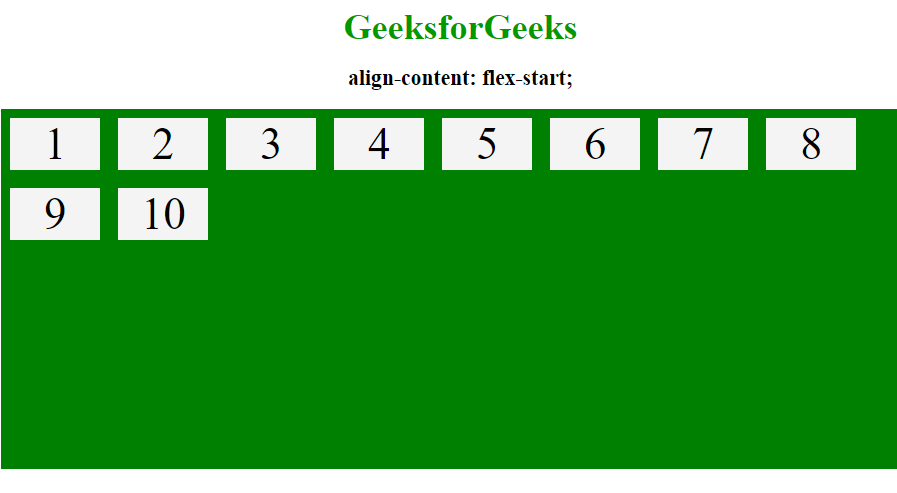
flex-start: Displays the lines at the start of the flex container.
Syntax:
align-content: flex-start;
Example:
html <!DOCTYPE html> <html> <head> <title>align-content property</title> <style> .main-container { display: flex; height: 400px; flex-wrap: wrap; align-content: flex-start; background-color: green; } .main-container div { background-color: #f4f4f4; width: 100px; margin: 10px; text-align: center; font-size: 50px; } h2 { text-align:center; } .geeks { font-size:40px; text-align:center; color:#009900; font-weight:bold; } </style> </head> <body> <div class = "geeks">GeeksforGeeks</div> <h2>align-content: flex-start;</h2> <div class="main-container"> <div>1</div> <div>2</div> <div>3</div> <div>4</div> <div>5</div> <div>6</div> <div>7</div> <div>8</div> <div>9</div> <div>10</div> </div> </body> </html> Output:
flex-end: Displays the flex lines at the end of the flex container
Syntax:
align-content: flex-end;
Example:
html <!DOCTYPE html> <html> <head> <title>align-content property</title> <style> .main-container { display: flex; height: 400px; flex-wrap: wrap; align-content: flex-end; background-color: green; } .main-container div { background-color: #f4f4f4; width: 100px; margin: 10px; text-align: center; font-size: 50px; } h2 { text-align:center; } .geeks { font-size:40px; text-align:center; color:#009900; font-weight:bold; } </style> </head> <body> <div class = "geeks">GeeksforGeeks</div> <h2>align-content: flex-end;</h2> <div class="main-container"> <div>1</div> <div>2</div> <div>3</div> <div>4</div> <div>5</div> <div>6</div> <div>7</div> <div>8</div> <div>9</div> <div>10</div> </div> </body> </html> Output:

space-around: By using space-around property space will be distributed equally around the flex lines.
Syntax:
align-content: space-around;
Example:
html <!DOCTYPE html> <html> <head> <title>align-content property</title> <style> .main-container { display: flex; height: 400px; flex-wrap: wrap; align-content: space-around; background-color: green; } .main-container div { background-color: #f4f4f4; width: 100px; margin: 10px; text-align: center; font-size: 50px; } h2 { text-align:center; } .geeks { font-size:40px; text-align:center; color:#009900; font-weight:bold; } </style> </head> <body> <div class = "geeks">GeeksforGeeks</div> <h2>align-content: space-around;</h2> <div class="main-container"> <div>1</div> <div>2</div> <div>3</div> <div>4</div> <div>5</div> <div>6</div> <div>7</div> <div>8</div> <div>9</div> <div>10</div> </div> </body> </html> Output:

space-between: Displays the flex lines with equal space between them.
Syntax:
align-content: space-between;
Example:
html <!DOCTYPE html> <html> <head> <title>align-content property</title> <style> .main-container { display: flex; height: 400px; flex-wrap: wrap; align-content: space-between; background-color: green; } .main-container div { background-color: #f4f4f4; width: 100px; margin: 10px; text-align: center; font-size: 50px; } h2 { text-align:center; } .geeks { font-size:40px; text-align:center; color:#009900; font-weight:bold; } </style> </head> <body> <div class = "geeks">GeeksforGeeks</div> <h2>align-content: space-between;</h2> <div class="main-container"> <div>1</div> <div>2</div> <div>3</div> <div>4</div> <div>5</div> <div>6</div> <div>7</div> <div>8</div> <div>9</div> <div>10</div> </div> </body> </html> Output:

Supported browser: The browser supported by CSS | align-content property are listed below:
- Google Chrome 29.0 and above
- Edge 12.0 and above
- Internet Explorer 11.0 and above
- Firefox 28.0 and above
- Opera 12.1 and above
- Safari 9.0 and above