Color Picker App using Angular
Last Updated : 23 Jul, 2025
We will be creating a Color Picker Application using the Angular framework. This app will enable users to select and display colors interactively through a user-friendly interface.
We will use Angular Material for styling and the ngx-color-picker library to provide advanced color selection capabilities. By the end of this article, you'll have a fully functional color picker integrated into an Angular application.
Project Preview
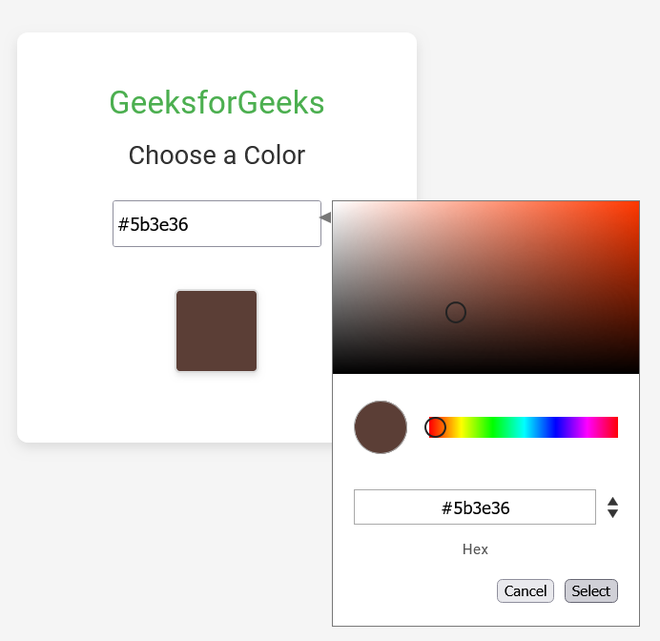 Project Preview
Prerequisites
Steps to Color Picker App using Angular
Step 1: Install Angular CLI
If you haven’t installed Angular CLI yet, install it using the following command
npm install -g @angular/cli
Step 2: Create a New Angular Project
ng new color-picker-app
cd color-picker-app
Step 3: Install Angular Material
Install Angular Material for better UI components:
ng add @angular/material
Step 4: Install Angular Material Color Picker
You can use a third-party Angular color picker library. One popular choice is ngx-color-picker. Install it with:
npm install ngx-color-picker --save
Dependencies
"dependencies": {
 "@angular/animations": "^16.2.0",
 "@angular/cdk": "^16.2.14",
 "@angular/common": "^16.2.0",
 "@angular/compiler": "^16.2.0",
 "@angular/core": "^16.2.0",
 "@angular/forms": "^16.2.0",
 "@angular/material": "^16.2.14",
 "@angular/platform-browser": "^16.2.0",
 "@angular/platform-browser-dynamic": "^16.2.0",
 "@angular/router": "^16.2.0",
 "ngx-color-picker": "^17.0.0",
 "rxjs": "~7.8.0",
 "tslib": "^2.3.0",
 "zone.js": "~0.13.0"
}
Project Structure
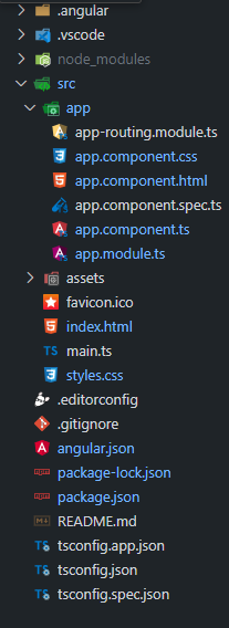 Project Structure
Example: Create the required files as seen in the folder structure and add the following codes.
HTML <!--app.component.html--> <div class="container"> <mat-card class="color-picker-card"> <mat-card-header> <div class="header-text"> <h1 class="title">GeeksforGeeks</h1> <h3 class="subtitle">Choose a Color</h3> </div> </mat-card-header> <mat-card-content> <div class="color-picker-container"> <input [value]="selectedColor" [(colorPicker)]="selectedColor" (colorPickerChange)="onColorChange($event)" [cpOKButton]="true" [cpOKButtonText]="'Select'" [cpCancelButton]="true" [cpSaveClickOutside]="false" [cpAlphaChannel]="'disabled'" [cpOutputFormat]="'hex'" class="color-picker-input" /> <div class="color-box" [style.background]="selectedColor"></div> </div> </mat-card-content> </mat-card> </div>
/* app.component.css */ .container { display: flex; justify-content: center; align-items: center; height: 100vh; background: #f5f5f5; } .color-picker-card { max-width: 300px; width: 100%; padding: 20px; border-radius: 8px; box-shadow: 0 4px 8px rgba(0, 0, 0, 0.1); background: #ffffff; text-align: center; display: flex; flex-direction: column; align-items: center; } .title { color: #4caf50; font-size: 1.5rem; margin: 0; } .subtitle { color: #333; font-size: 1.2rem; margin: 10px 0 20px; } .color-picker-container { display: flex; flex-direction: column; align-items: center; } .color-picker-input { margin-bottom: 16px; width: 100%; max-width: 150px; height: 30px; } .color-box { width: 60px; height: 60px; margin: 16px auto; border: 2px solid #ddd; border-radius: 4px; box-shadow: 0 2px 4px rgba(0, 0, 0, 0.1); } // app.module.ts import { NgModule } from '@angular/core'; import { BrowserModule } from '@angular/platform-browser'; import { ColorPickerModule } from 'ngx-color-picker'; import { MatCardModule } from '@angular/material/card'; import { AppComponent } from './app.component'; @NgModule({ declarations: [ AppComponent ], imports: [ BrowserModule, ColorPickerModule, MatCardModule ], providers: [], bootstrap: [AppComponent] }) export class AppModule { } // app.component.ts import { Component } from '@angular/core'; import { ColorPickerService } from 'ngx-color-picker'; @Component({ selector: 'app-root', templateUrl: './app.component.html', styleUrls: ['./app.component.css'] }) export class AppComponent { public title: string = 'color-picker-app'; public selectedColor: string = '#e45a33'; constructor(private cpService: ColorPickerService) { } public onColorChange(color: string): void { this.selectedColor = color; } } // app.component.spec.ts import { TestBed } from '@angular/core/testing'; import { RouterTestingModule } from '@angular/router/testing'; import { AppComponent } from './app.component'; describe('AppComponent', () => { beforeEach(() => TestBed.configureTestingModule({ imports: [RouterTestingModule], declarations: [AppComponent] })); it('should create the app', () => { const fixture = TestBed.createComponent(AppComponent); const app = fixture.componentInstance; expect(app).toBeTruthy(); }); it(`should have as title 'color-picker-app'`, () => { const fixture = TestBed.createComponent(AppComponent); const app = fixture.componentInstance; expect(app.title).toEqual('color-picker-app'); }); it('should render title', () => { const fixture = TestBed.createComponent(AppComponent); fixture.detectChanges(); const compiled = fixture.nativeElement as HTMLElement; expect(compiled.querySelector('.content span')?.textContent). toContain('color-picker-app app is running!'); }); }); Steps to Run the Application
Open the terminal, run this command from your root directory to start the application
ng serve --open
Open your browser and navigate to http://localhost:4200
Output
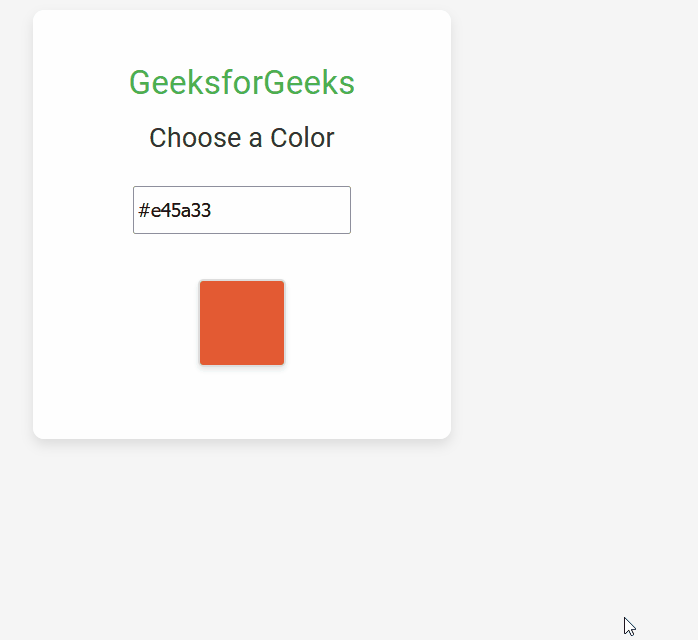 Color Picker App using Angular
Explore
AngularJS Basics
AngularJS Directives
AngularJS Filters
AngularJS Converting Functions
AngularJS Comparing Functions
AngularJS Questions
AngularJS Examples
2 min read
My Profile