Pandas 中的散點矩陣
- Pandas 中的散點矩陣
- 在 Pandas 中使用
scatter_matrix()方法 - 在 Pandas 中使用帶有
hist_kwds引數的scatter_matrix()方法 - 在 Pandas 中使用帶有
diagonal = 'kde'引數的scatter_matrix()方法
本教程探討在 Pandas 中使用散點矩陣來配對圖。
Pandas 中的散點矩陣
在資料預處理期間檢查用於分析迴歸的自變數之間的相關性非常重要。散點圖可以很容易地理解特徵之間的相關性。
Pandas 為分析師提供了 scatter_matrix() 函式以切實可行地實現這些繪圖。它還用於確定相關性是積極的還是消極的。
讓我們考慮一個 n 變數的例子; Pandas 中的這個函式將幫助我們擁有 n 行和 n 列,它們是 n x n 矩陣。
下面給出了實現散點圖的三個簡單步驟。
- 載入必要的庫。
- 匯入合適的資料。
- 使用
scatter_matrix方法繪製圖形。
語法:
pandas.plotting.scatter_matrix(dataframe) 本教程將教我們如何有效地使用 scatter_matrix() 作為分析師。
scatter_matrix() 一起使用,例如 alpha、diagonal、density_kwds、hist_kwds、range_padding。在 Pandas 中使用 scatter_matrix() 方法
此示例使用 scatter_matrix() 方法,沒有附加引數。
在這裡,我們使用 numpy 模組建立虛擬資料。建立了三個變數:x1、x2 和 x3。
import numpy as np import pandas as pd np.random.seed(134) N = 1000 x1 = np.random.normal(0, 1, N) x2 = x1 + np.random.normal(0, 3, N) x3 = 2 * x1 - x2 + np.random.normal(0, 2, N) 使用字典建立 Pandas DataFrame:
df = pd.DataFrame({"x1": x1, "x2": x2, "x3": x3}) print(df.head()) 輸出:
x1 x2 x3 0 -0.224315 -8.840152 10.145993 1 1.337257 2.383882 -1.854636 2 0.882366 3.544989 -1.117054 3 0.295153 -3.844863 3.634823 4 0.780587 -0.465342 2.121288 最後,資料已準備好供我們繪製圖表。
import numpy as np import pandas as pd from pandas.plotting import scatter_matrix import matplotlib.pyplot as plt np.random.seed(134) N = 1000 x1 = np.random.normal(0, 1, N) x2 = x1 + np.random.normal(0, 3, N) x3 = 2 * x1 - x2 + np.random.normal(0, 2, N) df = pd.DataFrame({"x1": x1, "x2": x2, "x3": x3}) df.head() # Creating the scatter matrix: pd.plotting.scatter_matrix(df) plt.show() 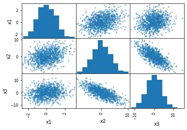
正如我們所看到的,我們可以如此輕鬆地生成這些圖。但是,是什麼讓它如此有趣?
- 描繪了我們的虛擬資料中變數
x1、x2和x3的分佈。 - 可以觀察到變數之間的相關性。
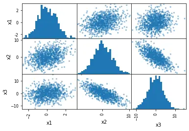
在 Pandas 中使用帶有 hist_kwds 引數的 scatter_matrix() 方法
下一個示例使用 hist_kwds 引數。我們可以使用此引數以 Python 字典的形式提供輸入,通過它我們可以更改直方圖的 bin 總數。
# Changing the number of bins of the scatter matrix in Python: pd.plotting.scatter_matrix(df, hist_kwds={"bins": 30}) 輸出:
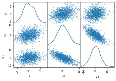
在 Pandas 中使用帶有 diagonal = 'kde' 引數的 scatter_matrix() 方法
在最後一個示例中,我們將用 kde 分佈替換直方圖。
KDE 代表核密度估計。它是一種可以平滑資料的基本工具,之後可以根據有限的資料樣本進行推斷。
使用 kde 繪製散點圖就像製作直方圖一樣簡單。為此,我們只需要將 hist_kwds 替換為 diagonal = 'kde'。
diagonal 引數不能考慮兩個引數:hist 和 kde。確保在程式碼中使用其中任何一個非常重要。
獲取 kde 的程式碼更改如下。
# Scatter matrix with Pandas and density plots: pd.plotting.scatter_matrix(df, diagonal="kde") 輸出:
我們只需要通過 read_csv 方法使用 Python Pandas 模組匯入 CSV 檔案。
csv_file = "URL for the dataset" # Reading the CSV file from the URL df_s = pd.read_csv(csv_file, index_col=0) # Checking the data quickly (first 5 rows): df_s.head() 與 Pandas 中的 scatter_matrix() 一樣,也可以使用可通過 seaborn 包使用的 pairplot 方法。
深入瞭解這些模組有助於繪製這些散點圖;它還佔了上風,使其更加使用者友好並建立更具吸引力的視覺化效果。