1. はじめに
皆様お疲れ様です。Swift AdventCalendarの12日目を担当させて頂きます、fumiyasac(Fumiya Sakai)と申します。何卒よろしくお願い致します。
最近になって、業務や個人開発の中でも徐々にSwiftUIやそれを取り巻くアーキテクチャ等にも触れる機会が徐々に増えてきました。
UIKitが主流だった時代から今日までiOSアプリにおけるUI実装に関する部分は、自分にとっては一番関心が高いトピックではあるので、今後はある程度まとまった記事の形でも継続的な投稿ができる様にして参ります。
(もちろん不定期で公開しているTwitter等での手書きノートによるアウトプットも継続していく所存ではあります📝)
私自身もそれほどSwiftUIに慣れているわけでは決してありませんが、これまでUIKitを活用して実装経験があるものや、サンプル実装検証をすすめた経験があるものの中で、
- UIKitを利用した際でも想像以上に工夫が必要だったUI実装を、SwiftUIに置き換えて考える事は可能か?
- 更にSwiftUI製の実装する場合は、従来のUIKitに比べての難易度はどのように変わるのか?
という点は気になっていた部分でもありましたので、自分でも簡単なサンプル実装を通じて試してみようと思いました。
本記事では、特に海外のMedium記事やStackoverflow等で紹介されていた実装を参考にして、
- GeometryReaderでの位置計算を利用しなくとも実現可能なDragGestureでの表現を有効に活用したCarousel表現
- ライブラリを利用しなくとも実現可能なPinterestの一覧画面に近い形のGrid表現
といった2種類の実装をSwiftUI用いて実装した際の簡単な解説と実装記録をまとめたものになります。
この様な表現については、UIKitをメインで利用していた際にも開発中の要望として上がってくる事はありましたが、いざ実装をしてみると想像以上に大変だった思い出があります。実際のアプリへ導入する際には、紹介したサンプルだけでは十分ではない部分もあるかと思いますが、実装の参考に少しでもなれば幸いに思います。
【環境やバージョンについて】
- Xcode 14.1
- Swift 5.6
- MacOS Monterey 12.6
【利用ライブラリ】
| ライブラリ名 | ライブラリの機能概要 |
|---|---|
| Kingfisher | URLから取得した画像データキャッシュ用ライブラリ |
| Cosmos | 割合(例:3.7等の表記)も考慮されて星形レーティング表示用ライブラリ |
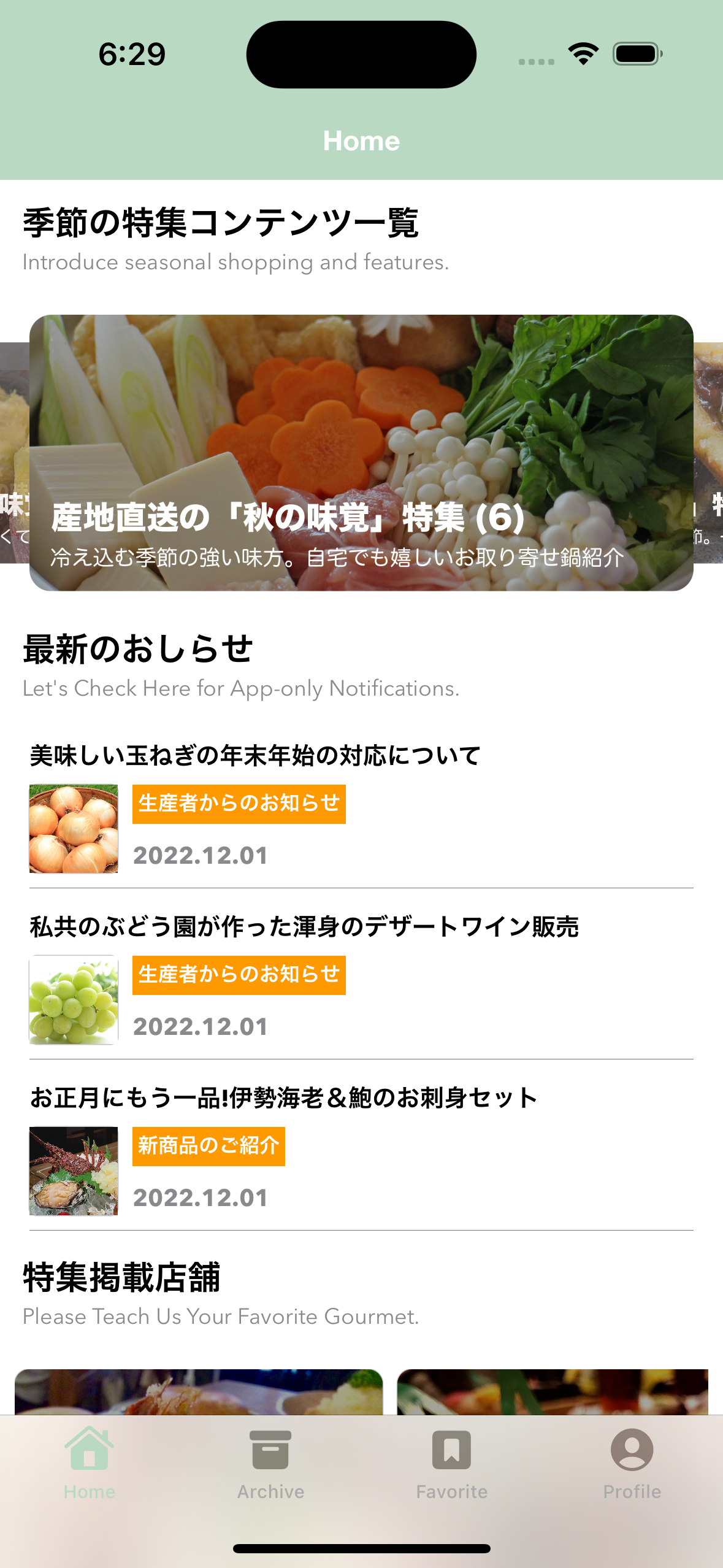
【アプリ画面内での利用イメージ図】
後述するSwiftUIで実装したView部品を組み合わせて1つの画面を構成する場合には、この様なイメージになるかと思います。
(※ScrollView内に各種要素を展開していく様な形になるので、上下スクロールとの競合についても別途考慮しなければいけない場合があるかもしれません。)
2. DragGestureを利用したCarousel表現例のご紹介
WebやアプリのTOP画面内でよく用いられる複数個のアイキャッチ画像やバナー広告等をCarousel型でひとまとめにして表現している様なUIは、様々なWebサービスやアプリでもポピュラーなUI表現の1つでもあるかと思います。iOSアプリ開発においても、UIKitを利用する場合ではUIPageViewControllerやUICollectionViewをベースにして、UIPageViewControllerDelegate・
UICollectionViewDelegateFlowLayout・UIScrollViewDelegate等を上手に活用する事で、指で動かした時の振る舞いや表示要素に適用するレイアウトに関する調整をしていく形が多いかと思います。工夫次第では画面内に指の動きやアニメーション等とも調和した形を演出ができるため、独自の工夫を加える余地が多くある一方で、アニメーションやインタラクション等に関する知識も必要になるので、場合によっては想定以上に複雑になってしまう可能性もある部分かと思います。
ここでは、指での水平方向移動と連動した形を実現するために、DragGestureを利用した移動距離を利用した、SwiftUIを利用したCarousel表現の例をコードと一緒に紹介できればと思います。
2-1. LazyHGridを利用した基本的なCarousel表現とUIViewRepresentableの活用例
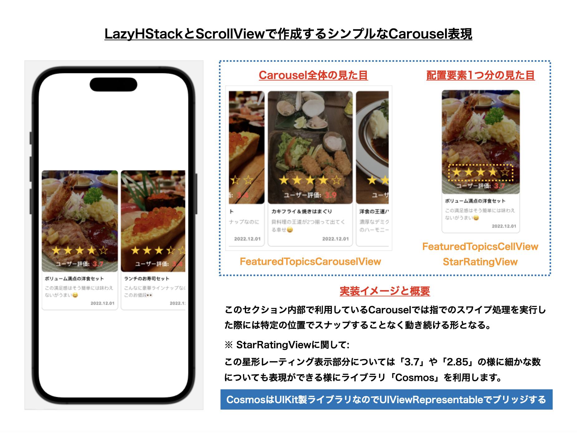
本題に入る前段として、まずはLazyHStackとScrollViewを組み合わせた、指で動かしてもある程度の位置で停止しない水平方向のCarousel表示を考えてみる事にします。
基本的な構造や内部実装についてはさほど難しい点はありませんが、星形レーティング表示部分において小数点まで考慮したい場合には、そのView要素を自前で準備するのはなかなか大変でしたので、今回は複雑なレーティング表示でも対応可能な「Cosmos」というUIKit製のUIライブラリをUIViewRepresentableを利用してSwiftUIでも利用できる様に調整しています。
【1. 図解】
【2. ライブラリ「Cosmos」をSwiftUI側で利用するための処理】
import SwiftUI import Cosmos // MEMO: UIKit製ライブラリ「CosmosView」をSwiftUIで利用する // https://github.com/evgenyneu/Cosmos/wiki/Using-Cosmos-with-SwiftUI struct RatingViewRepresentable: UIViewRepresentable { // MARK: - Property @Binding var rating: Double // MARK: - Function func makeUIView(context: Context) -> CosmosView { CosmosView() } func updateUIView(_ uiView: CosmosView, context: Context) { // @BindingでRatingの数値を反映する uiView.rating = rating // 内在サイズに則って自動でCosmosViewをリサイズする // 参考: 内在サイズについての説明 // https://developer.mozilla.org/ja/docs/Glossary/Intrinsic_Size uiView.setContentHuggingPriority(.defaultHigh, for: .vertical) uiView.setContentHuggingPriority(.defaultHigh, for: .horizontal) // ライブラリ「Cosmos」で調整可能な値を独自に調整する際に利用する setupCosmosViewSettings(uiView) } private func setupCosmosViewSettings(_ uiView: CosmosView) { // MEMO: ライブラリ「Cosmos」の基本設定部分 // 👉 色やサイズをはじめ表示モード等についても細かく設定が可能です。 uiView.settings.fillMode = .precise uiView.settings.starSize = 26 uiView.settings.emptyBorderWidth = 1.0 uiView.settings.filledBorderWidth = 1.0 uiView.settings.emptyBorderColor = .systemYellow uiView.settings.filledColor = .systemYellow uiView.settings.filledBorderColor = .systemYellow } } 【3. 表示データJSON】
利用する表示データ用のJSONの詳細はこちら
{ "result": [ { "id": 1, "rating": 3.7, "thumbnail_url": "https://example.com/featured_topic1.jpg", "title": "ボリューム満点の洋食セット", "caption": "この満足感はそう簡単には味わえないがうまい😆", "published_at": "2022-12-01T07:30:00.000+0000" }, { "id": 2, "rating": 3.4, "thumbnail_url": "https://example.com/featured_topic2.jpg", "title": "ランチのお寿司セット", "caption": "こんなに豪華ラインナップなのにこのお値段👀", "published_at": "2022-12-01T07:30:00.000+0000" }, { "id": 3, "rating": 3.9, "thumbnail_url": "https://example.com/featured_topic3.jpg", "title": "カキフライ&焼きはまぐり", "caption": "貝料理の王道が2つ揃って出てくる幸せ😄", "published_at": "2022-12-01T07:30:00.000+0000" }, { "id": 4, "rating": 3.7, "thumbnail_url": "https://example.com/featured_topic4.jpg", "title": "洋食の王道ハンバーグ", "caption": "濃厚なデミグラスソースと肉汁のハーモニー👍", "published_at": "2022-12-01T07:30:00.000+0000" }, { "id": 5, "rating": 3.4, "thumbnail_url": "https://example.com/featured_topic5.jpg", "title": "おしゃれな巻き寿司", "caption": "海苔ではなくお肉ときゅうりで巻いた変り種", "published_at": "2022-12-01T07:30:00.000+0000" }, { "id": 6, "rating": 3.9, "thumbnail_url": "https://example.com/featured_topic6.jpg", "title": "野菜たっぷり焼きカレー", "caption": "ヘルシーな野菜達がカレーと相性抜群😊", "published_at": "2022-12-01T07:30:00.000+0000" }, { "id": 7, "rating": 3.2, "thumbnail_url": "https://example.com/featured_topic7.jpg", "title": "うなぎの蒲焼き", "caption": "そのままでもご飯と一緒でも美味しい", "published_at": "2022-12-01T07:30:00.000+0000" }, { "id": 8, "rating": 4.3, "thumbnail_url": "https://example.com/featured_topic8.jpg", "title": "黒毛和牛のすき焼き", "caption": "贅沢で脂の上品なお肉を使った逸品", "published_at": "2022-12-01T07:30:00.000+0000" } ] } 【4. JSONデータをEntityに変換する処理】
取得したJSONをEntityへ変換する処理の詳細はこちら
import Foundation struct FeaturedTopicsResponse: Decodable, Equatable { let result: [FeaturedTopicEntity] // MARK: - Enum private enum Keys: String, CodingKey { case result } // MARK: - Initializer init(result: [FeaturedTopicEntity]) { self.result = result } // JSONの配列内の要素を取得する → JSONの配列内の要素にある値をDecodeして初期化する init(from decoder: Decoder) throws { let container = try decoder.container(keyedBy: Keys.self) self.result = try container.decode([FeaturedTopicEntity].self, forKey: .result) } // MARK: - Equatable // MEMO: Equatableプロトコルに適合させるための処理 static func == (lhs: FeaturedTopicsResponse, rhs: FeaturedTopicsResponse) -> Bool { return lhs.result == rhs.result } } struct FeaturedTopicEntity: Hashable, Decodable { let id: Int let rating: Double let thumbnailUrl: String let title: String let caption: String let publishedAt: String // MARK: - Enum private enum Keys: String, CodingKey { case id case rating case thumbnailUrl = "thumbnail_url" case title case caption case publishedAt = "published_at" } // MARK: - Initializer init(from decoder: Decoder) throws { // JSONの配列内の要素を取得する let container = try decoder.container(keyedBy: Keys.self) // JSONの配列内の要素にある値をDecodeして初期化する self.id = try container.decode(Int.self, forKey: .id) self.rating = try container.decode(Double.self, forKey: .rating) self.thumbnailUrl = try container.decode(String.self, forKey: .thumbnailUrl) self.title = try container.decode(String.self, forKey: .title) self.caption = try container.decode(String.self, forKey: .caption) self.publishedAt = try container.decode(String.self, forKey: .publishedAt) } // MARK: - Hashable // MEMO: Hashableプロトコルに適合させるための処理 func hash(into hasher: inout Hasher) { hasher.combine(id) } static func == (lhs: FeaturedTopicEntity, rhs: FeaturedTopicEntity) -> Bool { return lhs.id == rhs.id } } 【5. このView要素全体のコード一覧】
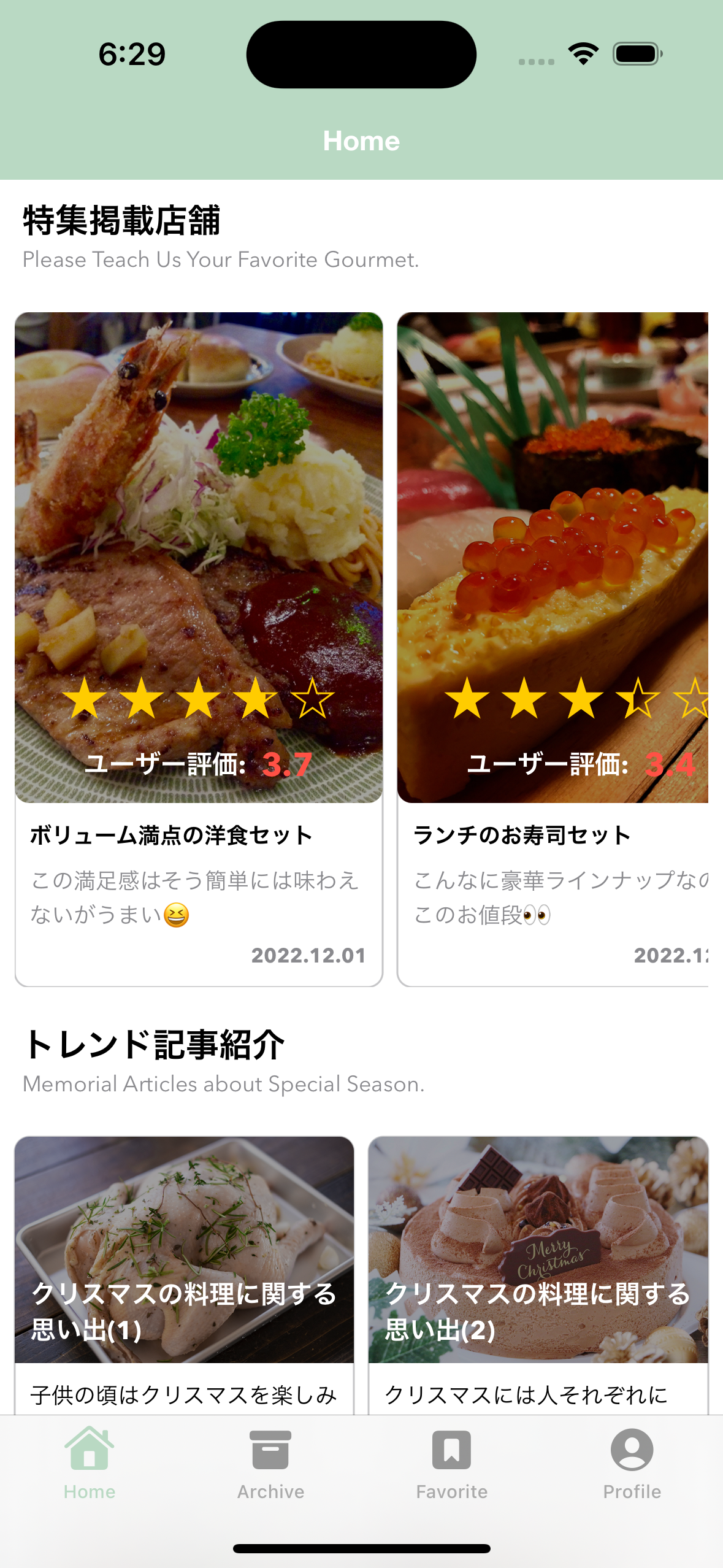
import SwiftUI import Kingfisher struct FeaturedTopicsCarouselView: View { // MARK: - Property private let screen = UIScreen.main.bounds private var screenWidth: CGFloat { return screen.width } // MEMO: LazyHStackに表示する内容を格納するための変数 @State private var featuredTopicsCarouselViewObjects: [FeaturedTopicsCarouselViewObject] = [] // MARK: - Initializer init(featuredTopicsCarouselViewObjects: [FeaturedTopicsCarouselViewObject]) { // イニシャライザ内で「_(変数名)」値を代入することでState値の初期化を実行する _featuredTopicsCarouselViewObjects = State(initialValue: featuredTopicsCarouselViewObjects) } // MARK: - Body var body: some View { VStack { ScrollView(.horizontal, showsIndicators: false) { // MEMO: 表示要素の間に8.0の行間をつけるためにSpacing値を8.0としています。 LazyHStack(spacing: 8.0) { ForEach(featuredTopicsCarouselViewObjects) { viewObjects in FeaturedTopicsCellView(viewObject: viewObjects) } } } .padding([.leading, .trailing], 8.0) } .frame(width: screenWidth) } } // MARK: - PickupPhotosCellView struct FeaturedTopicsCellView: View { // MARK: - Property private var thumbnailWidth: CGFloat { return 200.0 } private var thumbnailHeight: CGFloat { return thumbnailWidth * 960.0 / 720.0 } private var standardWidth: CGFloat { return thumbnailWidth } private var standardHeight: CGFloat { return thumbnailHeight + 100.0 } private var cellUserPointFont: Font { return Font.custom("AvenirNext-Bold", size: 14) } private var cellRatingFont: Font { return Font.custom("AvenirNext-Bold", size: 18) } private var cellTitleFont: Font { return Font.custom("AvenirNext-Bold", size: 12) } private var cellCaptionFont: Font { return Font.custom("AvenirNext-Regular", size: 12) } private var cellDateFont: Font { return Font.custom("AvenirNext-Bold", size: 11) } private var cellUserPointColor: Color { return Color.white } private var cellRatingColor: Color { return Color(uiColor: UIColor(code: "#ff5145")) } private var cellTitleColor: Color { return Color.primary } private var cellCaptionColor: Color { return Color.secondary } private var cellDateColor: Color { return Color.secondary } private var cellThumbnailMaskColor: Color { return Color.black.opacity(0.36) } private var cellThumbnailRoundRectangleColor: Color { return Color.secondary.opacity(0.5) } private var viewObject: FeaturedTopicsCarouselViewObject // MARK: - Initializer init(viewObject: FeaturedTopicsCarouselViewObject) { self.viewObject = viewObject } var body: some View { VStack(alignment: .leading) { // (1) 上部の画面要素とテキストや星形レーティングを重ねて表示する部分 // 👉 ZStack内部の要素についてはサムネイル表示のサイズと合わせています。 ZStack { KFImage(viewObject.thumbnailUrl) .resizable() .scaledToFill() .frame(width: thumbnailWidth, height: thumbnailHeight) .cornerRadius(8.0) Rectangle() .foregroundColor(cellThumbnailMaskColor) .frame(width: thumbnailWidth, height: thumbnailHeight) .cornerRadius(8.0) VStack { Spacer() // MEMO: 星形レーティング表示部分はRatingViewRepresentableと橋渡しをするStarRatingViewを経由して表示する // 👉 RatingViewRepresentable.swiftでUIKit製のライブラリで提供している「Cosmos」を利用できる様にしています。 StarRatingView(rating: viewObject.rating) HStack { Text("ユーザー評価:") .font(cellUserPointFont) .foregroundColor(cellUserPointColor) .lineLimit(1) Text(String(format: "%.1f", viewObject.rating)) .font(cellRatingFont) .foregroundColor(cellRatingColor) .lineLimit(1) } .padding([.bottom], 8.0) } .frame(width: thumbnailWidth, height: thumbnailHeight) } // (2) 下部のテキスト表示(タイトル表示) Text(viewObject.title) .font(cellTitleFont) .foregroundColor(cellTitleColor) .padding([.top], 2.0) .padding([.leading, .trailing], 8.0) .padding([.bottom], 2.0) .lineLimit(1) // (3) 下部のテキスト表示(キャプション表示) Text(viewObject.caption) .font(cellCaptionFont) .foregroundColor(cellCaptionColor) .padding([.top], -2.0) .padding([.leading, .trailing], 8.0) .lineSpacing(2.0) .lineLimit(2) // (4) 下部のテキスト表示(日付表示) HStack { Spacer() Text(DateLabelFormatter.getDateStringFromAPI(apiDateString: viewObject.publishedAt)) .font(cellDateFont) .foregroundColor(cellDateColor) .padding([.top], -6.0) .padding([.leading, .trailing], 8.0) .lineLimit(1) } // (5) Spacer Spacer() } // MEMO: タップ領域の確保とタップ時の処理 .contentShape(Rectangle()) .onTapGesture(perform: { print("想定: Tap処理を実行した際に何らかの処理を実行する (ID:\(viewObject.id))") }) .frame(width: standardWidth, height: standardHeight) .background( RoundedRectangle(cornerRadius: 8.0) .stroke(cellThumbnailRoundRectangleColor) ) } } // MARK: - StarRatingView struct StarRatingView: View { // MARK: - Property @State private var rating: Double = 0.0 // MARK: - Initializer init(rating: Double) { // イニシャライザ内で「_(変数名)」値を代入することでState値の初期化を実行する _rating = State(initialValue: rating) } // MARK: - Body var body: some View { // MEMO: ライブラリ「Cosmos」のView要素にイニシャライザで受け取った値を反映する RatingViewRepresentable(rating: $rating) } } // MARK: - ViewObject struct FeaturedTopicsCarouselViewObject: Identifiable { let id: Int let rating: Double let thumbnailUrl: URL? let title: String let caption: String let publishedAt: String } // MARK: - Preview struct FeaturedTopicsCarouselView_Previews: PreviewProvider { static var previews: some View { // MEMO: Preview表示用にレスポンスを想定したJsonを読み込んで画面に表示させる let featuredTopicsResponse = getFeaturedTopicsResponse() let featuredTopicsCarouselViewObjects = featuredTopicsResponse.result .map { FeaturedTopicsCarouselViewObject( id: $0.id, rating: $0.rating, thumbnailUrl: URL(string: $0.thumbnailUrl) ?? nil, title: $0.title, caption: $0.caption, publishedAt: $0.publishedAt ) } // Preview: FeaturedTopicsCarouselView FeaturedTopicsCarouselView(featuredTopicsCarouselViewObjects: featuredTopicsCarouselViewObjects) .previewDisplayName("FeaturedTopicsCarouselView Preview") // MEMO: 部品1つあたりを表示するためのViewObject let viewObject = FeaturedTopicsCarouselViewObject( id: 1, rating: 3.7, thumbnailUrl: URL(string: "https://example.com/featured_topic1.jpg") ?? nil, title: "ボリューム満点の洋食セット", caption: "この満足感はそう簡単には味わえないがうまい😆", publishedAt: "2022-12-01T07:30:00.000+0000" ) // Preview: FeaturedTopicsCellView FeaturedTopicsCellView(viewObject: viewObject) .previewDisplayName("FeaturedTopicsCellView Preview") // MEMO: Preview表示用にレスポンスを想定したJsonを読み込んで画面に表示させる StarRatingView(rating: 3.76) .previewDisplayName("StarRatingView Preview") } // MARK: - Private Static Function private static func getFeaturedTopicsResponse() -> FeaturedTopicsResponse { guard let path = Bundle.main.path(forResource: "featured_topics", ofType: "json") else { fatalError() } guard let data = try? Data(contentsOf: URL(fileURLWithPath: path)) else { fatalError() } guard let featuredTopicsResponse = try? JSONDecoder().decode(FeaturedTopicsResponse.self, from: data) else { fatalError() } return featuredTopicsResponse } } 2-2. Drag処理と連動した中央寄せ型のCarouselを実現するDragGesture活用例
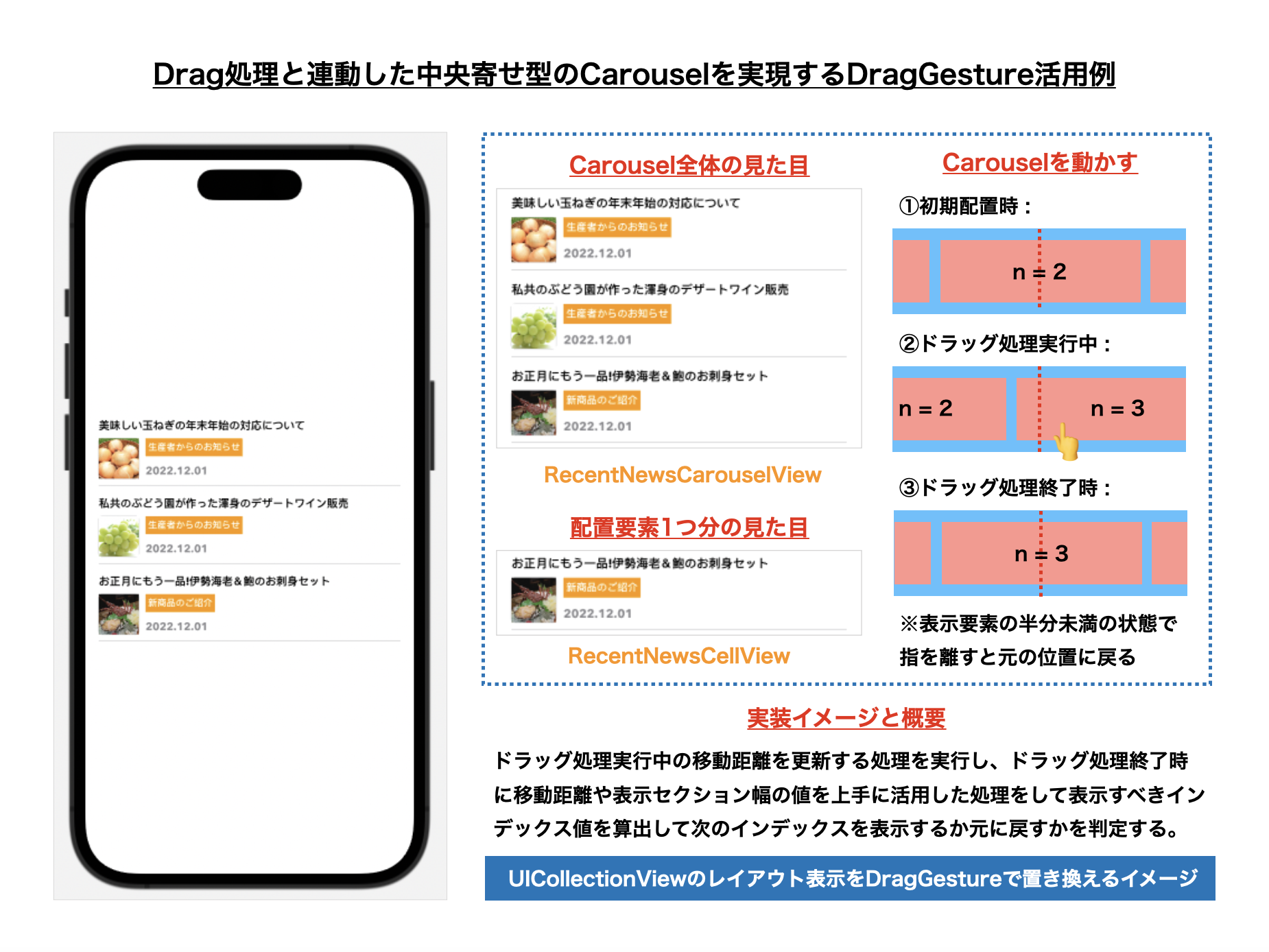
ここからは本題でもあるDragGestureを利用したCarousel表現の中でも、水平方向にドラッグ処理で移動後に指を離した際にその前後の要素が半分以上表示されている場合にはその前後の要素に移動し、そうでない場合には際には元の位置に戻る様な、中央寄せをしたCarousel表示を考えてみる事にします。
このような表現をUIKitを用いて実現する場合の方針としては、簡単なものであればUIPageViewControllerを利用する事が多いと思いますが、メインで表示したい要素を中央に寄せつつその左右にある要素についても少しだけ表示するような形のもの(例としてはTwitterのタイムラインで表示される漫画の広告の様な形の表現をイメージして頂ければ幸いです)であればUICollectionView & UICollectionViewLayoutを利用して配置要素の停止位置を調整する必要になる場合もあります。
今回紹介するサンプルでは、UIKitで言う所のUICollectionView & UICollectionViewLayoutの処理部分をそのままDragGestureに置き換えていく様なイメージになるかと思います。この処理での大きなポイントとなる値は、
-
@State private var scrollOffset: CGFloat
👉 表示対象要素のインデックス値と連動した最終的なスクロールのオフセット値 -
@State private var draggingOffset: CGFloat
👉 ドラッグ処理実行中に更新される表示対象要素の移動距離
の2値になります。そして、この処理をDragGestureの処理と連動させる事によって表示位置の更新処理を実行するために、
- ドラッグ処理実行中:
.onChanged({ event in ... })
👉 変数:draggingOffsetを更新する - ドラッグ処理終了時:
.onEnded({ event in ... })
👉 ドラッグ処理時に更新された変数:draggingOffsetの値等から最終的な表示位置となる変数:scrollOffsetを更新する
という流れで、水平方向へのCarousel処理を実現する点がポイントになるかと思います。
表示対象の要素を中央に寄せて停止させる必要があるので、移動距離からインデックス値を元にした位置調整をするための計算が少し大変ではあるものの、DragGestureに関する基本事項を理解していれば、従来のUICollectionView & UICollectionViewLayoutを利用した実装に比べてもいくばくかは直感的に考えられるのではないかと思います。
【1. 図解】
【2. 表示データJSON】
利用する表示データ用のJSONの詳細はこちら
{ "result": [ { "id": 1, "thumbnail_url": "https://example.com/news_thumbnail1.jpg", "title": "美味しい玉ねぎの年末年始の対応について", "news_category": "生産者からのお知らせ", "published_at": "2022-12-01T07:30:00.000+0000" }, { "id": 2, "thumbnail_url": "https://example.com/news_thumbnail2.jpg", "title": "私共のぶどう園が作った渾身のデザートワイン販売", "news_category": "生産者からのお知らせ", "published_at": "2022-12-01T07:30:00.000+0000" }, { "id": 3, "thumbnail_url": "https://example.com/news_thumbnail3.jpg", "title": "お正月にもう一品!伊勢海老&鮑のお刺身セット", "news_category": "新商品のご紹介", "published_at": "2022-12-01T07:30:00.000+0000" }, { "id": 4, "thumbnail_url": "https://example.com/news_thumbnail4.jpg", "title": "甘さと酸っぱさのハーモニー「いよかんジュース」のご紹介", "news_category": "生産者からのお知らせ", "published_at": "2022-12-01T07:30:00.000+0000" }, { "id": 5, "thumbnail_url": "https://example.com/news_thumbnail5.jpg", "title": "美味しいさつまいもの年末年始の対応について", "news_category": "生産者からのお知らせ", "published_at": "2022-12-01T07:30:00.000+0000" }, { "id": 6, "thumbnail_url": "https://example.com/news_thumbnail6.jpg", "title": "余った梨を活用した簡単デザートレシピ紹介", "news_category": "家庭での楽しみ方Tips", "published_at": "2022-12-01T07:30:00.000+0000" }, { "id": 7, "thumbnail_url": "https://example.com/news_thumbnail7.jpg", "title": "おうち時間を彩るテイクアウトメニュー達", "news_category": "おうちでも楽しめるテイクアウト", "published_at": "2022-12-01T07:30:00.000+0000" }, { "id": 8, "thumbnail_url": "https://example.com/news_thumbnail8.jpg", "title": "家庭の強い味方!野菜がたっぷり献立セットのご紹介", "news_category": "新商品のご紹介", "published_at": "2022-12-01T07:30:00.000+0000" }, { "id": 9, "thumbnail_url": "https://example.com/news_thumbnail9.jpg", "title": "簡単な手順でも美味しいご馳走レシピのご紹介", "news_category": "家庭での楽しみ方Tips", "published_at": "2022-12-01T07:30:00.000+0000" }, { "id": 10, "thumbnail_url": "https://example.com/news_thumbnail10.jpg", "title": "偏った食生活におさらばできる具沢山のお味噌汁集", "news_category": "家庭での楽しみ方Tips", "published_at": "2022-12-01T07:30:00.000+0000" }, { "id": 11, "thumbnail_url": "https://example.com/news_thumbnail11.jpg", "title": "農家の愛が詰まった新米の年末年始の対応について", "news_category": "生産者からのお知らせ", "published_at": "2022-12-01T07:30:00.000+0000" }, { "id": 12, "thumbnail_url": "https://example.com/news_thumbnail12.jpg", "title": "美味しいみかんの年末年始の対応について", "news_category": "生産者からのお知らせ", "published_at": "2022-12-01T07:30:00.000+0000" } ] } 【3. JSONデータをEntityに変換する処理】
取得したJSONをEntityへ変換する処理の詳細はこちら
import Foundation struct RecentNewsResponse: Decodable, Equatable { let result: [RecentNewsEntity] // MARK: - Enum private enum Keys: String, CodingKey { case result } // MARK: - Initializer init(result: [RecentNewsEntity]) { self.result = result } // JSONの配列内の要素を取得する → JSONの配列内の要素にある値をDecodeして初期化する init(from decoder: Decoder) throws { let container = try decoder.container(keyedBy: Keys.self) self.result = try container.decode([RecentNewsEntity].self, forKey: .result) } // MARK: - Equatable // MEMO: Equatableプロトコルに適合させるための処理 static func == (lhs: RecentNewsResponse, rhs: RecentNewsResponse) -> Bool { return lhs.result == rhs.result } } struct RecentNewsEntity: Hashable, Decodable { let id: Int let thumbnailUrl: String let title: String let newsCategory: String let publishedAt: String // MARK: - Enum private enum Keys: String, CodingKey { case id case thumbnailUrl = "thumbnail_url" case title case newsCategory = "news_category" case publishedAt = "published_at" } // MARK: - Initializer init(from decoder: Decoder) throws { // JSONの配列内の要素を取得する let container = try decoder.container(keyedBy: Keys.self) // JSONの配列内の要素にある値をDecodeして初期化する self.id = try container.decode(Int.self, forKey: .id) self.thumbnailUrl = try container.decode(String.self, forKey: .thumbnailUrl) self.title = try container.decode(String.self, forKey: .title) self.newsCategory = try container.decode(String.self, forKey: .newsCategory) self.publishedAt = try container.decode(String.self, forKey: .publishedAt) } // MARK: - Hashable // MEMO: Hashableプロトコルに適合させるための処理 func hash(into hasher: inout Hasher) { hasher.combine(id) } static func == (lhs: RecentNewsEntity, rhs: RecentNewsEntity) -> Bool { return lhs.id == rhs.id } } 【4. このView要素全体のコード一覧】
import SwiftUI import Kingfisher // MEMO: 中央寄せCarousel方式でのバナー表示の参考 // https://levelup.gitconnected.com/snap-to-item-scrolling-debccdcbb22f // ※ 基本の骨格はこの記事で解説されているサンプルの通りではありますが、内部に表示する内容を応用しているイメージです。 struct RecentNewsCarouselView: View { // MARK: - Property private let screen = UIScreen.main.bounds private let baseSpacing: CGFloat = 16.0 private let sectionSpacing: CGFloat = 16.0 private let sectionHeight: CGFloat = 260.0 private var sectionWidth: CGFloat { return screen.width - sectionSpacing } private var recentNewsCarouselViewObjects: [RecentNewsCarouselViewObject] = [] // MEMO: Grid表示View要素に表示する内容を格納するための変数 @State private var groupedRecentNewsCarouselViewObjects: [GroupedRecentNewsCarouselViewObject] = [] // MARK: - Initializer init(recentNewsCarouselViewObjects: [RecentNewsCarouselViewObject]) { self.recentNewsCarouselViewObjects = recentNewsCarouselViewObjects // イニシャライザ内で「_(変数名)」値を代入することでState値の初期化を実行する // 👉 ここでは引数で受け取ったpickupPhotosGridViewObject配列を2つに分割する _groupedRecentNewsCarouselViewObjects = State(initialValue: getGroupedRecentNewsCarouselViewObjects()) } // MARK: - Body var body: some View { HStack(alignment: .center, spacing: baseSpacing) { // MEMO: 1つのCarousel用Sectionに対して3つのRecentNewsCellViewを上寄せで表示するためにForEachの入れ子構造にしている ForEach(groupedRecentNewsCarouselViewObjects) { groupedRecentNewsCarouselViewObject in VStack { ForEach(0 ..< groupedRecentNewsCarouselViewObject.recentNewsCarouselViewObjects.count, id: \.self) { index in let viewObject = groupedRecentNewsCarouselViewObject.recentNewsCarouselViewObjects[index] RecentNewsCellView(viewObject: viewObject) // MEMO: VStack内部で等間隔に並べたいので最後以外にはSpacerを追加する if index < 2 { Spacer() } } } .frame(width: sectionWidth, height: sectionHeight, alignment: .leading) } } // MEMO: DragGestureの値変化を利用したCarousel表示用のModifier定義 // 👉 CampaignBannerCarouselViewとは異なりCarouselにまつわる処理のほとんどをModifierで実行するイメージ .modifier( RecentNewsCarouselViewModifier(sections: groupedRecentNewsCarouselViewObjects.count, sectionWidth: sectionWidth, sectionSpacing: sectionSpacing) ) } // MARK: - Private Function private func getGroupedRecentNewsCarouselViewObjects() -> [GroupedRecentNewsCarouselViewObject] { var groupedArray: [GroupedRecentNewsCarouselViewObject] = [] var temporaryArray: [RecentNewsCarouselViewObject] = [] for (i, recentNewsCarouselViewObject) in recentNewsCarouselViewObjects.enumerated() { if i % 3 == 2 || i == recentNewsCarouselViewObjects.count - 1 { temporaryArray.append(recentNewsCarouselViewObject) let recentNewsCarouselViewObjects = temporaryArray temporaryArray = [] groupedArray.append(GroupedRecentNewsCarouselViewObject(id: UUID(), recentNewsCarouselViewObjects: recentNewsCarouselViewObjects)) } else { temporaryArray.append(recentNewsCarouselViewObject) } } return groupedArray } } // MARK: - Modifier struct RecentNewsCarouselViewModifier: ViewModifier { // MARK: - Property @State private var scrollOffset: CGFloat @State private var draggingOffset: CGFloat private let sections: Int private let sectionWidth: CGFloat private let sectionSpacing: CGFloat // MARK: - Initializer init(sections: Int, sectionWidth: CGFloat, sectionSpacing: CGFloat) { self.sections = sections self.sectionWidth = sectionWidth self.sectionSpacing = sectionSpacing // 表示要素全体の幅を定義する // 👉 (sectionWidth) × (Section個数) + (sectionSpacing) × (Section個数 - 1) let contentWidth: CGFloat = CGFloat(sections) * sectionWidth + CGFloat(sections - 1) * sectionSpacing let screenWidth = UIScreen.main.bounds.width // 一番最初の表示要素が画面の中央に配置されるようにオフセット値を調整する let initialOffset = (contentWidth / 2.0) - (screenWidth / 2.0) + ((screenWidth - sectionWidth) / 2.0) // イニシャライザ内で「_(変数名)」値を代入することでState値の初期化を実行する // 👉 ここでは初回時のオフセット位置とドラッグ処理時に格納される値を0にする _scrollOffset = State(initialValue: initialOffset) _draggingOffset = State(initialValue: 0) } // MARK: - Body func body(content: Content) -> some View { content // MEMO: (scrollOffset + draggingOffset) とすることで表示対象が中央にピッタリと合うようにしている .offset(x: scrollOffset + draggingOffset, y: 0) // MEMO: simultaneousGestureを利用してScrollView内で使用しても上下スクロールとの競合を発生しにくくする(とはいえ出てしまう時はあるかもしれない...) // 👉 こちらを利用した経緯としては、DragとTapを同時に実行する必要があったので、最初はhighPriorityGestureを利用したがTapが効かなかったので、simultaneousGestureを利用しています。 // 参考リンク: // https://www.hackingwithswift.com/quick-start/swiftui/how-to-make-two-gestures-recognize-at-the-same-time-using-simultaneousgesture .simultaneousGesture( DragGesture(minimumDistance: 0) // 👉 Carousel要素の移動中はStateと連動するdraggingOffset値を更新する .onChanged({ event in draggingOffset = event.translation.width }) // 👉 Carousel要素の移動終了時は自然に元の位置または動かそうとした位置に戻る様にしている .onEnded({ event in // ドラッグ処理で動かした分をscrollOffsetに加算して、draggingOffsetは0に戻す scrollOffset += event.translation.width draggingOffset = 0 // 内部計算で利用するために計算表示要素全体の幅を定義する // 👉 (sectionWidth) × (Section個数) + (sectionSpacing) × (Section個数 - 1) let contentWidth: CGFloat = CGFloat(sections) * sectionWidth + CGFloat(sections - 1) * sectionSpacing let screenWidth = UIScreen.main.bounds.width // scrollOffsetの値を元にして配置要素の中央値を算出する let center = scrollOffset + (screenWidth / 2.0) + (contentWidth / 2.0) // scrollOffsetの値を元にして配置要素の中央値から表示されるであろうindex値を計算値から算出する var index = (center - (screenWidth / 2.0)) / (sectionWidth + sectionSpacing) // 指を離した際に半分以上か否かで次のindex値の要素を表示するかを決定する if index.remainder(dividingBy: 1) > 0.5 { index += 1 } else { index = CGFloat(Int(index)) } // 現在のインデックス値が0〜一番最後のインデックス値を超過しないように調整する index = min(index, CGFloat(sections) - 1) index = max(index, 0) // ドラッグ移動処理で移動させる値を決定する let newOffset = index * sectionWidth + (index - 1) * sectionSpacing - (contentWidth / 2.0) + (screenWidth / 2.0) - ((screenWidth - sectionWidth) / 2.0) + sectionSpacing // これまでの処理で算出したオフセット値を反映する際にアニメーション処理を伴うようにする withAnimation(.linear(duration: 0.12)) { scrollOffset = newOffset } }) ) } } // MARK: - RecentNewsCellView struct RecentNewsCellView: View { // MARK: - Property private var cellCategoryFont: Font { return Font.custom("AvenirNext-Bold", size: 11) } private var cellDateFont: Font { return Font.custom("AvenirNext-Bold", size: 13) } private var cellTitleFont: Font { return Font.custom("AvenirNext-Bold", size: 13) } private var cellCategoryColor: Color { return Color.white } private var cellCategoryBackgroundColor: Color { return Color(uiColor: UIColor(code: "#ff9900")) } private var cellDateColor: Color { return Color.secondary } private var cellTitleColor: Color { return Color.primary } private var cellThumbnailRoundRectangleColor: Color { return Color.secondary.opacity(0.5) } private var viewObject: RecentNewsCarouselViewObject // MARK: - Initializer init(viewObject: RecentNewsCarouselViewObject) { self.viewObject = viewObject } // MARK: - Body var body: some View { // MEMO: ちょっとこの辺は構造が強引で申し訳ないです...😢 VStack(alignment: .leading) { // (1) VStackでTextを左寄せしている VStack { Text(viewObject.title) .font(cellTitleFont) .foregroundColor(cellTitleColor) .lineLimit(1) .padding([.leading, .trailing], 8.0) .padding([.bottom], -10.0) .padding([.top], 6.0) } // (2) HStackで左寄せのサムネイル画像とカテゴリーと日付を入れたVStackを組み合わせている HStack(alignment: .top) { VStack(alignment: .leading) { KFImage(viewObject.thumbnailUrl) .resizable() .aspectRatio(contentMode: .fit) .clipped() .frame(width: 48.0, height: 48.0) .background( RoundedRectangle(cornerRadius: 4.0) .stroke(cellThumbnailRoundRectangleColor) ) } .padding([.leading, .top], 8.0) VStack(alignment: .leading) { Spacer() Text(viewObject.newsCategory) .font(cellCategoryFont) .foregroundColor(cellCategoryColor) .padding(3.0) .background(cellCategoryBackgroundColor) Text(DateLabelFormatter.getDateStringFromAPI(apiDateString: viewObject.publishedAt)) .font(cellDateFont) .foregroundColor(cellDateColor) } .padding([.top], 8.0) .frame(height: 48.0) } // (3) Divider Divider() .frame(maxWidth: .infinity) .background(.gray) .padding([.leading, .trailing], 8.0) .padding([.top], 0.0) } // MEMO: タップ領域の確保とタップ時の処理 .contentShape(Rectangle()) .onTapGesture(perform: { print("想定: Tap処理を実行した際に何らかの処理を実行する (ID:\(viewObject.id))") }) .frame(height: 74.0) } } // MARK: - ViewObject struct GroupedRecentNewsCarouselViewObject: Identifiable { let id: UUID let recentNewsCarouselViewObjects: [RecentNewsCarouselViewObject] } struct RecentNewsCarouselViewObject: Identifiable { let id: Int let thumbnailUrl: URL? let title: String let newsCategory: String let publishedAt: String } // MARK: - Preview struct RecentNewsCarouselView_Previews: PreviewProvider { static var previews: some View { // MEMO: Preview表示用にレスポンスを想定したJsonを読み込んで画面に表示させる let recentNewsResponse = getRecentNewsResponse() let recentNewsCarouselViewObjects = recentNewsResponse.result .map { RecentNewsCarouselViewObject( id: $0.id, thumbnailUrl: URL(string: $0.thumbnailUrl) ?? nil, title: $0.title, newsCategory: $0.newsCategory, publishedAt: $0.publishedAt ) } // Preview: RecentNewsCarouselView RecentNewsCarouselView(recentNewsCarouselViewObjects: recentNewsCarouselViewObjects) .previewDisplayName("RecentNewsCarouselView Preview") // MEMO: 部品1つあたりを表示するためのViewObject let viewObject = RecentNewsCarouselViewObject( id: 1, thumbnailUrl: URL(string: "https://example.com/news_thumbnail1.jpg") ?? nil, title: "美味しい玉ねぎの年末年始の対応について", newsCategory: "生産者からのお知らせ", publishedAt: "2022-12-01T07:30:00.000+0000" ) // Preview: RecentNewsCellView RecentNewsCellView(viewObject: viewObject) .previewDisplayName("RecentNewsCellView Preview") } // MARK: - Private Static Function private static func getRecentNewsResponse() -> RecentNewsResponse { guard let path = Bundle.main.path(forResource: "recent_news", ofType: "json") else { fatalError() } guard let data = try? Data(contentsOf: URL(fileURLWithPath: path)) else { fatalError() } guard let recentNewsResponse = try? JSONDecoder().decode(RecentNewsResponse.self, from: data) else { fatalError() } return recentNewsResponse } } 2-3. Drag処理に伴って回転&奥行きのある無限循環型Carouselを実現するDragGesture活用例
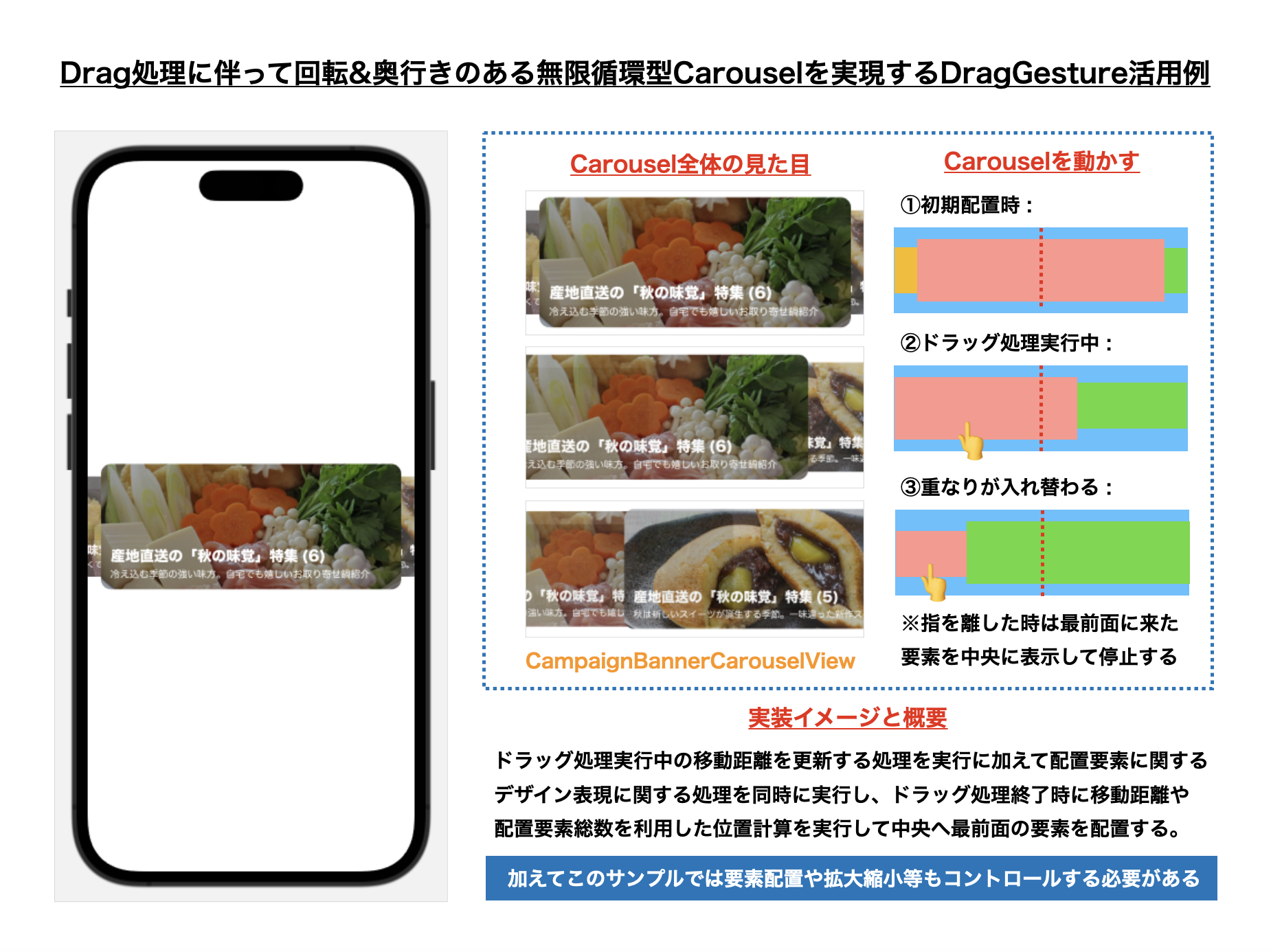
次にDragGestureを利用したCarousel表現の中でも少し複雑な表現を伴う、水平方向にドラッグ処理で移動後に指を離した際にその前後の要素が半分以上表示されている場合にはその前後の要素に移動し、そうでない場合には際には元の位置に戻る様な、回転&奥行きのある無限循環型Carousel表示を考えてみる事にします。(前述したCarousel表現をかなり応用した形になるかと思います。)
UIKitを利用する際の方針としては、UIPageViewControllerやUICollectionView & UICollectionViewLayoutをベースとする点は前述したサンプルと同じではありますが、
- スクロール実行時に配置要素が無限循環する点
- 画面上に円環状に配置要素を並べる必要がある点
- スクロールと連動して配置要素の拡大縮小比率が変化する点
- スクロール時に各要素の重なりを考慮する必要がある点
等の表現をするために、UIScrollViewDelegateやUICollectionViewLayoutをはじめとした処理や、三角関数やアフィン変換等も上手に活用する必要が出てくるので、要件や仕様によってはなかなか大変な処理となる場合もあるかと思います。
この処理も前述したCarousel表現と同様にポイントとなる値は、
-
@State private var snappedOffset: CGFloat
👉 表示対象要素のインデックス値と連動した最終的なスクロールのオフセット値 -
@State private var draggingOffset: CGFloat
👉 ドラッグ処理実行中に更新される表示対象要素の移動距離
の2値になります。そして、この処理をDragGestureの処理と連動させる事によって表示位置の更新処理を実行するために、
- ドラッグ処理実行中:
.onChanged({ event in ... })
👉 変数:draggingOffsetを更新する - ドラッグ処理終了時:
.onEnded({ event in ... })
👉 ドラッグ処理時に更新された変数:draggingOffsetの値等から最終的な表示位置となる変数:snappedOffsetを更新する
という流れで、水平方向へのCarousel処理を実現する点がポイントになるかと思います。
加えてこのサンプルでは、表示要素の円環状配置・重なり調整・透明度調整・位置調整をする必要があるので、下記のModifierに適用する値を決定する必要がある点にも注目する事が必要になります。
-
.scaleEffect: Viewの拡大縮小を決める部分 -
.opacity: Viewの透明度を決める部分 -
.zIndex: Viewの重なりを決める部分 -
.offset: Viewのオフセット値を決める部分
// ------------ // ✨ 内部のView処理でCarousel表示を構築している部分の抜粋 // ------------ ZStack { // ...サムネイル画像を配置している部分... } .frame( width: carouselWidth, height: carouselHeight ) .scaleEffect( // 拡大縮小の値を決定 getCarouselElementModifierValueBy(itemId: viewObject.id, ratio: 0.2) ) .opacity( // 透明度を決定する getCarouselElementModifierValueBy(itemId: viewObject.id, ratio: 0.3) ) .zIndex( // 重なりを決定する getCarouselElementModifierValueBy(itemId: viewObject.id, ratio: 0.1) ) .offset( // オフセット値を決定する x: calculateHorizontalOffsetBy(itemId: viewObject.id), y: 0.0 ) // MARK: - Private Function private func getCarouselElementModifierValueBy(itemId: Int, ratio: CGFloat) -> CGFloat { // MEMO: scaleEffect / opacity / zIndexに必要な調整値を算出する let distanceByItemId = calculateDistanceBy(itemId: itemId) return 1.0 - abs(distanceByItemId) * ratio } private func calculateDistanceBy(itemId: Int) -> CGFloat { // MEMO: remainderを利用して間隔値を算出する // 参考: https://dev.classmethod.jp/articles/utility-extension-remainder/ let allItemsCount = campaignBannersCarouselViewObjects.count let draggingOffsetByItemId = (draggingOffset - CGFloat(itemId)) return draggingOffsetByItemId .remainder(dividingBy: CGFloat(allItemsCount)) } private func calculateHorizontalOffsetBy(itemId: Int) -> CGFloat { // MEMO: 三角関数(この場合はsinθ)を利用して角度を算出し、奥行きのある重なりを表現する let allItemsCount = campaignBannersCarouselViewObjects.count let angle = Double.pi * 2 / Double(allItemsCount) * calculateDistanceBy(itemId: itemId) return sin(angle) * 200 } DragGestureに関する基本事項を理解する必要がある点に加えて、表示要素の総数や三角関数等を活用した処理が必要になる点にこのCarousel表現の難しさがありますが、SwiftUIのPreviewを活用して表示時の配置はもちろん、実際に動かした際の各要素に適用されている値とその振る舞いを確認できる点はとても便利で、複雑な表現であったとしても試しながら試行錯誤ができる点はその便利さをとても感じる事ができた様に思います(従来のUIKitで実装した場合はその都度Buildして確認をしなければいけなかったので、特に複雑なレイアウトを実際に確認する際は毎度の事ではありながら結構大変だった様に思います)。
【1. 図解】
【2. 表示データJSON】
利用する表示データ用のJSONの詳細はこちら
{ "result": [ { "id": 1, "banner_contents_id": 1001, "banner_url": "https://example.com/campaign_banner1.jpg" }, { "id": 2, "banner_contents_id": 1002, "banner_url": "https://example.com/campaign_banner2.jpg" }, { "id": 3, "banner_contents_id": 1003, "banner_url": "https://example.com/campaign_banner3.jpg" }, { "id": 4, "banner_contents_id": 1004, "banner_url": "https://example.com/campaign_banner4.jpg" }, { "id": 5, "banner_contents_id": 1005, "banner_url": "https://example.com/campaign_banner5.jpg" }, { "id": 6, "banner_contents_id": 1006, "banner_url": "https://example.com/campaign_banner6.jpg" } ] } 【3. JSONデータをEntityに変換する処理】
取得したJSONをEntityへ変換する処理の詳細はこちら
import Foundation struct CampaignBannersResponse: Decodable, Equatable { let result: [CampaignBannerEntity] // MARK: - Enum private enum Keys: String, CodingKey { case result } // MARK: - Initializer init(result: [CampaignBannerEntity]) { self.result = result } // JSONの配列内の要素を取得する → JSONの配列内の要素にある値をDecodeして初期化する init(from decoder: Decoder) throws { let container = try decoder.container(keyedBy: Keys.self) self.result = try container.decode([CampaignBannerEntity].self, forKey: .result) } // MARK: - Equatable // MEMO: Equatableプロトコルに適合させるための処理 static func == (lhs: CampaignBannersResponse, rhs: CampaignBannersResponse) -> Bool { return lhs.result == rhs.result } } struct CampaignBannerEntity: Hashable, Decodable { let id: Int let bannerContentsId: Int let bannerUrl: String // MARK: - Enum private enum Keys: String, CodingKey { case id case bannerContentsId = "banner_contents_id" case bannerUrl = "banner_url" } // MARK: - Initializer init(from decoder: Decoder) throws { // JSONの配列内の要素を取得する let container = try decoder.container(keyedBy: Keys.self) // JSONの配列内の要素にある値をDecodeして初期化する self.id = try container.decode(Int.self, forKey: .id) self.bannerContentsId = try container.decode(Int.self, forKey: .bannerContentsId) self.bannerUrl = try container.decode(String.self, forKey: .bannerUrl) } // MARK: - Hashable // MEMO: Hashableプロトコルに適合させるための処理 func hash(into hasher: inout Hasher) { hasher.combine(id) } static func == (lhs: CampaignBannerEntity, rhs: CampaignBannerEntity) -> Bool { return lhs.id == rhs.id } } 【4. このView要素全体のコード一覧】
import SwiftUI import Kingfisher // MEMO: Snapを伴うCarousel方式でのバナー表示の参考 // https://stackoverflow.com/questions/72343827/carousel-view-swiftui struct CampaignBannerCarouselView: View { // MARK: - Property private let screen = UIScreen.main.bounds private var carouselWidth: CGFloat { return screen.width - 32.0 } private var carouselHeight: CGFloat { return carouselWidth * 156 / 375 } // MEMO: Carousel表示時に利用する変化量を格納するための変数 @State private var snappedOffset: CGFloat @State private var draggingOffset: CGFloat // MEMO: Carouselに表示する内容を格納するための変数 @State private var campaignBannersCarouselViewObjects: [CampaignBannerCarouselViewObject] = [] // MARK: - Initializer init(campaignBannersCarouselViewObjects: [CampaignBannerCarouselViewObject]) { // イニシャライザ内で「_(変数名)」値を代入することでState値の初期化を実行する _campaignBannersCarouselViewObjects = State(initialValue: campaignBannersCarouselViewObjects) _snappedOffset = State(initialValue: 0.0) _draggingOffset = State(initialValue: 0.0) } // MARK: - Body var body: some View { ZStack { ForEach(campaignBannersCarouselViewObjects) { viewObject in ZStack { KFImage(viewObject.bannerUrl) .resizable() .aspectRatio(contentMode: .fit) .cornerRadius(12.0) } .frame(width: carouselWidth, height: carouselHeight) .scaleEffect(getCarouselElementModifierValueBy(itemId: viewObject.id, ratio: 0.2)) .opacity(getCarouselElementModifierValueBy(itemId: viewObject.id, ratio: 0.3)) .zIndex(getCarouselElementModifierValueBy(itemId: viewObject.id, ratio: 0.1)) .offset(x: calculateHorizontalOffsetBy(itemId: viewObject.id), y: 0.0) // MEMO: タップ領域の確保とタップ時の処理 .contentShape(Rectangle()) .onTapGesture(perform: { print("想定: Tap処理を実行した際に何らかの処理を実行する (ID:\(viewObject.id))") }) } } .modifier( // MEMO: DragGestureの値変化を利用したCarousel表示用のModifier定義 // 👉 State値に$をつけて値変化と連動させている点がポイントになる CampaignBannerCarouselViewModifier( snappedOffset: $snappedOffset, draggingOffset: $draggingOffset, viewObjectsCount: campaignBannersCarouselViewObjects.count ) ) } // MARK: - Private Function private func getCarouselElementModifierValueBy(itemId: Int, ratio: CGFloat) -> CGFloat { // MEMO: scaleEffect / opacity / zIndexに必要な調整値を算出する let distanceByItemId = calculateDistanceBy(itemId: itemId) return 1.0 - abs(distanceByItemId) * ratio } private func calculateDistanceBy(itemId: Int) -> CGFloat { // MEMO: remainderを利用して間隔値を算出する // 参考: https://dev.classmethod.jp/articles/utility-extension-remainder/ let allItemsCount = campaignBannersCarouselViewObjects.count let draggingOffsetByItemId = (draggingOffset - CGFloat(itemId)) return draggingOffsetByItemId .remainder(dividingBy: CGFloat(allItemsCount)) } private func calculateHorizontalOffsetBy(itemId: Int) -> CGFloat { // MEMO: 三角関数(この場合はsinθ)を利用して角度を算出し、奥行きのある重なりを表現する let allItemsCount = campaignBannersCarouselViewObjects.count let angle = Double.pi * 2 / Double(allItemsCount) * calculateDistanceBy(itemId: itemId) return sin(angle) * 200 } } // MARK: - Modifier struct CampaignBannerCarouselViewModifier: ViewModifier { // MARK: - Property // MEMO: CampaignBannerCarouselViewに定義したState値の変化量と連動する形としている @Binding private var snappedOffset: CGFloat @Binding private var draggingOffset: CGFloat private var viewObjectsCount: Int // MARK: - Initializer init( snappedOffset: Binding<CGFloat>, draggingOffset: Binding<CGFloat>, viewObjectsCount: Int ) { // イニシャライザ内で「_(変数名)」値を代入することでBinding値の初期化を実行する // ※viewObjectの総数については従来通りの初期化処理で良い _snappedOffset = snappedOffset _draggingOffset = draggingOffset self.viewObjectsCount = viewObjectsCount } // MARK: - body func body(content: Content) -> some View { content // MEMO: highPriorityGestureを利用してScrollView内で使用しても上下スクロールとの競合を発生しにくくする(とはいえ出てしまう時はあるかもしれない...) // 参考リンク: // https://www.hackingwithswift.com/quick-start/swiftui/how-to-force-one-gesture-to-recognize-before-another-using-highprioritygesture .highPriorityGesture( DragGesture(minimumDistance: 20) .onChanged({ value in // 👉 Carousel要素の移動中はStateと連動するdraggingOffset値を更新する draggingOffset = snappedOffset + value.translation.width / 250 }) .onEnded({ value in // 👉 Carousel要素の移動終了時は自然に元の位置または動かそうとした位置に戻る様にしている withAnimation(.linear(duration: 0.16)) { draggingOffset = snappedOffset + value.translation.width / 250 draggingOffset = round(draggingOffset).remainder(dividingBy: Double(viewObjectsCount)) snappedOffset = draggingOffset } }) ) } } // MARK: - ViewObject struct CampaignBannerCarouselViewObject: Identifiable { let id: Int let bannerContentsId: Int let bannerUrl: URL? } // MARK: - Preview struct CampaignBannerCarouselView_Previews: PreviewProvider { static var previews: some View { // MEMO: Preview表示用にレスポンスを想定したJsonを読み込んで画面に表示させる let campaignBannersResponse = getCampaignBannersResponse() let campaignBannerCarouselViewObjects = campaignBannersResponse.result .map { CampaignBannerCarouselViewObject( id: $0.id, bannerContentsId: $0.bannerContentsId, bannerUrl: URL(string: $0.bannerUrl) ?? nil ) } CampaignBannerCarouselView(campaignBannersCarouselViewObjects: campaignBannerCarouselViewObjects) } // MARK: - Private Static Function private static func getCampaignBannersResponse() -> CampaignBannersResponse { guard let path = Bundle.main.path(forResource: "campaign_banners", ofType: "json") else { fatalError() } guard let data = try? Data(contentsOf: URL(fileURLWithPath: path)) else { fatalError() } guard let campaignBannersResponse = try? JSONDecoder().decode(CampaignBannersResponse.self, from: data) else { fatalError() } return campaignBannersResponse } } 3. 少し応用的なGrid表現例のご紹介
こちらもWebやアプリの様々な画面内でよく用いられるGrid表現についても、Carousel表現と並ぶポピュラーなUI表現の1つでもあるかと思います。特にUICollectionViewとそのレイアウト表現を活用した実装ついてはUIKitでは様々な場面で頻繁に活用される表現だと思います。とはいえ、画像のアスペクト比に配慮したGrid表示をする様な場合等の様にUI実装の要望としてはあるもの、のいざ実装をしてみるとUICollectionViewLayoutを利用した計算が必要になったり等、想像以上に難易度が高かったという場合もあるかもしれません。
ここでは基本的なGrid表示を利用したUI実装とPinterestのような写真のアスペクト比に合わせたGrid表示の2種類のレイアウトに関する実装事例について簡単に紹介できればと思います。
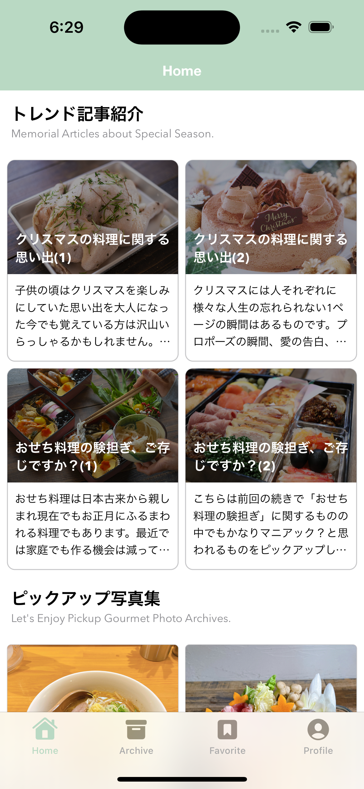
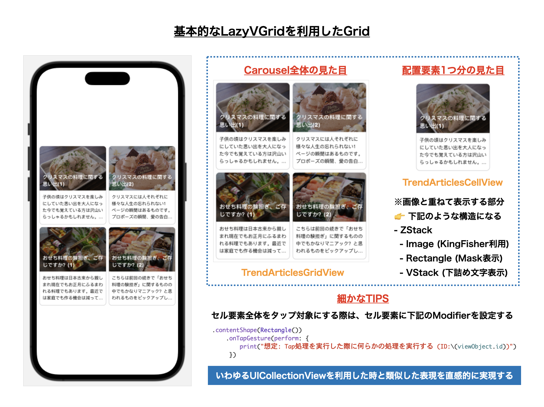
3-1. 基本的なLazyVGridを利用したGrid
本題に入る前段として、まずはLazyVGridを利用した2カラムのGrid表示についても軽くここで触れておきます。
【1. 図解】
【2. 表示データJSON】
利用する表示データ用のJSONの詳細はこちら
{ "result": [ { "id": 1, "thumbnail_url": "https://example.com/trend_article1.jpg", "title": "クリスマスの料理に関する思い出(1)", "introduction": "子供の頃はクリスマスを楽しみにしていた思い出を大人になった今でも覚えている方は沢山いらっしゃるかもしれません。また、家族と一緒に料理をする機会が多いご家庭の中ではこの機会が貴重な一家団欒の場となっていたことでしょう。今回はクリスマスが近いシーズンにピッタリな「心温まるクリスマスに因んだストーリー」をいくつかご紹介できればと思います🎄", "published_at": "2022-12-01T07:30:00.000+0000" }, { "id": 2, "thumbnail_url": "https://example.com/trend_article2.jpg", "title": "クリスマスの料理に関する思い出(2)", "introduction": "クリスマスには人それぞれに様々な人生の忘れられない1ページの瞬間はあるものです。プロポーズの瞬間、愛の告白、子供達へのプレゼント、クリスマスケーキを囲んでの家族の時間等、何かきっかけが生まれる瞬間をきっと頭の片隅に記憶として残っているものがきっとあるものです。そんな思い出の1ページを集めたものをここではピックアップしています🎂", "published_at": "2022-12-01T07:30:00.000+0000" }, { "id": 3, "thumbnail_url": "https://example.com/trend_article3.jpg", "title": "おせち料理の験担ぎ、ご存じですか?(1)", "introduction": "おせち料理は日本古来から親しまれ現在でもお正月にふるまわれる料理でもあります。最近では家庭でも作る機会は減っていることもあり、「なぜこの料理が入っているの?」という素朴な疑問を持つかもしれません。ところが実は1つ1つの料理の中にはしっかりとした「験担ぎ」が込められている事はご存じでしようか?今回はそんなおせち料理の世界に触れてみることにしましょう😏", "published_at": "2022-12-01T07:30:00.000+0000" }, { "id": 4, "thumbnail_url": "https://example.com/trend_article4.jpg", "title": "おせち料理の験担ぎ、ご存じですか?(2)", "introduction": "こちらは前回の続きで「おせち料理の験担ぎ」に関するものの中でもかなりマニアック?と思われるものをピックアップしています。前回は皆様にとっても馴染みのあるものに関するラインナップでしたが今回はなかなか難しいですよ😁", "published_at": "2022-12-01T07:30:00.000+0000" } ] } 【3. JSONデータをEntityに変換する処理】
取得したJSONをEntityへ変換する処理の詳細はこちら
import Foundation struct TrendArticleResponse: Decodable, Equatable { let result: [TrendArticleEntity] // MARK: - Enum private enum Keys: String, CodingKey { case result } // MARK: - Initializer init(result: [TrendArticleEntity]) { self.result = result } // JSONの配列内の要素を取得する → JSONの配列内の要素にある値をDecodeして初期化する init(from decoder: Decoder) throws { let container = try decoder.container(keyedBy: Keys.self) self.result = try container.decode([TrendArticleEntity].self, forKey: .result) } // MARK: - Equatable // MEMO: Equatableプロトコルに適合させるための処理 static func == (lhs: TrendArticleResponse, rhs: TrendArticleResponse) -> Bool { return lhs.result == rhs.result } } struct TrendArticleEntity: Hashable, Decodable { let id: Int let thumbnailUrl: String let title: String let introduction: String let publishedAt: String // MARK: - Enum private enum Keys: String, CodingKey { case id case thumbnailUrl = "thumbnail_url" case title case introduction case publishedAt = "published_at" } // MARK: - Initializer init(from decoder: Decoder) throws { // JSONの配列内の要素を取得する let container = try decoder.container(keyedBy: Keys.self) // JSONの配列内の要素にある値をDecodeして初期化する self.id = try container.decode(Int.self, forKey: .id) self.thumbnailUrl = try container.decode(String.self, forKey: .thumbnailUrl) self.title = try container.decode(String.self, forKey: .title) self.introduction = try container.decode(String.self, forKey: .introduction) self.publishedAt = try container.decode(String.self, forKey: .publishedAt) } // MARK: - Hashable // MEMO: Hashableプロトコルに適合させるための処理 func hash(into hasher: inout Hasher) { hasher.combine(id) } static func == (lhs: TrendArticleEntity, rhs: TrendArticleEntity) -> Bool { return lhs.id == rhs.id } } 【4. このView要素全体のコード一覧】
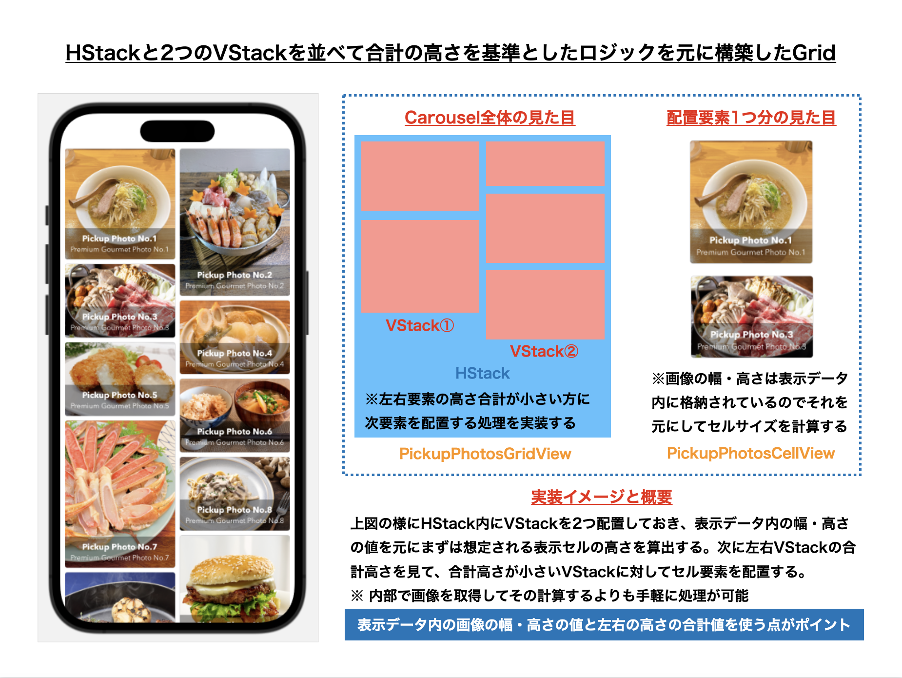
import SwiftUI import Kingfisher struct TrendArticlesGridView: View { // MARK: - Property // MEMO: 片方のSpacing値を8.0、もう一方を0.0にして調整している(これが正解かは自信はないです😢) private let gridColumns = [ GridItem(spacing: 8.0), GridItem(spacing: 0.0) ] private let screen = UIScreen.main.bounds private var screenWidth: CGFloat { return screen.width } private var standardWidth: CGFloat { // MEMO: 間隔は8.0×3=24.0と想定しています return CGFloat((screen.width - 24.0) / 2) } private var standardHeight: CGFloat { return CGFloat(standardWidth / 1.5) + 94.0 } // MEMO: LazyVGridに表示する内容を格納するための変数 @State private var trendArticlesGridViewObjects: [TrendArticlesGridViewObject] = [] // MARK: - Initializer init(trendArticlesGridViewObjects: [TrendArticlesGridViewObject]) { // イニシャライザ内で「_(変数名)」値を代入することでState値の初期化を実行する _trendArticlesGridViewObjects = State(initialValue: trendArticlesGridViewObjects) } // MARK: - Body var body: some View { VStack { // MEMO: 上下に8.0の行間をつけるためにSpacing値を8.0としています。 LazyVGrid(columns: gridColumns, spacing: 8.0) { ForEach(trendArticlesGridViewObjects) { viewObject in // MEMO: TrendArticlesGridViewTrendとTrendArticlesCellViewのstandardWidthとstandardHeightは合わせています。 TrendArticlesCellView(viewObject: viewObject) .frame(height: standardHeight) } } // MEMO: 全体の左右にもそれぞれ8.0の行間をつけるためVStackの中にLazyVGridを入れて左右のpadding値を8.0としています。 .padding([.leading, .trailing], 8.0) } .frame(width: screenWidth) } } // MARK: - TrendArticlesCellView struct TrendArticlesCellView: View { // MARK: - Property private let screen = UIScreen.main.bounds private var thumbnailWidth: CGFloat { // MEMO: 間隔は8.0×3=24.0と想定しています return CGFloat((screen.width - 24.0) / 2) } private var thumbnailHeight: CGFloat { return CGFloat(standardWidth / 1.5) } private var standardWidth: CGFloat { return thumbnailWidth } private var standardHeight: CGFloat { return thumbnailHeight + 94.0 } private var cellTitleFont: Font { return Font.custom("AvenirNext-Bold", size: 14) } private var cellIntroductionFont: Font { return Font.custom("AvenirNext-Regular", size: 12) } private var cellThumbnailMaskColor: Color { return Color.black.opacity(0.36) } private var cellTitleColor: Color { return Color.white } private var cellIntroductionColor: Color { return Color.primary } private var cellRoundRectangleColor: Color { return Color.secondary.opacity(0.5) } private var viewObject: TrendArticlesGridViewObject // MARK: - Initializer init(viewObject: TrendArticlesGridViewObject) { self.viewObject = viewObject } // MARK: - Body var body: some View { VStack(alignment: .leading) { // (1) 上部の画面要素とテキストを重ねて表示する部分 // 👉 ZStack内部の要素についてはサムネイル表示のサイズと合わせています。 ZStack { KFImage(viewObject.thumbnailUrl) .resizable() .aspectRatio(contentMode: .fit) .frame(width: thumbnailWidth, height: thumbnailHeight) Rectangle() .foregroundColor(cellThumbnailMaskColor) .frame(width: thumbnailWidth, height: thumbnailHeight) VStack { Spacer() Text(viewObject.title) .font(cellTitleFont) .foregroundColor(cellTitleColor) .padding([.leading, .trailing], 8.0) .padding([.bottom], 8.0) .lineLimit(2) } .frame(width: thumbnailWidth, height: thumbnailHeight) } // (2) 下部のテキスト表示 VStack { Text(viewObject.introduction) .font(cellIntroductionFont) .foregroundColor(cellIntroductionColor) .padding([.leading, .trailing], 8.0) .padding([.bottom], 2.0) .padding([.top], 2.0) .lineSpacing(2.0) .lineLimit(4) } // (3) 上に要素を詰めるためのSpacer Spacer() } // MEMO: タップ領域の確保とタップ時の処理 .contentShape(Rectangle()) .onTapGesture(perform: { print("想定: Tap処理を実行した際に何らかの処理を実行する (ID:\(viewObject.id))") }) .cornerRadius(8.0) .frame(width: standardWidth, height: standardHeight) .background( RoundedRectangle(cornerRadius: 8.0) .stroke(cellRoundRectangleColor) ) } } // MARK: - ViewObject struct TrendArticlesGridViewObject: Identifiable { let id: Int let thumbnailUrl: URL? let title: String let introduction: String let publishedAt: String } // MARK: - Preview struct TrendArticlesGridView_Previews: PreviewProvider { static var previews: some View { // MEMO: Preview表示用にレスポンスを想定したJsonを読み込んで画面に表示させる let trendArticleResponse = getTrendArticleResponse() let trendArticlesGridViewObjects = trendArticleResponse.result .map { TrendArticlesGridViewObject( id: $0.id, thumbnailUrl: URL(string: $0.thumbnailUrl) ?? nil, title: $0.title, introduction: $0.introduction, publishedAt: $0.publishedAt ) } // Preview: TrendArticlesGridView TrendArticlesGridView(trendArticlesGridViewObjects: trendArticlesGridViewObjects) .previewDisplayName("TrendArticlesGridView Preview") // MEMO: 部品1つあたりを表示するためのViewObject let viewObject = TrendArticlesGridViewObject( id: 1, thumbnailUrl: URL(string: "https://example.com/trend_article1.jpg") ?? nil, title: "クリスマスの料理に関する思い出(1)", introduction: "子供の頃はクリスマスを楽しみにしていた思い出を大人になった今でも覚えている方は沢山いらっしゃるかもしれません。また、家族と一緒に料理をする機会が多いご家庭の中ではこの機会が貴重な一家団欒の場となっていたことでしょう。今回はクリスマスが近いシーズンにピッタリな「心温まるクリスマスに因んだストーリー」をいくつかご紹介できればと思います🎄", publishedAt: "2022-12-01T07:30:00.000+0000" ) // Preview: TrendArticlesCellView TrendArticlesCellView(viewObject: viewObject) .previewDisplayName("TrendArticlesCellView Preview") } // MARK: - Private Static Function private static func getTrendArticleResponse() -> TrendArticleResponse { guard let path = Bundle.main.path(forResource: "trend_articles", ofType: "json") else { fatalError() } guard let data = try? Data(contentsOf: URL(fileURLWithPath: path)) else { fatalError() } guard let trendArticleResponse = try? JSONDecoder().decode(TrendArticleResponse.self, from: data) else { fatalError() } return trendArticleResponse } } 3-2. HStackと2つのVStackを並べて合計の高さを基準としたロジックを元に構築したGrid
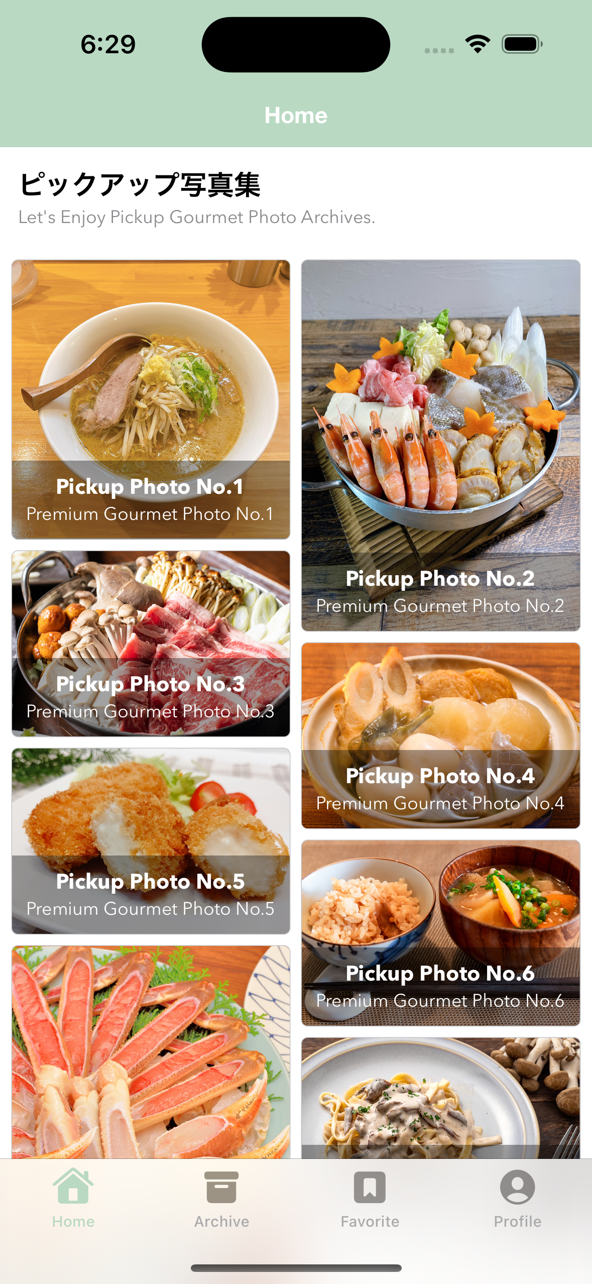
今回紹介する方法については、HStackの内部に2つのVStackを入れ、表示セル要素の高さを利用して左右どちらかの要素に配置するかを決定する様な内部ロジックと組み合わせる事で実現しています。
特にポイントとなるのは、
- 予め表示データJSON内部のデータに表示対象の画像サイズを入れておく
- 左右の配置要素の合計の高さを見比べた上で、
[PickupPhotosGridViewObject] 👉 (leftPhotosGridViewObjects: [PickupPhotosGridViewObject], rightPhotosGridViewObjects: [PickupPhotosGridViewObject])変換し、左右のVStackのどちらかに配置するかを決定する
の2点になるかと思います。
// ------------ // ✨ 内部のView処理でCarousel表示を構築している部分の抜粋 // ------------ private var pickupPhotosGridViewObjects: [PickupPhotosGridViewObject] = [] // MEMO: Grid表示View要素に表示する内容を格納するための変数 @State private var splittedPickupPhotosGridViewObjects: (leftPhotosGridViewObjects: [PickupPhotosGridViewObject], rightPhotosGridViewObjects: [PickupPhotosGridViewObject]) = (leftPhotosGridViewObjects: [], rightPhotosGridViewObjects: []) // MARK: - Initializer init(pickupPhotosGridViewObjects: [PickupPhotosGridViewObject]) { self.pickupPhotosGridViewObjects = pickupPhotosGridViewObjects // イニシャライザ内で「_(変数名)」値を代入することでState値の初期化を実行する // 👉 ここでは引数で受け取ったpickupPhotosGridViewObject配列を2つに分割する _splittedPickupPhotosGridViewObjects = State(initialValue: getSplittedPickupPhotosGridViewObjects()) } // MARK: - Private Function private func getSplittedPickupPhotosGridViewObjects() -> (leftPhotosGridViewObjects: [PickupPhotosGridViewObject], rightPhotosGridViewObjects: [PickupPhotosGridViewObject]) { var leftHeightSum: Int = 0 var rightHeightSum: Int = 0 var leftPhotosGridViewObjects: [PickupPhotosGridViewObject] = [] var rightPhotosGridViewObjects: [PickupPhotosGridViewObject] = [] // MEMO: 算出したサムネイル画像高さの大きさ元にして左右のどちらに配置するかを決定する // 👉 今回のサンプルではAPIレスポンス内でサムネイルの幅と高さを持つ想定なので、この部分をうまく活用する for viewObject in pickupPhotosGridViewObjects { let standardWidth = UIScreen.main.bounds.width / 2 let standardHeight = Int(ceil(standardWidth / viewObject.photoWidth * viewObject.photoHeight)) // Debug. print("ID:\(viewObject.id) / leftHeightSum:\(leftHeightSum) / rightHeightSum:\(rightHeightSum) / standardHeight:\(standardHeight)") // 左右の配置決定と左右高さ合計値加算処理を実行する if leftHeightSum > rightHeightSum { rightPhotosGridViewObjects.append(viewObject) rightHeightSum += standardHeight } else { leftPhotosGridViewObjects.append(viewObject) leftHeightSum += standardHeight } } return (leftPhotosGridViewObjects: leftPhotosGridViewObjects, rightPhotosGridViewObjects: rightPhotosGridViewObjects) } 1つの表示要素として考えた場合にはUIKitを利用した表現と遜色はありませんが、表示対象の総数が多い場合にはこの構造では表示要素のリサイクル処理が効かないため、表示対象のデータ数が多い場合には適さない場合もある点に注意が必要です。
【1. 図解】
【2. 表示データJSON】
利用する表示データ用のJSONの詳細はこちら
{ "result": [ { "id": 1, "photo_url": "https://example.com/pickup_photo1.jpg", "photo_width": 960, "photo_height": 960, "title": "Pickup Photo No.1", "caption": "Premium Gourmet Photo No.1", "published_at": "2022-12-01T07:30:00.000+0000" }, { "id": 2, "photo_url": "https://example.com/pickup_photo2.jpg", "photo_width": 960, "photo_height": 1280, "title": "Pickup Photo No.2", "caption": "Premium Gourmet Photo No.2", "published_at": "2022-12-01T07:30:00.000+0000" }, { "id": 3, "photo_url": "https://example.com/pickup_photo3.jpg", "photo_width": 1200, "photo_height": 800, "title": "Pickup Photo No.3", "caption": "Premium Gourmet Photo No.3", "published_at": "2022-12-01T07:30:00.000+0000" }, { "id": 4, "photo_url": "https://example.com/pickup_photo4.jpg", "photo_width": 1200, "photo_height": 800, "title": "Pickup Photo No.4", "caption": "Premium Gourmet Photo No.4", "published_at": "2022-12-01T07:30:00.000+0000" }, { "id": 5, "photo_url": "https://example.com/pickup_photo5.jpg", "photo_width": 960, "photo_height": 640, "title": "Pickup Photo No.5", "caption": "Premium Gourmet Photo No.5", "published_at": "2022-12-01T07:30:00.000+0000" }, { "id": 6, "photo_url": "https://example.com/pickup_photo6.jpg", "photo_width": 960, "photo_height": 640, "title": "Pickup Photo No.6", "caption": "Premium Gourmet Photo No.6", "published_at": "2022-12-01T07:30:00.000+0000" }, { "id": 7, "photo_url": "https://example.com/pickup_photo7.jpg", "photo_width": 900, "photo_height": 1200, "title": "Pickup Photo No.7", "caption": "Premium Gourmet Photo No.7", "published_at": "2022-12-01T07:30:00.000+0000" }, { "id": 8, "photo_url": "https://example.com/pickup_photo8.jpg", "photo_width": 960, "photo_height": 640, "title": "Pickup Photo No.8", "caption": "Premium Gourmet Photo No.8", "published_at": "2022-12-01T07:30:00.000+0000" }, { "id": 9, "photo_url": "https://example.com/pickup_photo9.jpg", "photo_width": 960, "photo_height": 960, "title": "Pickup Photo No.9", "caption": "Premium Gourmet Photo No.9", "published_at": "2022-12-01T07:30:00.000+0000" }, { "id": 10, "photo_url": "https://example.com/pickup_photo10.jpg", "photo_width": 900, "photo_height": 1200, "title": "Pickup Photo No.10", "caption": "Premium Gourmet Photo No.10", "published_at": "2022-12-01T07:30:00.000+0000" }, { "id": 11, "photo_url": "https://example.com/pickup_photo11.jpg", "photo_width": 960, "photo_height": 960, "title": "Pickup Photo No.11", "caption": "Premium Gourmet Photo No.11", "published_at": "2022-12-01T07:30:00.000+0000" }, { "id": 12, "photo_url": "https://example.com/pickup_photo12.jpg", "photo_width": 960, "photo_height": 720, "title": "Pickup Photo No.12", "caption": "Premium Gourmet Photo No.12", "published_at": "2022-12-01T07:30:00.000+0000" }, { "id": 13, "photo_url": "https://example.com/pickup_photo13.jpg", "photo_width": 1200, "photo_height": 900, "title": "Pickup Photo No.13", "caption": "Premium Gourmet Photo No.13", "published_at": "2022-12-01T07:30:00.000+0000" }, { "id": 14, "photo_url": "https://example.com/pickup_photo14.jpg", "photo_width": 900, "photo_height": 1200, "title": "Pickup Photo No.14", "caption": "Premium Gourmet Photo No.14", "published_at": "2022-12-01T07:30:00.000+0000" }, { "id": 15, "photo_url": "https://example.com/pickup_photo15.jpg", "photo_width": 960, "photo_height": 960, "title": "Pickup Photo No.15", "caption": "Premium Gourmet Photo No.15", "published_at": "2022-12-01T07:30:00.000+0000" }, { "id": 16, "photo_url": "https://example.com/pickup_photo16.jpg", "photo_width": 1280, "photo_height": 720, "title": "Pickup Photo No.16", "caption": "Premium Gourmet Photo No.16", "published_at": "2022-12-01T07:30:00.000+0000" }, { "id": 17, "photo_url": "https://example.com/pickup_photo17.jpg", "photo_width": 960, "photo_height": 640, "title": "Pickup Photo No.17", "caption": "Premium Gourmet Photo No.17", "published_at": "2022-12-01T07:30:00.000+0000" }, { "id": 18, "photo_url": "https://example.com/pickup_photo18.jpg", "photo_width": 960, "photo_height": 1280, "title": "Pickup Photo No.18", "caption": "Premium Gourmet Photo No.18", "published_at": "2022-12-01T07:30:00.000+0000" }, { "id": 19, "photo_url": "https://example.com/pickup_photo19.jpg", "photo_width": 960, "photo_height": 960, "title": "Pickup Photo No.19", "caption": "Premium Gourmet Photo No.19", "published_at": "2022-12-01T07:30:00.000+0000" }, { "id": 20, "photo_url": "https://example.com/pickup_photo20.jpg", "photo_width": 960, "photo_height": 720, "title": "Pickup Photo No.20", "caption": "Premium Gourmet Photo No.20", "published_at": "2022-12-01T07:30:00.000+0000" } ] } 【3. JSONデータをEntityに変換する処理】
取得したJSONをEntityへ変換する処理の詳細はこちら
import Foundation struct PickupPhotoResponse: Decodable, Equatable { let result: [PickupPhotoEntity] // MARK: - Enum private enum Keys: String, CodingKey { case result } // MARK: - Initializer init(result: [PickupPhotoEntity]) { self.result = result } // JSONの配列内の要素を取得する → JSONの配列内の要素にある値をDecodeして初期化する init(from decoder: Decoder) throws { let container = try decoder.container(keyedBy: Keys.self) self.result = try container.decode([PickupPhotoEntity].self, forKey: .result) } // MARK: - Equatable // MEMO: Equatableプロトコルに適合させるための処理 static func == (lhs: PickupPhotoResponse, rhs: PickupPhotoResponse) -> Bool { return lhs.result == rhs.result } } struct PickupPhotoEntity: Hashable, Decodable { let id: Int let photoUrl: String let photoWidth: Int let photoHeight: Int let title: String let caption: String let publishedAt: String // MARK: - Enum private enum Keys: String, CodingKey { case id case photoUrl = "photo_url" case photoWidth = "photo_width" case photoHeight = "photo_height" case title case caption case publishedAt = "published_at" } // MARK: - Initializer init(from decoder: Decoder) throws { // JSONの配列内の要素を取得する let container = try decoder.container(keyedBy: Keys.self) // JSONの配列内の要素にある値をDecodeして初期化する self.id = try container.decode(Int.self, forKey: .id) self.photoUrl = try container.decode(String.self, forKey: .photoUrl) self.photoWidth = try container.decode(Int.self, forKey: .photoWidth) self.photoHeight = try container.decode(Int.self, forKey: .photoHeight) self.title = try container.decode(String.self, forKey: .title) self.caption = try container.decode(String.self, forKey: .caption) self.publishedAt = try container.decode(String.self, forKey: .publishedAt) } // MARK: - Hashable // MEMO: Hashableプロトコルに適合させるための処理 func hash(into hasher: inout Hasher) { hasher.combine(id) } static func == (lhs: PickupPhotoEntity, rhs: PickupPhotoEntity) -> Bool { return lhs.id == rhs.id } } 【4. このView要素全体のコード一覧】
import SwiftUI import Kingfisher // MEMO: Snapを伴うCarousel方式でのバナー表示の参考(決まった数量のデータを表示する) // ※ 参考リンクでの実装方針を元に改変したものになります。 // https://stackoverflow.com/questions/66101176/how-could-i-use-a-swiftui-lazyvgrid-to-create-a-staggered-grid struct PickupPhotosGridView: View { // MARK: - Property private var pickupPhotosGridViewObjects: [PickupPhotosGridViewObject] = [] // MEMO: Grid表示View要素に表示する内容を格納するための変数 @State private var splittedPickupPhotosGridViewObjects: (leftPhotosGridViewObjects: [PickupPhotosGridViewObject], rightPhotosGridViewObjects: [PickupPhotosGridViewObject]) = (leftPhotosGridViewObjects: [], rightPhotosGridViewObjects: []) // MARK: - Initializer init(pickupPhotosGridViewObjects: [PickupPhotosGridViewObject]) { self.pickupPhotosGridViewObjects = pickupPhotosGridViewObjects // イニシャライザ内で「_(変数名)」値を代入することでState値の初期化を実行する // 👉 ここでは引数で受け取ったpickupPhotosGridViewObject配列を2つに分割する _splittedPickupPhotosGridViewObjects = State(initialValue: getSplittedPickupPhotosGridViewObjects()) } // MARK: - Body var body: some View { // MEMO: StaggeredGridの様な表現をするために、VStackを縦に2つ並べて表現する // 👉 LazyVGridにすると表示がおかしくなったのでこの形としています。 HStack(alignment: .top) { VStack(spacing: 8.0) { ForEach(splittedPickupPhotosGridViewObjects.leftPhotosGridViewObjects) { viewObject in PickupPhotosCellView(viewObject: viewObject) } } VStack(spacing: 8.0) { ForEach(splittedPickupPhotosGridViewObjects.rightPhotosGridViewObjects) { viewObject in PickupPhotosCellView(viewObject: viewObject) } } } } // MARK: - Private Function private func getSplittedPickupPhotosGridViewObjects() -> (leftPhotosGridViewObjects: [PickupPhotosGridViewObject], rightPhotosGridViewObjects: [PickupPhotosGridViewObject]) { var leftHeightSum: Int = 0 var rightHeightSum: Int = 0 var leftPhotosGridViewObjects: [PickupPhotosGridViewObject] = [] var rightPhotosGridViewObjects: [PickupPhotosGridViewObject] = [] // MEMO: 算出したサムネイル画像高さの大きさ元にして左右のどちらに配置するかを決定する // 👉 今回のサンプルではAPIレスポンス内でサムネイルの幅と高さを持つ想定なので、この部分をうまく活用する for viewObject in pickupPhotosGridViewObjects { let standardWidth = UIScreen.main.bounds.width / 2 let standardHeight = Int(ceil(standardWidth / viewObject.photoWidth * viewObject.photoHeight)) // Debug. print("ID:\(viewObject.id) / leftHeightSum:\(leftHeightSum) / rightHeightSum:\(rightHeightSum) / standardHeight:\(standardHeight)") // 左右の配置決定と左右高さ合計値加算処理を実行する if leftHeightSum > rightHeightSum { rightPhotosGridViewObjects.append(viewObject) rightHeightSum += standardHeight } else { leftPhotosGridViewObjects.append(viewObject) leftHeightSum += standardHeight } } return (leftPhotosGridViewObjects: leftPhotosGridViewObjects, rightPhotosGridViewObjects: rightPhotosGridViewObjects) } } // MARK: - PickupPhotosCellView struct PickupPhotosCellView: View { // MARK: - Property private let screen = UIScreen.main.bounds private var cellTitleFont: Font { return Font.custom("AvenirNext-Bold", size: 14) } private var cellCaptionFont: Font { return Font.custom("AvenirNext-Regular", size: 12) } private var cellTitleColor: Color { return Color.white } private var cellCaptionColor: Color { return Color.white } private var standardWidth: CGFloat { // MEMO: 間隔は8.0×3=24.0と想定しています return CGFloat((screen.width - 24.0) / 2) } private var standardHeight: CGFloat { return CGFloat(Int(ceil(standardWidth / viewObject.photoWidth * viewObject.photoHeight))) } private var bottomAreaBackground: Color { return Color.black.opacity(0.36) } private var cellRoundRectangleColor: Color { return Color.secondary.opacity(0.5) } private var viewObject: PickupPhotosGridViewObject // MARK: - Initializer init(viewObject: PickupPhotosGridViewObject) { self.viewObject = viewObject } var body: some View { // サムネイル画像とタイトル&キャプションを重ねて表示する ZStack { // (1) サムネイル画像を表示する部分 KFImage(viewObject.photoUrl) .resizable() .aspectRatio(contentMode: .fit) .clipped() // (2) タイトル&キャプションを重ねて表示する部分 VStack { Spacer() HStack { VStack { Text(viewObject.title) .font(cellTitleFont) .foregroundColor(cellTitleColor) .lineLimit(1) Text(viewObject.caption) .font(cellCaptionFont) .foregroundColor(cellCaptionColor) .lineLimit(1) } .padding(8.0) } // MEMO: テキスト要素のまわりに余白を与える .frame(maxWidth: .infinity) .background(bottomAreaBackground) } } // MEMO: タップ領域の確保とタップ時の処理 .contentShape(Rectangle()) .onTapGesture(perform: { print("想定: Tap処理を実行した際に何らかの処理を実行する (ID:\(viewObject.id))") }) // MEMO: 表示要素全体に付与する角丸と配色を設定している部分 .cornerRadius(4.0) .frame(width: standardWidth, height: standardHeight) .background( RoundedRectangle(cornerRadius: 4.0) .stroke(cellRoundRectangleColor) ) } } // MARK: - ViewObject struct PickupPhotosGridViewObject: Identifiable { let id: Int let title: String let caption: String let photoUrl: URL? let photoWidth: CGFloat let photoHeight: CGFloat } // MARK: - Preview struct PickupPhotosGridView_Previews: PreviewProvider { static var previews: some View { // MEMO: Preview表示用にレスポンスを想定したJsonを読み込んで画面に表示させる let pickupPhotoResponse = getPickupPhotoResponse() let pickupPhotoGridViewObjects = pickupPhotoResponse.result .map { PickupPhotosGridViewObject( id: $0.id, title: $0.title, caption: $0.caption, photoUrl: URL(string: $0.photoUrl) ?? nil, photoWidth: CGFloat($0.photoWidth), photoHeight: CGFloat($0.photoHeight) ) } // Preview: PickupPhotosGridView // MEMO: 全体を表示させたいのでScrollViewを仕込んでいる ScrollView { PickupPhotosGridView(pickupPhotosGridViewObjects: pickupPhotoGridViewObjects) } .previewDisplayName("PickupPhotosGridView Preview") // MEMO: 部品1つあたりを表示するためのViewObject let viewObject1 = PickupPhotosGridViewObject( id: 1, title: "Pickup Photo No.1", caption: "Premium Gourmet Photo No.1", photoUrl: URL(string: "https://example.com/pickup_photo1.jpg") ?? nil, photoWidth: 960, photoHeight: 960 ) let viewObject2 = PickupPhotosGridViewObject( id: 2, title: "Pickup Photo No.2", caption: "Premium Gourmet Photo No.2", photoUrl: URL(string: "https://example.com/pickup_photo2.jpg") ?? nil, photoWidth: 960, photoHeight: 1280 ) let viewObject3 = PickupPhotosGridViewObject( id: 3, title: "Pickup Photo No.3", caption: "Premium Gourmet Photo No.3", photoUrl: URL(string: "https://example.com/pickup_photo3.jpg") ?? nil, photoWidth: 1200, photoHeight: 800 ) // Preview: PickupPhotosCellView PickupPhotosCellView(viewObject: viewObject1) .previewDisplayName("PickupPhotosCellView1 Preview") PickupPhotosCellView(viewObject: viewObject2) .previewDisplayName("PickupPhotosCellView2 Preview") PickupPhotosCellView(viewObject: viewObject3) .previewDisplayName("PickupPhotosCellView3 Preview") } // MARK: - Private Static Function private static func getPickupPhotoResponse() -> PickupPhotoResponse { guard let path = Bundle.main.path(forResource: "pickup_photos", ofType: "json") else { fatalError() } guard let data = try? Data(contentsOf: URL(fileURLWithPath: path)) else { fatalError() } guard let pickupPhotoResponse = try? JSONDecoder().decode(PickupPhotoResponse.self, from: data) else { fatalError() } return pickupPhotoResponse } } 4. OSSライブラリを活用した特徴的なCarousel表現の実装例
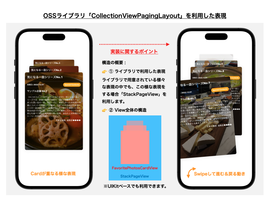
ここまでは、純正のSwiftUIのみで表現可能なUI実装に関する解説をしてきましたが、ここではSwiftUIにも対応したOSSを活用したCarousel表現の事例についても簡単ではありますがご紹介できればと思います。数あるSwiftUI製のライブラリの中でも今回は下記に紹介するライブラリを活用した表現について考えてみます。
UIKitを利用した場合であっても難易度が高くなりがちな、奥行きのある表現や拡大縮小等のエフェクトを伴う様なCarousel表現を簡単に実現可能です。加えて、UIKitを利用している場合であっても利用可能な点も個人的にはポイントであると感じております。このライブラリで表現可能なものの中でも、今回は 「Card状のView要素が複数枚重なり合っており、Swipeアクションによって下にある次のカード要素が表示される」 様な形の表現をするためのコード例になります。
※実際の画面に導入した際のイメージは下記の様な形となります。
【1. 図解】
【2. 表示データJSON】
利用する表示データ用のJSONの詳細はこちら
{ "result": [ { "id": 1, "photo_url": "https://example.com/favorite_scene1.jpg", "author": "編集部●●●●", "title": "気になる一皿シリーズNo.1", "category": "Special Contents", "shop_name": "サンプル店舗 No.1", "comment": "(※このコメントはサンプルになります!)気になる一皿シリーズでは、読者の皆様がお店で「思わず感動を覚えてしまった思い出の一皿」をテーマに、美味しかったお料理の写真とコメントを掲載しています。行きつけのお店でのお気に入りの一品から、ちょっと贅沢をしたい時に仕事帰りに立ち寄るお店での思い出、大切な人と行く勝負レストランでの是非とも食べて欲しいお料理の思い出等、あなたとお料理のストーリーを是非とも教えてください!", "published_at": "2022-12-01T07:30:00.000+0000" }, { "id": 2, "photo_url": "https://example.com/favorite_scene2.jpg", "author": "編集部●●●●", "title": "気になる一皿シリーズNo.2", "category": "Special Contents", "shop_name": "サンプル店舗 No.2", "comment": "(※このコメントはサンプルになります!)気になる一皿シリーズでは、読者の皆様がお店で「思わず感動を覚えてしまった思い出の一皿」をテーマに、美味しかったお料理の写真とコメントを掲載しています。行きつけのお店でのお気に入りの一品から、ちょっと贅沢をしたい時に仕事帰りに立ち寄るお店での思い出、大切な人と行く勝負レストランでの是非とも食べて欲しいお料理の思い出等、あなたとお料理のストーリーを是非とも教えてください!", "published_at": "2022-12-01T07:30:00.000+0000" }, { "id": 3, "photo_url": "https://example.com/favorite_scene3.jpg", "author": "編集部●●●●", "title": "気になる一皿シリーズNo.3", "category": "Special Contents", "shop_name": "サンプル店舗 No.3", "comment": "(※このコメントはサンプルになります!)気になる一皿シリーズでは、読者の皆様がお店で「思わず感動を覚えてしまった思い出の一皿」をテーマに、美味しかったお料理の写真とコメントを掲載しています。行きつけのお店でのお気に入りの一品から、ちょっと贅沢をしたい時に仕事帰りに立ち寄るお店での思い出、大切な人と行く勝負レストランでの是非とも食べて欲しいお料理の思い出等、あなたとお料理のストーリーを是非とも教えてください!", "published_at": "2022-12-01T07:30:00.000+0000" }, { "id": 4, "photo_url": "https://example.com/favorite_scene4.jpg", "author": "編集部●●●●", "title": "気になる一皿シリーズNo.4", "category": "Special Contents", "shop_name": "サンプル店舗 No.4", "comment": "(※このコメントはサンプルになります!)気になる一皿シリーズでは、読者の皆様がお店で「思わず感動を覚えてしまった思い出の一皿」をテーマに、美味しかったお料理の写真とコメントを掲載しています。行きつけのお店でのお気に入りの一品から、ちょっと贅沢をしたい時に仕事帰りに立ち寄るお店での思い出、大切な人と行く勝負レストランでの是非とも食べて欲しいお料理の思い出等、あなたとお料理のストーリーを是非とも教えてください!", "published_at": "2022-12-01T07:30:00.000+0000" }, { "id": 5, "photo_url": "https://example.com/favorite_scene5.jpg", "author": "編集部●●●●", "title": "気になる一皿シリーズNo.5", "category": "Special Contents", "shop_name": "サンプル店舗 No.5", "comment": "(※このコメントはサンプルになります!)気になる一皿シリーズでは、読者の皆様がお店で「思わず感動を覚えてしまった思い出の一皿」をテーマに、美味しかったお料理の写真とコメントを掲載しています。行きつけのお店でのお気に入りの一品から、ちょっと贅沢をしたい時に仕事帰りに立ち寄るお店での思い出、大切な人と行く勝負レストランでの是非とも食べて欲しいお料理の思い出等、あなたとお料理のストーリーを是非とも教えてください!", "published_at": "2022-12-01T07:30:00.000+0000" }, { "id": 6, "photo_url": "https://example.com/favorite_scene6.jpg", "author": "編集部●●●●", "title": "気になる一皿シリーズNo.6", "category": "Special Contents", "shop_name": "サンプル店舗 No.6", "comment": "(※このコメントはサンプルになります!)気になる一皿シリーズでは、読者の皆様がお店で「思わず感動を覚えてしまった思い出の一皿」をテーマに、美味しかったお料理の写真とコメントを掲載しています。行きつけのお店でのお気に入りの一品から、ちょっと贅沢をしたい時に仕事帰りに立ち寄るお店での思い出、大切な人と行く勝負レストランでの是非とも食べて欲しいお料理の思い出等、あなたとお料理のストーリーを是非とも教えてください!", "published_at": "2022-12-01T07:30:00.000+0000" }, { "id": 7, "photo_url": "https://example.com/favorite_scene7.jpg", "author": "編集部●●●●", "title": "気になる一皿シリーズNo.7", "category": "Special Contents", "shop_name": "サンプル店舗 No.7", "comment": "(※このコメントはサンプルになります!)気になる一皿シリーズでは、読者の皆様がお店で「思わず感動を覚えてしまった思い出の一皿」をテーマに、美味しかったお料理の写真とコメントを掲載しています。行きつけのお店でのお気に入りの一品から、ちょっと贅沢をしたい時に仕事帰りに立ち寄るお店での思い出、大切な人と行く勝負レストランでの是非とも食べて欲しいお料理の思い出等、あなたとお料理のストーリーを是非とも教えてください!", "published_at": "2022-12-01T07:30:00.000+0000" }, { "id": 8, "photo_url": "https://example.com/favorite_scene8.jpg", "author": "編集部●●●●", "title": "気になる一皿シリーズNo.8", "category": "Special Contents", "shop_name": "サンプル店舗 No.8", "comment": "(※このコメントはサンプルになります!)気になる一皿シリーズでは、読者の皆様がお店で「思わず感動を覚えてしまった思い出の一皿」をテーマに、美味しかったお料理の写真とコメントを掲載しています。行きつけのお店でのお気に入りの一品から、ちょっと贅沢をしたい時に仕事帰りに立ち寄るお店での思い出、大切な人と行く勝負レストランでの是非とも食べて欲しいお料理の思い出等、あなたとお料理のストーリーを是非とも教えてください!", "published_at": "2022-12-01T07:30:00.000+0000" }, { "id": 9, "photo_url": "https://example.com/favorite_scene9.jpg", "author": "編集部●●●●", "title": "気になる一皿シリーズNo.9", "category": "Special Contents", "shop_name": "サンプル店舗 No.9", "comment": "(※このコメントはサンプルになります!)気になる一皿シリーズでは、読者の皆様がお店で「思わず感動を覚えてしまった思い出の一皿」をテーマに、美味しかったお料理の写真とコメントを掲載しています。行きつけのお店でのお気に入りの一品から、ちょっと贅沢をしたい時に仕事帰りに立ち寄るお店での思い出、大切な人と行く勝負レストランでの是非とも食べて欲しいお料理の思い出等、あなたとお料理のストーリーを是非とも教えてください!", "published_at": "2022-12-01T07:30:00.000+0000" }, { "id": 10, "photo_url": "https://example.com/favorite_scene10.jpg", "author": "編集部●●●●", "title": "気になる一皿シリーズNo.10", "category": "Special Contents", "shop_name": "サンプル店舗 No.10", "comment": "(※このコメントはサンプルになります!)気になる一皿シリーズでは、読者の皆様がお店で「思わず感動を覚えてしまった思い出の一皿」をテーマに、美味しかったお料理の写真とコメントを掲載しています。行きつけのお店でのお気に入りの一品から、ちょっと贅沢をしたい時に仕事帰りに立ち寄るお店での思い出、大切な人と行く勝負レストランでの是非とも食べて欲しいお料理の思い出等、あなたとお料理のストーリーを是非とも教えてください!", "published_at": "2022-12-01T07:30:00.000+0000" }, { "id": 11, "photo_url": "https://example.com/favorite_scene11.jpg", "author": "編集部●●●●", "title": "気になる一皿シリーズNo.11", "category": "Special Contents", "shop_name": "サンプル店舗 No.11", "comment": "(※このコメントはサンプルになります!)気になる一皿シリーズでは、読者の皆様がお店で「思わず感動を覚えてしまった思い出の一皿」をテーマに、美味しかったお料理の写真とコメントを掲載しています。行きつけのお店でのお気に入りの一品から、ちょっと贅沢をしたい時に仕事帰りに立ち寄るお店での思い出、大切な人と行く勝負レストランでの是非とも食べて欲しいお料理の思い出等、あなたとお料理のストーリーを是非とも教えてください!", "published_at": "2022-12-01T07:30:00.000+0000" }, { "id": 12, "photo_url": "https://example.com/favorite_scene12.jpg", "author": "編集部●●●●", "title": "気になる一皿シリーズNo.12", "category": "Special Contents", "shop_name": "サンプル店舗 No.12", "comment": "(※このコメントはサンプルになります!)気になる一皿シリーズでは、読者の皆様がお店で「思わず感動を覚えてしまった思い出の一皿」をテーマに、美味しかったお料理の写真とコメントを掲載しています。行きつけのお店でのお気に入りの一品から、ちょっと贅沢をしたい時に仕事帰りに立ち寄るお店での思い出、大切な人と行く勝負レストランでの是非とも食べて欲しいお料理の思い出等、あなたとお料理のストーリーを是非とも教えてください!", "published_at": "2022-12-01T07:30:00.000+0000" } ] } 【3. JSONデータをEntityに変換する処理】
取得したJSONをEntityへ変換する処理の詳細はこちら
import Foundation // MEMO: お気に入り一覧表示用のAPIレスポンス定義 struct FavoriteSceneResponse: Decodable, Equatable { let result: [FavoriteSceneEntity] // MARK: - Enum private enum Keys: String, CodingKey { case result } // MARK: - Initializer init(result: [FavoriteSceneEntity]) { self.result = result } // JSONの配列内の要素を取得する → JSONの配列内の要素にある値をDecodeして初期化する init(from decoder: Decoder) throws { let container = try decoder.container(keyedBy: Keys.self) self.result = try container.decode([FavoriteSceneEntity].self, forKey: .result) } // MARK: - Equatable // MEMO: Equatableプロトコルに適合させるための処理 static func == (lhs: FavoriteSceneResponse, rhs: FavoriteSceneResponse) -> Bool { return lhs.result == rhs.result } } struct FavoriteSceneEntity: Hashable, Decodable { let id: Int let photoUrl: String let author: String let title: String let category: String let shopName: String let comment: String let publishedAt: String // MARK: - Enum private enum Keys: String, CodingKey { case id case photoUrl = "photo_url" case author case title case category case shopName = "shop_name" case comment case publishedAt = "published_at" } // MARK: - Initializer init(from decoder: Decoder) throws { // JSONの配列内の要素を取得する let container = try decoder.container(keyedBy: Keys.self) // JSONの配列内の要素にある値をDecodeして初期化する self.id = try container.decode(Int.self, forKey: .id) self.photoUrl = try container.decode(String.self, forKey: .photoUrl) self.author = try container.decode(String.self, forKey: .author) self.title = try container.decode(String.self, forKey: .title) self.category = try container.decode(String.self, forKey: .category) self.shopName = try container.decode(String.self, forKey: .shopName) self.comment = try container.decode(String.self, forKey: .comment) self.publishedAt = try container.decode(String.self, forKey: .publishedAt) } // MARK: - Hashable // MEMO: Hashableプロトコルに適合させるための処理 func hash(into hasher: inout Hasher) { hasher.combine(id) } static func == (lhs: FavoriteSceneEntity, rhs: FavoriteSceneEntity) -> Bool { return lhs.id == rhs.id } } 【4. このView要素全体のコード一覧】
import SwiftUI import CollectionViewPagingLayout import Kingfisher // MEMO: OSSライブラリ「CollectionViewPagingLayout」を活用した変形Carousel表現 // https://github.com/amirdew/CollectionViewPagingLayout // ※ CollectionViewPagingLayoutの中でStackPageViewを利用しています。 // ※ このライブラリはUIKitでも利用可能です。 struct FavoriteSwipePagingView: View { // MARK: - Property // MEMO: Card表示View要素に表示する内容を格納するための変数 @State private var favoritePhotosCardViewObjects: [FavoritePhotosCardViewObject] = [] // MARK: - Initializer init(favoritePhotosCardViewObjects: [FavoritePhotosCardViewObject]) { // イニシャライザ内で「_(変数名)」値を代入することでState値の初期化を実行する _favoritePhotosCardViewObjects = State(initialValue: favoritePhotosCardViewObjects) } // MARK: - Body var body: some View { StackPageView(favoritePhotosCardViewObjects) { viewObject in FavoritePhotosCardView(viewObject: viewObject) } // MEMO: 要素をタップした際の処理を記載する // 👉 Closureから、ViewObject内のid値が渡ってくるのでこれを利用する形となります。 .onTapPage({ id in print("想定: Tap処理を実行した際に何らかの処理を実行する (ID:\(id))") }) // MEMO: Carousel表現の表示対象エリアを間隔値を設定する // 👉 真ん中の位置から上下左右に60を設定していますが、PreviewやBuildで確認して調整していく形になります。 .pagePadding( vertical: .absolute(60), horizontal: .absolute(60) ) } } // MARK: - FavoritePhotosCardView struct FavoritePhotosCardView: View { // MARK: - Property private let screen = UIScreen.main.bounds private var cardWidth: CGFloat { return UIScreen.main.bounds.width - 72.0 } private var cardHeight: CGFloat { return cardWidth * 1120 / 840 } private var cardTitleFont: Font { return Font.custom("AvenirNext-Bold", size: 16) } private var cardShopNameFont: Font { return Font.custom("AvenirNext-Bold", size: 13) } private var cardPublishedFont: Font { return Font.custom("AvenirNext-Bold", size: 10) } private var cardCategoryFont: Font { return Font.custom("AvenirNext-Bold", size: 10) } private var cardCommentFont: Font { return Font.custom("AvenirNext-Regular", size: 11) } private var cardAuthorFont: Font { return Font.custom("AvenirNext-Regular", size: 11) } private var cardThumbnailMaskColor: Color { return Color.black.opacity(0.46) } private var cardTitleColor: Color { return Color.white } private var cardShopNameColor: Color { return Color.white } private var cardPublishedColor: Color { return Color.white } private var cardCategoryColor: Color { return Color.white } private var cardCategoryBackgroundColor: Color { return Color(uiColor: UIColor(code: "#ffaa00")) } private var cardCommentColor: Color { return Color.white } private var cardAuthorColor: Color { return Color.white } private var cardRoundRectangleColor: Color { return Color.secondary.opacity(0.36) } private var viewObject: FavoritePhotosCardViewObject // MARK: - Initializer init(viewObject: FavoritePhotosCardViewObject) { self.viewObject = viewObject } // MARK: - Body var body: some View { // 上部の画面要素とテキストを重ねて表示する部分 // 👉 ZStack内部の要素についてはサムネイル表示のサイズと合わせています。 ZStack { // (1) サムネイル画像 KFImage(viewObject.photoUrl) .resizable() .aspectRatio(contentMode: .fit) .frame(width: cardWidth, height: cardHeight) // (2) 半透明の背景 Rectangle() .foregroundColor(cardThumbnailMaskColor) .frame(width: cardWidth, height: cardHeight) // (3) サムネイル画像と半透明の背景の上に表示する要素群 VStack(spacing: 0.0) { // (3)-1 タイトル表示 Text(viewObject.title) .font(cardTitleFont) .foregroundColor(cardTitleColor) .padding([.leading, .trailing], 12.0) .padding([.top], 16.0) .padding([.bottom], 12.0) .lineLimit(1) // MEMO: VStackのalignmentではなく.frameのalignmentで定めています。 // 👉 VStackのalignment: .leadingが効かなかったためにこうしました。 .frame(maxWidth: .infinity, alignment: .leading) // (3)-2 Divider Divider() .background(.gray) .padding([.leading, .trailing], 12.0) // (3)-3 投稿日&カテゴリ表示 HStack { Text("投稿日: " + viewObject.publishedAt) .font(cardPublishedFont) .foregroundColor(cardPublishedColor) .padding([.leading, .trailing], 12.0) .padding([.top, .bottom], 8.0) .lineLimit(1) .frame(maxWidth: .infinity, alignment: .leading) Text(viewObject.category) .font(cardCategoryFont) .foregroundColor(cardCategoryColor) .padding([.leading, .trailing], 8.0) .padding([.top, .bottom], 4.0) .background(cardCategoryBackgroundColor) .cornerRadius(12.0) .frame(maxWidth: .infinity, alignment: .trailing) Spacer() .frame(width: 12.0) } .frame(height: 36.0) // (3)-4 Divider Divider() .background(.gray) .padding([.leading, .trailing], 12.0) // (3)-5 店舗名表示 Text(viewObject.shopName) .font(cardShopNameFont) .foregroundColor(cardShopNameColor) .padding([.leading, .trailing], 12.0) .padding([.top, .bottom], 8.0) .lineLimit(1) .frame(maxWidth: .infinity, alignment: .leading) // (3)-6 Divider Divider() .background(.gray) .padding([.leading, .trailing], 12.0) // (3)-7 コメント表示 Text(viewObject.comment) .font(cardCommentFont) .foregroundColor(cardShopNameColor) .padding([.leading, .trailing], 12.0) .padding([.top], 8.0) .padding([.bottom], 0.0) .lineLimit(8) .frame(maxWidth: .infinity, alignment: .leading) // (3)-8 作者表示 Text("文章&編集: " + viewObject.author) .font(cardCommentFont) .foregroundColor(cardCommentColor) .padding([.leading, .trailing], 12.0) .padding([.top], 8.0) .padding([.bottom], 4.0) .lineLimit(1) .frame(maxWidth: .infinity, alignment: .trailing) // (3)-9 Spacer Spacer() } .frame(width: cardWidth, height: cardHeight) } .cornerRadius(8.0) .frame(width: cardWidth, height: cardHeight) .background( RoundedRectangle(cornerRadius: 8.0) .stroke(cardRoundRectangleColor) ) } } // MARK: - ViewObject struct FavoritePhotosCardViewObject: Identifiable { let id: Int let photoUrl: URL? let author: String let title: String let category: String let shopName: String let comment: String let publishedAt: String } // MARK: - Preview struct FavoriteSwipePagingView_Previews: PreviewProvider { static var previews: some View { // MEMO: Preview表示用にレスポンスを想定したJsonを読み込んで画面に表示させる let favoriteSceneResponse = getFavoriteSceneResponse() let favoritePhotosCardViewObjects = favoriteSceneResponse.result .map { FavoritePhotosCardViewObject( id: $0.id, photoUrl: URL(string: $0.photoUrl) ?? nil, author: $0.author, title: $0.title, category: $0.category, shopName: $0.shopName, comment: $0.comment, publishedAt: DateLabelFormatter.getDateStringFromAPI(apiDateString: $0.publishedAt) ) } // Preview: FavoriteSwipePagingView FavoriteSwipePagingView(favoritePhotosCardViewObjects: favoritePhotosCardViewObjects) .previewDisplayName("FavoriteSwipePagingView Preview") // MEMO: 部品1つあたりを表示するためのViewObject let viewObject = FavoritePhotosCardViewObject( id: 1, photoUrl: URL(string: "https://example.com/favorite_scene1.jpg") ?? nil, author: "編集部●●●●", title: "気になる一皿シリーズNo.1", category: "Special Contents", shopName: "サンプル店舗 No.1", comment: "(※このコメントはサンプルになります!)気になる一皿シリーズでは、読者の皆様がお店で「思わず感動を覚えてしまった思い出の一皿」をテーマに、美味しかったお料理の写真とコメントを掲載しています。行きつけのお店でのお気に入りの一品から、ちょっと贅沢をしたい時に仕事帰りに立ち寄るお店での思い出、大切な人と行く勝負レストランでの是非とも食べて欲しいお料理の思い出等、あなたとお料理のストーリーを是非とも教えてください!", publishedAt: DateLabelFormatter.getDateStringFromAPI(apiDateString: "2022-12-01T07:30:00.000+0000") ) // Preview: FavoritePhotosCardView FavoritePhotosCardView(viewObject: viewObject) .previewDisplayName("FavoritePhotosCardView Preview") } // MARK: - Private Static Function private static func getFavoriteSceneResponse() -> FavoriteSceneResponse { guard let path = Bundle.main.path(forResource: "favorite_scenes", ofType: "json") else { fatalError() } guard let data = try? Data(contentsOf: URL(fileURLWithPath: path)) else { fatalError() } guard let favoriteSceneResponse = try? JSONDecoder().decode(FavoriteSceneResponse.self, from: data) else { fatalError() } return favoriteSceneResponse } } 5. (補足) DragGestureを動画教材を利用して学んだ際のノート紹介
最初にSwiftUIを試した際には、まだ業務でも触れていなかったこともあり、実際に作ってみたいものの完成形や実装イメージをうまく組み立てる事ができずにもどかしい思いをした経験もありました。
基本事項を理解したつもりなっていた部分を補うために、最近ではUI実装例を解説しているUdemy等の有料教材等も有効活用しながら基本を徐々に固めていく様にしています。
【参考: 以前にAndroidやFlutterを始める事になった際に実践した振り返り】
基本的には、上記の記事でも紹介している様な形の基本事項や周辺知識に関するインプットを応用した形になります。
5-1. DragGestureを利用した処理サンプル例から実装イメージとポイントを紐解いていく
本記事で紹介しているUIサンプル実装を進めていくにあたり、特にポイントとなる部分はGesture(特にDragGestureの部分)の取り扱いの部分でしたので、今回は進めていく前段として下記のUdemy講座を受講することにしました。
その中でDragGestureを利用した表現に関する簡単なサンプルを解説するChapter部分での実装を元にして、利用している基本事項とその関連性をまとめたノート事例が下記に紹介するものとなります。
【No.1】
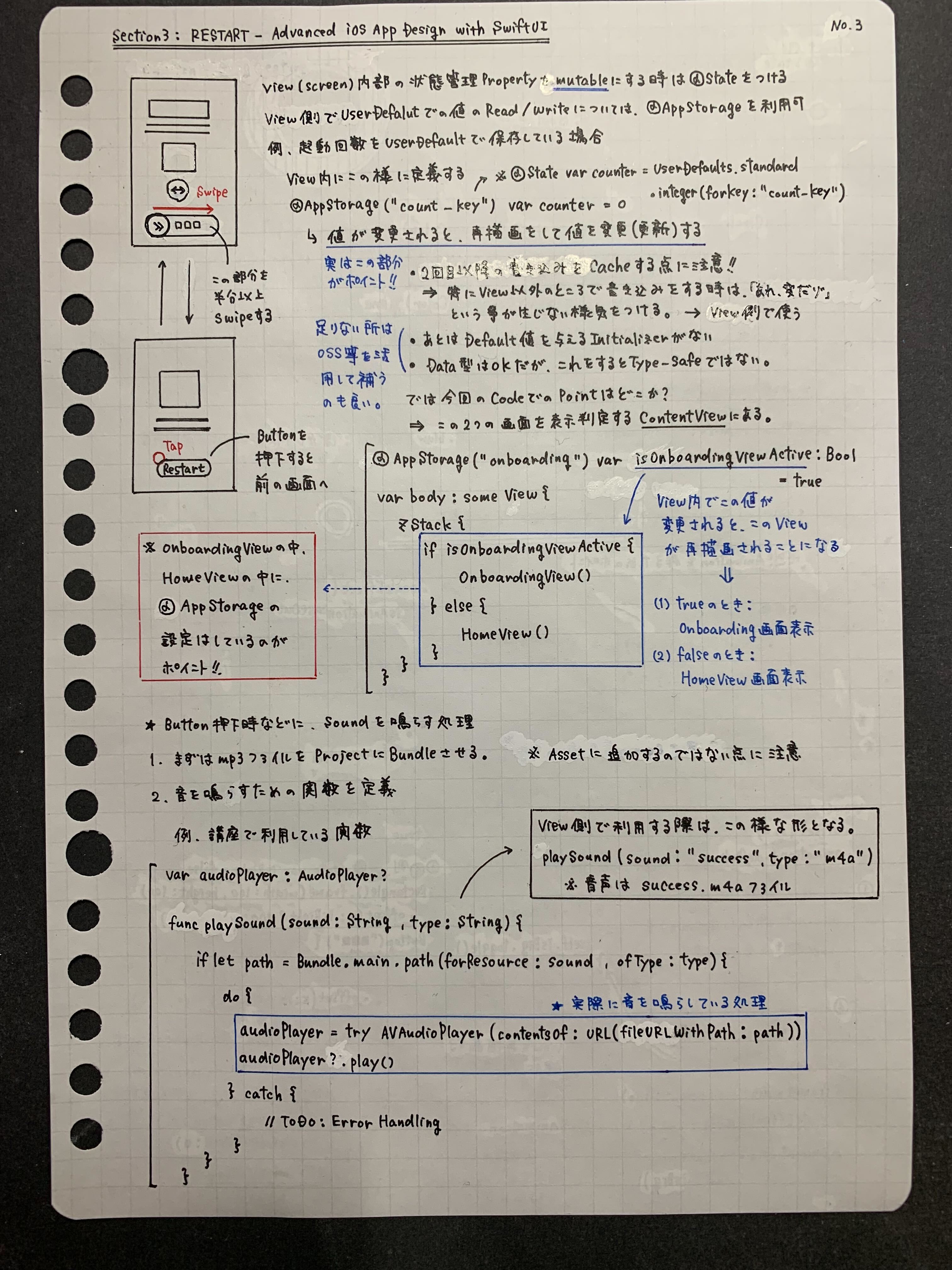
【No.2】
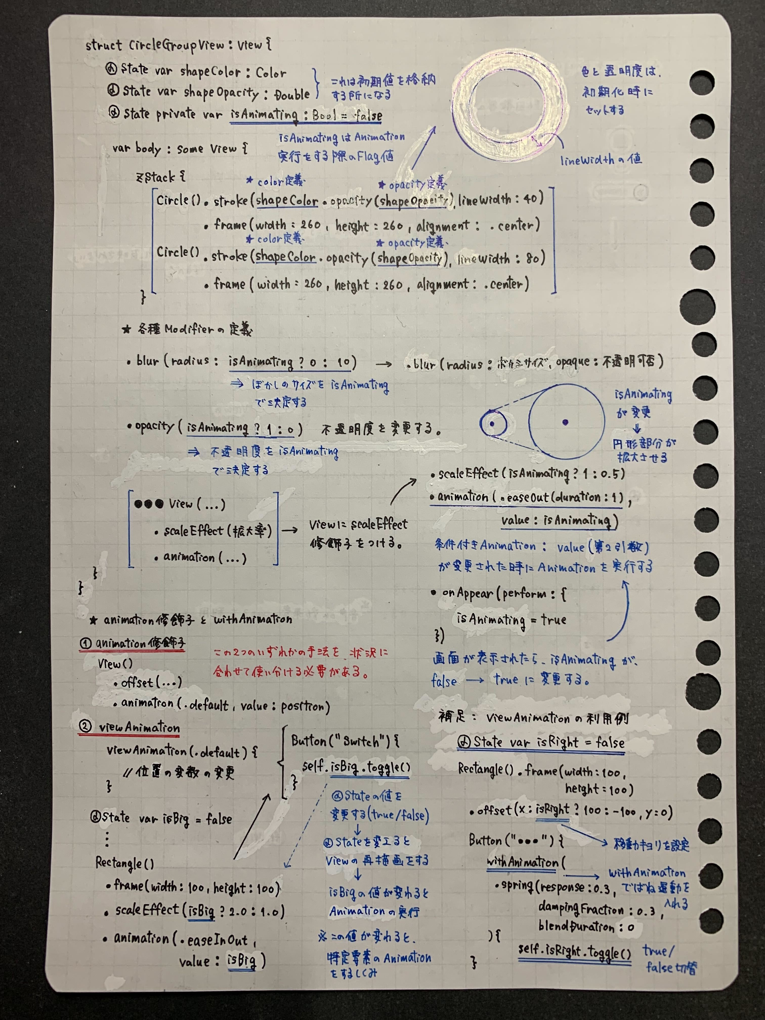
【No.3】
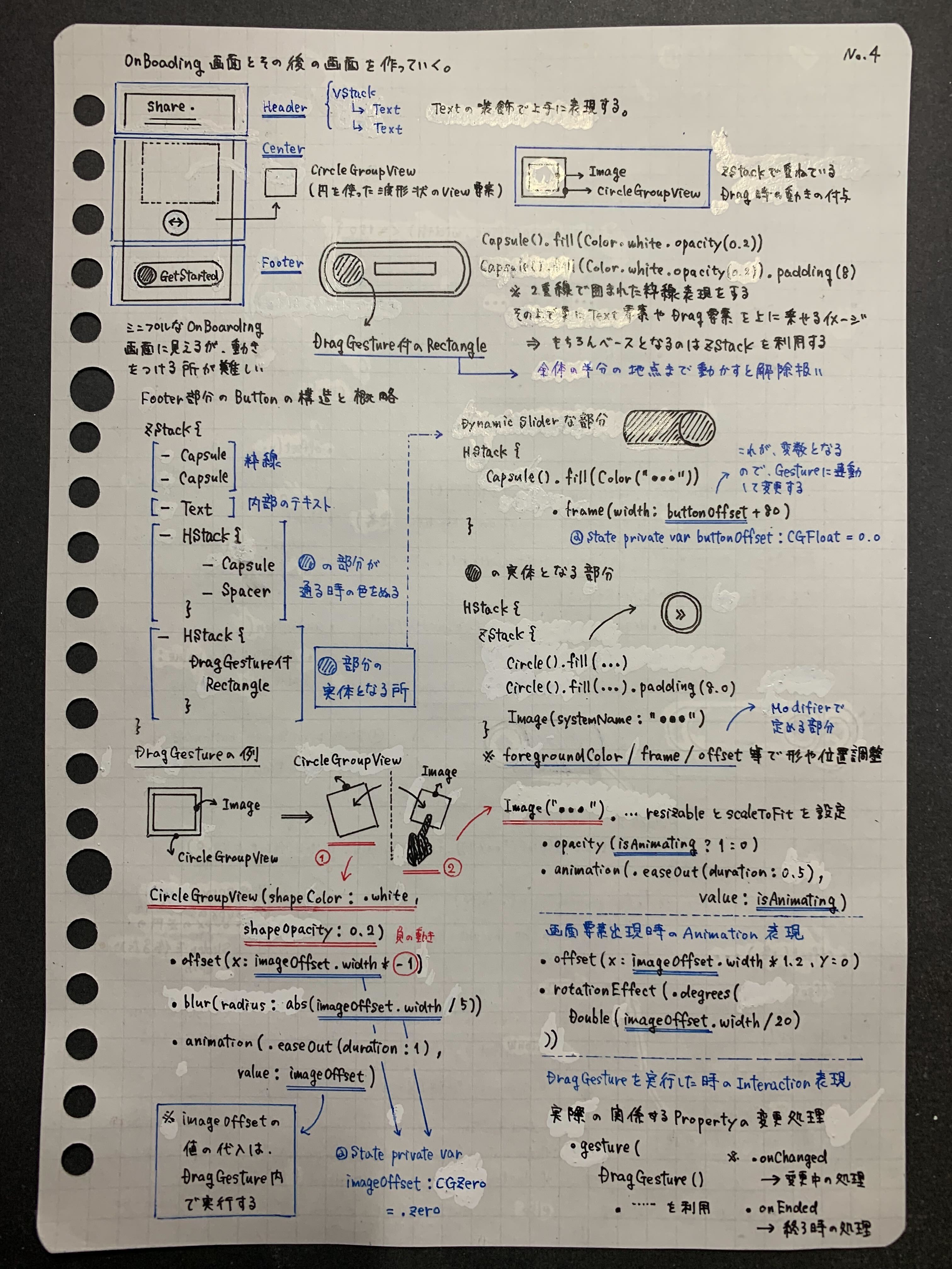
【No.4】
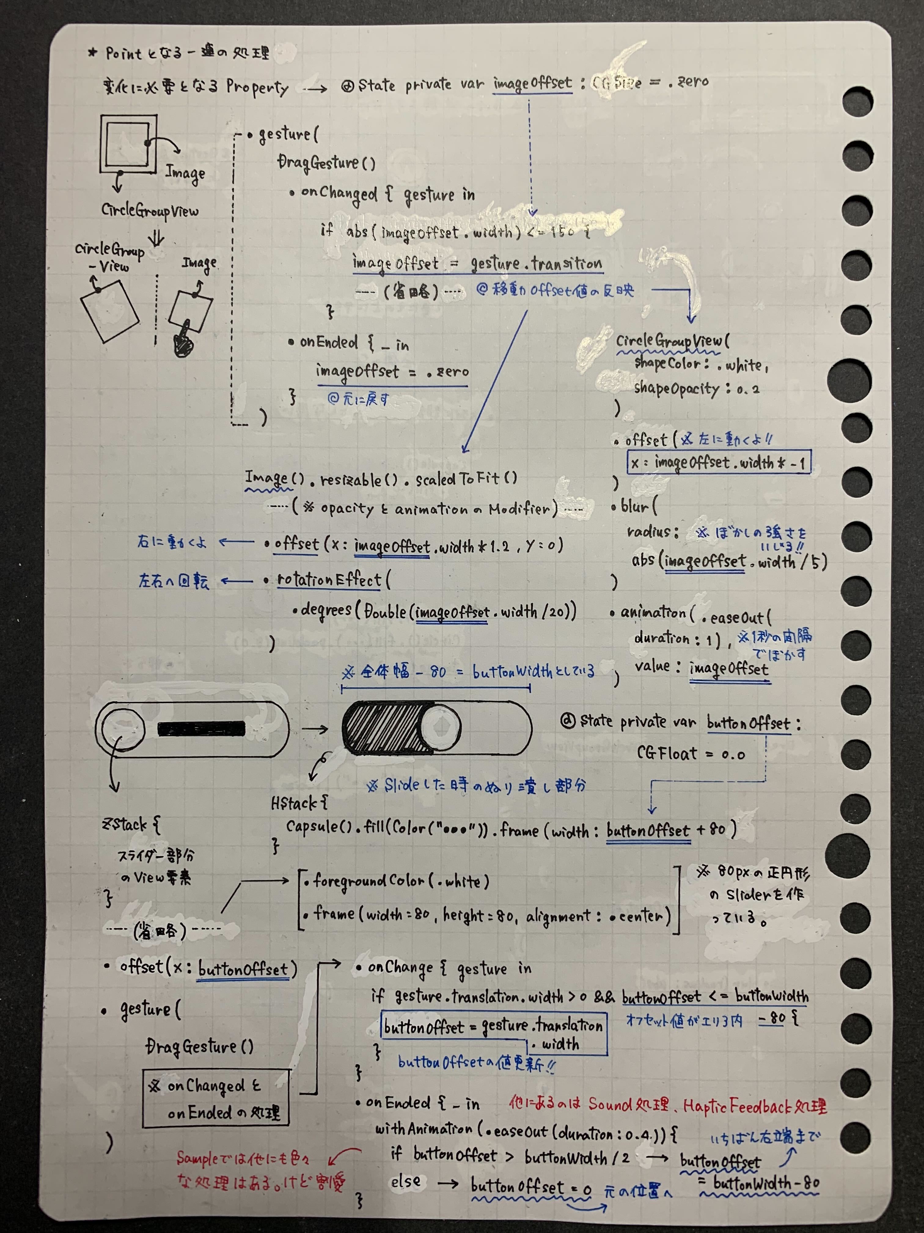
5-2. その他ノートを活用したインプット事例の紹介
今回紹介したDragGesture関連に関するもの以外でも、SwiftUIやその周辺知識に関連するものの中で、自分が気になったTIPSについては時間を見つけてある程度の形で下記の様な形で手書きのノートを利用して自分なりに整理してまとめる様にしています。UI実装の事はもちろんですが、SwiftUIを利用した実装に関連するアーキテクチャや新しく利用可能になったAPIに関するもの等、タイミングに応じて内容は様々ではありますが、今後の業務で利用する事をなるべく見越した内容にできる様に準備したり、理解が曖昧な部分を改めて整理する用途に加えて、小さなアウトプットを継続するために現在も実施しています。
【Netflixに似たUI構造をSwiftUIで再現するサンプルにおけるポイントをまとめたもの】
【SwiftUIをReduxを組み合わせた画面実装サンプルにおけるポイントをまとめたもの】
【TCAとReduxにおける特徴的な相違点をまとめたもの】
【AsyncImageと自前での画像表示Cache機構の整理してまとめたもの】
5-3. SwiftUI関連のインプットで活用しているもの
Udemy等の有料で提供されている教材等を活用してインプットをする事もありますが、下記で紹介している様なYouTubeチャンネル内で紹介されているSwiftUI関連の解説動画やライブコーディングで気になった実装やTIPSに関しても実装イメージを理解したり、紹介されている実装内で利用されている基本事項を整理するために積極的に活用する様にしています。実際に1つの画面実装を作り切るまでをじっくり解説しているものから、UI実装に関するTIPS的な位置付けのものまで幅広くあるので、私の場合は、 「UI実装に関するキーワードや気になるトピックス」 という観点からノートに2枚程度でまずは納得できる所まで図解と自分の言葉でまとめていくスタイルを取る事が多いと思います。
6. まとめ
私自身はお恥ずかしながら、個人的に触れる機会はあったものの、業務内でSwiftUIに本格的に触れた期間は多くはありませんが、必要な基本事項をある程度整理して理解した上で実装を進めていくと、
- 以前にUIKitで実装したもの経験があったものが直感的に実装を進めていけた
- Xcode Previewで確認しながらレイアウト構築や調整をする体験が心地良かった
という所感も、今回のUI実装を進めていく中で感じた場合があったと思います。
DragGestureを活用した奥行きのある無限Carouselの実装や、PinterestのようなGrid表示については、UIKit + UICollectionViewを利用した実装を選択した場合でも、UICollectionViewDelegateFlowLayoutクラスを継承した独自のレイアウト定義等を活用したカスタマイズが必要になるので、結果的にはなかなか一筋縄ではいかないUI実装になる事は多いかと思います。特に今回紹介したサンプル実装においては、画面上に配置する部品単位として考えた場合には、Preview等を活用しながら小さな単位として小さく試して動かしながらUI実装を考える事ができる点は、SwiftUIの開発体験の良さでもあると改めて強く感じた次第です。
バージョンによる差異や制約があったり、従来のUIKitとは考え方を変える必要がある部分もありますが、今後ともSwiftUIに関しては様々な実装やアイデアを試して形にしていく事は勿論ではありますが、これまで扱ってきたUIKitとの上手な調和という観点についても引き続き調べていきたいと思っております。