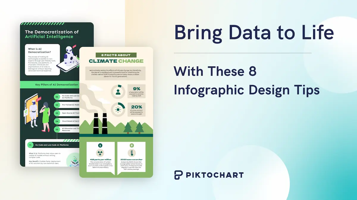

Your infographic has great data, but nobody’s engaging with it. Sound familiar?
Even the most valuable insights can get buried by cluttered layouts and confusing visuals.
Without clear design principles, your message gets buried.
That’s where strategic infographic design comes in. It transforms raw data into visual stories that command attention and drive action.
In this guide, you’ll learn essential design tips that make infographics impossible to ignore.
What makes a good infographic?
Before we talk about tips, let’s take a look at what makes a good infographic.
A good infographic supports the story you want to tell. It gives the viewer directions to focus on what matters.
At its core, a strong infographic starts with a single, focused message. It doesn’t try to explain everything at once. Instead, it guides the viewer through one key idea, building clarity through structure and simplicity.
Good design balances visual appeal with function.
For example, suppose you wanted your viewer to spot a pattern. You could direct their attention with color and layout to highlight key statistics. This way, the comparison becomes clear at a glance, and the viewer doesn’t have to work to find the insight.
Another ingredient of good infographic design is how information flows on the image. The best infographics lead the eye naturally, from headline to insight to takeaway.
Our Sales Process Flow Chart template is a great example:

This infographic uses a bold, winding path to guide the viewer step by step through the sales journey. The numbered steps coupled with directional lines keep the viewer’s eye moving in the intended order.
It also makes use of another crucial element of good infographics—visual metaphors.
Each icon visually represents the action, like a magnifying glass for “Prospecting” or a handshake for “Closing”. This way, the viewer can grasp the meaning even before reading the labels.
With these foundations in place, your infographic is set up to do what it’s meant to: communicate clearly, quickly, and with purpose.
Want to see more examples? Check out this collection of effective infographics.
1. Define your audience and purpose before designing.
Great infographics don’t start in the editor; they start with understanding who you’re designing for.
Before you start placing icons or choosing fonts, ask the most important question: why are you making this infographic, and who is it for?
Not every message needs an infographic. Here’s what actually defines one, and when it’s the right tool for the job.
It’s easy to jump into design mode too soon. But the most effective infographics start with a clear understanding of audience and intent. Without that, even a beautifully designed piece can fall flat.
We recommend starting with these:
- Why would someone care about this infographic?
- What should they learn, understand, or do after seeing it?
- Is an infographic even the right format for this message?
Infographics work best when the goal is to deliver specific, important data quickly. If your audience values visual communication and fast insights, you’re on the right track.
But if what they need is depth, detail, or layered context, consider other formats like reports, articles, or dashboards.
nderstanding your audience also helps shape the way you present the information. Do they need comparisons? A timeline? A process breakdown? Do they scan quickly or pause for detail?
To figure out what your audience is looking for, start by checking what they’ve already reacted to. Which visuals have they shared or commented on? What kinds of data or formats sparked questions, confusion, or interest?
One tip that’s worked great for us: run customer surveys.
Nothing beats talking to the people you’re designing for. Ask them what kind of visual content they prefer. You’ll often get clearer direction than you’d expect.
For example, if your audience needs to compare options quickly, a side-by-side comparison template like this one works well:

The more you know, the better you can design something that actually connects with your viewers.
2. Start with clear visual hierarchy to guide your audience
Once you know who you’re speaking to and what they care about, the next step is making sure they actually see it.
To do that, your design needs to guide them so they focus on the message you’re trying to convey.
For a real-world example of how to do that, take a look at this Piktochart template:

Your eye lands immediately on the bold “LASER TAG” in the center. It’s the largest element on the page, surrounded by bright color and motion. Only after that do you look at the details.
If “LASER TAG” were written in the same font, size, and weight as the rest of the text, you’d probably skim right past it. The whole poster would lose its energy and direction.
That’s the power of visual hierarchy it turns scattered content into a clear, readable story. Which is what makes it the foundation of effective infographic design.
Without a clear visual hierarchy, nothing in your design will pop out. Everything blends together, and your viewer won’t know where to look first. Or why they should care.
Not sure how to get started? We built our Piktochart templates with visual hierarchy in mind. Headlines, callouts, and supporting text are all styled to guide attention naturally.
If you’re not sure where to start, just plug in your content and tweak the emphasis from there.
3. Master typography and font selection for maximum clarity.
Font is so ingrained in the way we consume information that we seldom think about it.
That’s the thing with typography: when it works, it disappears. When it doesn’t, it gets in the way.
In infographic design, your font choices don’t need to be perfect, but they do need to be sensible.
Font selection fundamentals
Simplicity wins in font selection.
Here’s how you can keep it simple:
- Stick to legible fonts. Sans-serif fonts are usually the safest choice for clarity, especially at smaller sizes.
- Avoid decorative or novelty fonts. If you’re using one, make sure it’s intentional, and use it sparingly.
- Limit yourself to two or three fonts max. One for headings, one for body text, and maybe a third for labels or numbers.
- Make sure your fonts scale well. Everything should still be readable if the design is resized or viewed on a small screen.
You’re not trying to impress anyone with your font choices. You just want people to read your content without friction.
Creating effective contrast with typography
Our brains are wired to notice differences.
In fact, studies show we often miss even obvious changes unless something stands out. This phenomenon is known as change blindness.
- Vary the size. Headlines should be visibly larger than body text so readers know where to start.
- Use font weight for emphasis. Bold key points or headings, while keeping supporting text lighter.
- Check color contrast. Your text needs to pop from the background. If you have to squint, it’s not working.
Contrast acts as a signal that helps your viewer know what to read first, what to skim, and what to remember.
Typography consistency principles
Inconsistent typography makes your infographic feel chaotic, even if everything else is in place.
These quick principles help you keep things tidy and readable:
- Use the same font for the same job. All headers should match. Same for body text, labels, footnotes, etc.
- Stick to a unified style. Avoid switching weights, alignments, or styles without a reason.
- Let your typography guide the reader. Use consistent spacing, alignment, and hierarchy so they know what to read and in what order.
Typography consistency acts like signposting. It helps your viewer move through the content without second-guessing what each section means.
Using Piktochart to design your infographic? Try using the Text Styles panel to keep your typography consistent across your infographic.
Display, Title, Header, Body, and Caption styles are already set up—you just need to assign the right role to each text block. It’s like having a type system built in, without needing to create one from scratch.
For more practical tips on fonts and typography, watch the video tutorial below.
4. Develop a strategic color scheme with color-coded information.
Strategic use of color helps people understand your infographic faster.
For example, take a look at this Statistical Infographic template:

The entire piece is built on a consistent purple background to creates visual unity. But within that, it uses a single bright green to highlight every data point—percentages, stats, key phrases, icons.
This makes the numbers instantly recognizable, even before you read the details.
The template showcases color-coding in action: it assigns a specific color to one type of content (in this case, data) and repeats it consistently across the graphic. It helps your viewer know what to look for, and where to find it, without having to think too hard.
To build a smart color system:
- Balance bold accents with a neutral base. Let your key colors stand out without overwhelming the rest.
- Stick to a limited palette. 3–5 colors is usually plenty.
- Stay consistent. Once a color signals something—like data, category, or status—don’t switch it up.
Most of our templates come with color-coding and extra color palettes. Simply click on the Colors tab on the left panel to access the alternative palettes.

Alternatively, you can upload an image in the Brand tab of the Colors menu. Our editor will extract its colors and create a color palette automatically.

5. Use iconography and illustrations to enhance understanding.
Icons tap into our brain’s visual processing skills. After all, it takes us only 13 milliseconds to recognize an image.
It’ll always be faster for us to see a small calendar icon and think “date” than reading the word itself. An envelope? You already know it means “email.”
In infographics, icons and illustrations help explain concepts faster and make dense information feel more approachable. But for them to work, they have to be used with intent.
Here’s how to get the most out of them:
- Match icons to meaning. Choose visuals people already associate with your topic, like a magnifying glass for research.
- Stick to a single style. Mixing flat icons with 3D or hand-drawn ones breaks visual flow.
- Use them to support structure. Place icons next to section titles or categories to make them pop out.
Used well, icons make your content easier to scan and remember.
Want to make sure your design matches your message? This guide to infographic types breaks down the most common formats and when to use each.
Our editor comes with a searchable icon library labelled by style.
This way, you ensure your design keeps a consistent icon style.
6. Choose the right charts and graphs for your data.
Say I told you our sales went from 1,250 to 3,870 to 7,210 over the last three quarters. That’s a bit hard to picture for most people. Numbers can feel abstract on their own.
But now imagine seeing that same data as a rising line on a graph. Suddenly the growth feels more concrete.
That’s what charts do. They give shape to data so your message lands faster and sticks longer.
But not every chart fits every story:
- Bar charts: Great for comparing categories side by side, like revenue by region, votes by candidate, or tasks completed by team member.
- Line graphs: Best for showing change over time, for example monthly website traffic.
- Pie charts: Use them when you want to show how a whole breaks into parts, for example a marketing budget split by channel.
Our editor makes it easy to add any kind of graphs to your project. Simply click on the charts on the left panel and you’ll get a graph ready to go.

Drop in your data and the graph will adjust accordingly in real time.
Not sure what kind of chart to use? This guide on types of graphs can help.
7. Use white space effectively.
You’ve probably stumbled upon posters that looked like jumbled messes. Everything squeezed in, no breathing room, and somehow the more information there was, the less you took in.
Without enough space, even a well-designed infographic can feel overwhelming. Your viewer feels hit by a wall of information that they have to work hard to untangle.
White space supports your viewers by giving their eyes room to breathe and their brain time to process.
When used intentionally, white space:
- Guides the eye. It helps direct attention to the most important parts of your content.
- Improves legibility. With more space around text and elements, reading becomes less effortful.
- Adds breathing room. It separates sections so your viewer doesn’t feel like everything is shouting at once.
White space gives your content room to communicate.
Use layout blocks and grid lines in the editor to space out your content. Snap-to-grid makes alignment easy,
8. Optimize for different platforms and audiences.
Your infographic might look great on your laptop screen, but how will it hold up on a phone? Or in someone’s LinkedIn feed? Or printed on a poster?
Design isn’t one-size-fits-all. Where your infographic shows up affects how people experience it. So, it pays to design with that in mind.
When designing your infographic, you need to consider where you’re going to post it. It will impact both the format and the style you should go for:
- Facebook favors wide or tall posts with strong visuals and short copy
- Twitter/X, with its fast-feed environment, benefits from landscape visuals with concise takeaways and a strong lead image
- Instagram prefers square or vertical formats with minimal text and bold visuals that pop on a small screen
- LinkedIn favors horizontal layouts and more professional, content-rich visuals
- Pinterest is ideal for tall, scrollable designs that guide the viewer down a visual narrative
You’ll also want to think about device size. What’s readable on a 13-inch screen might be unreadable on mobile. Stick to larger font sizes, use fewer words, and break your content into digestible blocks.
If you’re planning to print, export at high resolution (300 DPI). For web use, opt for lighter formats like WebP or compressed JPGs to keep loading times fast.
A word of warning about WebPs though. While the format works on most modern platforms, some systems (like LinkedIn) still prefer PNG or JPG.
Want to tailor your design to students, educators, or presentations? Explore infographic examples for students.
Feeling lost? Use Piktochart’s smart resize feature to adapt your layout for any platform. Just pick from a preset—like Instagram Story, Twitter Post, or LinkedIn Header—and the canvas adjusts automatically.

Put these infographic design tips into practice with Piktochart
Infographic design is less about looks, and more about how clearly you communicate.
Your design should guide your reader’s attention to make complex ideas easier to grasp.
Put yourself in your viewer’s shoes. Can they tell what’s important at a glance? Do they know where to start reading? Is the takeaway obvious without extra explanation?
Your goal should be to remove any potential obstacle between your viewers and their understanding of the topic. If you expect them to do the work, you’ll find your infographics miss the mark.
The good news? You don’t need a design degree or expensive software to create effective infographics.
Get started for free today with Piktochart’s editor. Or try our generative AI assistant to plan your layout and content in seconds, so you’re never starting from scratch.
Need more guidance? Check out our step-by-step guide on how to make an infographic.
Frequently asked questions about infographic design tips
How to make a good infographic with limited design skills?
Start with a clear message, use a template, and keep it simple. Stick to 2–3 fonts, a limited color palette, and use icons and charts that directly support your content. Tools like Piktochart help you skip the design guesswork and focus on what you want to say.
What makes a good infographic stand out from the rest?
A good infographic guides the viewer through a focused idea using clear visuals, consistent design, and just enough text. When your viewer can understand the message in seconds, that’s when your infographic stands out.