Free UI/UX design course
Learn how to create exceptional designs by reading my new tutorial.
Start learningModals advanced features
Modals are quite complex components with many options available. In this lesson, we'll explore some of the more advanced ones.
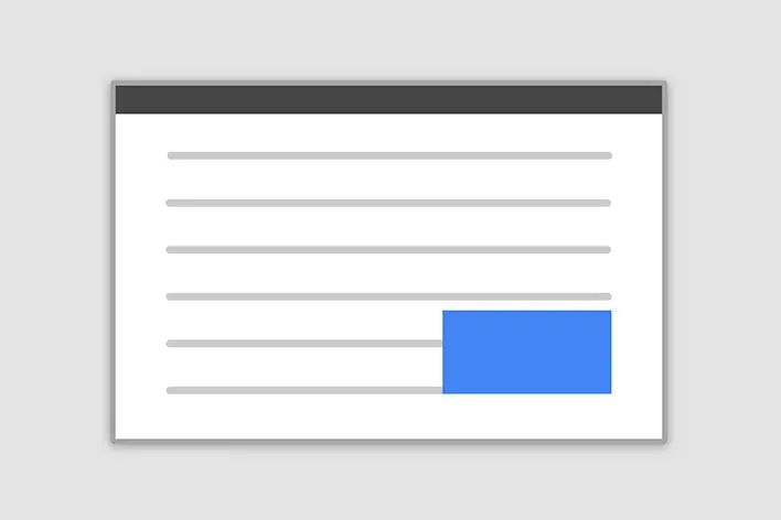
Step 1 - change the size of the modal
Modals have three optional sizes, available via modifier classes to be placed on a .modal-dialog. These sizes kick in at certain breakpoints to avoid horizontal scrollbars on narrower viewports.
| Size | Class | Modal max-width |
|---|---|---|
| Small | .modal-sm | 300px |
| Default | None | 500px |
| Large | .modal-lg | 800px |
| Extra large | .modal-xl | 1140px |
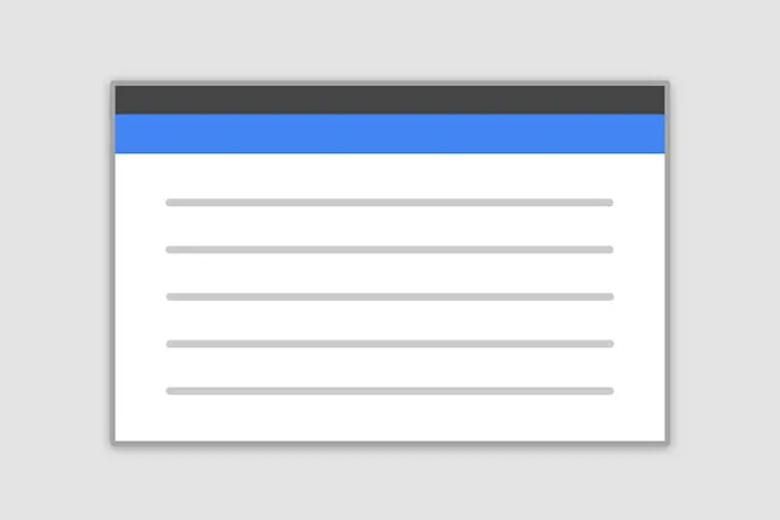
Modal can also be fullscreen.
Fullscreen option makes a modal cover the entire user viewport. It's available via modifier classes that are placed on a .modal-dialog .
| Class | Availability |
|---|---|
.modal-fullscreen | Always |
.modal-fullscreen-sm-down | Below 576px |
.modal-fullscreen-md-down | Below 768px |
.modal-fullscreen-lg-down | Below 992px |
.modal-fullscreen-xl-down | Below 1200px |
.modal-fullscreen-xxl-down | Below 1400px |
Let's change the modal in our project to Extra Large. According to the knowledge given above, it is enough to add the modal-xl class to the element with the modal-dialog class:
Now when you click on the image on the tab, the modal will be much bigger.

Step 2 - modify the content of the modal
Since the construction of the modal is so similar to the construction of the card, we can use it similarly. This means that inside the modal-body we can freely insert various elements, such as graphics, buttons or icons.
Additionally, nothing prevents you from using a grid inside a modal.
So let's replace our default modal with a modal with a bit more complex content. The content itself will be nothing new - it's just a grid with graphic on the left and icons with text on the right. So we won't go into the details of this as we've covered it many times in previous lessons.
Note, however, that we changed the ID of our modal to id="project-1". Therefore, we also need to change the ID in data-attributes in our trigger, i.e. in the card.
Now when you click on an image in a card, an extra large modal will be launched with new content inside.
Step 3 - add the other 2 modals
Each of the cards in the My projects section applies to a different project, so each of them should run its own modal with details about that project.
Inside the Projects modals section, I'm going to add 3 different modals, each with slightly different content.
Of course, you can modify the content of modals according to your preferences. Feel free to experiment with modals if you want.
Step 4 - update the triggers
Also remember about triggers. You need to add the data-attributes to the corresponding element in the cards. Make sure that each trigger points to the appropriate ID of the modal it is supposed to launch.
Notice that I added a triggers to the "read more" buttons in addition to the photos in the cards.
Note: Modals have many more options. Some of them are available in the paid version of MDB Pro.
It is not required for this tutorial, but if you want to see what additional options the MDB Pro modals have, you can click through the buttons in the demo below.
Click the buttons to launch the modals.
Frame modal
Position
Side modal
Position


About author
Michal Szymanski
Co Founder at MDBootstrap / Listed in Forbes „30 under 30" / Open-source enthusiast / Dancer, nerd & book lover.
Author of hundreds of articles on programming, business, marketing and productivity. In the past, an educator working with troubled youth in orphanages and correctional facilities.