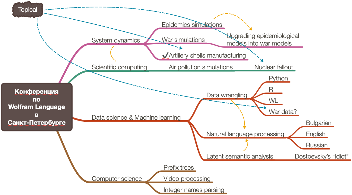
Two weeks ago (June 1st and 2nd) I participated in the Wolfram Language conference in St. Petersburg, Russia. Here are the corresponding announcements:
Interestingly, I first prepared a Latent Semantic Analysis (LSA) talk, but then found out that the organizers listed another talk I discussed with them, on extending dynamic systems models. (The latter one is the first we discussed, so, it was my “fault” that I wanted to talk about LSA.)
Here are the presentation notebooks for LSA in English and Russian .
Some afterthoughts
Тhe conference was very “strong”, my presentation was the “weakest.”
With “strong” I refer to the content and style of the presentations.
This was also the first scientific presentation I gave in Russian. I also got a participation diploma .
I prepared the initial models of artillery shells manufacturing, but much more work has to be done in order to have a meaningful article or presentation. (Hopefully, I am finishing that soon.)
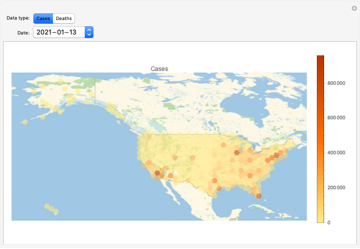
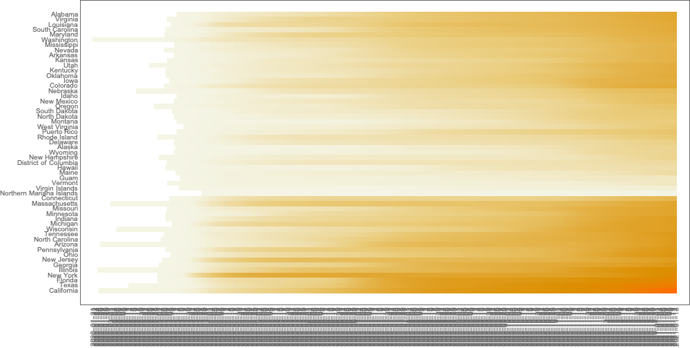
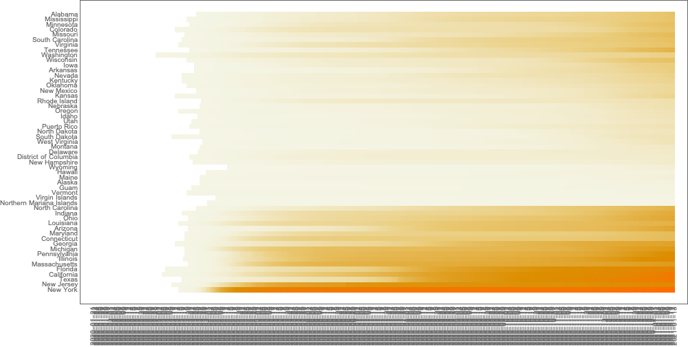
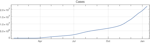
This post is both an update and a full-blown version of an older post — “NY Times COVID-19 data visualization” — using NY Times COVID-19 data up to 2021-01-13.
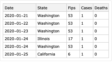
The purpose of this document/notebook is to give data locations, data ingestion code, and code for rudimentary analysis and visualization of COVID-19 data provided by New York Times, [NYT1].
The following steps are taken:
Ingest data
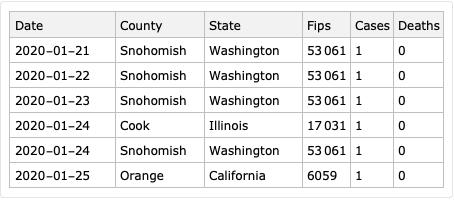
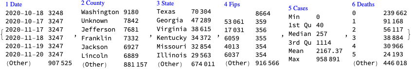
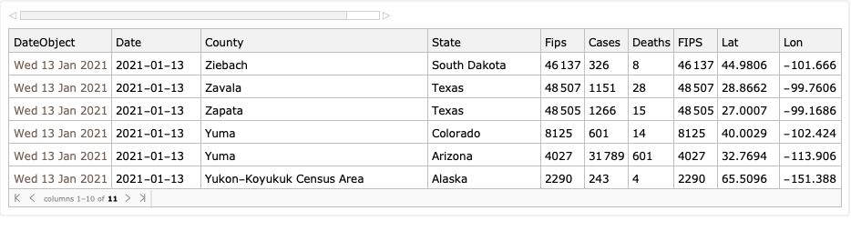
Take COVID-19 data from The New York Times, based on reports from state and local health agencies, [NYT1].
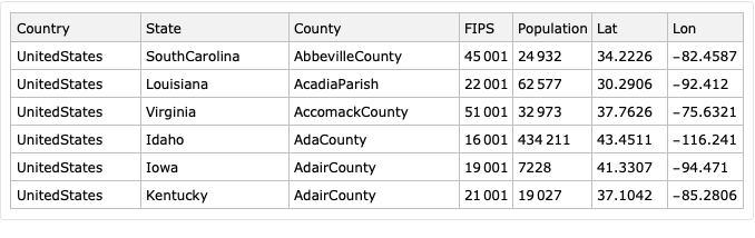
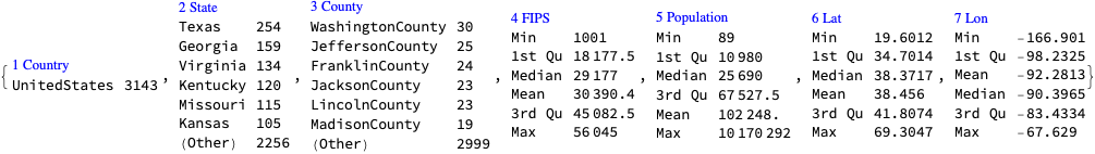
Take USA counties records data (FIPS codes, geo-coordinates, populations), [WRI1].
Merge the data.
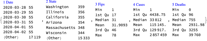
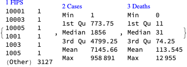
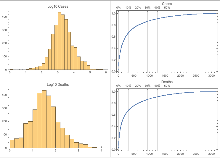
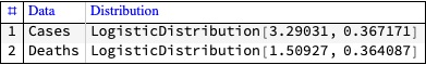
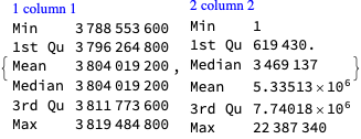
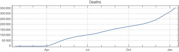
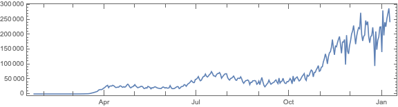
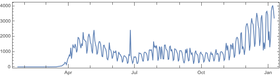
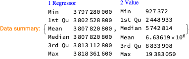
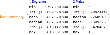
Make data summaries and related plots.
Make corresponding geo-plots.
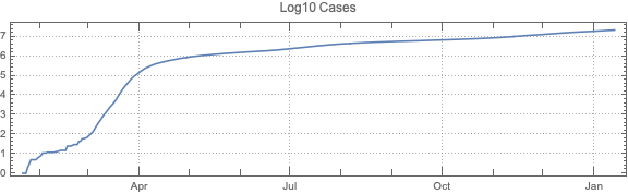
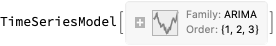
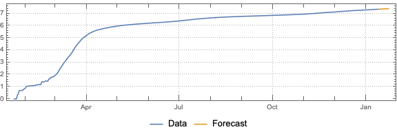
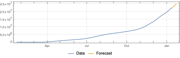
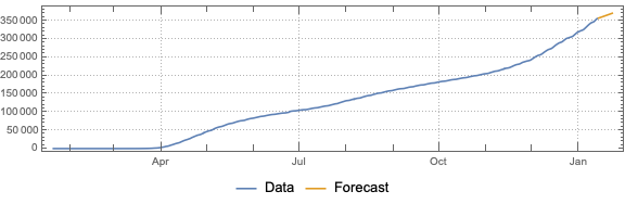
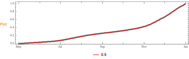
Do “out of the box” time series forecast.
Analyze fluctuations around time series trends.
Note that other, older repositories with COVID-19 data exist, like, [JH1, VK1].
Remark: The time series section is done for illustration purposes only. The forecasts there should not be taken seriously.
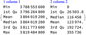
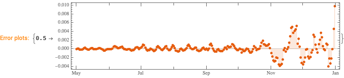
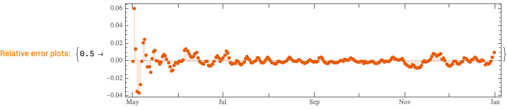
We want to see does the time series data have fluctuations around its trends and estimate the distributions of those fluctuations. (Knowing those distributions some further studies can be done.)
This can be efficiently using the software monad QRMon, [AAp2, AA1]. Here we load the QRMon package:
Here we specify QRMon workflow that rescales the data, fits a B-spline curve to get the trend, and finds the absolute and relative errors (residuals, fluctuations) around that trend:
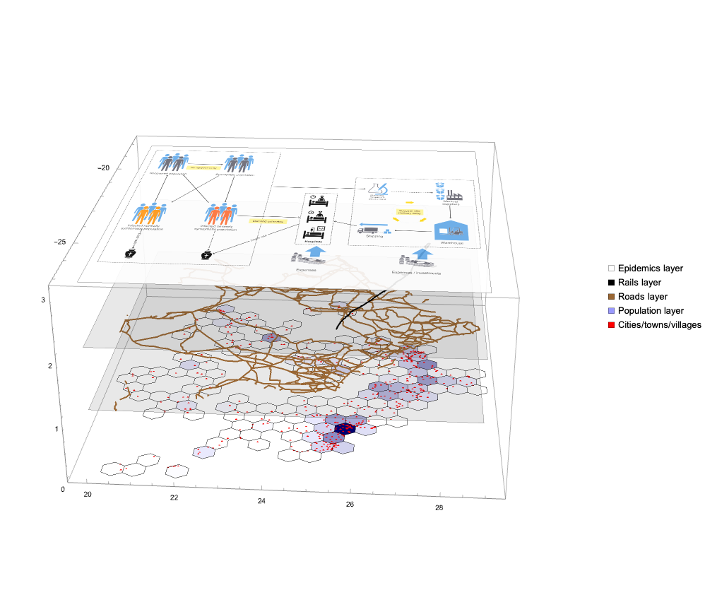
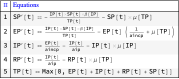
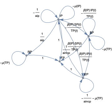
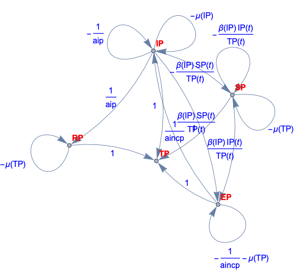
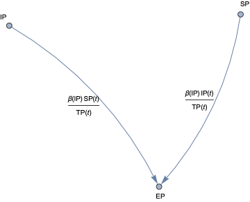
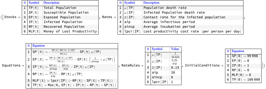
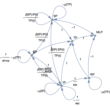
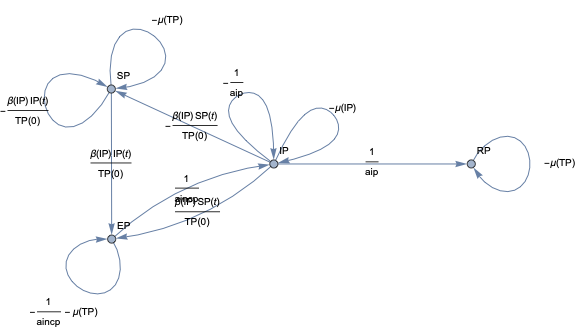
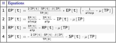
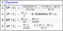
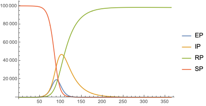
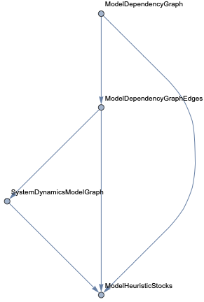
In this document we give usage examples for the functions of the package, “SystemDynamicsModelGraph.m”, [AAp1]. The package provides functions for making dependency graphs for the stocks in System Dynamics (SD) models. The primary motivation for creating the functions in this package is to have the ability to introspect, proofread, and verify the (typical) ODE models made in SD.
A more detailed explanation is:
For a given SD system S of Ordinary Differential Equations (ODEs) we make Mathematica graph objects that represent the interaction of variable dependent functions in S.
Those graph objects give alternative (and hopefully convenient) way of visualizing the model of S.
Load packages
The following commands load the packages [AAp1, AAp2, AAp3]:
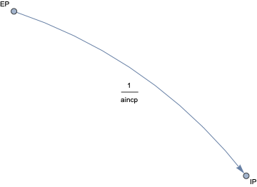
When the second argument given to ModelDependencyGraph is Automatic the stocks in the equations are heuristically found with the function ModelHeuristicStocks:
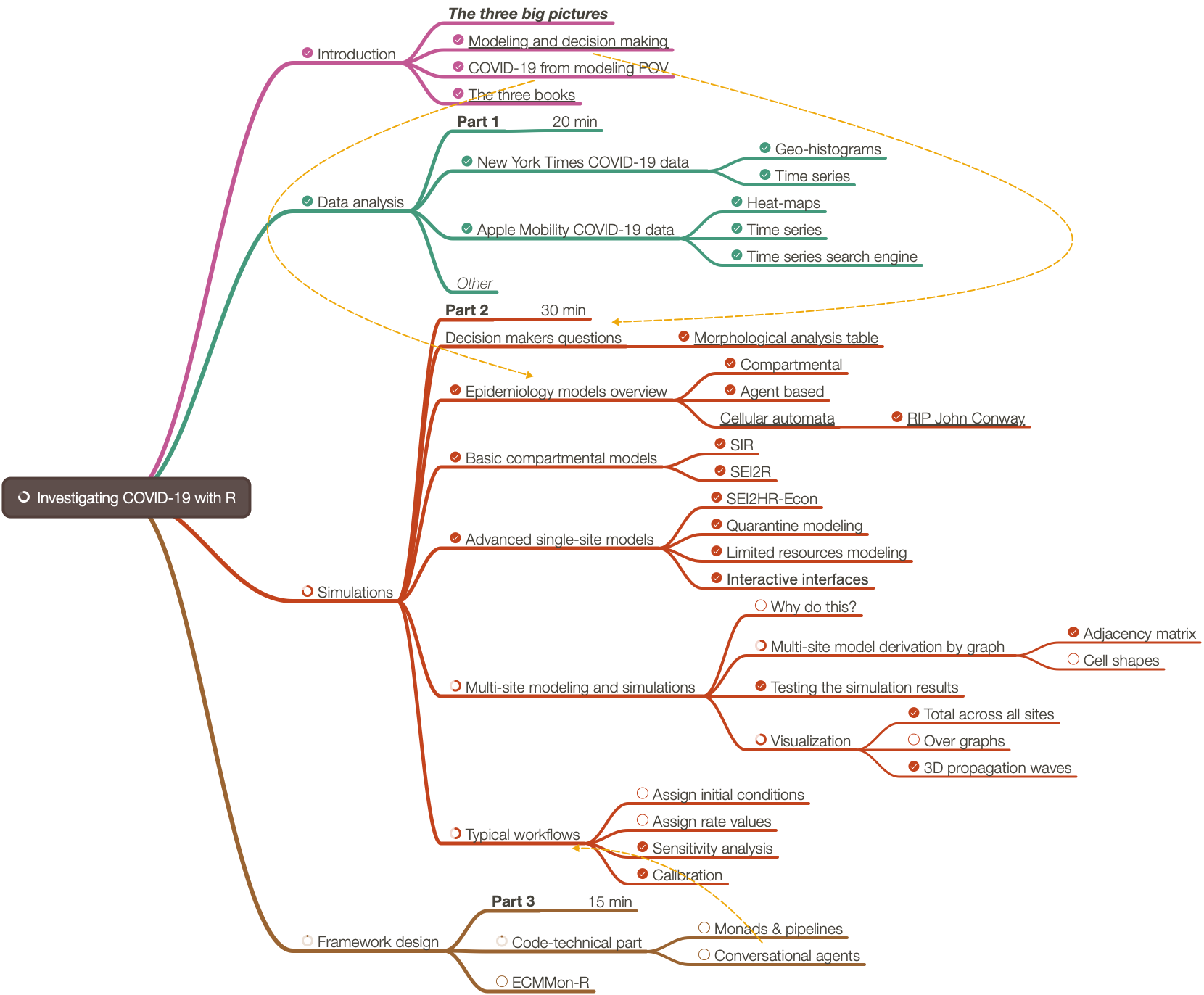
(Note that mind-map’s PDF has hyperlinks. Also, see the folder Presentation-aids. )
The organizers and I did a poll for what people want to hear. After discussing the results of the 15 votes from that poll we decided the presentation to be a methodological one instead of a know-how one.
Approximately 30% of the presentation was based on the R-project “COVID-19-modeling-in-R”, [AA1].
Approximately 30% of the presentation was based on an R-programmed software monad for epidemiology compartmental models, ECMMon-R, [AAr2].
For the rest were used frameworks, simulations, and graphics made with Mathematica, [AAr1].
The presentation was given online (because of COVID-19) using Zoom. 90 people registered. Nearly 40 showed up (and maybe 20 stayed throughout.)
(Note that mind-map’s PDF has hyperlinks. Also, see the folder Presentation-aids. )
Approximately 70% of the presentation was based on an R-programmed software monad for epidemiology compartmental models, ECMMon-R, [AAr2]. For the rest were used frameworks, simulations, and graphics made with Mathematica, [AAr1], and Wolfram System Modeler .
The presentation was given online (because of COVID-19) using Zoom. 190 people registered. Nearly 70 showed up (and maybe 60 stayed throughout.)