Doomsday clock parsing and plotting

Introduction

The Doomsday Clock is a symbolic timepiece maintained by the Bulletin of the Atomic Scientists (BAS) since 1947. It represents how close humanity is perceived to be to global catastrophe, primarily nuclear war but also including climate change and biological threats. The clock’s hands are set annually to reflect the current state of global security; midnight signifies theoretical doomsday.

In this notebook we consider two tasks:

  • Parsing of Doomsday Clock reading statements
  • Evolution of Doomsday Clock times
    • We extract relevant Doomsday Clock timeline data from the corresponding Wikipedia page.
      • (Instead of using a page from BAS.)
    • We show how timeline data from that Wikipedia page can be processed with “standard” Wolfram Language (WL) functions and with LLMs.
    • The result plot shows the evolution of the minutes to midnight.
      • The plot could show trends, highlighting significant global events that influenced the clock setting.
      • Hence, we put in informative callouts and tooltips.

The data extraction and visualization in the notebook serve educational purposes or provide insights into historical trends of global threats as perceived by experts. We try to make the ingestion and processing code universal and robust, suitable for multiple evaluations now or in the (near) future.

Remark: Keep in mind that the Doomsday Clock is a metaphor and its settings are not just data points but reflections of complex global dynamics (by certain experts and a board of sponsors.)

Remark: Currently (2024-12-30) Doomsday Clock is set at 90 seconds before midnight.

Data ingestion

Here we ingest the Doomsday Clock timeline page and show corresponding statistics:

 url = "https://thebulletin.org/doomsday-clock/timeline/"; txtEN = Import[url, "Plaintext"]; TextStats[txtEN] (*<|"Characters" -> 77662, "Words" -> 11731, "Lines" -> 1119|>*) 

By observing the (plain) text of that page we see the Doomsday Clock time setting can be extracted from the sentence(s) that begin with the following phrase:

 startPhrase = "Bulletin of the Atomic Scientists"; sentence = Select[Map[StringTrim, StringSplit[txtEN, "\n"]], StringStartsQ[#, startPhrase] &] // First (*"Bulletin of the Atomic Scientists, with a clock reading 90 seconds to midnight"*) 

Grammar and parsers

Here is a grammar in Extended Backus-Naur Form (EBNF) for parsing Doomsday Clock statements:

 ebnf = " <TOP> = <clock-reading> ; <clock-reading> = <opening> , ( <minutes> | [ <minutes> , [ 'and' | ',' ] ] , <seconds> ) , 'to' , 'midnight' ; <opening> = [ { <any> } ] , 'clock' , [ 'is' ] , 'reading' ; <any> = '_String' ; <minutes> = <integer> <& ( 'minute' | 'minutes' ) <@ \"Minutes\"->#&; <seconds> = <integer> <& ( 'second' | 'seconds' ) <@ \"Seconds\"->#&; <integer> = '_?IntegerQ' ;"; 

Remark: The EBNF grammar above can be obtained with LLMs using a suitable prompt with example sentences. (We do not discuss that approach further in this notebook.)

Here the parsing functions are generated from the EBNF string above:

 ClearAll["p*"] res = GenerateParsersFromEBNF[ParseToEBNFTokens[ebnf]]; res // LeafCount (*375*) 

We must redefine the parser pANY (corresponding to the EBNF rule “”) in order to prevent pANY of gobbling the word “clock” and in that way making the parser pOPENING fail.

 pANY = ParsePredicate[StringQ[#] && # != "clock" &]; 

Here are random sentences generated with the grammar:

 SeedRandom[32]; GrammarRandomSentences[GrammarNormalize[ebnf], 6] // Sort // ColumnForm 
 54jfnd 9y2f clock is reading 46 second to midnight clock is reading 900 minutes to midnight clock is reading 955 second to midnight clock reading 224 minute to midnight clock reading 410 minute to midnight jdsf5at clock reading 488 seconds to midnight 

Verifications of the (sub-)parsers:

 pSECONDS[{"90", "seconds"}] (*{{{}, "Seconds" -> 90}}*) 
 pOPENING[ToTokens@"That doomsday clock is reading"] (*{{{}, {{"That", "doomsday"}, {"clock", {"is", "reading"}}}}}*) 

Here the “top” parser is applied:

 str = "the doomsday clock is reading 90 seconds to midnight"; pTOP[ToTokens@str] (*{{{}, {{{"the", "doomsday"}, {"clock", {"is", "reading"}}}, {{{}, "Seconds" -> 90}, {"to", "midnight"}}}}}*) 

Here the sentence extracted above is parsed and interpreted into an association with keys “Minutes” and “Seconds”:

 aDoomReading = Association@Cases[Flatten[pTOP[ToTokens@sentence]], _Rule] (*<|"Seconds" -> 90|>*) 

Plotting the clock

Using the interpretation derived above here we make a list suitable for ClockGauge:

 clockShow = DatePlus[{0, 0, 0, 12, 0, 0}, {-(Lookup[aDoomReading, "Minutes", 0]*60 + aDoomReading["Seconds"]), "Seconds"}] (*{-2, 11, 30, 11, 58, 30}*) 

In that list, plotting of a Doomsday Clock image (or gauge) is trivial.

 ClockGauge[clockShow, GaugeLabels -> Automatic] 

Let us define a function that makes the clock-gauge plot for a given association.

 Clear[DoomsdayClockGauge]; Options[DoomsdayClockGauge] = Options[ClockGauge]; DoomsdayClockGauge[m_Integer, s_Integer, opts : OptionsPattern[]] := DoomsdayClockGauge[<|"Minutes" -> m, "Seconds" -> s|>, opts]; DoomsdayClockGauge[a_Association, opts : OptionsPattern[]] := Block[{clockShow}, clockShow = DatePlus[{0, 0, 0, 12, 0, 0}, {-(Lookup[a, "Minutes", 0]*60 + Lookup[a, "Seconds", 0]), "Seconds"}]; ClockGauge[clockShow, opts, GaugeLabels -> Placed[Style["Doomsday\nclock", RGBColor[0.7529411764705882, 0.7529411764705882, 0.7529411764705882], FontFamily -> "Krungthep"], Bottom]] ]; 

Here are examples:

 Row[{ DoomsdayClockGauge[17, 0], DoomsdayClockGauge[1, 40, GaugeLabels -> Automatic, PlotTheme -> "Scientific"], DoomsdayClockGauge[aDoomReading, PlotTheme -> "Marketing"] }] 

More robust parsing

More robust parsing of Doomsday Clock statements can be obtained in these three ways:

  • “Fuzzy” match of words
    • For misspellings like “doomsdat” instead of “doomsday.”
  • Parsing of numeric word forms.
    • For statements, like, “two minutes and twenty five seconds.”
  • Delegating the parsing to LLMs when grammar parsing fails.

Fuzzy matching

The parser ParseFuzzySymbol can be used to handle misspellings (via EditDistance):

 pDD = ParseFuzzySymbol["doomsday", 2]; lsPhrases = {"doomsdat", "doomsday", "dumzday"}; ParsingTestTable[pDD, lsPhrases] 

In order to include the misspelling handling into the grammar we manually rewrite the grammar. (The grammar is small, so, it is not that hard to do.)

 pANY = ParsePredicate[StringQ[#] && EditDistance[#, "clock"] > 1 &]; pOPENING = ParseOption[ParseMany[pANY]]⊗ParseFuzzySymbol["clock", 1]⊗ParseOption[ParseSymbol["is"]]⊗ParseFuzzySymbol["reading", 2]; pMINUTES = "Minutes" -> # &⊙(pINTEGER ◁ ParseFuzzySymbol["minutes", 3]); pSECONDS = "Seconds" -> # &⊙(pINTEGER ◁ ParseFuzzySymbol["seconds", 3]); pCLOCKREADING = Cases[#, _Rule, Infinity] &⊙(pOPENING⊗(pMINUTES⊕ParseOption[pMINUTES⊗ParseOption[ParseSymbol["and"]⊕ParseSymbol["&"]⊕ParseSymbol[","]]]⊗pSECONDS)⊗ParseSymbol["to"]⊗ParseFuzzySymbol["midnight", 2]); 

Here is a verification table with correct- and incorrect spellings:

 lsPhrases = { "doomsday clock is reading 2 seconds to midnight", "dooms day cloc is readding 2 minute and 22 sekonds to mildnight"}; ParsingTestTable[pCLOCKREADING, lsPhrases, "Layout" -> "Vertical"] 

Parsing of numeric word forms

One way to make the parsing more robust is to implement the ability to parse integer names (or numeric word forms) not just integers.

Remark: For a fuller discussion — and code — of numeric word forms parsing see the tech note “Integer names parsing” of the paclet “FunctionalParsers”, [AAp1].

First, we make an association that connects integer names with corresponding integer values

 aWordedValues = Association[IntegerName[#, "Words"] -> # & /@ Range[0, 100]]; aWordedValues = KeyMap[StringRiffle[StringSplit[#, RegularExpression["\\W"]], " "] &, aWordedValues]; Length[aWordedValues] (*101*) 

Here is how the rules look like:

 aWordedValues[[1 ;; -1 ;; 20]] (*<|"zero" -> 0, "twenty" -> 20, "forty" -> 40, "sixty" -> 60, "eighty" -> 80, "one hundred" -> 100|>*) 

Here we program the integer names parser:

 pUpTo10 = ParseChoice @@ Map[ParseSymbol[IntegerName[#, {"English", "Words"}]] &, Range[0, 9]]; p10s = ParseChoice @@ Map[ParseSymbol[IntegerName[#, {"English", "Words"}]] &, Range[10, 100, 10]]; pWordedInteger = ParseApply[aWordedValues[StringRiffle[Flatten@{#}, " "]] &, p10s\[CircleTimes]pUpTo10\[CirclePlus]p10s\[CirclePlus]pUpTo10]; 

Here is a verification table of that parser:

 lsPhrases = {"three", "fifty seven", "thirti one"}; ParsingTestTable[pWordedInteger, lsPhrases] 

There are two parsing results for “fifty seven”, because pWordedInteger is defined with p10s⊗pUpTo10⊕p10s… . This can be remedied by using ParseJust or ParseShortest:

 lsPhrases = {"three", "fifty seven", "thirti one"}; ParsingTestTable[ParseJust@pWordedInteger, lsPhrases] 

Let us change pINTEGER to parse both integers and integer names:

 pINTEGER = (ToExpression\[CircleDot]ParsePredicate[StringMatchQ[#, NumberString] &])\[CirclePlus]pWordedInteger; lsPhrases = {"12", "3", "three", "forty five"}; ParsingTestTable[pINTEGER, lsPhrases] 

Let us try the new parser using integer names for the clock time:

 str = "the doomsday clock is reading two minutes and forty five seconds to midnight"; pTOP[ToTokens@str] (*{{{}, {"Minutes" -> 2, "Seconds" -> 45}}}*) 

Enhance with LLM parsing

There are multiple ways to employ LLMs for extracting “clock readings” from arbitrary statements for Doomsday Clock readings, readouts, and measures. Here we use LLM few-shot training:

 flop = LLMExampleFunction[{ "the doomsday clock is reading two minutes and forty five seconds to midnight" -> "{\"Minutes\":2, \"Seconds\": 45}", "the clock of the doomsday gives 92 seconds to midnight" -> "{\"Minutes\":0, \"Seconds\": 92}", "The bulletin atomic scienist maybe is set to a minute an 3 seconds." -> "{\"Minutes\":1, \"Seconds\": 3}" }, "JSON"] 

Here is an example invocation:

 flop["Maybe the doomsday watch is at 23:58:03"] (*{"Minutes" -> 1, "Seconds" -> 57}*) 

The following function combines the parsing with the grammar and the LLM example function — the latter is used for fallback parsing:

 Clear[GetClockReading]; GetClockReading[st_String] := Block[{op}, op = ParseJust[pTOP][ToTokens[st]]; Association@ If[Length[op] > 0 && op[[1, 1]] === {}, Cases[op, Rule], (*ELSE*) flop[st] ] ]; 

Robust parser demo

Here is the application of the combine function above over a certain “random” Doomsday Clock statement:

 s = "You know, sort of, that dooms-day watch is 1 and half minute be... before the big boom. (Of doom...)"; GetClockReading[s] (*<|"Minutes" -> 1, "Seconds" -> 30|>*) 

Remark: The same type of robust grammar-and-LLM combination is explained in more detail in the video “Robust LLM pipelines (Mathematica, Python, Raku)”, [AAv1]. (See, also, the corresponding notebook [AAn1].)

Timeline

In this section we extract Doomsday Clock timeline data and make a corresponding plot.

Parsing page data

Instead of using the official Doomsday clock timeline page we use Wikipedia:

 url = "https://en.wikipedia.org/wiki/Doomsday_Clock"; data = Import[url, "Data"]; 

Get timeline table:

 tbl = Cases[data, {"Timeline of the Doomsday Clock [ 13 ] ", x__} :> x, Infinity] // First; 

Show table’s columns:

 First[tbl] (*{"Year", "Minutes to midnight", "Time ( 24-h )", "Change (minutes)", "Reason", "Clock"}*) 

Make a dataset:

 dsTbl = Dataset[Rest[tbl]][All, AssociationThread[{"Year", "MinutesToMidnight", "Time", "Change", "Reason"}, #] &]; dsTbl = dsTbl[All, Append[#, "Date" -> DateObject[{#Year, 7, 1}]] &]; dsTbl[[1 ;; 4]] 

Here is an association used to retrieve the descriptions from the date objects:

 aDateToDescr = Normal@dsTbl[Association, #Date -> BreakStringIntoLines[#Reason] &]; 

Using LLM-extraction instead

Alternatively, we can extract the Doomsday Clock timeline using LLMs. Here we get the plaintext of the Wikipedia page and show statistics:

 txtWk = Import[url, "Plaintext"]; TextStats[txtWk] (*<|"Characters" -> 43623, "Words" -> 6431, "Lines" -> 315|>*) 

Here we get the Doomsday Clock timeline table from that page in JSON format using an LLM:

 res = LLMSynthesize[{ "Give the time table of the doomsday clock as a time series that is a JSON array.", "Each element of the array is a dictionary with keys 'Year', 'MinutesToMidnight', 'Time', 'Description'.", txtWk, LLMPrompt["NothingElse"]["JSON"] }, LLMEvaluator -> LLMConfiguration[<|"Provider" -> "OpenAI", "Model" -> "gpt-4o", "Temperature" -> 0.4, "MaxTokens" -> 5096|>] ] (*"```json[{\"Year\": 1947, \"MinutesToMidnight\": 7, \"Time\": \"23:53\", \"Description\": \"The initial setting of the Doomsday Clock.\"},{\"Year\": 1949, \"MinutesToMidnight\": 3, \"Time\": \"23:57\", \"Description\": \"The Soviet Union tests its first atomic bomb, officially starting the nuclear arms race.\"}, ... *) 

Post process the LLM result:

 res2 = ToString[res, CharacterEncoding -> "UTF-8"]; res3 = StringReplace[res2, {"```json", "```"} -> ""]; res4 = ImportString[res3, "JSON"]; res4[[1 ;; 3]] (*{{"Year" -> 1947, "MinutesToMidnight" -> 7, "Time" -> "23:53", "Description" -> "The initial setting of the Doomsday Clock."}, {"Year" -> 1949, "MinutesToMidnight" -> 3, "Time" -> "23:57", "Description" -> "The Soviet Union tests its first atomic bomb, officially starting the nuclear arms race."}, {"Year" -> 1953, "MinutesToMidnight" -> 2, "Time" -> "23:58", "Description" -> "The United States and the Soviet Union test thermonuclear devices, marking the closest approach to midnight until 2020."}}*) 

Make a dataset with the additional column “Date” (having date-objects):

 dsDoomsdayTimes = Dataset[Association /@ res4]; dsDoomsdayTimes = dsDoomsdayTimes[All, Append[#, "Date" -> DateObject[{#Year, 7, 1}]] &]; dsDoomsdayTimes[[1 ;; 4]] 

Here is an association that is used to retrieve the descriptions from the date objects:

 aDateToDescr2 = Normal@dsDoomsdayTimes[Association, #Date -> #Description &]; 

Remark: The LLM derived descriptions above are shorter than the descriptions in the column “Reason” of the dataset obtained parsing the page data. For the plot tooltips below we use the latter.

Timeline plot

In order to have informative Doomsday Clock evolution plot we obtain and partition dataset’s time series into step-function pairs:

 ts0 = Normal@dsDoomsdayTimes[All, {#Date, #MinutesToMidnight} &]; ts2 = Append[Flatten[MapThread[Thread[{#1, #2}] &, {Partition[ts0[[All, 1]], 2, 1], Most@ts0[[All, 2]]}], 1], ts0[[-1]]]; 

Here are corresponding rule wrappers indicating the year and the minutes before midnight:

 lbls = Map[Row[{#Year, Spacer[3], "\n", IntegerPart[#MinutesToMidnight], Spacer[2], "m", Spacer[2], Round[FractionalPart[#MinutesToMidnight]*60], Spacer[2], "s"}] &, Normal@dsDoomsdayTimes]; lbls = Map[If[#[[1, -3]] == 0, Row@Take[#[[1]], 6], #] &, lbls]; 

Here the points “known” by the original time series are given callouts:

 aRules = Association@MapThread[#1 -> Callout[Tooltip[#1, aDateToDescr[#1[[1]]]], #2] &, {ts0, lbls}]; ts3 = Lookup[aRules, Key[#], #] & /@ ts2; 

Finally, here is the plot:

 DateListPlot[ts3, PlotStyle -> Directive[{Thickness[0.007`], Orange}], Epilog -> {PointSize[0.01`], Black, Point[ts0]}, PlotLabel -> Row[(Style[#1, FontSize -> 16, FontColor -> Black, FontFamily -> "Verdana"] &) /@ {"Doomsday clock: minutes to midnight,", Spacer[3], StringRiffle[MinMax[Normal[dsDoomsdayTimes[All, "Year"]]], "-"]}], FrameLabel -> {"Year", "Minutes to midnight"}, Background -> GrayLevel[0.94`], Frame -> True, FrameTicks -> {{Automatic, (If[#1 == 0, {0, Style["00:00", Red]}, {#1, Row[{"23:", 60 - #1}]}] &) /@ Range[0, 17]}, {Automatic, Automatic}}, GridLines -> {None, All}, AspectRatio -> 1/3, ImageSize -> 1200 ] 

Remark: By hovering with the mouse over the black points the corresponding descriptions can be seen. We considered using clock-gauges as tooltips, but showing clock-settings reasons is more informative.

Remark: The plot was intentionally made to resemble the timeline plot in Doomsday Clock’s Wikipedia page.

Conclusion

As expected, parsing, plotting, or otherwise processing the Doomsday Clock settings and statements are excellent didactic subjects for textual analysis (or parsing) and temporal data visualization. The visualization could serve educational purposes or provide insights into historical trends of global threats as perceived by experts. (Remember, the clock’s settings are not just data points but reflections of complex global dynamics.)

One possible application of the code in this notebook is to make a “web service“ that gives clock images with Doomsday Clock readings. For example, click on this button:

Setup

 Needs["AntonAntonov`FunctionalParsers`"] 
 Clear[TextStats]; TextStats[s_String] := AssociationThread[{"Characters", "Words", "Lines"}, Through[{StringLength, Length@*TextWords, Length@StringSplit[#, "\n"] &}[s]]]; 
 BreakStringIntoLines[str_String, maxLength_Integer : 60] := Module[ {words, lines, currentLine}, words = StringSplit[StringReplace[str, RegularExpression["\\v+"] -> " "]]; lines = {}; currentLine = ""; Do[ If[StringLength[currentLine] + StringLength[word] + 1 <= maxLength, currentLine = StringJoin[currentLine, If[currentLine === "", "", " "], word], AppendTo[lines, currentLine]; currentLine = word; ], {word, words} ]; AppendTo[lines, currentLine]; StringJoin[Riffle[lines, "\n"]] ] 

References

Articles, notebooks

[AAn1] Anton Antonov, “Making robust LLM computational pipelines from software engineering perspective”, (2024), Wolfram Community.

Paclets

[AAp1] Anton Antonov, “FunctionalParsers”, (2023), Wolfram Language Paclet Repository.

Videos

[AAv1] Anton Antonov, “Robust LLM pipelines (Mathematica, Python, Raku)”, (2024), YouTube/@AAA4prediction.

Age at creation for programming languages stats

Introduction

In this blog post (notebook) we ingest programming languages creation data from Programming Language DataBase” and visualize several statistics of it.

We do not examine the data source and we do not want to reason too much about the data using the stats. We started this notebook by just wanting to make the bubble charts (both 2D and 3D.) Nevertheless, we are tempted to say and justify statements like:

  • Pareto holds, as usual.
  • Language creators tend to do it more than once.
  • Beware the Second system effect.

References

Here are reference links with explanations and links to dataset files:


Data ingestion

Here we get the TSC file with Wolfram Function Repository (WFR) function ImportCSVToDataset:

url = "https://pldb.io/posts/age.tsv";
dsData = ResourceFunction["ImportCSVToDataset"][url, "Dataset", "FieldSeparators" -> "\t"];
dsData[[1 ;; 4]]

Here we summarize the data using the WFR function RecordsSummary:

ResourceFunction["RecordsSummary"][dsData, "MaxTallies" -> 12]

Here is a list of languages we use to “get orientated” in the plots below:

lsFocusLangs = {"C++", "Fortran", "Java", "Mathematica", "Perl 6", "Raku", "SQL", "Wolfram Language"};

Here we find the most important tags (used in the plots below):

lsTopTags = ReverseSortBy[Tally[Normal@dsData[All, "tags"]], Last][[1 ;; 7, 1]]

(*{"pl", "textMarkup", "dataNotation", "grammarLanguage", "queryLanguage", "stylesheetLanguage", "protocol"}*)

Here we add the column “group” based on the focus languages and most important tags:

dsData = dsData[All, Append[#, "group" -> Which[MemberQ[lsFocusLangs, #id], "focus", MemberQ[lsTopTags, #tags], #tags, True, "other"]] &];

Distributions

Here are the distributions of the variables/columns:

  • age at creation
    • i.e. “How old was the creator?”
  • appeared”
    • i.e. “In what year the programming language was proclaimed?”
Association @ Map[# -> Histogram[Normal@dsData[All, #], 20, "Probability", Sequence[ImageSize -> Medium, PlotTheme -> "Detailed"]] &, {"ageAtCreation", "appeared"}]

Here are corresponding Box-Whisker plots together with tables of their statistics:

aBWCs = Association@
Map[# -> BoxWhiskerChart[Normal@dsData[All, #], "Outliers", Sequence[BarOrigin -> Left, ImageSize -> Medium, AspectRatio -> 1/2, PlotRange -> Full]] &, {"ageAtCreation", "appeared"}];

Pareto principle manifestation

Number of creations

Here is the Pareto principle plot of for the number of created (or renamed) programming languages per creator (using the WFR function ParetoPrinciplePlot):

ResourceFunction["ParetoPrinciplePlot"][Association[Rule @@@ Tally[Normal@dsData[All, "creators"]]], ImageSize -> Large]

We can see that ≈25% of the creators correspond to ≈50% of the languages.

Popularity

Obviously, programmers can and do use more than one programming language. Nevertheless, it is interesting to see the Pareto principle plot for the languages “mind share” based on the number of users estimates.

ResourceFunction["ParetoPrinciplePlot"][Normal@dsData[Association, #id -> #numberOfUsersEstimate &], ImageSize -> Large]

Remark: Again, the plot above is “wrong” — programmers use more than one programming language.


Correlations

In order to see meaningful correlation, pairwise plots we take logarithms of the large value columns:

dsDataVar = dsData[All, {"appeared", "ageAtCreation", "numberOfUsersEstimate", "numberOfJobsEstimate", "rank", "measurements", "pldbScore"}];
dsDataVar = dsDataVar[All, Append[#, <|"numberOfUsersEstimate" -> Log10[#numberOfUsersEstimate + 1], "numberOfJobsEstimate" -> Log10[#numberOfJobsEstimate + 1]|>] &];

Remark: Note that we “cheat” by adding 1 before taking the logarithms.

We obtain the tables of correlations plots using the newly introduced, experimental PairwiseListPlot. If we remove the rows with zeroes some of the correlations become more obvious. Here is the corresponding tab view of the two correlation tables:

TabView[{
"data" -> PairwiseListPlot[dsDataVar, PlotTheme -> "Business", ImageSize -> 800],
"zero-free data" -> PairwiseListPlot[dsDataVar[Select[FreeQ[Values[#], 0] &]], PlotTheme -> "Business", ImageSize -> 800]}]

Remark: Given the names of the data columns and the corresponding obvious interpretations we can say that the stronger correlations make sense.


Bubble chart 2D

In this section we make an informative 2D bubble chart with (tooltips).

First, note that not all triplets of “appeared”,”ageAtCreation”, and “numberOfUsersEstimate” are unique:

ReverseSortBy[Tally[Normal[dsData[All, {"appeared", "ageAtCreation", "numberOfUsersEstimate"}]]], Last][[1 ;; 3]]

(*{{<|"appeared" -> 2017, "ageAtCreation" -> 33, "numberOfUsersEstimate" -> 420|>, 2}, {<|"appeared" -> 2023, "ageAtCreation" -> 39, "numberOfUsersEstimate" -> 11|>, 1}, {<|"appeared" -> 2022, "ageAtCreation" -> 55, "numberOfUsersEstimate" -> 6265|>, 1}}*)

Hence we make two datasets: (1) one for the core bubble chart, (2) the other for the labeling function:

aData = GroupBy[Normal@dsData, #group &, KeyTake[#, {"appeared", "ageAtCreation", "numberOfUsersEstimate"}] &];
aData2 = GroupBy[Normal@dsData, #group &, KeyTake[#, {"appeared", "ageAtCreation", "numberOfUsersEstimate", "id", "creators"}] &];

Here is the labeling function (see the section “Applications” of the function page of BubbleChart):

Clear[LangLabeler];
LangLabeler[v_, {r_, c_}, ___] := Placed[Grid[{
{Style[aData2[[r, c]]["id"], Bold, 12], SpanFromLeft},
{"Creator(s):", aData2[[r, c]]["creators"]},
{"Appeared:", aData2[[r, c]]["appeared"]},
{"Age at creation:", aData2[[r, c]]["ageAtCreation"]},
{"Number of users:", aData2[[r, c]]["numberOfUsersEstimate"]}
}, Alignment -> Left], Tooltip];

Here is the bubble chart:

BubbleChart[
aData,
FrameLabel -> {"Age at Creation", "Appeared"},
PlotLabel -> "Number of users estimate",
BubbleSizes -> {0.05, 0.14},
LabelingFunction -> LangLabeler,
AspectRatio -> 1/2.5,
ChartStyle -> 7,
PlotTheme -> "Detailed",
ChartLegends -> {Keys[aData], None},
ImageSize -> 1000
]

Remark: The programming language J is a clear outlier because of creators’ ages.


Bubble chart 3D

In this section we a 3D bubble chart.

As in the previous section we define two datasets: for the core plot and for the tooltips:

aData3D = GroupBy[Normal@dsData, #group &, KeyTake[#, {"appeared", "ageAtCreation", "measurements", "numberOfUsersEstimate"}] &];
aData3D2 = GroupBy[Normal@dsData, #group &, KeyTake[#, {"appeared", "ageAtCreation", "measurements", "numberOfUsersEstimate", "id", "creators"}] &];

Here is the corresponding labeling function:

Clear[LangLabeler3D];
LangLabeler3D[v_, {r_, c_}, ___] := Placed[Grid[{
{Style[aData3D2[[r, c]]["id"], Bold, 12], SpanFromLeft},
{"Creator(s):", aData3D2[[r, c]]["creators"]},
{"Appeared:", aData3D2[[r, c]]["appeared"]},
{"Age at creation:", aData3D2[[r, c]]["ageAtCreation"]},
{"Number of users:", aData3D2[[r, c]]["numberOfUsersEstimate"]}
}, Alignment -> Left], Tooltip];

Here is the 3D chart:

BubbleChart3D[
aData3D,
AxesLabel -> {"appeared", "ageAtCreation", "measuremnts"},
PlotLabel -> "Number of users estimate",
BubbleSizes -> {0.02, 0.07},
LabelingFunction -> LangLabeler3D,
BoxRatios -> {1, 1, 1},
ChartStyle -> 7,
PlotTheme -> "Detailed",
ChartLegends -> {Keys[aData], None},
ImageSize -> 1000
]

Remark: In the 3D bubble chart plot “Mathematica” and “Wolfram Language” are easier to discern.


Second system effect traces

In this section we try — and fail — to demonstrate that the more programming languages a team of creators makes the less successful those languages are. (Maybe, because they are more cumbersome and suffer the Second system effect?)

Remark: This section is mostly made “for fun.” It is not true that each sets of languages per creators team is made of comparable languages. For example, complementary languages can be in the same set. (See, HTTP, HTML, URL.) Some sets are just made of the same language but with different names. (See, Perl 6 and Raku, and Mathematica and Wolfram Language.) Also, older languages would have the First mover advantage.

Make creators to index association:

aCreators = KeySort@Association[Rule @@@ Select[Tally[Normal@dsData[All, "creators"]], #[[2]] > 1 &]];
aNameToIndex = AssociationThread[Keys[aCreators], Range[Length[aCreators]]];

Make a bubble chart with relative popularity per creators team:

aNUsers = Normal@GroupBy[dsData, #creators &, (m = Max[1, Max[Sqrt@KeyTake[#, "numberOfUsersEstimate"]]]; Map[Tooltip[{#appeared, #creators /. aNameToIndex, Sqrt[#numberOfUsersEstimate]/m}, Grid[{{Style[#id, Black, Bold], SpanFromLeft}, {"Creator(s):", #creators}, {"Users:", #numberOfUsersEstimate}}, Alignment -> Left]] &, #]) &];
aNUsers = KeySort@Select[aNUsers, Length[#] > 1 &];
BubbleChart[aNUsers, AspectRatio -> 2, BubbleSizes -> {0.02, 0.05}, ChartLegends -> Keys[aNUsers], ImageSize -> Large, GridLines -> {None, Values[aNameToIndex]}, FrameTicks -> {{Reverse /@ (List @@@ Normal[aNameToIndex]), None}, {Automatic, Automatic}}]

From the plot above we cannot decisively say that:

 The most recent creation of a team of programming language creators is not team's most popular creation. 

That statement, though, does hold for a fair amount of cases.


Instead of conclusions

Consider:

  • Making an interactive interface for the variables, types of plots, etc.
  • Placing callouts for the focus languages in bubble charts.

Cryptocurrencies data explorations

Introduction

The main goal of this notebook is to provide some basic views and insights into the landscape of cryptocurrencies. The “landscape” we consider consists of price action and trading volume time series for cryptocurrencies found in Yahoo Finance.

Here is the work plan followed in this notebook:

  1. Get cryptocurrency data
  2. Do basic data analysis over suitable date ranges
  3. Gather important cryptocurrency events
  4. Plot together cryptocurrency prices and trading volume time series together with the events
  5. Make observations and conjectures over the plots
  6. Find “global” correlations between the different cryptocurrencies
  7. Find clusters of cryptocurrencies based on time series correlations

Here are some details for the steps above:

  • The procedure of obtaining the cryptocurrencies data, point 1, is explained in detail in [AA1].
    • There is a dedicated resource object CrypocurrencyData that provides cryptocurrency data and related documentation.
  • The cryptocurrency events data, point 3, is taken from different news sites.
    • Links are provided in the corresponding dataset.
  • The points 6 and 7 follow similar explorations (and code) described in [AA2, AA3].
    • Those two articles deal with COVID-19 time series.

Remark: Note that in this notebook we do not discuss philosophical, macro-economic, and environmental issues with cryptocurrencies. We only discuss financial time series data.

Cryptocurrencies data

The cryptocurrencies data used in this notebook is obtained from found in Yahoo Finance . The procedure of obtaining the cryptocurrencies data is explained in detail in [AA1]. There is a dedicated resource object CrypocurrencyData that provides the cryptocurrency data and related documentation.

Here are all cryptocurrencies we have data for:

ResourceFunction["CryptocurrencyData"]["CryptocurrencyNames"]  (*<|"BTC" -> "Bitcoin", "ETH" -> "Ethereum", "USDT" -> "Tether", "BNB" -> "BinanceCoin", "ADA" -> "Cardano", "XRP" -> "XRP", "USDC" -> "Coin", "DOGE" -> "Dogecoin", "DOT1" -> "Polkadot", "HEX" -> "HEX", "UNI3" -> "Uniswap", "BCH" -> "BitcoinCash", "LTC" -> "Litecoin", "LINK" -> "Chainlink", "SOL1" -> "Solana", "MATIC" -> "MaticNetwork", "THETA" -> "THETA", "XLM" -> "Stellar", "VET" -> "VeChain", "ICP1" -> "InternetComputer", "ETC" -> "EthereumClassic", "TRX" -> "TRON", "FIL" -> "FilecoinFutures", "XMR" -> "Monero", "EOS" -> "EOS"|>*)

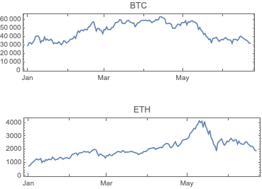
Remark: FinancialData is “aware” of 10 cryptocurrencies, but that is not documented (as far as I can tell) and only prices are provided. (For more details see the discussion in CrypocurrencyData.) Here are examples:

Row[DateListPlot[FinancialData[#, "Jan 1 2021"], ImageSize -> Medium, AspectRatio -> 1/4, PlotLabel -> #] & /@ {"BTC", "ETH"}]
02bue86eonuo0

Significant cryptocurrencies

In this section we analyze the summaries of cryptocurrencies data in order to derive a list of the most significant ones.

We choose the phrase “significant cryptocurrency” to mean “a cryptocurrency with high market capitalization, price, or trading volume.”

Together with the summaries we look into the Pareto principle adherence of the corresponding values.

Remark: The Pareto principle adherence should be interpreted carefully here – the cryptocurrencies are not mutually exclusive when in comes to money invested and trading volumes. Nevertheless, we can interpret the corresponding value ratios as indicators of “mind share” or “significance.”

By summaries

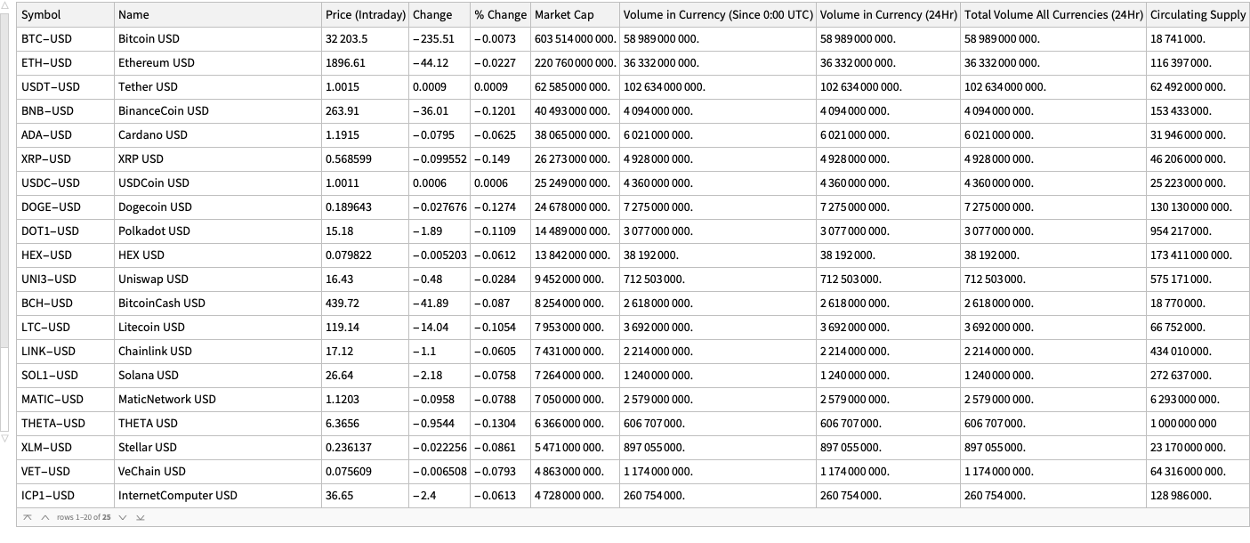
Here is a summary of the cryptocurrencies we consider (from Yahoo Finance) ordered by “Market Cap” (largest first):

dsCCSummary = ResourceFunction["CryptocurrencyData"][All, "Summary"]
0u3re74xw7086

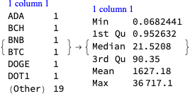
Here is the summary of summary dataset above:

ResourceFunction["RecordsSummary"][dsCCSummary]
14gue3qibxrf7

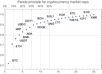
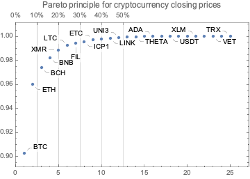
Here is a Pareto principle adherence plot for the cryptocurrency market caps:

aMCaps = Normal[dsCCSummary[Association, StringSplit[#Symbol, "-"][[1]] -> #["Market Cap"] &]]; ResourceFunction["ParetoPrinciplePlot"][aMCaps, PlotRange -> All, PlotLabel -> "Pareto principle for cryptocurrency market caps"]
0xgj73uot9hb1

Here is the Pareto statistic for the top 12 cryptocurrencies:

Take[AssociationThread[Keys@aMCaps, Accumulate[Values@aMCaps]]/Total[aMCaps], 12]  (*<|"BTC" -> 0.521221, "ETH" -> 0.71188, "USDT" -> 0.765931, "BNB" -> 0.800902, "ADA" -> 0.833777, "XRP" -> 0.856467, "USDC" -> 0.878274, "DOGE" -> 0.899587, "DOT1" -> 0.9121, "HEX" -> 0.924055, "UNI3" -> 0.932218, "BCH" -> 0.939346|>*)

By price

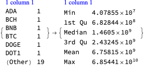
Get the mean daily closing prices data for the last two weeks and show the corresponding data summary:

startDate = DatePlus[Now, -Quantity[2, "Weeks"]]; aMeans = ReverseSort[Association[# -> Mean[ResourceFunction["CryptocurrencyData"][#, "Close", startDate]["Values"]] & /@ ResourceFunction["CryptocurrencyData"]["Cryptocurrencies"]]]; ResourceFunction["RecordsSummary"][aMeans, Thread -> True]
1rpeb683tls42

Pareto principle adherence plot:

ResourceFunction["ParetoPrinciplePlot"][aMeans, PlotRange -> All, PlotLabel -> "Pareto principle for cryptocurrency closing prices"]
1a9fsea677xld

Here are the Pareto statistic values for the top 12 cryptocurrencies:

aCCTop = Take[AssociationThread[Keys@aMeans, Accumulate[Values@aMeans]]/Total[aMeans], 12]  (*<|"BTC" -> 0.902595, "ETH" -> 0.959915, "BCH" -> 0.974031, "BNB" -> 0.982414, "XMR" -> 0.988689, "LTC" -> 0.992604, "FIL" -> 0.99426, "ICP1" -> 0.995683, "ETC" -> 0.997004, "SOL1" -> 0.997906, "LINK" -> 0.998449, "UNI3" -> 0.998987|>*)

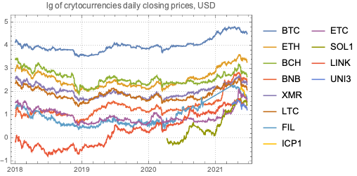
Plot the daily closing prices of top cryptocurrencies since January 2018:

DateListPlot[Log10 /@ Association[# -> ResourceFunction["CryptocurrencyData"][#, "Close", "Jan 1, 2018"] & /@ Keys[aCCTop]], PlotLabel -> "lg of crytocurrencies daily closing prices, USD", PlotTheme -> "Detailed", PlotRange -> All]
19tfy1oj2yrs7

By trading volume

Get the mean daily trading volumes data for the last two weeks and show the corresponding data summary:

startDate = DatePlus[Now, -Quantity[2, "Weeks"]]; aMeans = ReverseSort[Association[# -> Mean[ResourceFunction["CryptocurrencyData"][#, "Volume", startDate]["Values"]] & /@ ResourceFunction["CryptocurrencyData"]["Cryptocurrencies"]]]; ResourceFunction["RecordsSummary"][aMeans, Thread -> True]
1lnrdt94mofry

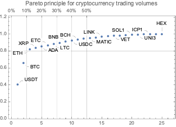
Pareto principle adherence plot:

ResourceFunction["ParetoPrinciplePlot"][aMeans, PlotRange -> {0, 1.1},PlotRange -> All, PlotLabel -> "Pareto principle for cryptocurrency trading volumes"]
0nvcws0qh5hum

Here are the Pareto statistic values for the top 12 cryptocurrencies:

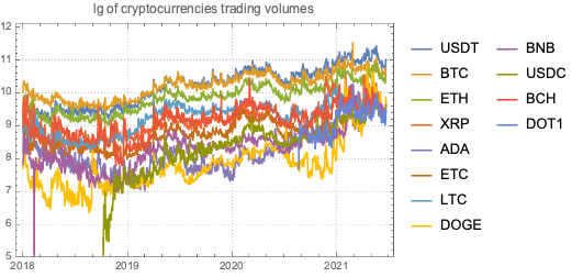
aCCTop = N@Take[AssociationThread[Keys@aMeans, Accumulate[Values@aMeans]]/Total[aMeans], 12]  (*<|"USDT" -> 0.405697, "BTC" -> 0.657918, "ETH" -> 0.817959, "XRP" -> 0.836729, "ADA" -> 0.853317, "ETC" -> 0.868084, "LTC" -> 0.882358, "DOGE" -> 0.896621, "BNB" -> 0.910013, "USDC" -> 0.923379, "BCH" -> 0.933938, "DOT1" -> 0.944249|>*)

Plot the daily closing prices of top cryptocurrencies since January 2018:

DateListPlot[Log10 /@ Association[# -> ResourceFunction["CryptocurrencyData"][#, "Volume", "Jan 1, 2018"] & /@ Keys[aCCTop]], PlotLabel -> "lg of cryptocurrencies trading volumes", PlotTheme -> "Detailed", PlotRange -> {5, Automatic}]
1tns5zrq560q7

In this section we make a dataset that has the dates of certain cryptocurrency related events and links to their news announcements.

The events were taken by observing cryptocurrency board stories in the news aggregation site slashdot.org.

lsEventData = {  {"Jun 18, 2021", "China to shut down over 90% of its Bitcoin mining capacity after local bans", "https://www.globaltimes.cn/page/202106/1226598.shtml"},   {"Jun 10, 2021", "Global banking regulators call for toughest rules for cryptocurrencies", "https://www.theguardian.com/technology/2021/jun/10/global-banking-regulators-cryptocurrencies-bitcoin"},   {"June 10, 2021", "IMF sees legal, economic issues with El Salvador's bitcoin move","https://www.reuters.com/business/finance/imf-sees-legal-economic-issues-with-el-salvador-bitcoin-move-2021-06-10/"},   {"June 8, 2021", "El Salvador Becomes First Country To Adopt Bitcoin as Legal Tender After Passing Law", "https://www.cnbc.com/2021/06/09/el-salvador-proposes-law-to-make-bitcoin-legal-tender.html"},   {"June 8, 2021", "US recovers millions in cryptocurrency paid to Colonial Pipeline ransomware hackers", "https://edition.cnn.com/2021/06/07/politics/colonial-pipeline-ransomware-recovered/"},   {"June 4, 2021", "Start of Bitcoin 2021: World\[CloseCurlyQuote]s Largest Cryptocurrency Conference Coming To Wynwood", "https://miami.cbslocal.com/2021/06/04/bitcoin-2021-worlds-largest-cryptocurrency-conference-coming-to-wynwood/"},   {"June 6, 2021", "End of Bitcoin 2021: World\[CloseCurlyQuote]s Largest Cryptocurrency Conference Coming To Wynwood", "https://miami.cbslocal.com/2021/06/04/bitcoin-2021-worlds-largest-cryptocurrency-conference-coming-to-wynwood/"},   {"May 28, 2021", "Iran Bans Crypto Mining After Months of Blackouts", "https://gizmodo.com/iran-bans-crypto-mining-after-months-of-blackouts-1846991039"},   {"May 19, 2021", "Bitcoin, Ethereum prices in free fall as China plans crackdown on mining and trading", "https://www.cnet.com/news/bitcoin-ethereum-prices-in-freefall-as-china-plans-crackdown-on-mining-and-trading/#ftag=CAD590a51e"}   }; dsEventData = Dataset[lsEventData][All, AssociationThread[{"Date", "Event", "URL"}, #] &]; dsEventData = dsEventData[All, Join[Prepend[#, "DateObject" -> DateObject[#Date]], <|"URL" -> URL[#URL]|>] &]; dsEventData = dsEventData[SortBy[#DateObject &]]
1qjdxqriy9jbj

Cryptocurrency time series with events

In this section we discuss possible correlation and causation effects of reported cryptocurrency events.

Remark: The discussion is based on time series and events only, without considering other operational properties of the cryptocurrencies.

Here is a date range:

dateRange = {"May 15 2021", "Jun 21 2021"};

Here get time series for the daily opening and closing prices for the selected date range:

aBTCPrices = ResourceFunction["CryptocurrencyData"]["BTC", {"Open", "Close"}, dateRange]; aETHPrices = ResourceFunction["CryptocurrencyData"]["ETH", {"Open", "Close"}, dateRange]; aCCVolume = ResourceFunction["CryptocurrencyData"][{"BTC", "ETH"}, "Volume", dateRange];

Here are the summaries for prices:

ResourceFunction["GridTableForm"][Map[ResourceFunction["RecordsSummary"][#["Values"], "USD"] &, #] & /@ <|"BTC" -> aBTCPrices, "ETH" -> aETHPrices|>]
0klkuvia1jexo

Here are the summaries for trading volumes:

ResourceFunction["RecordsSummary"][#["Values"], "USD"] & /@ aCCVolume
10xmepjcwrxdn

Here we plot the cryptocurrency events with together with the Bitcoin (BTC) price time series:

CryptocurrencyPlot[{aBTCPrices, dsEventData}, PlotLabel -> "BTC daily prices", ImageSize -> 1200]
0gnba7mxklpo0

Here we plot the cryptocurrency events with together with the Ether (ETH) price time series:

CryptocurrencyPlot[{aETHPrices, dsEventData}, PlotRange -> {0.95, 1.05} MinMax[aETHPrices[[1]]["Values"]], PlotLabel -> "BTC daily prices", ImageSize -> 1200]
0dfaqwvvggjcf

Here we plot the cryptocurrency events with together with the BTC trading volume time series:

CryptocurrencyPlot[{aCCVolume, dsEventData}, PlotLabel -> "BTC and ETH trading volumes", ImageSize -> 1200]
1ltpksb32ajim

Observations

Going down

We can see that opening prices and volume going down correlate with:

  1. The news announcement that China plans to crackdown on mining and trading
  2. The news announcement Iran bans crypto mining
  3. The Sichuan Provincial Development and Reform Commission and the Sichuan Energy Bureau issue of a joint notice, ordering local electricity companies to “screen, clean up and terminate” mining operations
  4. The start of the “Bitcoin 2021” conference

Related conjectures:

  • We can easily conjecture that 1 and 2 made cryptocurrencies (Bitcoin) less attractive to miners or traders in China and Iran, hence the price and the volume went down.
  • The most active Bitcoin traders were attending the “Bitcoin 2021” conference, hence the price and volume went down.

Going up

We can see the prices and volume going up correlate with:

  1. The news announcement of El Salvador adopting BTC as legal tender currency
  2. The news announcement that US Justice Department recovered most of the ransom paid to the Colonial Pipeline hackers
  3. The end of the “Bitcoin 2021” conference

Related conjectures:

  • Of course, a country deciding to use BTC as legal tender would make (some) traders willing to invest in BTC.
  • The announcement that USA Justice Department, have made (some) traders to more confidently invest in BTC.
    • Although, the opposite could also happen – for some people if BTC can be recovered by law enforcement, then BTC is less attractive for financial transactions.
  • After the end of “Bitcoin 2021” conference the attending traders resumed their usual activity.
    • That conjecture and the “start of Bitcoin 2021” conjecture above support each other.
    • The same pattern is observed for both BTC and ETH trading volumes.

Time series correlations

In this section we compute and visualize correlations between the time series of a set of cryptocurrencies.

Getting time series data

Here are the cryptocurrencies we consider:

lsCCFocus = ResourceFunction["CryptocurrencyData"]["Cryptocurrencies"]  (*{"ADA", "BCH", "BNB", "BTC", "DOGE", "DOT1", "EOS", "ETC", "ETH", "FIL", "HEX", "ICP1", "LINK", "LTC", "MATIC", "SOL1", "THETA", "TRX", "UNI3", "USDC", "USDT", "VET", "XLM", "XMR", "XRP"}*)

The start date we use is the one that was 90 days ago:

startDate = DatePlus[Date[], -Quantity[90, "Days"]]  (*{2021, 3, 24, 13, 24, 42.303}*)
aTSOpen = ResourceFunction["CryptocurrencyData"][lsCCFocus, "Open", startDate]; aTSVolume = ResourceFunction["CryptocurrencyData"][lsCCFocus, "Volume", startDate];
dateRange = {startDate, Date[]}; aTSOpen2 = Quiet@TimeSeriesResample[#, Append[dateRange, "Day"]] & /@ aTSOpen; aTSVolume2 = Quiet@TimeSeriesResample[#, Append[dateRange, "Day"]] & /@ aTSVolume;

Opening price time series

Show heat-map plot corresponding to the max-normalized time series with clustering:

matVals = Association["SparseMatrix" -> SparseArray[Values@Map[#["Values"]/Max[#["Values"]] &, aTSOpen2]],"RowNames" -> Keys[aTSOpen2], "ColumnNames" -> Range[Length[aTSOpen2[[1]]["Times"]]]]; HeatmapPlot[Map[# /. x_Association :> Keys[x] &, matVals], Dendrogram -> {True, False}, DistanceFunction -> {CosineDistance, None}, ImageSize -> 1200]
1uktoasdy8urt

Derive correlation triplets using SpearmanRho :

lsCorTriplets = Flatten[Outer[{#1, #2, SpearmanRho[aTSOpen2[#1]["Values"], aTSOpen2[#2]["Values"]]} &, Keys@aTSOpen2, Keys@aTSOpen2], 1]; dsCorTriplets = Dataset[lsCorTriplets][All, AssociationThread[{"TS1", "TS2", "Correlation"}, #] &]; dsCorTriplets = dsCorTriplets[Select[#TS1 != #TS2 &]];

Show summary of the correlation triplets:

ResourceFunction["RecordsSummary"][dsCorTriplets]
0zhrnqlozgni6

Show correlations that too high or too low:

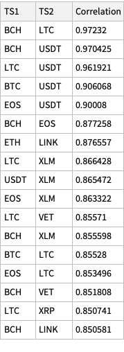
Dataset[Union[Normal@dsCorTriplets[Select[Abs[#Correlation] > 0.85 &]], "SameTest" -> (Sort[Values@#1] == Sort[Values@#2] &)]][ReverseSortBy[#Correlation &]]
1g8hz1lewgpx7

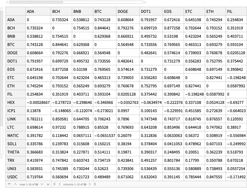
Cross tabulate the correlation triplets and show the corresponding dataset:

dsMatCor = ResourceFunction["CrossTabulate"][dsCorTriplets]
12idrdt53tzmc

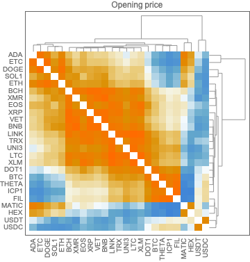
Cross tabulate the correlation triplets and plot the corresponding matrix with heat-map plot:

matCor1 = ResourceFunction["CrossTabulate"][dsCorTriplets, "Sparse" -> True]; gr1 = HeatmapPlot[matCor1, Dendrogram -> {True, True}, DistanceFunction -> {CosineDistance, CosineDistance}, ImageSize -> Medium, PlotLabel -> "Opening price"]
0ufk6pcr1j3da

Trading volume time series

Show heat-map plot corresponding to the max-normalized time series with clustering:

matVals = Association["SparseMatrix" -> SparseArray[Values@Map[#["Values"]/Max[#["Values"]] &, aTSVolume2]], "RowNames" -> Keys[aTSOpen2], "ColumnNames" -> Range[Length[aTSVolume2[[1]]["Times"]]]]; HeatmapPlot[Map[# /. x_Association :> Keys[x] &, matVals], Dendrogram -> {True, False}, DistanceFunction -> {CosineDistance, None}, ImageSize -> 1200]
1ktjec1jdlsrg

Derive correlation triplets using SpearmanRho :

lsCorTriplets = Flatten[Outer[{#1, #2, SpearmanRho[aTSVolume2[#1]["Values"], aTSVolume2[#2]["Values"]]} &, Keys@aTSVolume2, Keys@aTSVolume2], 1]; dsCorTriplets = Dataset[lsCorTriplets][All, AssociationThread[{"TS1", "TS2", "Correlation"}, #] &]; dsCorTriplets = dsCorTriplets[Select[#TS1 != #TS2 &]];

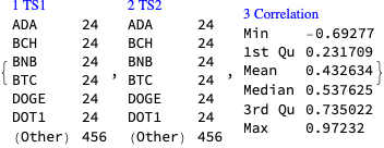
Show summary of the correlation triplets:

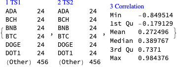
ResourceFunction["RecordsSummary"][dsCorTriplets]
0un433xvnvbm4

Show correlations that too high or too low:

Dataset[Union[Normal@dsCorTriplets[Select[Abs[#Correlation] > 0.85 &]], "SameTest" -> (Sort[Values@#1] == Sort[Values@#2] &)]][ReverseSortBy[#Correlation &]]
191tqczjvp1gp

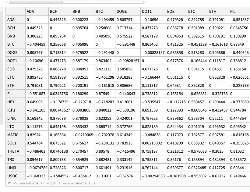
Cross tabulate the correlation triplets and show the corresponding dataset:

dsMatCor = ResourceFunction["CrossTabulate"][dsCorTriplets]
1wmxdysnjdvj1

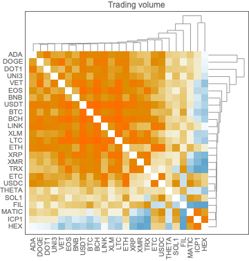
Cross tabulate the correlation triplets and plot the corresponding matrix with heat-map plot:

matCor2 = ResourceFunction["CrossTabulate"][dsCorTriplets, "Sparse" -> True]; gr2 = HeatmapPlot[matCor2, Dendrogram -> {True, True}, DistanceFunction -> {CosineDistance, CosineDistance}, ImageSize -> Medium, PlotLabel -> "Trading volume"]
1nywjggle91rq

Observations

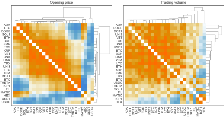
Here are the correlation matrix plots above placed next to each other:

Row[{gr1, gr2}]
1q472yp7r4c04

Generally speaking, the two clustering patterns are different. This is one of the reasons to do the nearest neighbor graph clusterings below.

Nearest neighbors graphs

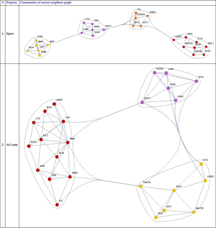
In this section we create nearest neighbor graphs of the correlation matrices computed above and plot clusterings of the nodes.

Graphs overview

Here we create the nearest neighbor graphs:

aNNGraphsVertexRules = Association@MapThread[#2 -> Association[Thread[Rule[Normal[Transpose[#SparseMatrix]], #ColumnNames]]] &, {{matCor1, matCor2}, {"Open", "Volume"}}];
aNNGraphs = Association@MapThread[(gr = NearestNeighborGraph[Normal[Transpose[#SparseMatrix]], 4, GraphLayout -> "SpringEmbedding", VertexLabels -> Normal[aNNGraphsVertexRules[#2]]]; #2 -> Graph[EdgeList[gr], VertexLabels -> Normal[aNNGraphsVertexRules[#2]], ImageSize -> Large]) &, {{matCor1, matCor2}, {"Open", "Volume"}}];

Here we plot the graphs with clusters:

ResourceFunction["GridTableForm"][List @@@ Normal[CommunityGraphPlot[#, ImageSize -> 800] & /@ aNNGraphs], TableHeadings -> {"Property", "Communities of nearest neighbors graph"}, Background -> White, Dividers -> All]
1fl5f7a50gkvu

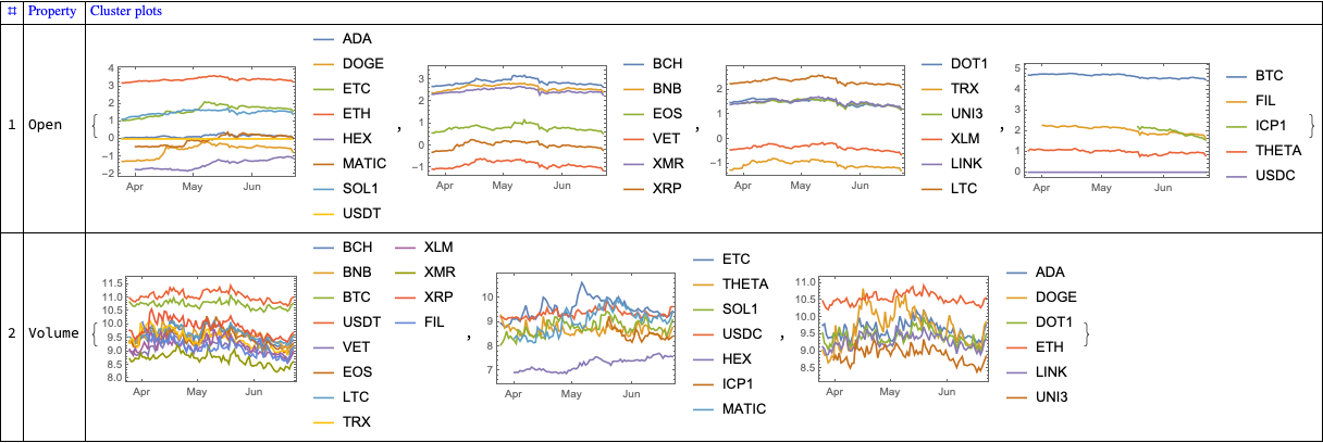
Here are the corresponding time series plots for each cluster:

aClusterPlots =   Association@Map[  Function[{prop},   prop -> Map[  DateListPlot[Log10 /@ ResourceFunction["CryptocurrencyData"][#, prop, dateRange]] &,   FindGraphCommunities[aNNGraphs[prop]] /. aNNGraphsVertexRules[prop]]   ],   Keys[aNNGraphs]   ];
ResourceFunction["GridTableForm"][List @@@ Normal[aClusterPlots], TableHeadings -> {"Property", "Cluster plots"}, Background -> White, Dividers -> All]
0j8tmvwyygijv

Other types of analysis

I investigated the data with several other methods:

  • Clustering with different methods and distance functions
  • Clustering after the application of Independent Component Analysis (ICA), [AAw5]
  • Time series analysis with Quantile Regression (QR), [AAw6]

None of the outcomes provided some “immediate”, notable insight. The analyses with ICA and QR, though, seem to provide some interesting and fruitful future explorations.

Load packages

Import["https://raw.githubusercontent.com/antononcube/MathematicaForPrediction/master/SSparseMatrix.m"] Import["https://raw.githubusercontent.com/antononcube/MathematicaForPrediction/master/Misc/HeatmapPlot.m"]

Definitions

Clear[CryptocurrencyPlot]; CryptocurrencyPlot[{aCryptoCurrenciesData_Association, dsEventData_Dataset}, opts : OptionsPattern[]] :=   Block[{aEventDateObject, aEventURL, aEventRank, grGrid, lsVals},     aEventDateObject = Normal@dsEventData[Association, {#Event -> AbsoluteTime[#DateObject]} &];   aEventURL = Normal@dsEventData[Association, {#Event -> Button[Mouseover[Style[#Event, Gray, FontSize -> 10], Style[#Event, Pink, FontSize -> 10]], NotebookLocate[{#URL, None}], Appearance -> None]} &]; aEventRank = Block[{k = 1}, Normal@dsEventData[Association, {#Event -> (k++)/Length[dsEventData]} &]];     lsVals = Flatten@Map[#["Values"] &, Values@aCryptoCurrenciesData];  grGrid =   DateListPlot[  KeyValueMap[Callout[{#2, Rescale[aEventRank[#1], {0, 1}, MinMax[lsVals]]}, aEventURL[#1], Right] &, Sort@aEventDateObject],   PlotStyle -> {Gray, Opacity[0.3], PointSize[0.0035]},   Joined -> False,   GridLines -> {Sort@Values[aEventDateObject], None}   ];   Show[  DateListPlot[  aCryptoCurrenciesData,   opts,   GridLines -> {Sort@Values[aEventDateObject], None},   PlotRange -> All,   AspectRatio -> 1/4,   ImageSize -> Large   ],   grGrid   ]   ]; CryptocurrencyPlot[___] := $Failed;

References

Articles

[AA1] Anton Antonov, “Crypto-currencies data acquisition with visualization”, (2021), MathematicaForPrediction at WordPress.

[AA2] Anton Antonov, “NY Times COVID-19 data visualization”, (2020), SystemModeling at GitHub.

[AA3] Anton Antonov, “Apple mobility trends data visualization”, (2020), SystemModeling at GitHub.

Packages

[AAp1] Anton Antonov, Data reshaping Mathematica package, (2018), MathematicaForPrediciton at GitHub.

[AAp2] Anton Antonov, Heatmap plot Mathematica package, (2018), MathematicaForPrediciton at GitHub.

Resource functions

[AAw1] Anton Antonov, CryptocurrencyData, (2021).

[AAw2] Anton Antonov, RecordsSummary, (2019).

[AAw3] Anton Antonov, ParetoPrinciplePlot, (2019).

[AAw4] Anton Antonov, CrossTabulate, (2019).

[AAw5] Anton Antonov, IndependentComponentAnalysis, (2019).

[AAw6] Anton Antonov, QuantileRegression, (2019).

Time series search engines over COVID-19 data

Introduction

In this article we proclaim the preparation and availability of interactive interfaces to two Time Series Search Engines (TSSEs) over COVID-19 data. One TSSE is based on Apple Mobility Trends data, [APPL1]; the other on The New York Times COVID-19 data, [NYT1].

Here are links to interactive interfaces of the TSSEs hosted (and publicly available) at shinyapps.io by RStudio:

Motivation: The primary motivation for making the TSSEs and their interactive interfaces is to use them as exploratory tools. Combined with relevant data analysis (e.g. [AA1, AA2]) the TSSEs should help to form better intuition and feel of the spread of COVID-19 and related data aggregation, public reactions, and government polices.

The rest of the article is structured as follows:

  1. Brief descriptions the overall process, the data
  2. Brief descriptions the search engines structure and implementation
  3. Discussions of a few search examples and their (possible) interpretations

The overall process

For both search engines the overall process has the same steps:

  1. Ingest the data
  2. Do basic (and advanced) data analysis
  3. Make (and publish) reports detailing the data ingestion and transformation steps
  4. Enhance the data with transformed versions of it or with additional related data
  5. Make a Time Series Sparse Matrix Recommender (TSSMR)
  6. Make a Time Series Search Engine Interactive Interface (TSSEII)
  7. Make the interactive interface easily accessible over the World Wide Web

Here is a flow chart that corresponds to the steps listed above:

TSSMRFlowChart

Data

The Apple data

The Apple Mobility Trends data is taken from Apple’s site, see [APPL1]. The data ingestion, basic data analysis, time series seasonality demonstration, (graph) clusterings are given in [AA1]. (Here is a link to the corresponding R-notebook .)

The weather data was taken using the Mathematica function WeatherData, [WRI1].

(It was too much work to get the weather data using some of the well known weather data R packages.)

The New York Times data

The New York Times COVID-19 data is taken from GitHub, see [NYT1]. The data ingestion, basic data analysis, and visualizations are given in [AA2]. (Here is a link to the corresponding R-notebook .)

The search engines

The following sub-sections have screenshots of the TSSE interactive interfaces.

I did experiment with combining the data of the two engines, but did not turn out to be particularly useful. It seems that is more interesting and useful to enhance the Apple data engine with temperature data, and to enhance The New Your Times engine with the (consecutive) differences of the time series.

Structure

The interactive interfaces have three panels:

  • Nearest Neighbors
    • Gives the time series nearest neighbors for the time series of selected entity.
    • Has interactive controls for entity selection and filtering.
  • Trend Finding
    • Gives the time series that adhere to a specified named trend.
    • Has interactive controls for trend curves selection and entity filtering.
  • Notes
    • Gives references and data objects summary.

Implementation

Both TSSEs are implemented using the R packages “SparseMatrixRecommender”, [AAp1], and “SparseMatrixRecommenderInterfaces”, [AAp2].

The package “SparseMatrixRecommender” provides functions to create and use Sparse Matrix Recommender (SMR) objects. Both TSSEs use underlying SMR objects.

The package “SparseMatrixRecommenderInterfaces” provides functions to generate the server and client functions for the Shiny framework by RStudio.

As it was mentioned above, both TSSEs are published at shinyapps.io. The corresponding source codes can be found in [AAr1].

The Apple data TSSE has four types of time series (“entities”). The first three are normalized volumes of Apple maps requests while driving, transit transport use, and walking. (See [AA1] for more details.) The fourth is daily mean temperature at different geo-locations.

Here are screenshots of the panels “Nearest Neighbors” and “Trend Finding” (at interface launch):

AppleTSSENNs

AppleTSSETrends

The New York Times COVID-19 Data Search Engine

The New York Times TSSE has four types of time series (aggregated) cases and deaths, and their corresponding time series differences.

Here are screenshots of the panels “Nearest Neighbors” and “Trend Finding” (at interface launch):

NYTTSSENNs

NYTTSSETrends

Examples

In this section we discuss in some detail several examples of using each of the TSSEs.

Apple data search engine examples

Here are a few observations from [AA1]:

  • The COVID-19 lockdowns are clearly reflected in the time series.
  • The time series from the Apple Mobility Trends data shows strong weekly seasonality. Roughly speaking, people go to places they are not familiar with on Fridays and Saturdays. Other work week days people are more familiar with their trips. Since much lesser number of requests are made on Sundays, we can conjecture that many people stay at home or visit very familiar locations.

Here are a few assumptions:

  • Where people frequently go (work, school, groceries shopping, etc.) they do not need directions that much.
  • People request directions when they have more free time and will for “leisure trips.”
  • During vacations people are more likely to be in places they are less familiar with.
  • People are more likely to take leisure trips when the weather is good. (Warm, not raining, etc.)

Nice, France vs Florida, USA

Consider the results of the Nearest Neighbors panel for Nice, France.

Since French tend to go on vacation in July and August ([SS1, INSEE1]) we can see that driving, transit, and walking in Nice have pronounced peaks during that time:

Of course, we also observe the lockdown period in that geographical area.

Compare those time series with the time series from driving in Florida, USA:

We can see that people in Florida, USA have driving patterns unrelated to the typical weather seasons and vacation periods.

(Further TSSE queries show that there is a negative correlation with the temperature in south Florida and the volumes of Apple Maps directions requests.)

Italy and Balkan countries driving

We can see that according to the data people who have access to both iPhones and cars in Italy and the Balkan countries Bulgaria, Greece, and Romania have similar directions requests patterns:

(The similarities can be explained with at least a few “obvious” facts, but we are going to restrain ourselves.)

The New York Times data search engine examples

In Broward county, Florida, USA and Cook county, Illinois, USA we can see two waves of infections in the difference time series:

References

Data

[APPL1] Apple Inc., Mobility Trends Reports, (2020), apple.com.

[NYT1] The New York Times, Coronavirus (Covid-19) Data in the United States, (2020), GitHub.

[WRI1] Wolfram Research (2008), WeatherData, Wolfram Language function.
Articles

[AA1] Anton Antonov, “Apple mobility trends data visualization (for COVID-19)”, (2020), SystemModeling at GitHub/antononcube.
[AA2] Anton Antonov, “NY Times COVID-19 data visualization”, (2020), SystemModeling at GitHub/antononcube.

[INSEE1] Institut national de la statistique et des études économiques, “En 2010, les salariés ont pris en moyenne six semaines de congé”, (2012).

[SS1] Sam Schechner and Lee Harris, “What Happens When All of France Takes Vacation? 438 Miles of Traffic”, (2019), The Wall Street Journal

Packages, repositories

[AAp1] Anton Antonov, Sparse Matrix Recommender framework functions, (2019), R-packages at GitHub/antononcube.

[AAp2] Anton Antonov, Sparse Matrix Recommender framework interface functions, (2019), R-packages at GitHub/antononcube.

[AAr1] Anton Antonov, Coronavirus propagation dynamics, (2020), SystemModeling at GitHub/antononcube.

NY Times COVID-19 data visualization (Update)

Introduction

This post is both an update and a full-blown version of an older post — “NY Times COVID-19 data visualization” — using NY Times COVID-19 data up to 2021-01-13.

The purpose of this document/notebook is to give data locations, data ingestion code, and code for rudimentary analysis and visualization of COVID-19 data provided by New York Times, [NYT1].

The following steps are taken:

  • Ingest data
    • Take COVID-19 data from The New York Times, based on reports from state and local health agencies, [NYT1].
    • Take USA counties records data (FIPS codes, geo-coordinates, populations), [WRI1].
  • Merge the data.
  • Make data summaries and related plots.
  • Make corresponding geo-plots.
  • Do “out of the box” time series forecast.
  • Analyze fluctuations around time series trends.

Note that other, older repositories with COVID-19 data exist, like, [JH1, VK1].

Remark: The time series section is done for illustration purposes only. The forecasts there should not be taken seriously.

Import data

NYTimes USA states data

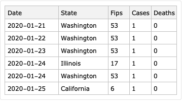
dsNYDataStates = ResourceFunction["ImportCSVToDataset"]["https://raw.githubusercontent.com/nytimes/covid-19-data/master/us-states.csv"]; dsNYDataStates = dsNYDataStates[All, AssociationThread[Capitalize /@ Keys[#], Values[#]] &]; dsNYDataStates[[1 ;; 6]]
18qzu6j67rb6y
ResourceFunction["RecordsSummary"][dsNYDataStates]
0eh58fau8y8r1

NYTimes USA counties data

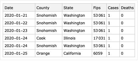
dsNYDataCounties = ResourceFunction["ImportCSVToDataset"]["https://raw.githubusercontent.com/nytimes/covid-19-data/master/us-counties.csv"]; dsNYDataCounties = dsNYDataCounties[All, AssociationThread[Capitalize /@ Keys[#], Values[#]] &]; dsNYDataCounties[[1 ;; 6]]
1cpd9bx9xi71h
ResourceFunction["RecordsSummary"][dsNYDataCounties]
1elzwfv0fe32k

US county records

dsUSACountyData = ResourceFunction["ImportCSVToDataset"]["https://raw.githubusercontent.com/antononcube/SystemModeling/master/Data/dfUSACountyRecords.csv"]; dsUSACountyData = dsUSACountyData[All, Join[#, <|"FIPS" -> ToExpression[#FIPS]|>] &]; dsUSACountyData[[1 ;; 6]]
0ycsuwd577vov
ResourceFunction["RecordsSummary"][dsUSACountyData]
0tqfkpq6gxui9

Merge data

Verify that the two datasets have common FIPS codes:

Length[Intersection[Normal[dsUSACountyData[All, "FIPS"]], Normal[dsNYDataCounties[All, "Fips"]]]]  (*3133*)

Merge the datasets:

dsNYDataCountiesExtended = Dataset[JoinAcross[Normal[dsNYDataCounties], Normal[dsUSACountyData[All, {"FIPS", "Lat", "Lon", "Population"}]], Key["Fips"] -> Key["FIPS"]]];

Add a “DateObject” column and (reverse) sort by date:

dsNYDataCountiesExtended = dsNYDataCountiesExtended[All, Join[<|"DateObject" -> DateObject[#Date]|>, #] &]; dsNYDataCountiesExtended = dsNYDataCountiesExtended[ReverseSortBy[#DateObject &]]; dsNYDataCountiesExtended[[1 ;; 6]]
09o5nw7dv2wba

Basic data analysis

We consider cases and deaths for the last date only. (The queries can be easily adjusted for other dates.)

dfQuery = dsNYDataCountiesExtended[Select[#Date == dsNYDataCountiesExtended[1, "Date"] &], {"FIPS", "Cases", "Deaths"}]; dfQuery = dfQuery[All, Prepend[#, "FIPS" -> ToString[#FIPS]] &];
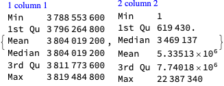
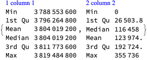
Total[dfQuery[All, {"Cases", "Deaths"}]]  (*<|"Cases" -> 22387340, "Deaths" -> 355736|>*)

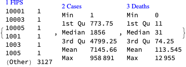
Here is the summary of the values of cases and deaths across the different USA counties:

ResourceFunction["RecordsSummary"][dfQuery]
1kdnmrlhe4srx

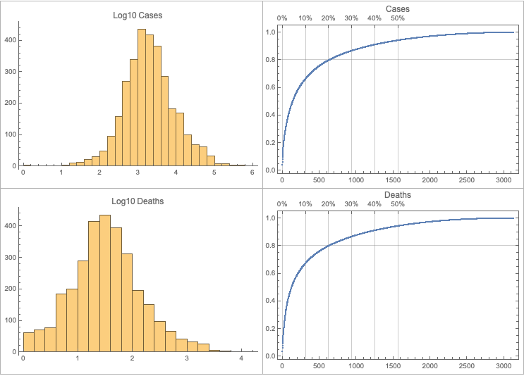
The following table of plots shows the distributions of cases and deaths and the corresponding Pareto principle adherence plots:

opts = {PlotRange -> All, ImageSize -> Medium}; Rasterize[Grid[  Function[{columnName},   {Histogram[Log10[#], PlotLabel -> Row[{Log10, Spacer[3], columnName}], opts], ResourceFunction["ParetoPrinciplePlot"][#, PlotLabel -> columnName, opts]} &@Normal[dfQuery[All, columnName]]   ] /@ {"Cases", "Deaths"},   Dividers -> All, FrameStyle -> GrayLevel[0.7]]]
13l8k7qfbkr3q

A couple of observations:

  • The logarithms of the cases and deaths have nearly Normal or Logistic distributions.
  • Typical manifestation of the Pareto principle: 80% of the cases and deaths are registered in 20% of the counties.

Remark: The top 20% counties of the cases are not necessarily the same as the top 20% counties of the deaths.

Distributions

Here we find the distributions that correspond to the cases and deaths (using FindDistribution ):

ResourceFunction["GridTableForm"][List @@@ Map[Function[{columnName},   columnName -> FindDistribution[N@Log10[Select[#, # > 0 &]]] &@Normal[dfQuery[All, columnName]]   ], {"Cases", "Deaths"}], TableHeadings -> {"Data", "Distribution"}]
10hkfowjmj6oh

Pareto principle locations

The following query finds the intersection between that for the top 600 Pareto principle locations for the cases and deaths:

Length[Intersection @@ Map[Function[{columnName}, Keys[TakeLargest[Normal@dfQuery[Association, #FIPS -> #[columnName] &], 600]]], {"Cases", "Deaths"}]]  (*516*)

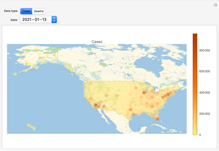
Geo-histogram

lsAllDates = Union[Normal[dsNYDataCountiesExtended[All, "Date"]]]; lsAllDates // Length  (*359*)
Manipulate[  DynamicModule[{ds = dsNYDataCountiesExtended[Select[#Date == datePick &]]},   GeoHistogram[  Normal[ds[All, {"Lat", "Lon"}][All, Values]] -> N[Normal[ds[All, columnName]]],   Quantity[150, "Miles"], PlotLabel -> columnName, PlotLegends -> Automatic, ImageSize -> Large, GeoProjection -> "Equirectangular"]   ],   {{columnName, "Cases", "Data type:"}, {"Cases", "Deaths"}},   {{datePick, Last[lsAllDates], "Date:"}, lsAllDates}]
1egny238t830i

Heat-map plots

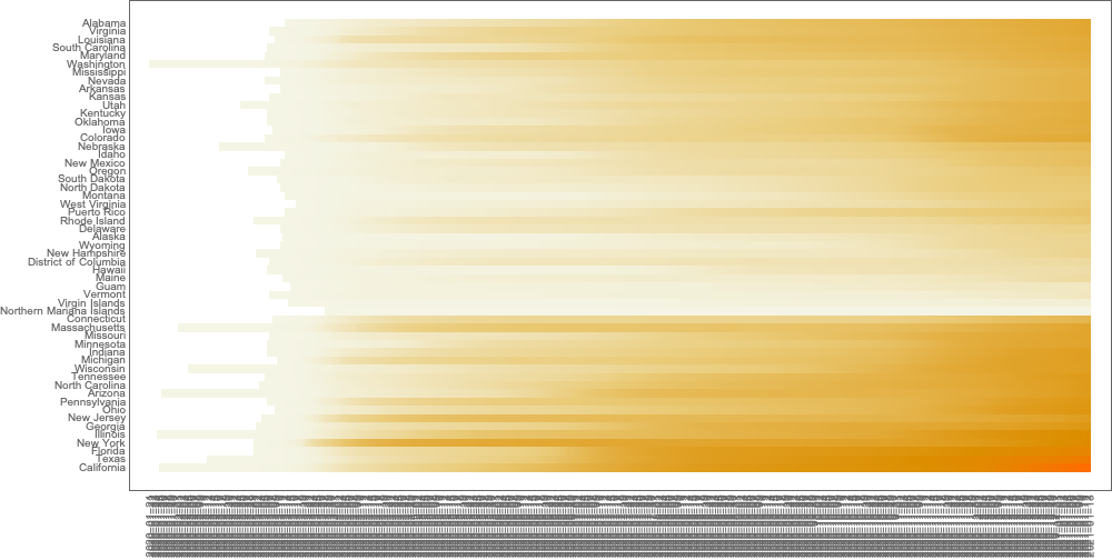
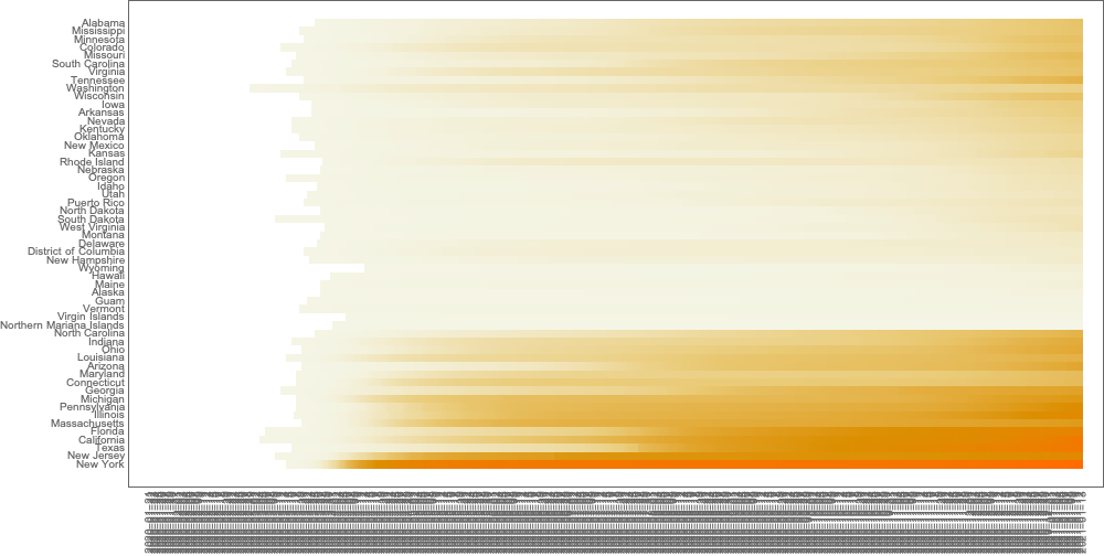
An alternative of the geo-visualization is to use a heat-map plot. Here we use the package “HeatmapPlot.m”, [AAp1].

Import["https://raw.githubusercontent.com/antononcube/MathematicaForPrediction/master/Misc/HeatmapPlot.m"]

Cases

Cross-tabulate states with dates over cases:

matSDC = ResourceFunction["CrossTabulate"][dsNYDataStates[All, {"State", "Date", "Cases"}], "Sparse" -> True];

Make a heat-map plot by sorting the columns of the cross-tabulation matrix (that correspond to states):

HeatmapPlot[matSDC, DistanceFunction -> {EuclideanDistance, None}, AspectRatio -> 1/2, ImageSize -> 1000]
1lmgbj4mq4wx9

Deaths

Cross-tabulate states with dates over deaths and plot:

matSDD = ResourceFunction["CrossTabulate"][dsNYDataStates[All, {"State", "Date", "Deaths"}], "Sparse" -> True]; HeatmapPlot[matSDD, DistanceFunction -> {EuclideanDistance, None}, AspectRatio -> 1/2, ImageSize -> 1000]
0g2oziu9g4a8d

Time series analysis

Cases

Time series

For each date sum all cases over the states, make a time series, and plot it:

tsCases = TimeSeries@(List @@@ Normal[GroupBy[Normal[dsNYDataCountiesExtended], #DateObject &, Total[#Cases & /@ #] &]]); opts = {PlotTheme -> "Detailed", PlotRange -> All, AspectRatio -> 1/4,ImageSize -> Large}; DateListPlot[tsCases, PlotLabel -> "Cases", opts]
1i9aypjaqxdm0
ResourceFunction["RecordsSummary"][tsCases["Path"]]
1t61q3iuq40zn

Logarithmic plot:

DateListPlot[Log10[tsCases], PlotLabel -> Row[{Log10, Spacer[3], "Cases"}], opts]
0r01nxd19xj1x

“Forecast”

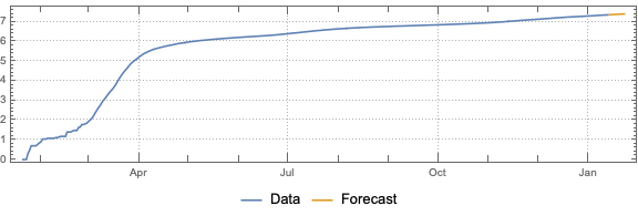
Fit a time series model to log 10 of the time series:

tsm = TimeSeriesModelFit[Log10[tsCases]]
1gz0j2673707m

Plot log 10 data and forecast:

DateListPlot[{tsm["TemporalData"], TimeSeriesForecast[tsm, {10}]}, opts, PlotLegends -> {"Data", "Forecast"}]
10vx2ydgcpq0c

Plot data and forecast:

DateListPlot[{tsCases, 10^TimeSeriesForecast[tsm, {10}]}, opts, PlotLegends -> {"Data", "Forecast"}]
04qu24g27fzi6

Deaths

Time series

For each date sum all cases over the states, make a time series, and plot it:

tsDeaths = TimeSeries@(List @@@ Normal[GroupBy[Normal[dsNYDataCountiesExtended], #DateObject &, Total[#Deaths & /@ #] &]]); opts = {PlotTheme -> "Detailed", PlotRange -> All, AspectRatio -> 1/4,ImageSize -> Large}; DateListPlot[tsDeaths, PlotLabel -> "Deaths", opts]
1uc6wpre2zxl3
ResourceFunction["RecordsSummary"][tsDeaths["Path"]]
1olawss0k1gvd

“Forecast”

Fit a time series model:

tsm = TimeSeriesModelFit[tsDeaths, "ARMA"]
0e5p4c2hxhahd

Plot data and forecast:

DateListPlot[{tsm["TemporalData"], TimeSeriesForecast[tsm, {10}]}, opts, PlotLegends -> {"Data", "Forecast"}]
06uurgguaxyg9

Fluctuations

We want to see does the time series data have fluctuations around its trends and estimate the distributions of those fluctuations. (Knowing those distributions some further studies can be done.)

This can be efficiently using the software monad QRMon, [AAp2, AA1]. Here we load the QRMon package:

Import["https://raw.githubusercontent.com/antononcube/MathematicaForPrediction/master/MonadicProgramming/MonadicQuantileRegression.m"]

Fluctuations presence

Here we plot the consecutive differences of the cases:

DateListPlot[Differences[tsCases], ImageSize -> Large, AspectRatio -> 1/4, PlotRange -> All]
1typufai7chn8

Here we plot the consecutive differences of the deaths:

DateListPlot[Differences[tsDeaths], ImageSize -> Large, AspectRatio -> 1/4, PlotRange -> All]
0wqagqqfj3p7l

From the plots we see that time series are not monotonically increasing, and there are non-trivial fluctuations in the data.

Absolute and relative errors distributions

Here we take interesting part of the cases data:

tsData = TimeSeriesWindow[tsCases, {{2020, 5, 1}, {2020, 12, 31}}];

Here we specify QRMon workflow that rescales the data, fits a B-spline curve to get the trend, and finds the absolute and relative errors (residuals, fluctuations) around that trend:

qrObj =   QRMonUnit[tsData]⟹  QRMonEchoDataSummary⟹  QRMonRescale[Axes -> {False, True}]⟹  QRMonEchoDataSummary⟹  QRMonQuantileRegression[16, 0.5]⟹  QRMonSetRegressionFunctionsPlotOptions[{PlotStyle -> Red}]⟹  QRMonDateListPlot[AspectRatio -> 1/4, ImageSize -> Large]⟹  QRMonErrorPlots["RelativeErrors" -> False, AspectRatio -> 1/4, ImageSize -> Large, DateListPlot -> True]⟹  QRMonErrorPlots["RelativeErrors" -> True, AspectRatio -> 1/4, ImageSize -> Large, DateListPlot -> True];
0mcebeqra4iqj
0lz7fflyitth2
0ke1wkttei4a3
0smqxx82ytyjq
1ct1s3qemddsi

Here we find the distribution of the absolute errors (fluctuations) using FindDistribution:

lsNoise = (qrObj⟹QRMonErrors["RelativeErrors" -> False]⟹QRMonTakeValue)[0.5]; FindDistribution[lsNoise[[All, 2]]]  (*CauchyDistribution[6.0799*10^-6, 0.000331709]*)

Absolute errors distributions for the last 90 days:

lsNoise = (qrObj⟹QRMonErrors["RelativeErrors" -> False]⟹QRMonTakeValue)[0.5]; FindDistribution[lsNoise[[-90 ;; -1, 2]]]  (*ExtremeValueDistribution[-0.000996315, 0.00207593]*)

Here we find the distribution of the of the relative errors:

lsNoise = (qrObj⟹QRMonErrors["RelativeErrors" -> True]⟹QRMonTakeValue)[0.5]; FindDistribution[lsNoise[[All, 2]]]  (*StudentTDistribution[0.0000511326, 0.00244023, 1.59364]*)

Relative errors distributions for the last 90 days:

lsNoise = (qrObj⟹QRMonErrors["RelativeErrors" -> True]⟹QRMonTakeValue)[0.5]; FindDistribution[lsNoise[[-90 ;; -1, 2]]]  (*NormalDistribution[9.66949*10^-6, 0.00394395]*)

References

[NYT1] The New York Times, Coronavirus (Covid-19) Data in the United States, (2020), GitHub.

[WRI1] Wolfram Research Inc., USA county records, (2020), System Modeling at GitHub.

[JH1] CSSE at Johns Hopkins University, COVID-19, (2020), GitHub.

[VK1] Vitaliy Kaurov, Resources For Novel Coronavirus COVID-19, (2020), community.wolfram.com.

[AA1] Anton Antonov, “A monad for Quantile Regression workflows”, (2018), at MathematicaForPrediction WordPress.

[AAp1] Anton Antonov, Heatmap plot Mathematica package, (2018), MathematicaForPrediciton at GitHub.

[AAp2] Anton Antonov, Monadic Quantile Regression Mathematica package, (2018), MathematicaForPrediciton at GitHub.