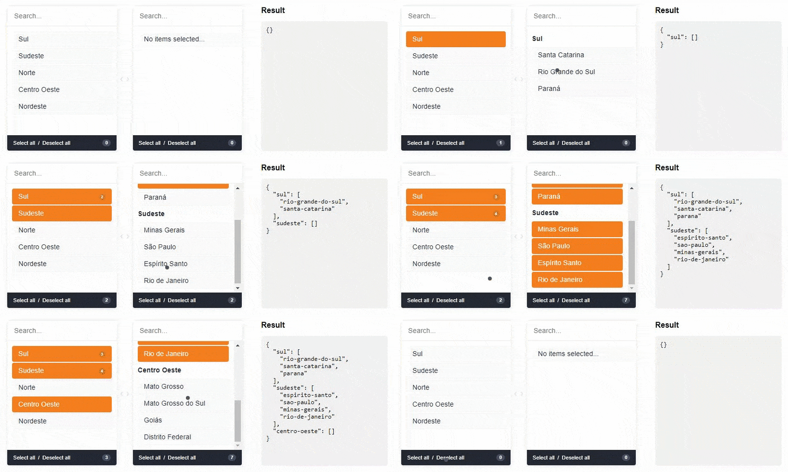
A component for Vue.js to select double-sided data. The customer can select one or more items and ship them from side to side. Values can be displayed grouped or ungrouped.
First install it using:
npm install --save vue-select-sidesor
yarn add vue-select-sidesThen you can either use it as a component:
import vueSelectSides from "vue-select-sides"; export default { components: { vueSelectSides } };Global component:
import vueSelectSides from "vue-select-sides"; Vue.use(VueSelectSides); Vue.component("vue-select-sides", VueSelectSides);Or if you wish to include it in a script tag, just include the vueSelectSides.umd.min.js file located in the dist folder as so:
<script src="dist/vueSelectSides.umd.min.js"></script>The component has support for two types: mirror and grouped.
// modern @import "/node_modules/vue-select-sides/styles/themes/soft.scss"; // or dark @import "/node_modules/vue-select-sides/styles/themes/dark.scss"; // or light @import "/node_modules/vue-select-sides/styles/themes/light.scss";Warning: v-model must be of type Object
<vue-select-sides type="grouped" v-model="selected" :list="list" ></vue-select-sides>import vueSelectSides from "vue-select-sides"; export default { components: { vueSelectSides }, data() { return { selected: {}, list: [ { value: "sul", label: "Sul", disabled: false, children: [ { value: "santa-catarina", label: "Santa Catarina", disabled: false }, { ... } ] }, { value: "sudeste", label: "Sudeste", disabled: false, children: [ { value: "minas-gerais", label: "Minas Gerais", disabled: false }, { ... } ] } ] }; } };Warning: v-model must be of type Array
<vue-select-sides type="mirror" v-model="selected" :list="list" ></vue-select-sides>import vueSelectSides from "vue-select-sides"; export default { components: { vueSelectSides }, data() { return { selected: [], list: [ { value: "afghanistan", label: "Afghanistan", disabled: true }, { value: "brazil", label: "Brazil" }, { value: "fiji", label: "Fiji", disabled: true }, { value: "ghana", label: "Ghana" }, { ... } ]; } };List of locales available for the plugin:
en_US- [English] - Defaultpt_BR- [Portuguese] - Contributed by @juliorosseties_ES- [Spanish] - Contributed by @etrepatfr_FR- [French] - Contributed by @MajuTotr_TR- [Turkey] - Contributed by @Abdulsametileripl_PL- [Polish] - Contributed by @jzapal
import vueSelectSides from "vue-select-sides"; Vue.use(vueSelectSides, { locale: "pt_BR" }); Vue.component("vue-select-sides", vueSelectSides);These are all the props you can pass to the component:
| name | type | example | notes |
|---|---|---|---|
| v-model | Array or Object | ["xyz"] or {xyz: ["abc", "def"]} | Use Object if type is grouped else uses Array |
| type | String | grouped or mirror | |
| list | Array | [{ value: "xyz", label: "Label xyz 01", disabled: true/false }] | You can add the children key to type grouped |
| search | Boolean | true or false | To show/hide search input. Default is visible (true) |
| total | Boolean | true or false | To show/hide total selected in footer. Default is visible (true) |
| toggle-all | Boolean | true or false | To show/hide toggle in footer. Default is visible (true) |
| sort-selected-up | Boolean | true or false | Show first the pre-selected. Default does not visible (false). Available only grouped type |
| order-by | String | asc or desc | Show first the pre-selected. Default is natural order |
String | en_US, pt_BR, es_ES or fr_FR | Use Use global locale | |
| placeholder-search-left | String | "Yay! Search items..." | Placeholder on the left search field. Default is "" |
| placeholder-search-right | String | "Or search children items..." | Placeholder on the right search field. Default is "" |
If your problem or idea is not addressed yet, please open a new issue.

yarn install yarn run serve yarn run build You can help with a donation on Paypal
Vue select sides is open-sourced software licensed under the the MIT license.


