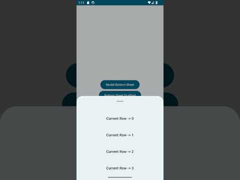
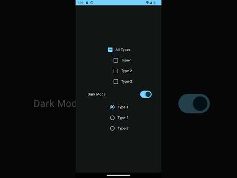
𝚃𝚑𝚎 𝚛𝚎𝚙𝚘𝚜𝚒𝚝𝚘𝚛𝚢 𝚙𝚛𝚘𝚟𝚒𝚍𝚎𝚜 𝚌𝚘𝚖𝚙𝚛𝚎𝚑𝚎𝚗𝚜𝚒𝚟𝚎 𝚒𝚗𝚏𝚘𝚛𝚖𝚊𝚝𝚒𝚘𝚗 𝚘𝚗 𝚑𝚘𝚠 𝚝𝚘 𝚎𝚏𝚏𝚎𝚌𝚝𝚒𝚟𝚎𝚕𝚢 𝚞𝚝𝚒𝚕𝚒𝚣𝚎 𝙼𝚊𝚝𝚎𝚛𝚒𝚊𝚕-𝟹 𝚠𝚒𝚝𝚑𝚒𝚗 𝚝𝚑𝚎 𝙹𝚎𝚝𝚙𝚊𝚌𝚔 𝙲𝚘𝚖𝚙𝚘𝚜𝚎 𝚏𝚛𝚊𝚖𝚎𝚠𝚘𝚛𝚔. 𝙸𝚝 𝚘𝚏𝚏𝚎𝚛𝚜 𝚊 𝚠𝚎𝚊𝚕𝚝𝚑 𝚘𝚏 𝚔𝚗𝚘𝚠𝚕𝚎𝚍𝚐𝚎 𝚊𝚗𝚍 𝚙𝚛𝚊𝚌𝚝𝚒𝚌𝚊𝚕 𝚌𝚘𝚍𝚎 𝚜𝚊𝚖𝚙𝚕𝚎𝚜 𝚝𝚑𝚊𝚝 𝚒𝚕𝚕𝚞𝚜𝚝𝚛𝚊𝚝𝚎 𝚝𝚑𝚎 𝚙𝚛𝚒𝚗𝚌𝚒𝚙𝚕𝚎𝚜 𝚘𝚏 𝚝𝚑𝚎 𝙼𝚊𝚝𝚎𝚛𝚒𝚊𝚕-𝟹 𝚍𝚎𝚜𝚒𝚐𝚗, 𝚛𝚎𝚌𝚎𝚗𝚝𝚕𝚢 𝚒𝚗𝚝𝚛𝚘𝚍𝚞𝚌𝚎𝚍 𝚋𝚢 𝙶𝚘𝚘𝚐𝚕𝚎. 𝙱𝚢 𝚎𝚡𝚙𝚕𝚘𝚛𝚒𝚗𝚐 𝚝𝚑𝚒𝚜 𝚛𝚎𝚙𝚘𝚜𝚒𝚝𝚘𝚛𝚢, 𝚍𝚎𝚟𝚎𝚕𝚘𝚙𝚎𝚛𝚜 𝚌𝚊𝚗 𝚐𝚊𝚒𝚗 𝚊 𝚍𝚎𝚎𝚙 𝚞𝚗𝚍𝚎𝚛𝚜𝚝𝚊𝚗𝚍𝚒𝚗𝚐 𝚘𝚏 𝚝𝚑𝚎 𝚒𝚗𝚝𝚛𝚒𝚌𝚊𝚌𝚒𝚎𝚜 𝚘𝚏 𝚒𝚗𝚌𝚘𝚛𝚙𝚘𝚛𝚊𝚝𝚒𝚗𝚐 𝙼𝚊𝚝𝚎𝚛𝚒𝚊𝚕-𝟹 𝚒𝚗𝚝𝚘 𝚝𝚑𝚎𝚒𝚛 𝚙𝚛𝚘𝚓𝚎𝚌𝚝𝚜 𝚊𝚗𝚍 𝚎𝚗𝚑𝚊𝚗𝚌𝚎 𝚝𝚑𝚎𝚒𝚛 𝚊𝚋𝚒𝚕𝚒𝚝𝚢 𝚝𝚘 𝚌𝚛𝚎𝚊𝚝𝚎 𝚟𝚒𝚜𝚞𝚊𝚕𝚕𝚢 𝚊𝚙𝚙𝚎𝚊𝚕𝚒𝚗𝚐 𝚊𝚗𝚍 𝚌𝚘𝚑𝚎𝚜𝚒𝚟𝚎 𝚞𝚜𝚎𝚛 𝚒𝚗𝚝𝚎𝚛𝚏𝚊𝚌𝚎𝚜.
- It is the new standard way of building the UI that Google recommends.
- In the past till now we used to use material-2 and the material-3 comes with new features
- A good feature that comes with material-3 is dynamic colors
- In android-12, we will know about these dynamic colors
- Android takes wallpaper or the color that you define as your wallpaper and generates a color theme around that. So all the apps that use material themes will generate your own theme based on the color of the wallpaper for your app
- Yes this is optional, we can disable our application if this doesn't suit our design.
𝙼𝚊𝚝𝚎𝚛𝚒𝚊𝚕𝟸 | 𝙼𝚊𝚝𝚎𝚛𝚒𝚊𝚕𝟹 |
|---|---|
In the theme file we refer function blocks as lightColors and darkColors | In the theme file we refer function blocks as lightColorScheme and darkColorScheme |
There is a primary variant color | primary variant color is not there but primary,secondary,tertiary color is present |
| Dynamic colors are not present | Dynamic colors are present |
𝙸𝚖𝚙𝚘𝚛𝚝𝚊𝚗𝚝 𝚕𝚒𝚗𝚔𝚜 |
|---|
| 𝙼𝚊𝚝𝚎𝚛𝚒𝚊𝚕-𝟹 |
| 𝙲𝚘𝚕𝚘𝚛 𝚂𝚢𝚜𝚝𝚎𝚖 |
| 𝙳𝚒𝚏𝚏𝚎𝚛𝚎𝚗𝚝 𝚌𝚘𝚕𝚘𝚛𝚜 𝚊𝚗𝚍 𝚛𝚘𝚕𝚎𝚜 𝚘𝚏 𝚝𝚑𝚎𝚖 𝚞𝚜𝚎𝚍 𝚒𝚗 𝚠𝚒𝚍𝚐𝚎𝚝𝚜 |
| 𝙼𝚊𝚝𝚎𝚛𝚒𝚊𝚕 𝚃𝚑𝚎𝚖𝚎 𝙱𝚞𝚒𝚕𝚍𝚎𝚛 |
| 𝙼𝚒𝚐𝚛𝚊𝚝𝚒𝚗𝚐 𝚏𝚛𝚘𝚖 𝙼𝚊𝚝𝚎𝚛𝚒𝚊𝚕-𝟸 𝚝𝚘 𝙼𝚊𝚝𝚎𝚛𝚒𝚊𝚕-𝟹 |
𝙲𝚘𝚕𝚘𝚛 𝚂𝚢𝚜𝚝𝚎𝚖 𝙲𝚘𝚗𝚝𝚎𝚗𝚝𝚜 |
|---|
| 𝙺𝚎𝚢 𝙲𝚘𝚕𝚘𝚛𝚜 |
| 𝙰𝚌𝚌𝚎𝚗𝚝 𝙲𝚘𝚕𝚘𝚛𝚜 |
| 𝙽𝚎𝚞𝚝𝚛𝚊𝚕 𝙲𝚘𝚕𝚘𝚛𝚜 |
| 𝙴𝚛𝚛𝚘𝚛 𝙲𝚘𝚕𝚘𝚛𝚜 |
| 𝙿𝚛𝚘𝚍𝚞𝚌𝚝-𝚜𝚙𝚎𝚌𝚒𝚏𝚒𝚌 𝚌𝚞𝚜𝚝𝚘𝚖 𝙲𝚘𝚕𝚘𝚛𝚜 |
| 𝙸𝚗𝚟𝚎𝚛𝚜𝚎 𝙲𝚘𝚕𝚘𝚛𝚜 |
| 𝙽𝚎𝚞𝚝𝚛𝚊𝚕 𝙲𝚘𝚕𝚘𝚛𝚜 |
𝙺𝚎𝚢 𝙲𝚘𝚕𝚘𝚛 𝙽𝚊𝚖𝚎 | 𝙳𝚎𝚜𝚌𝚛𝚒𝚙𝚝𝚒𝚘𝚗 𝚘𝚗 𝚠𝚑𝚎𝚛𝚎 𝚝𝚘 𝚞𝚜𝚎 |
|---|---|
| Primary Key Color | This is something bright and something that stands out, Say action button etc that enables user to click on it |
| Secodary Key Color | This is usually based on primary key color that need to stand out but not as much as primary color |
| Tertiary Key Color | This is same as primary and secondary but next lighter action |
𝙰𝚌𝚌𝚎𝚗𝚝 𝙲𝚘𝚕𝚘𝚛 𝙽𝚊𝚖𝚎 | 𝙳𝚎𝚜𝚌𝚛𝚒𝚙𝚝𝚒𝚘𝚗 𝚘𝚗 𝚠𝚑𝚎𝚛𝚎 𝚝𝚘 𝚞𝚜𝚎 |
|---|---|
| On Primary | This is a color that is on top of primary color. Say if a action button is there with primary color, the plus symbol on it will be on primary |
| Primary Container | This is a color similar to primary color, Now we use this say a background for the floating action button. |
| On Primary Container | This will the plus symbol color on the primary container color |
𝙽𝚎𝚞𝚝𝚛𝚊𝚕 𝙲𝚘𝚕𝚘𝚛 𝙽𝚊𝚖𝚎 | 𝙳𝚎𝚜𝚌𝚛𝚒𝚙𝚝𝚒𝚘𝚗 𝚘𝚗 𝚠𝚑𝚎𝚛𝚎 𝚝𝚘 𝚞𝚜𝚎 |
|---|---|
| Background | This will the color of the background, In case of list the padding area part that seperates list item from screen |
| OnBackground | This will be if any color needs to be added on top of the background but out side the surface |
| Surface | This will be the background color of the card view in a list |
| OnSurface | This will be the color, if any view is added that has a background on top of the surface |
𝙴𝚛𝚛𝚘𝚛 𝙲𝚘𝚕𝚘𝚛 𝙽𝚊𝚖𝚎 | 𝙳𝚎𝚜𝚌𝚛𝚒𝚙𝚝𝚒𝚘𝚗 𝚘𝚗 𝚠𝚑𝚎𝚛𝚎 𝚝𝚘 𝚞𝚜𝚎 |
|---|---|
| Error | Usually we show error in this color, Say Snackbar indicating background color |
| On Error | This color will be the text or icon color on top of error background color |
| Error Container | This will be the background of say dialog that is displayed as error |
| On Error Container | Again this will be the content that is displayed on top of error container color |
- This is basically the branding colors that we use are specifc to app, In Such a scenario, we use these custom specific colors
- This is used for some elements that is displayed on top of other surfaces.
- Used on top of the widgets such as snackbar
- Used on the borders of widgets and the content of it
- There are 2 types
DynamicandCustom. Dynamicis used to get the colors based on a image.Customis used to define colors based on a specific color.- In the custom colors option we choose a primary color and based on the primary color the algorithm selects other colors, We can even give a specific touches for it.
@Composable fun MaterialAppTheme( // Flag to determine the dark/light theme darkTheme: Boolean = isSystemInDarkTheme(), // Dynamic color is available on Android 12+ dynamicColor: Boolean = true, // Parent most top level composable content: @Composable () -> Unit ) { // We need context here because the support for dynamic colors comes from android system val context = LocalContext.current val view = LocalView.current // We can apply one of four different color scheme's depending on what type of device the user has. // CONDITION-1:-> If the user is running on android-12 and above, We need to use dynamic colors. // CONDITION-2:-> If the user is running on device prior to android-12, We will use normal material-2 theme. // CONDITION-3:-> If the user again is using light theme, then we use light colors else use dark colors. val colorScheme = when { dynamicColor && Build.VERSION.SDK_INT >= Build.VERSION_CODES.S -> { // CONDITION-1:-> If the user is running on android-12 and above, We need to use dynamic colors. if (darkTheme){ // CONDITION-3:-> If the user again is using dark theme, then we use dark colors. dynamicDarkColorScheme(context) } else { // CONDITION-3:-> If the user again is using light theme, then we use light colors. dynamicLightColorScheme(context) } } darkTheme -> { // CONDITION-1:-> If the user is running on below android-12, We need to use material-2 colors. // CONDITION-3:-> If the user again is using dark theme, then we use dark colors. DarkColors } else -> { // CONDITION-1:-> If the user is running on below android-12, We need to use material-2 colors. // CONDITION-3:-> If the user again is using light theme, then we use light colors. LightColors } } // Set the color for the status bar if (!view.isInEditMode) { /* getting the current window by tapping into the Activity */ val currentWindow = (view.context as? Activity)?.window ?: throw Exception("Not in an activity - unable to get Window reference") SideEffect { /* the default code did the same cast here - might as well use our new variable! */ currentWindow.statusBarColor = colorScheme.primary.toArgb() /* accessing the insets controller to change appearance of the status bar, with 100% less deprecation warnings */ WindowCompat.getInsetsController(currentWindow, view).isAppearanceLightStatusBars = darkTheme } } MaterialTheme( colorScheme = colorScheme, typography = Typography, content = content ) }- Before
Material 3, there were6 Headline variations,2 Subtitle variations,2 Body variations,Button,Caption, andOverline styles. - How to use
headline,title,body,label, etc. More details on android documentation. - In
Material 3, there is a more regular and smaller number of variants for each classification, namelySmall,Medium, andLarge.
If you feel like support me a coffee for my efforts, I would greatly appreciate it.

Read contribution guidelines for more information regarding contribution.
Feature requests are always welcome, File an issue here.
Support it by clicking the ⭐ button on the upper right of this page. ✌️
This project is licensed under the Apache License 2.0 - see the LICENSE file for details


