 React
React iOS
iOS Android
 Flutter
 Angular
 JavaScript
 Unity
Unity Unreal
 Node
Node Python
 Ruby
Ruby PHP
PHP Java
Java .NET
.NET Go
Go REST
RESTimport { Text } from "react-native"; import { ReactionData } from "stream-chat-react-native"; const supportedReactions: ReactionData[] = [ { type: "happy", Icon: () => <Text>😄</Text> }, { type: "sad", Icon: () => <Text>😦</Text> }, { type: "love", Icon: () => <Text>❤️</Text> }, { type: "angry", Icon: () => <Text>😠</Text> }, { type: "haha", Icon: () => <Text>😆</Text> }, ]; <Channel supportedReactions={supportedReactions}> {/* Underlying MessageList and MessageInput components */} </Channel>;Customize Message Reactions
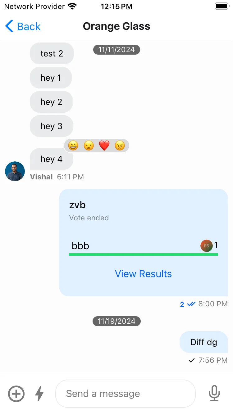
Message reactions are a crucial part of a chat applications. The SDK comes with built-in support for adding reactions to messages.
Supported Reaction types
You can customize the supported types of reactions for your application using the supportedReactions prop of the Channel component.
It expects an array of object with keys Icon and type. You can use ReactionData type for additional type safety.
An example of how you can pass the supportedRections to the Channel component could be:
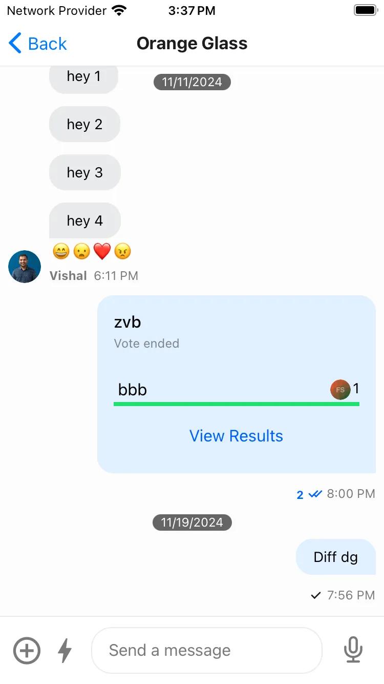
Reaction List Position
For the display of the reactions in the message we support both top and bottom view which can be customized using the reactionListPosition prop of the Channel component.
<Channel reactionListPosition="bottom"> {/* Underlying MessageList and MessageInput components */} </Channel>
|
|
| Top Reactions | Bottom Reactions |
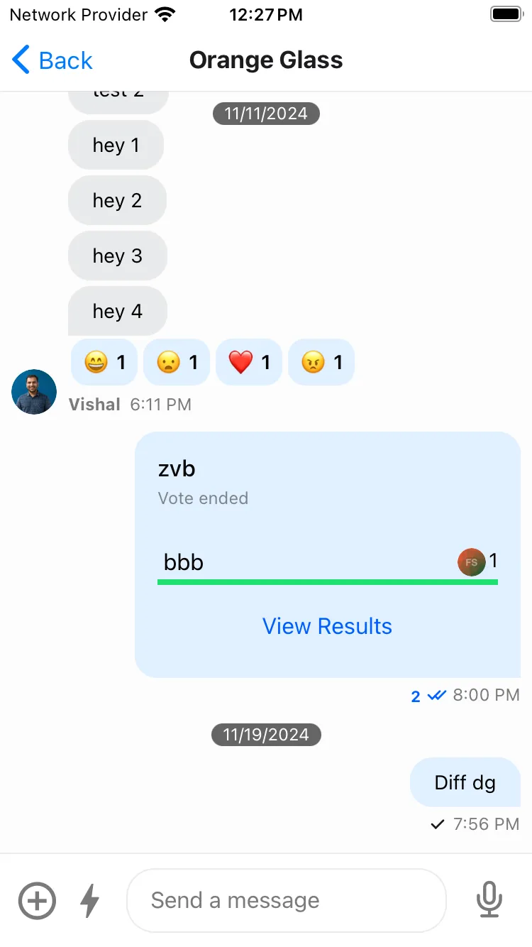
Enforce unique reactions
We allow customizing the reaction behaviour for a message, such that a message can only have a single type of reaction as reacted by the user.
To do this, you can enable the enforceUniqueReaction prop in the Channel component.
<Channel enforceUniqueReaction> {/* Underlying MessageList and MessageInput components */} </Channel>Customizing message Reaction List components
The message reaction list component on the message when the message has some reactions can be customized using the following components:
ReactionListTopReactionListBottom
These components can be customized by passing a custom UI implementation to the Channel component as follows:
import { Pressable, StyleSheet } from "react-native"; import { Channel, useMessageContext } from "stream-chat-react-native"; const CustomReactionListBottomComponent = () => { const { handleReaction, onPress, onLongPress, reactions, showMessageOverlay, } = useMessageContext(); return ( <View style={styles.container}> {reactions?.map((reaction) => { const { type, Icon } = reaction; return ( <Pressable onLongPress={(event) => { if (onLongPress) { onLongPress({ defaultHandler: () => { if (handleReaction) { showMessageOverlay(true); } }, emitter: "reactionList", event, }); } }} onPress={(event) => { onPress({ defaultHandler: () => { if (handleReaction) { handleReaction(reaction.type); } }, emitter: "reactionList", event, }); }} key={type} > {Icon ? <Icon /> : null} </Pressable> ); })} </View> ); }; const ChannelScreen = () => { return ( <Channel reactionListPosition="bottom" ReactionListBottom={CustomReactionListBottomComponent} > {/* Underlying MessageList and MessageInput components */} </Channel> ); }; const styles = StyleSheet.create({ container: { borderRadius: 4, flexDirection: "row", marginVertical: 2, }, });Customizing Reaction Picker component
The UI for the Reaction Picker can be customized by passing a custom MessageReactionPicker component in the Channel component.
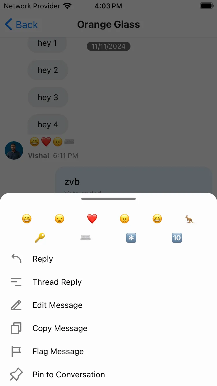
import { FlatList, Pressable, StyleSheet } from "react-native"; import { Channel, useMessageContext } from "stream-chat-react-native"; const CustomMessageReactionPicker = () => { const { supportedReactions } = useMessagesContext(); const { dismissOverlay, handleReaction } = useMessageContext(); const renderItem = ({ item }: { item: ReactionData }) => { return ( <Pressable key={item.type} onPress={() => { if (handleReaction) { handleReaction(item.type); } dismissOverlay(); }} > {item.Icon ? <item.Icon /> : null} </Pressable> ); }; return ( <FlatList columnWrapperStyle={styles.container1} data={supportedReactions} keyExtractor={(item) => item.type} numColumns={6} renderItem={renderItem} /> ); }; const ChannelScreen = () => { return ( <Channel reactionListPosition="bottom" MessageReactionPicker={CustomMessageReactionPicker} > {/* Underlying MessageList and MessageInput components */} </Channel> ); }; const styles = StyleSheet.create({ container: { justifyContent: "space-evenly", marginVertical: 8, }, });Customizing Message Reactions by user list component
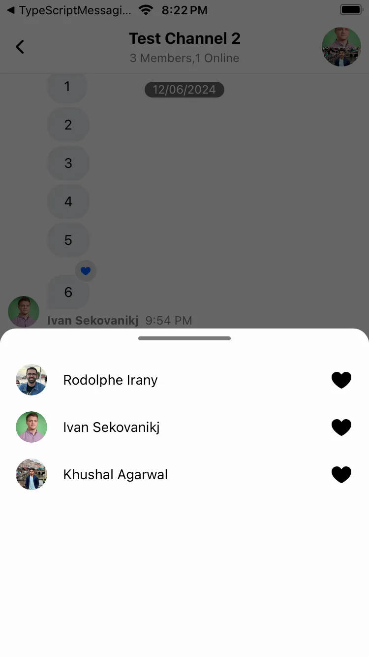
We display the list of the reactions reacted by users in the channel in the MessageUserReactions component and each of the item in the list using the MessageUserReactionsItem and the avatar using the MessageUserReactionsAvatar component.
import { useMemo } from "react"; import { Image, FlatList, StyleSheet, Text, View } from "react-native"; import { ReactionSortBase } from "stream-chat"; import { Channel, Reaction, useFetchReactions, useMessageContext, } from "stream-chat-react-native"; const CustomMessageUserReactions = () => { const { message } = useMessageContext(); const reactionSort: ReactionSortBase = { created_at: -1, }; const { reactions: fetchedReactions } = useFetchReactions({ message, sort: reactionSort, }); const reactions = useMemo( () => fetchedReactions.map((reaction) => ({ id: reaction.user?.id, image: reaction.user?.image, name: reaction.user?.name, type: reaction.type, })) as Reaction[], [fetchedReactions], ); const renderItem = ({ item }: { item: Reaction }) => { const Icon = supportedReactions?.find( (supportedReaction) => supportedReaction.type === item.type, )?.Icon; return ( <View style={styles.container}> <MessageUserReactionsAvatar reaction={item} /> <Text style={styles.text}>{item.name}</Text> <View style={styles.icon}>{Icon && <Icon />}</View> </View> ); }; return ( <FlatList data={reactions} keyExtractor={(item) => item.id} renderItem={renderItem} /> ); }; const styles = StyleSheet.create({ container: { flexDirection: "row", flexWrap: "wrap", marginHorizontal: 16, alignItems: "center", marginVertical: 8, }, icon: { position: "absolute", right: 0, }, text: { marginHorizontal: 16, }, });Similarly, you can customize the MessageUserReactionsItem and MessageUserReactionsAvatar component.