open class ChatMessageContentView: _View, ThemeProvider { public private(set) var deliveryStatusView: ChatMessageDeliveryStatusView? open func layout(options: ChatMessageLayoutOptions) { if options.contains(.deliveryStatusIndicator) { metadataSubviews.append(createDeliveryStatusView()) } ... } }Customize Message Delivery Status
This guide explains how to manipulate delivery status UI part, specifically:
- how to show avatars of members who have seen the message
- how to hide status delivery indicator
If message delivery status term is not familiar to you - check out Message Delivery Status guide first.
UI component showing delivery status
The UI component responsible for showing delivery status indicator is ChatMessageDeliveryStatusView. This component is shown inside ChatMessageContentView when the message view is configured with layout options that include deliveryStatusIndicator option.
Show avatars of members who’s seen a message
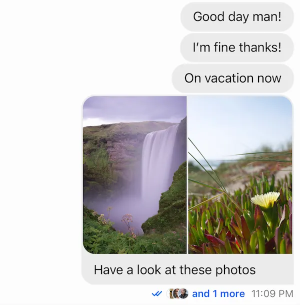
By default, when message from the current user sent to a group channel has read delivery state, it shows the number of members who have seen it. To customize this behaviour and show member avatars, a custom ChatMessageDeliveryStatusView subclass is needed.
The implementation of a subclass might be the following:
// 1. Subclass `ChatMessageDeliveryStatusView` final class CustomChatMessageDeliveryStatusView: ChatMessageDeliveryStatusView { // 2. Declare configuration variables for max # of avatars shown & the avatar size private let maxNumberOfAvatars = 3 private let avatarSize = CGSize(width: 15, height: 15) // 3. Declare a container for avatars and array of `ChatAvatarView` to have easy access to avatar views. private let avatarsStackView = UIStackView() private var avatarViews: [ChatAvatarView] = [] // 4. Override `setUpLayout` to make layout customizations. override func setUpLayout() { // Call `super` to get default layout in place. super.setUpLayout() // Setup the stack view showing avatars. avatarsStackView.translatesAutoresizingMaskIntoConstraints = false avatarsStackView.axis = .horizontal avatarsStackView.distribution = .fill avatarsStackView.alignment = .fill stackView.addArrangedSubview(avatarsStackView) // Create avatar views and add them to both the container and the array. (0..<maxNumberOfAvatars).forEach { _ in let avatarView = components.avatarView.init() avatarView.translatesAutoresizingMaskIntoConstraints = false avatarView.heightAnchor.constraint(equalToConstant: avatarSize.height).isActive = true avatarView.widthAnchor.constraint(equalToConstant: avatarSize.width).isActive = true avatarsStackView.addArrangedSubview(avatarView) avatarViews.append(avatarView) } // Make `messageReadСountsLabel` the last in the root container. // This label will be used to show `and N more` and should go after the avatars in the UI. stackView.addArrangedSubview(messageReadСountsLabel) } // 5. Override `updateContent` to configure avatars when content is updated. override func updateContent() { super.updateContent() // Get array of members who have seen the message. Sort it to fix the order. let readBy = content?.message.readBy.sorted { $0.id < $1.id } ?? [] avatarsStackView.isHidden = readBy.count == 0 // Iterate and configure avatar views, hide those ones that don't have a user to show. for index in 0..<avatarViews.count { let user = readBy.indices.contains(index) ? readBy[index] : nil let avatarView = avatarViews[index] avatarView.isHidden = user == nil components.imageLoader.loadImage( into: avatarView.imageView, url: user?.imageURL, imageCDN: components.imageCDN, placeholder: appearance.images.userAvatarPlaceholder4, preferredSize: avatarSize ) } // Calculate how many member are not shown. Show `and more` label if not users are shown. let leftUsers = readBy.count - avatarViews.count messageReadСountsLabel.text = leftUsers > 0 ? "and \(leftUsers) more" : nil messageReadСountsLabel.isHidden = messageReadСountsLabel.text == nil } }Let’s take some final touches and make the UI a bit nicer:
override func setUpLayout() { // 1. Use negative spacing in the stack view making the next avatar overlapping the previous one. avatarsStackView.spacing = -avatarSize.width / 2 (0..<maxNumberOfAvatars).forEach { _ in // 2. Add a border to each avatar view. avatarView.imageView.layer.borderColor = appearance.colorPalette.background6.cgColor avatarView.imageView.layer.borderWidth = 1 } }The last step is to register custom subclass in Components so it is injected into the UI SDK and used instead of the default component:
Components.default.messageDeliveryStatusView = CustomChatMessageDeliveryStatusView.selfRun the app and see the outcome 🎉
| Before | After |
|---|---|
 |  |
Handle taps
When only a subset of members is displayed in the message cell, there can be a requirement to show the entire list. Let’s see how to handle taps on delivery indicator and bring custom tap handler in place.
Steps:
- Enable user interaction for custom delivery indicator
- Have a custom
ChatMessageListVCsubclass and overridemessageContentViewDidTapOnDeliveryStatusIndicator - Register
ChatMessageListVCcomponent
Luckily, the CustomChatMessageDeliveryStatusView is a UIControl so it can be made tappable just by setting isUserInteractionEnabled = true:
// 1. final class CustomChatMessageDeliveryStatusView: ChatMessageDeliveryStatusView { override func updateContent() { ... // Allow interaction when message is in `read` state. isUserInteractionEnabled = readBy.count > 0 } }With enabled interaction, taps on the delivery component trigger messageContentViewDidTapOnDeliveryStatusIndicator on ChatMessageListVC. Nothing happens by default but it’s possible to have custom logic triggered by subclassing ChatMessageListVC and providing an override for this method.
// 2. final class CustomChatMessageListVC: ChatMessageListVC { override func messageContentViewDidTapOnDeliveryStatusIndicator(_ indexPath: IndexPath?) { guard let indexPath = indexPath, let message = dataSource?.chatMessageListVC(self, messageAt: indexPath) else { return } // Create and present custom screen showing `message.readBy` } }Don’t forget to inject it:
// 3. Components.default.messageListVC = CustomChatMessageListVC.selfRunning the app and making a tap on custom delivery status indicator triggers messageContentViewDidTapOnDeliveryStatusIndicator on custom message list subclass 🎉
Hide delivery status
The delivery status indicator can be hidden in the UI by creating custom layout options resolver which would exclude the deliveryStatusIndicator from calculated options.
Steps:
- Subclass
ChatMessageLayoutOptionsResolvertype - Override
optionsForMessage, excludedeliveryStatusIndicatoroption fromsuper.optionsForMessage - Inject custom subclass into
Components
// 1. final class CustomChatMessageLayoutOptionsResolver: ChatMessageLayoutOptionsResolver { // 2. override func optionsForMessage( at indexPath: IndexPath, in channel: ChatChannel, with messages: AnyRandomAccessCollection<ChatMessage>, appearance: Appearance ) -> ChatMessageLayoutOptions { var layoutOptions = super.optionsForMessage(at: indexPath, in: channel, with: messages, appearance: appearance) layoutOptions.remove(.deliveryStatusIndicator) return layoutOptions } } // 3. Components.default.messageLayoutOptionsResolver = CustomChatMessageLayoutOptionsResolver()| Before | After |
|---|---|
 |  |
You can find more information on how the components configuration works here.