 React
React iOS
iOS Android
 Flutter
 Angular
 JavaScript
 Unity
Unity Unreal
 Node
Node Python
 Ruby
Ruby PHP
PHP Java
Java .NET
.NET Go
Go REST
REST<style name="StreamTheme.MediaAttachmentViewStyle" parent="@style/StreamUiTheme"> <item name="streamUiMediaAttachmentPlayVideoIconTint">@color/stream_ui_literal_white</item> <item name="streamUiMediaAttachmentPlayVideoIconBackgroundColor">@color/stream_ui_literal_black</item> <item name="streamUiMediaAttachmentPlayVideoIconCornerRadius">10dp</item> <item name="streamUiMediaAttachmentPlayVideoIconElevation">0dp</item> <item name="streamUiMediaAttachmentPlayVideoIconPadding">6dp</item> </style>Image and Video Previews
Introduction
The UI Components Chat SDK allows you to customize how image and video attachments are displayed.
Video thumbnails are a paid feature, with the pricing listed here. They are enabled by default but can be turned off by setting the ChatUI property videoThumbnailsEnabled to false. You can read more about disabling video thumbnails in the configuration documentation
Customization
Attachments are rendered inside various Chat UI Components such as MessageListView or MessageComposerView. Different components allow you to stylize attachment rendering in different ways.
MessageListView
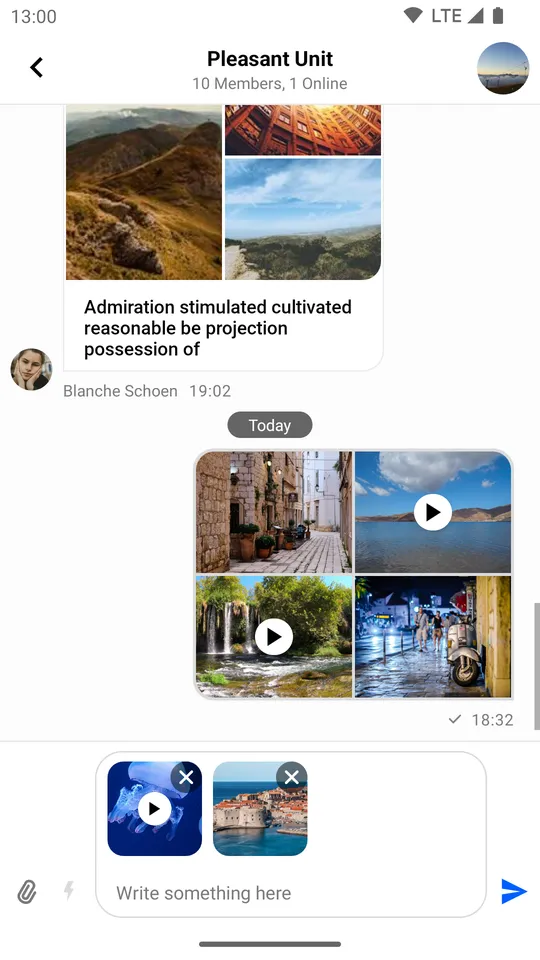
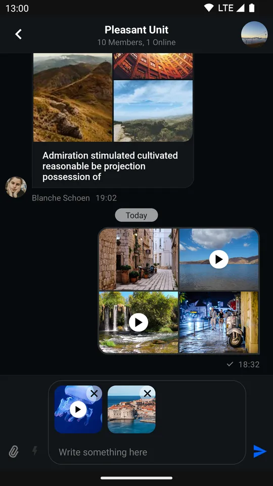
Internally, MessageListView uses MediaAttachmentsGroupView to present media (image and video) attachments in a tiled manner.
By default, it looks like so:
| Default Image and Video Attachment Previews (Light Mode) | Default Image and Video Attachment Previews (Dark Mode) |
|---|---|
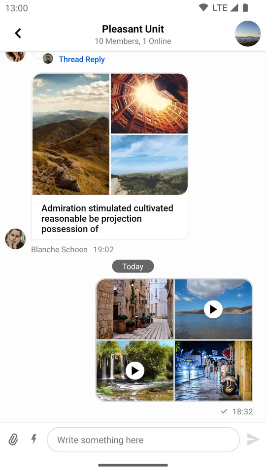 | 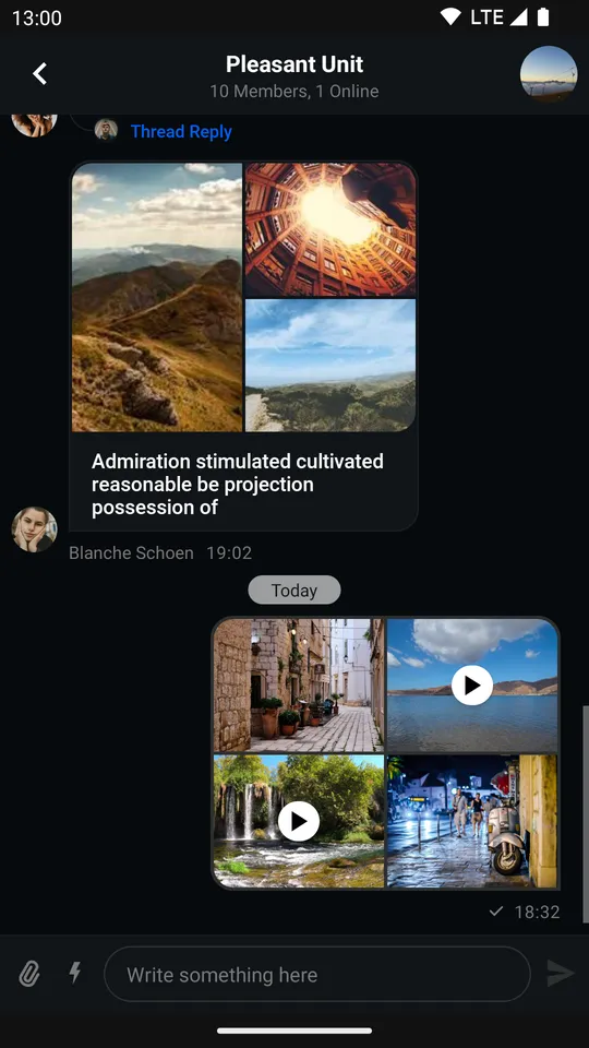 |
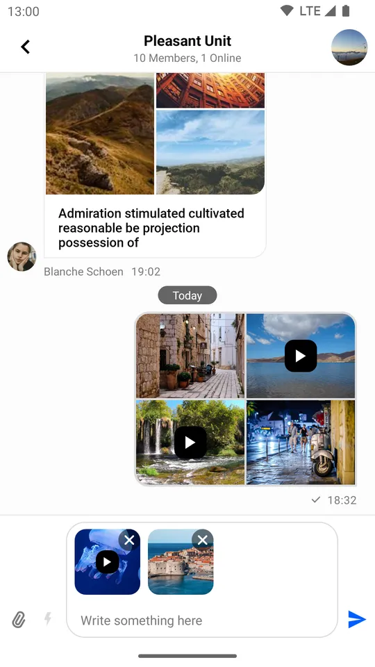
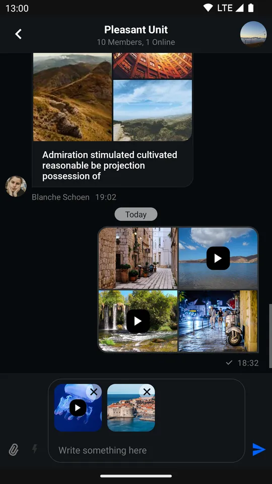
We’ll start changing it by replacing the stock play button in favor of a flatter, semi-transparent design.
First, create a new style which will transform the design of the video icon:
Only certain attributes were used here, you can find the rest in the source file.
Next, add it to your Stream theme:
<style name="StreamTheme" parent="@style/StreamUiTheme"> <item name="streamUiMessageListMediaAttachmentStyle">@style/StreamTheme.MediaAttachmentViewStyle</item> </style>And finally, override streamUiTheme:
<style name="AppTheme" parent="Theme.MaterialComponents.DayNight.NoActionBar"> <item name="streamUiTheme">@style/StreamTheme</item> </style>The result should look like so:
| Custom Image and Video Attachment Previews (Light Mode) | Custom Image and Video Attachment Previews (Dark Mode) |
|---|---|
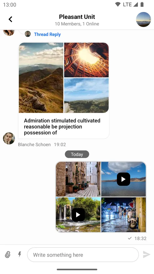 | 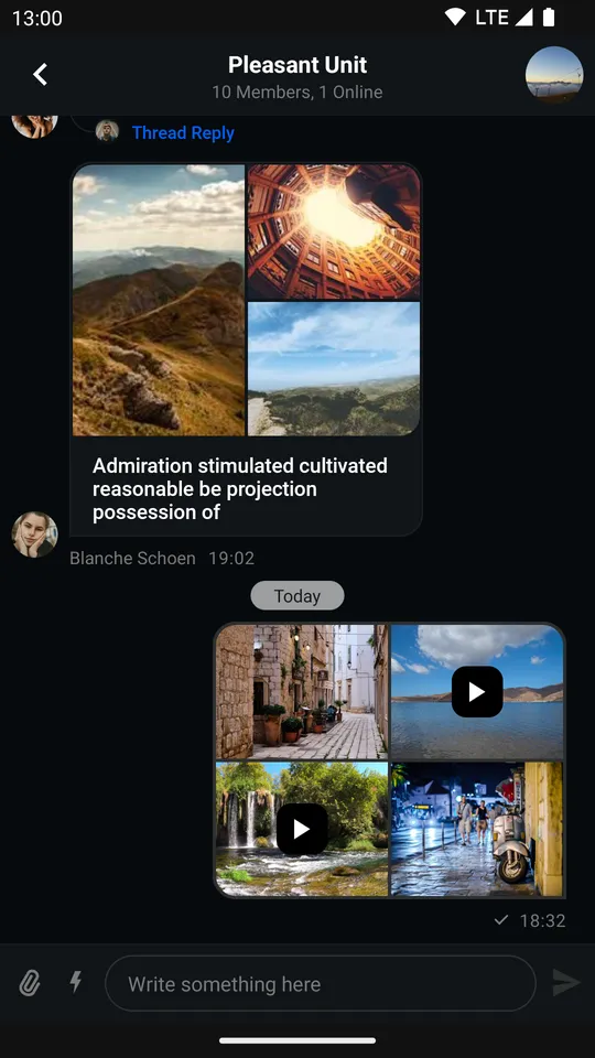 |
MessageComposerView
By default, attachments inside MessageComposerView look like so:
| Default Image and Video Attachment Previews (Light Mode) | Default Image and Video Attachment Previews (Dark Mode) |
|---|---|
 |  |
This component offers a more direct styling approach compared to MessageListView. You can simply add attributes to the MessageComposerView declaration in your XML layout.
All we need to do to replicate the custom UI we created for MessageListView is the following:
<io.getstream.chat.android.ui.feature.messages.composer.MessageComposerView android:id="@+id/messageComposerView" android:layout_width="match_parent" android:layout_height="wrap_content" app:streamUiMessageComposerMessageInputVideoCornerRadius="10dp" app:streamUiMessageComposerMessageInputVideoAttachmentIconDrawableTint="@color/white" app:streamUiMessageComposerMessageInputVideoAttachmentIconBackgroundColor="@color/stream_ui_literal_black" />Only certain attributes were used here, you can find the rest in the source file.
Which results in the following UI:
| Custom Image and Video Attachment Previews (Light Mode) | Custom Image and Video Attachment Previews (Dark Mode) |
|---|---|
 |  |
Attachment Gallery
The attachment gallery is used for previewing image and video attachments. Although it is not an individual UI Component in itself, but rather a feature-complete Activity, it still offers a degree of customization.
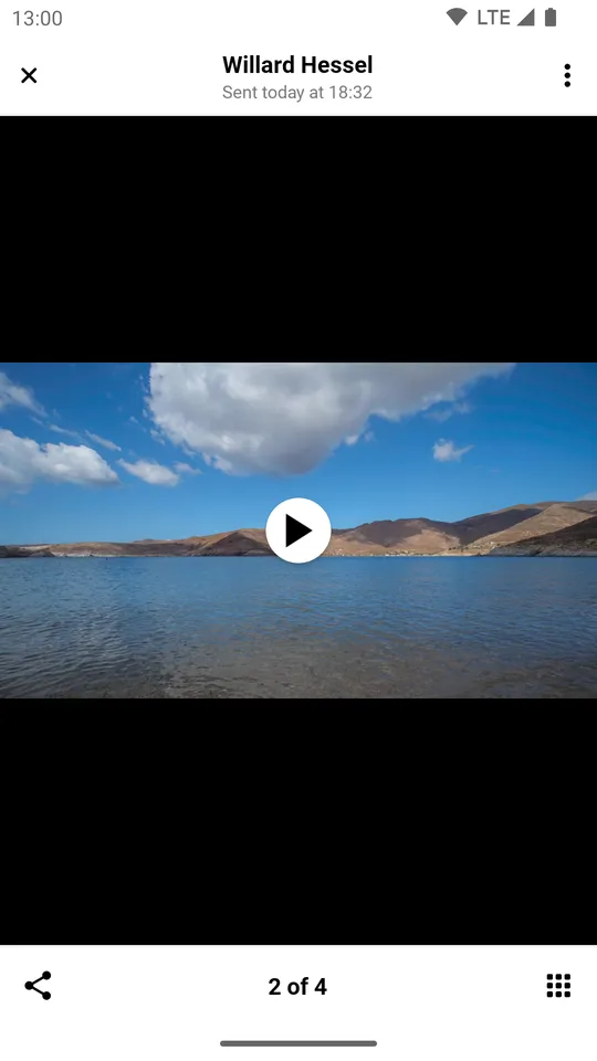
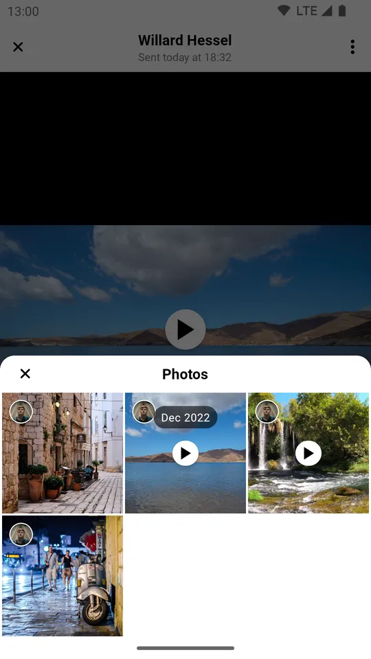
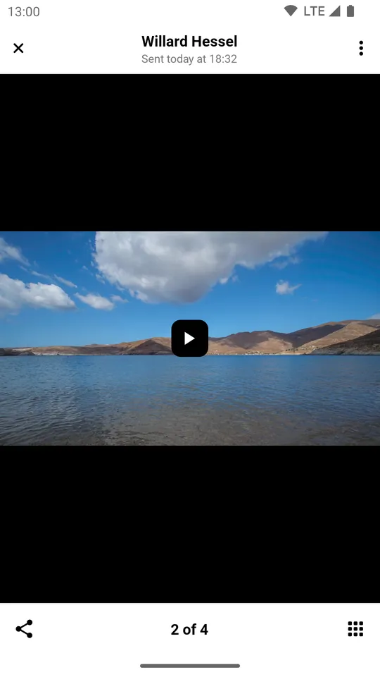
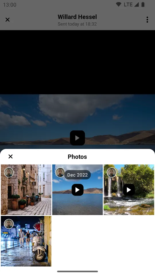
The default appearance of the gallery looks like this:
| Default Image and Video Attachment Gallery (Light Mode) | Default Image and Video Attachment Gallery with Overview (Light Mode) |
|---|---|
 |  |
| Default Image and Video Attachment Gallery (Dark Mode) | Default Image and Video Attachment Gallery with Overview (Dark Mode) |
|---|---|
 |  |
Let’s replicate the changes we made in the previous sections.
First, create a style that changes the way video attachments are rendered inside the main viewing area of the gallery:
<style name="StreamTheme.AttachmentGalleryVideoAttachmentsStyle" parent="@style/StreamUiTheme"> <item name="streamUiAttachmentGalleryViewMediaPlayVideoIconTint">@color/stream_ui_literal_white</item> <item name="streamUiAttachmentGalleryViewMediaPlayVideoIconBackgroundColor">@color/stream_ui_literal_black</item> <item name="streamUiAttachmentGalleryViewMediaPlayVideoIconElevation">0dp</item> <item name="streamUiAttachmentGalleryViewMediaPlayVideoIconCornerRadius">10dp</item> <item name="streamUiAttachmentGalleryViewMediaPlayVideoIconPadding">8dp</item> </style>Only certain attributes were used here, you can find the rest in the source file.
Second, create one that changes the way video attachments are rendered inside the overview:
<style name="StreamTheme.MediaAttachmentGridViewStyle" parent="@style/StreamUiTheme"> <item name="streamUiMediaAttachmentGridViewPlayVideoIconTint">@color/stream_ui_literal_white</item> <item name="streamUiMediaAttachmentGridViewPlayVideoIconBackgroundColor">@color/stream_ui_literal_black</item> <item name="streamUiMediaAttachmentGridViewPlayVideoIconElevation">0dp</item> <item name="streamUiMediaAttachmentGridViewPlayVideoIconCornerRadius">10dp</item> <item name="streamUiMediaAttachmentGridViewPlayVideoIconPadding">4dp</item> </style>Only certain attributes were used here, you can find the rest in the source file.
Then, add them to your Stream theme:
<style name="CustomStreamUiTheme" parent="@style/StreamUiTheme"> <item name="streamUiAttachmentGalleryVideoAttachmentsStyle">@style/StreamTheme.AttachmentGalleryVideoAttachmentsStyle</item> <item name="streamUiMediaAttachmentGridViewStyle">@style/StreamTheme.MediaAttachmentGridViewStyle</item> </style>Afterwards, override streamUiTheme in your custom gallery Activity theme:
<style name="CustomAttachmentGalleryTheme" parent="StreamUi.AttachmentGallery"> <item name="streamUiTheme">@style/CustomStreamUiTheme</item> </style>Finally, override the default attachment gallery Activity theme inside your manifest:
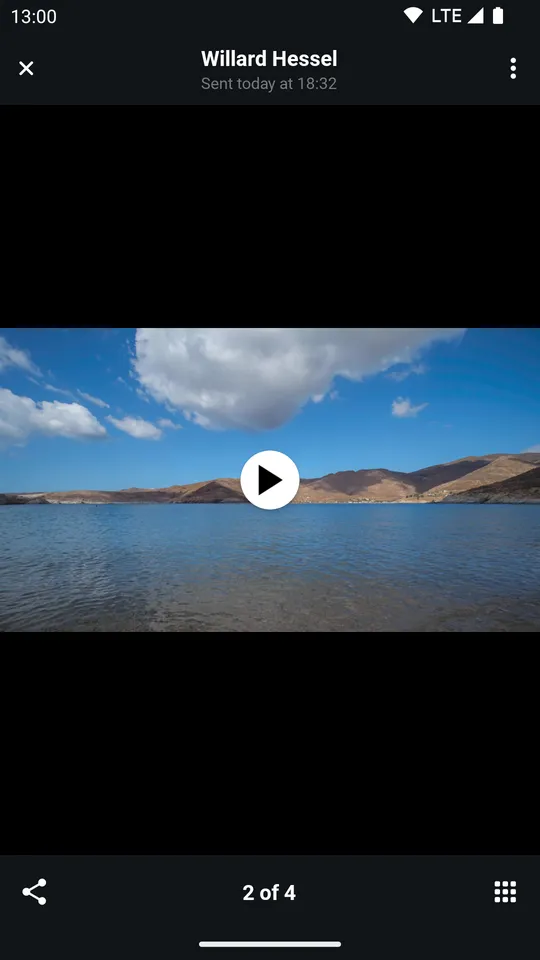
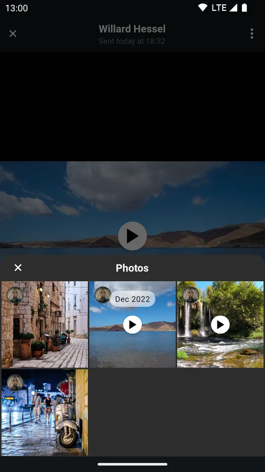
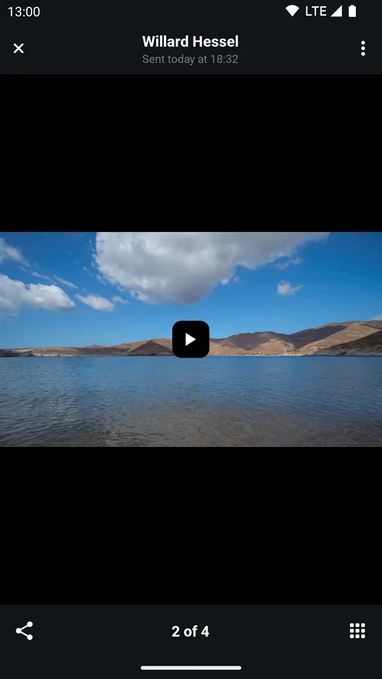
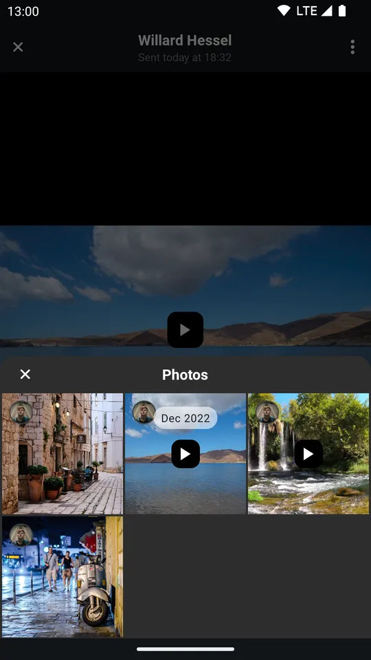
<activity android:name="io.getstream.chat.android.ui.feature.gallery.AttachmentGalleryActivity" android:theme="@style/CustomAttachmentGalleryTheme" tools:replace="android:theme" />Now the attachment gallery should look like so:
| Custom Image and Video Attachment Gallery (Light Mode) | Custom Image and Video Attachment Gallery with Overview (Light Mode) |
|---|---|
 |  |
| Custom Image and Video Attachment Gallery (Dark Mode) | Custom Image and Video Attachment Gallery with Overview (Dark Mode) |
|---|---|
 |  |