 React
React iOS
iOS Android
 Flutter
 Angular
 JavaScript
 Unity
Unity Unreal
 Node
Node Python
 Ruby
Ruby PHP
PHP Java
Java .NET
.NET Go
Go REST
RESTChannelAvatar( channel = channel, // The current logged in user currentUser = currentUser, // Reasonable avatar size modifier = Modifier.size(36.dp) )ChannelAvatar
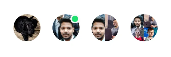
The ChannelAvatar allows you to display a channel avatar, that shows the channel image, or a grid of its active members.
Let’s see how to integrate the component into your code.
Usage
To use the component, simply pass the Channel object to the ChannelAvatar, like so:
Based on the state of the Channel and the number of members, it shows different types of images:
 |
|---|
Handling Actions
The ChannelAvatar component exposes a single action to handle click events:
@Composable fun ChannelAvatar( ..., // State onClick: (() -> Unit)? = null, )If you want to handle clicks on ChannelAvatar, you can use the code below:
fun ChannelAvatar( ..., // State ) { // Handle avatar clicks here }Customization
In terms of UI customization, the ChannelAvatar exposes the following properties:
@Composable fun ChannelAvatar( channel: Channel, currentUser: User?, modifier: Modifier = Modifier, shape: Shape = ChatTheme.shapes.avatar, textStyle: TextStyle = ChatTheme.typography.title3Bold, groupAvatarTextStyle: TextStyle = ChatTheme.typography.captionBold, showOnlineIndicator: Boolean = true, onlineIndicatorAlignment: OnlineIndicatorAlignment = OnlineIndicatorAlignment.TopEnd, onlineIndicator: @Composable BoxScope.() -> Unit = { OnlineIndicator(modifier = Modifier.align(onlineIndicatorAlignment.alignment)) }, contentDescription: String? = null, ... // Action handlers )channel: The channel whose data we need to show.currentUser: The current user, used to determine avatar data.modifier: Modifier for the root component. Useful for things like the component size, padding, background and similar.shape: The shape of the avatar.textStyle: The text style of the initials text.groupAvatarTextStyle: The text style of the initials text in the group avatar.showOnlineIndicator: If we show online indicator or not.onlineIndicatorAlignment: The alignment of online indicator.onlineIndicator: Custom composable that allows replacing the default online indicator.contentDescription: The content description of the avatar.
Here’s an example of customizing the UI of the channel avatar:
ChannelAvatar( channel = channel, currentUser = currentUser, modifier = Modifier.size(48.dp), shape = RoundedCornerShape(8.dp) )The sample above will produce a custom channel avatar with rounded corners:
 |
|---|
On this page: