 React
React iOS
iOS Android
 Flutter
 Angular
 JavaScript
 Unity
Unity Unreal
 Node
Node Python
 Ruby
Ruby PHP
PHP Java
Java .NET
.NET Go
Go REST
RESTclass CustomChatComponentFactory : ChatComponentFactory { // Override the specific composable methods which you like to customize }Component Factory
The ChatComponentFactory is a factory which defines most of the stateless low-level composable components, which are used as building blocks for the high-level screen components and the bound components (see Component Architecture).
The screen components, the bound components, and even the low-level components which depend on different low-level components, use the ChatComponentFactory to render specific components of the UI in a stateless manner.
By overriding the ChatComponentFactory, developers can easily customize or override specific parts of the Chat UI, without the need to build their own implementations from scratch. This enables a high degree of customization and flexibility, allowing the Chat UI to be tailored to specific design requirements.
The ChatComponentFactory is available on the Compose SDK since version 6.11.0
Usage
To apply a custom component factory to your Chat UI, all you need to do is to implement the ChatComponentFactory interface:
And pass the custom ChatComponentFactory to the ChatTheme wrapping your Chat UI:
ChatTheme( componentFactory = CustomChatComponentFactory(), ) { MessagesScreen( viewModelFactory = viewModelFactory, ) }The custom components provided by the custom ChatComponentFactory will now override all the default components used by the wrapped MessagesScreen.
Customization options
The ChatComponentFactory allows customization of most low-level components used in different Chat screens. It provides the ability to customize common components globally, as well as specific components in particular locations.
Available Components
| Component | Description |
|---|---|
| Avatars | Customize user, group, and channel avatars. |
| Channel List Header | Modify the header of the channel list. |
| Channel Items | Customize how individual channels and their elements appear. |
| Messages List Header | Customize the header of the message list. |
| Messages Items | Customize message bubbles, timestamps, and other elements. |
| Message Composer | Customize the message input field, send button, and attachments. |
| Menus & Actions | Customize context menus for messages and channels. |
| Reactions | Modify the reaction picker and displayed reactions. |
| Thread List | Customize the thread list components. |
| Pinned Message List | Customize the pinned message list components. |
Avatars
The ChatComponentFactory provides a way to customize the avatars which are used in the Chat screens. You can customize several types of avatars:
ChannelAvatar
Avatar shown in the leading part of the channel items, or in the heading of a message list:
| ChannelItem | MessageListHeader |
|---|---|
 | 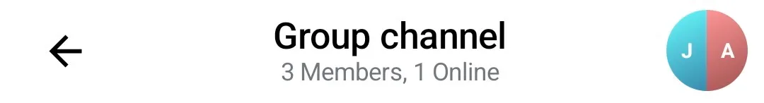 |
To customize the default ChannelAvatar, you need to override the ChatComponentFactory#ChannelAvatar method:
class CustomChatComponentFactory : ChatComponentFactory { @Composable override fun ChannelAvatar( modifier: Modifier, channel: Channel, currentUser: User?, onClick: (() -> Unit)? ) { // Your implementation of the channel avatar } }UserAvatar
Avatar shown for a single user, showing his image (if available), or the user initials. It also shows an online indicator if the user is online. It is used in several places such as:
- Search results
- Channel members
- Mention suggestions
ChannelAvatar- if theChannelis a channel consisting of two members, one of which is the current user, or if theChannelhas only one user.
| Search results | Channel members | Mention suggestions |
|---|---|---|
 | 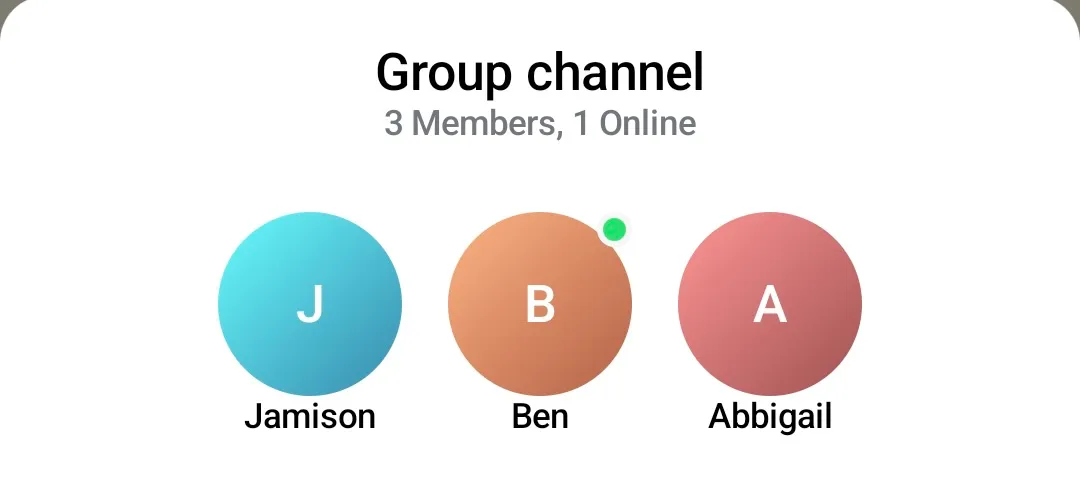 | 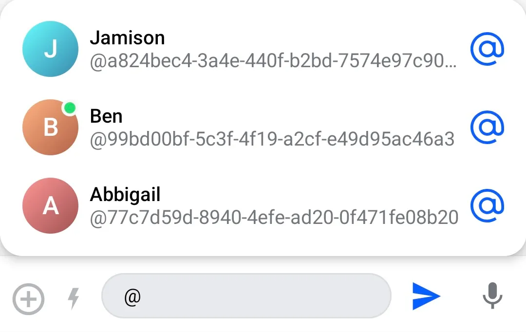 |
To customize the default UserAvatar, you need to override the ChatComponentFactory#UserAvatar method:
class CustomChatComponentFactory : ChatComponentFactory { @Composable override fun UserAvatar( modifier: Modifier, user: User, textStyle: TextStyle, showOnlineIndicator: Boolean, onlineIndicator: @Composable (BoxScope.() -> Unit), onClick: (() -> Unit)? ) { // Your implementation of the user avatar } }GroupAvatar
Avatar which is internally used by the ChannelAvatar, to render an avatar for 2 or more users. You can override it if you want to utilize the default ChannelAvatar for channel consisting of 1 or 2 members, but want to customize the case when the Channel has more than 2 members.
To customize the default GroupAvatar, you need to override the ChatComponentFactory#GroupAvatar method:
class CustomChatComponentFactory : ChatComponentFactory { @Composable override fun GroupAvatar( modifier: Modifier, users: List<User>, shape: Shape, textStyle: TextStyle, onClick: (() -> Unit)? ) { // Your implementation of the group avatar } }Avatar
Default, low-level component which is independent from Channel or User. It is internally used by the ChannelAvatar and the GroupAvatar to render a single avatar in the grid, and also by the UserAvatar to render the avatar content. It is also used in other places where we show an avatar for a single user, where the online indicator is not shown, such as:
- Channel list header - avatar of the currently logged in user
- Quoted messages - avatar of the user who sent the quoted message
- Thread participants in the message footer
- Polls - avatar of users which casted a vote
- User reactions
- Leading content of a message - avatar of the user who sent the message
| Channel list header | Quoted message | Thread participants | Polls | User reactions | Message sender |
|---|---|---|---|---|---|
 |  |  |  | 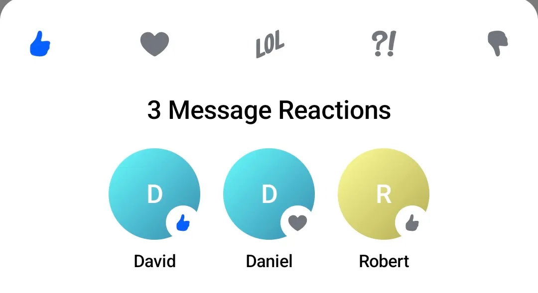 |  |
To customize the default Avatar, you need to override the ChatComponentFactory#Avatar method:
class CustomChatComponentFactory : ChatComponentFactory { @Composable override fun Avatar( modifier: Modifier, imageUrl: String, initials: String, shape: Shape, textStyle: TextStyle, placeholderPainter: Painter?, errorPlaceholderPainter: Painter?, contentDescription: String?, initialsAvatarOffset: DpOffset, onClick: (() -> Unit)? ) { // Your implementation of the avatar } }The previous Avatar method without the errorPlaceholderPainter parameter is now deprecated. Please update your implementation to use the new method signature, which provides better control over fallback behavior when image loading fails.
FallbackAvatar
Composable used to render a fallback avatar when the user’s image cannot be loaded. It displays the initials inside a shape, typically a circle. This component is used as a last resort if both the image and the placeholder fail.
It is used internally by Avatar when the image is not available or fails to load.
To customize the fallback avatar, you can override ChatComponentFactory#FallbackAvatar:
class CustomChatComponentFactory : ChatComponentFactory { @Composable override fun FallbackAvatar( imageUrl: String, initials: String, modifier: Modifier, shape: Shape, textStyle: TextStyle, avatarOffset: DpOffset, onClick: (() -> Unit)? ) { // Your implementation of the fallback avatar } }Channel List Header
The ChannelListHeader is the default component displayed in the ChannelsScreen header if the isShowingHeader flag is set to true (See: Channels Screen and Channel List Header).
| Channel List Header |
|---|
|
If you would like to customize the default ChannelListHeader while using the high-level screen component ChannelsScreen you can override the corresponding ChatComponentFactory method: ChannelListHeader. The method provides some default data such as the title, the connection state, and the default user actions, which you can use to build your own channel list header:
class CustomChatComponentFactory : ChatComponentFactory { @Composable override fun ChannelListHeader( modifier: Modifier, title: String, currentUser: User?, connectionState: ConnectionState, onAvatarClick: (User?) -> Unit, onHeaderActionClick: () -> Unit ) { // Your custom implementation of the channel list header } }The factory also allows for a more granular customization of the channel list header, by providing different factory methods for the leading, the center and the trailing content of the header. The default leading content is an avatar of the currently logged in user, the default center content consists of a title showing the connection state, while the trailing content displays an additional custom action button.
You can customize the different parts of the header by providing your own implementation of the corresponding methods:
ChannelListHeaderLeadingContentChannelListHeaderCenterContentChannelListHeaderTrailingContent
class CustomChatComponentFactory : ChatComponentFactory { @Composable override fun RowScope.ChannelListHeaderLeadingContent( currentUser: User?, onAvatarClick: (User?) -> Unit ) { // Your implementation of the leading content } @Composable override fun RowScope.ChannelListHeaderCenterContent( connectionState: ConnectionState, title: String ) { // Your implementation of the center content } @Composable override fun RowScope.ChannelListHeaderTrailingContent( onHeaderActionClick: () -> Unit ) { // Your implementation of the trailing content } }By overriding any of these ChatComponentFactory methods, you can easily swap in and out the ChannelListHeader(or specific parts from it), while using the high-level ChannelsScreen component.
If you are not using the high-level screen component ChannelsScreen, you can still use the ChannelListHeader component independently from the ChatComponentFactory, and customize its leading/center/trailing content directly by passing your own content for the leadingContent/centerContent/trailingContent slots as described in Channel List Header.
Channel Items
Similar to the ChannelListHeader, the ChatComponentFactory provides a way to customize the channel items which are shown in the list of channels (in the high-level screen component ChannelsScreen, or the bound ChannelList component).
| Channel list item |
|---|
|
To provide your own implementation for the channel item, you can override the ChatComponentFactory#ChannelListItemContent. The method provides the channel item which needs to be rendered, the default click and long-click actions, and the current user which you can use to build your own implementation of the channel item:
class CustomChatComponentFactory : ChatComponentFactory { @Composable override fun LazyItemScope.ChannelListItemContent( channelItem: ItemState.ChannelItemState, currentUser: User?, onChannelClick: (Channel) -> Unit, onChannelLongClick: (Channel) -> Unit, ) { // Your implementation of the channel item } }The factory also allows for a more granular customization of the channel items, by providing different factory methods for the leading, the center and the trailing content of the item. The default leading content is an avatar of channel, the default center content consists of the channel name and the last message in the channel, while the trailing content displays the timestamp of the last message in the channel.
You can customize the leading/center/trailing content of the channel item separately, but overriding one or more of the dedicated methods:
ChannelItemLeadingContentChannelItemCenterContentChannelItemTrailingContent
class CustomChatComponentFactory : ChatComponentFactory { @Composable override fun RowScope.ChannelItemLeadingContent( channelItem: ItemState.ChannelItemState, currentUser: User?, ) { // Your channel item leading content implementation } @Composable override fun RowScope.ChannelItemCenterContent( channelItem: ItemState.ChannelItemState, currentUser: User?, ) { // Your channel item center content implementation } @Composable override fun RowScope.ChannelItemTrailingContent( channelItem: ItemState.ChannelItemState, currentUser: User?, ) { // Your channel item trailing content implementation } }By utilizing these methods, you can easily customize the appearance of the channel items (or parts of them), while still utilizng the features that the high-level ChannelsScreen component provides.
If you are using the bound ChannelList component instead of the high-level ChannelsScreen, you can also directly customize the channel items by providing a custom implementation for the channelContent (more details in the Channel List documentation).
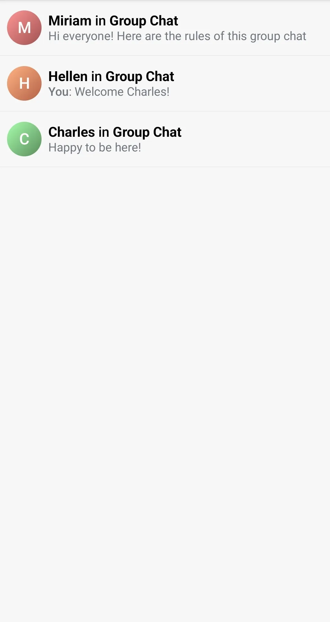
Message List Header
The MessageListHeader is the default component displayed in the MessagesScreen header if the showHeader flag is set to true (See: Messages Screen and Message List Header).
| Message List Header |
|---|
|
If you would like to customize the default MessageListHeader while using the high-level screen component MessagesScreen you can override the corresponding ChatComponentFactory method: MessageListHeader. The method provides some default data such as the Channel, the connection state, the typing users, and the default user actions which you can use to build your own message list header:
class CustomChatComponentFactory : ChatComponentFactory { @Composable override fun MessageListHeader( modifier: Modifier, channel: Channel, currentUser: User?, connectionState: ConnectionState, typingUsers: List<User>, messageMode: MessageMode, onBackPressed: () -> Unit, onHeaderTitleClick: (Channel) -> Unit, onChannelAvatarClick: () -> Unit, ) { // Your implementation of the message list header } }The factory also allows for a more granular customization of the message list header, by providing different factory methods for the leading, the center and the trailing content of the header. The default leading content is a back button, while the center content consists of a title holding the channel name, and a subtitle showing info about the user count. The trailing content shows the channel avatar.
You can customize the different parts of the header by providing your own implementation of the corresponding methods:
MessageListHeaderLeadingContentMessageListHeaderCenterContentMessageListHeaderTrailingContent
class CustomChatComponentFactory : ChatComponentFactory { @Composable override fun RowScope.MessageListHeaderLeadingContent( onBackPressed: () -> Unit, ) { // Your implementation for the message list header leading content } @Composable override fun RowScope.MessageListHeaderCenterContent( modifier: Modifier, channel: Channel, currentUser: User?, typingUsers: List<User>, messageMode: MessageMode, onHeaderTitleClick: (Channel) -> Unit, connectionState: ConnectionState, ) { // Your implementation for the message list header center content } @Composable override fun RowScope.MessageListHeaderTrailingContent( channel: Channel, currentUser: User?, onClick: () -> Unit, ) { // Your implementation for the message list header trailing content } }By overriding any of these ChatComponentFactory methods, you can easily swap in and out the MessageListHeader(or specific parts from it), while using the high-level MessagesScreen component.
You can also customize the MessageListHeader from the MessagesScreen by passing your implemenation in the topBarContent slot.
If you are not using the high-level screen component MessagesScreen, you can still use the MessageListHeader component independently from the ChatComponentFactory, and customize its leading/center/trailing content directly by passing your own content for the leadingContent/centerContent/trailingContent slots as described in Message List Header.
Message List Background
You can customize the background of the MessageList by overriding the ChatComponentFactory#MessageListBackground composable. In this composable, you can render any sort of background you want, such as a gradient, an image, or even a more complex background with multiple layers, and it will be rendered behind the message list items.
class CustomChatComponentFactory : ChatComponentFactory { @Composable override fun MessageListBackground() { // Your implementation for the message list background } }Message Items
MessageListItemContent
The message list item content represents the entire content of a regular chat message.

class CustomChatComponentFactory : ChatComponentFactory { @Composable public fun LazyItemScope.MessageListItemContent( messageItem: MessageItemState, reactionSorting: ReactionSorting, onPollUpdated: (Message, Poll) -> Unit, onCastVote: (Message, Poll, Option) -> Unit, onRemoveVote: (Message, Poll, Vote) -> Unit, selectPoll: (Message, Poll, PollSelectionType) -> Unit, onClosePoll: (String) -> Unit, onAddPollOption: (Poll, String) -> Unit, onLongItemClick: (Message) -> Unit, onThreadClick: (Message) -> Unit, onReactionsClick: (Message) -> Unit, onGiphyActionClick: (GiphyAction) -> Unit, onMediaGalleryPreviewResult: (MediaGalleryPreviewResult?) -> Unit, onQuotedMessageClick: (Message) -> Unit, onUserAvatarClick: ((User) -> Unit)?, onMessageLinkClick: ((Message, String) -> Unit)?, onUserMentionClick: (User) -> Unit, onAddAnswer: (Message, Poll, String) -> Unit, ) { // Custom message list item content implementation } }MessageTextContent
This allows customization of the text content inside a message bubble.

class CustomChatComponentFactory : ChatComponentFactory { @Composable override fun MessageTextContent( message: Message, currentUser: User?, onLongItemClick: (Message) -> Unit, onLinkClick: ((Message, String) -> Unit)?, onUserMentionClick: (User) -> Unit ) { // Custom message text content implementation } }MessageItemFooterContent
This allows customization of the entire footer of a message, which includes timestamps and message status.

class CustomChatComponentFactory : ChatComponentFactory { @Composable override fun ColumnScope.MessageItemFooterContent( messageItem: MessageItemState ) { // Custom message item footer implementation } }MessageFooterStatusIndicator
This allows customization of the status indicator of a message, which includes the read status and read count.

class CustomChatComponentFactory : ChatComponentFactory { @Composable override fun MessageFooterStatusIndicator( modifier: Modifier, message: Message, isMessageRead: Boolean, readCount: Int ) { // Custom status indicator implementation } }Message list date separator
In addition to the actual message items, you can also utilize the ChatComponentFactory to customize the different parts of the message list, such as the date separators appearing between messages sent on different days:
| Message list date separator |
|---|
 |
To provide a custom appearance for the date separator, you can override the ChatComponentFactory#MessageListDateSeparatorItemContent method. The method provides the DateSeparatorItemState from where you can extract the date which needs to be rendered:
class CustomChatComponentFactory : ChatComponentFactory { @Composable override fun LazyItemScope.MessageListDateSeparatorItemContent(dateSeparatorItem: DateSeparatorItemState) { // Your implementation for the message list date separator } }Message list unread separator
Similarly to the date separator, you can also customize the appearance of the unread separator shown in the MessageList after the last read message:
| Message list unread separator |
|---|
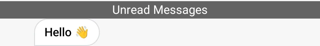 |
To provide a custom appearance for the unread separator, you can override the ChatComponentFactory#MessageListUnreadSeparatorItemContent:
class CustomChatComponentFactory : ChatComponentFactory { @Composable override fun LazyItemScope.MessageListUnreadSeparatorItemContent(unreadSeparatorItem: UnreadSeparatorItemState) { // Your implementation for the unread separator } }System message item
Utilizing the ChatComponentFactory, you can also customize the appearance of the system messages in the MessageList:
| System message item |
|---|
 |
To provide a custom appearance for the system message item, you can override the ChatComponentFactory#MessageListSystemItemContent method. The method provides the SystemMessageItemState which you can use to extract the system Message that needs to be shown:
class CustomChatComponentFactory : ChatComponentFactory { @Composable override fun LazyItemScope.MessageListSystemItemContent(systemMessageItem: SystemMessageItemState) { // Your implementation for the system message item } }Message list typing indicator
The typing indicator is an item which is placed at the bottom of the MessageList, and is shown when 1 or more users are currently typing a message. By default, the SDK does not provide a typing indicator implementation, so if you would like to show it, you would need to override the ChatComponentFactory#MessageListTypingIndicatorItemContent method, and provide your own UI for it. The method provides the TypingItemState from which you can extract the currently typing users:
class CustomChatComponentFactory : ChatComponentFactory { @Composable override fun LazyItemScope.MessageListTypingIndicatorItemContent(typingItem: TypingItemState) { // Your implementation of the typing indicator, ex: Text("${typingItem.typingUsers.size} users are typing...") } }Message Composer
The ChatComponentFactory provides a way to customize different parts of the MessageComposer when it is used as part of the high-level screen component MessagesScreen, by simply overriding the corresponding factory method, without the need to re-implement big parts of the UI.
If you are using the bound/stateless component MessageComposer directly instead of the MessagesScreen, you can use the ChatComponentFactory, but you can also customize most of the components by passing custom implementation in the specific slots. More details can be found in the Message Composer docs.
The default composer consists of several basic components:
- Attachments button
- Commands button
- Input field
- Send button
| Message composer |
|---|
 |
Let’s see how you can customize each one of the base composer components:
Composer label
By default, when there is no message entered in the composer, it shows a simple “Send a message” label. To override the default text with a new one, or to completely replace the component with a different one, you can override the ChatComponentFactory#MessageComposerLabel:
class CustomChatComponentFactory : ChatComponentFactory { @Composable override fun MessageComposerLabel(state: MessageComposerState) { // Your implementation of the composer label } }If you are using the bound/stateless component MessageComposer directly instead of the MessagesScreen, you can also customize this component by providing your implementation in the label slot.
Composer input
If you need to modify the whole input field, you can override the method: ChatComponentFactory#MessageComposerInput, which provides the current MessageComposerState, and the callbacks required to update the state backing the composer input field: onInputChanged and onAttachmentRemoved. It also provides the aforementioned label component, so that you can re-use the default composer label in your custom input field:
class CustomChatComponentFactory : ChatComponentFactory { @Composable override fun RowScope.MessageComposerInput( state: MessageComposerState, onInputChanged: (String) -> Unit, onAttachmentRemoved: (Attachment) -> Unit, label: @Composable (MessageComposerState) -> Unit, ) { // Your custom implementation of the composer input field } }If you are using the bound/stateless component MessageComposer directly instead of the MessagesScreen, you can also customize this component by providing your implementation in the input slot.
Attachments button
The first button in the default message composer - the “Attachments” button can be customized by overriding the ChatComponentFactory#MessageComposerAttachmentsButton method. It provides two arguments:
enabled- flag instructing whether the button should be enabled/disabledonClick- the action to be taken when the button is clicked. By default, calling this method will result in the opening of the attachments picker.
If you want to update the appearance of the button, but at the same time to also preserve the existing behaviour, we strongly recommend to respect the enabled flag, and to call the provided onClick lambda in your custom button implementation.
class CustomChatComponentFactory : ChatComponentFactory { @Composable override fun RowScope.MessageComposerAttachmentsButton( enabled: Boolean, onClick: () -> Unit, ) { // Your custom implementation of the 'Attachments' button } }Commands button
Similar to the “Attachments” button, you can easily customize the second button shown in the default message composer - the “Commands” button. You can do that by overriding the ChatComponentFactory#MessageComposerCommandsButton method. It provides several arguments:
hasCommandSuggestions- indicator if the commands suggestion menu is activeenabled- flag instructing whether the button should be enabled/disabledonClick- the action to be taken when the button is clicked. By default, calling this method will result in the opening/closing of the commands suggestion menu.
If you want to update the appearance of the button, but at the same time to also preserve the existing behaviour, we strongly recommend to respect the enabled flag, and to call the provided onClick lambda in your custom button implementation.
class CustomChatComponentFactory : ChatComponentFactory { @Composable override fun RowScope.MessageComposerCommandsButton( hasCommandSuggestions: Boolean, enabled: Boolean, onClick: () -> Unit, ) { // Your implementation of the commands button } }Integrations
The previously mentioned “Attachments” and “Commands” buttons can also be customized as a group via ChatComponentFactory#MessageComposerIntegrations. The integrations represent the ‘leading’ content of the message composer, and it contains both the “Attachments” and “Commands” buttons. So if you want to customize, or maybe even remove the whole content before the input field, you can do that by overriding the following:
class CustomChatComponentFactory : ChatComponentFactory { @Composable override fun RowScope.MessageComposerIntegrations( state: MessageComposerState, onAttachmentsClick: () -> Unit, onCommandsClick: () -> Unit, ) { // Your implementation of the composer integrations } }If you are using the bound/stateless component MessageComposer directly instead of the MessagesScreen, you can also customize this component by providing your implementation in the integrations slot.
Send button
The “Send” button shown after the input field in the default message composer can be customized via the ChatComponentFactory#MessageComposerSendButton. The method provides couple of arguments:
enabled- flag instructing whether the button should be enabled/disabledisInputValid- flag indicating if the currently entered input passed the validation checks and can be submittedonClick- the action to be taken when the button is clicked. By default, calling this method will result in attempting to send the currently entered message to the channel.
If you want to update the appearance of the button, but at the same time to also preserve the existing behaviour, we strongly recommend to respect the enabled and isInputValid flags, and to call the provided onClick lambda in your custom button implementation.
class CustomChatComponentFactory : ChatComponentFactory { @Composable override fun MessageComposerSendButton( enabled: Boolean, isInputValid: Boolean, onClick: () -> Unit, ) { // Your implementation of the send button } }Audio record button
The “Audio record” button and voice messages are disabled by default. To enable it, you need to set the AudioRecordingTheme.enabled flag to true, which is defined in the MessageComposerTheme.
The “Audio record” button in the message composer is used to record and send audio messages to the channel. You can start the recording process by pressing and holding the “Audio record” button.
| Audio Record Button |
|---|
 |
You can customize this button by overriding the ChatComponentFactory#MessageComposerAudioRecordButton:
class CustomChatComponentFactory : ChatComponentFactory { @Composable override fun MessageComposerAudioRecordButton( state: RecordingState, recordingActions: AudioRecordingActions, ) { // Your implementation of the audio record button } }Composer trailing content
Similar to how the “Attachments” and “Commands” buttons are grouped in a single “Integrations” component, the “Send” and “Audio record” buttons are grouped in the “Trailing content” component. You can customize the trailing content by overriding the ChatComponentFactory#MessageComposerTrailingContent:
class CustomChatComponentFactory : ChatComponentFactory { @Composable override fun MessageComposerTrailingContent( state: MessageComposerState, onSendClick: (String, List<Attachment>) -> Unit, recordingActions: AudioRecordingActions, ) { // Your implementation of the composer trailing content } }If you are using the bound/stateless component MessageComposer directly instead of the MessagesScreen, you can also customize this component by providing your implementation in the trailingContent slot.
Mentions popup content
When the user enters the @ character in the message composer, it is detected as a mention action, and a popup showing all suggested users that can be mentioned is shown:
| Mentions popup |
|---|
|
You can customize this popup dialog by overriding the ChatComponentFactory#MessageComposerMentionsPopupContent method, which provides:
mentionSuggestions- the list of users which match the mention stringonMentionSelected- the action to be taken when a suggestion is clicked. By default, calling this method results in appending the full user name to the@character in the current message.
class CustomChatComponentFactory : ChatComponentFactory { @Composable override fun MessageComposerMentionsPopupContent( mentionSuggestions: List<User>, onMentionSelected: (User) -> Unit, ) { // Your implementation of the the mentions popup content } }If you are using the bound/stateless component MessageComposer directly instead of the MessagesScreen, you can also customize this component by providing your implementation in the mentionPopupContent slot.
If you want to keep the default layout of the popup content, and only change the content of the mention items, you can do that by overriding the specific ChatComponentFactory#MessageComposerMentionSuggestionItem method. This method provides the User for which the item will be rendered, and the lambda to be invoked when the item is clicked. You can use these arguments to build your own custom mention suggestion item:
class CustomChatComponentFactory : ChatComponentFactory { @Composable override fun MessageComposerMentionSuggestionItem( user: User, onMentionSelected: (User) -> Unit, ) { // Your implementation for the mention suggestion item } }As with other similar items, the ChatComponentFactory provides a way for granular customization of the mention suggestion items, by overriding the corresponding methods for the leading/center/trailing content of the items. The default leading content displays the user avatar, while the center content displays the user name and ID. The trailing content displays a decorative @ icon. You can customize or even remove any of these parts of the items by overriding the corresponding methods:
MessageComposerMentionSuggestionItemLeadingContentMessageComposerMentionSuggestionItemCenterContentMessageComposerMentionSuggestionItemTrailingContent
class CustomChatComponentFactory : ChatComponentFactory { @Composable override fun RowScope.MessageComposerMentionSuggestionItemLeadingContent( user: User, ) { // Your implementation of the leading content } @Composable override fun RowScope.MessageComposerMentionSuggestionItemCenterContent( user: User, ) { // Your implementation of the center content } @Composable override fun RowScope.MessageComposerMentionSuggestionItemTrailingContent( user: User, ) { // Your implementation of the trailing content } }Commands popup content
Clicking on the “Commands” button from the message composer, or starting your message with the / character results in showing a popup which displays all the possible commands that can be performed in the channel (ex. /mute, /unmute).
| Commands popup |
|---|
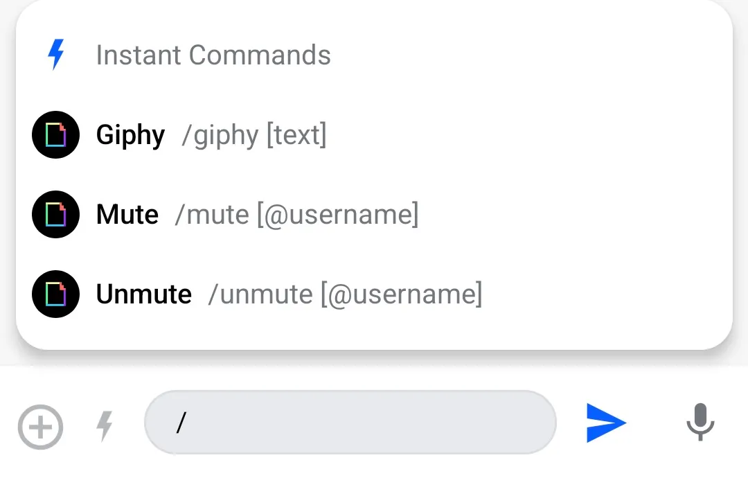 |
You can customize this popup dialog by overriding the ChatComponentFactory#MessageComposerCommandsPopupContent method, which provides:
commandSuggestions- the list of commands which match the command stringonCommandSelected- the action to be taken when a suggestion is clicked. By default, calling this method results in appending the full command to the/character in the current message.
class CustomChatComponentFactory : ChatComponentFactory { @Composable override fun MessageComposerCommandsPopupContent( commandSuggestions: List<Command>, onCommandSelected: (Command) -> Unit, ) { // Your implementation of the command suggestions popup } }If you are using the bound/stateless component MessageComposer directly instead of the MessagesScreen, you can also customize this component by providing your implementation in the commandPopupContent slot.
If you want to keep the default layout of the popup content, and only change the content of the command items, you can do that by overriding the specific ChatComponentFactory#MessageComposerCommandSuggestionItem method. This method provides the Command for which the item will be rendered, and the lambda to be invoked when the item is clicked. You can use these arguments to build your own custom command suggestion item:
class CustomChatComponentFactory : ChatComponentFactory { @Composable override fun MessageComposerCommandSuggestionItem( command: Command, onCommandSelected: (Command) -> Unit, ) { // Your implementation of the command suggestion item } }As with other similar items, the ChatComponentFactory provides a way for granular customization of the command suggestion items, by overriding the corresponding methods for the leading/center content of the items. The default leading content displays the command icon, while the center content displays the full name of the command, and an example of how the whole command string should look like. You can customize or even remove any of these parts of the items by overriding the corresponding methods:
MessageComposerCommandSuggestionItemLeadingContentMessageComposerCommandSuggestionItemCenterContent
class CustomChatComponentFactory : ChatComponentFactory { @Composable override fun RowScope.MessageComposerCommandSuggestionItemLeadingContent( command: Command, ) { // Your implementation of the leading content } @Composable override fun RowScope.MessageComposerCommandSuggestionItemCenterContent( modifier: Modifier, command: Command, ) { // Your implementation of the center content } }Composer header
The message composer header is a component which appears only in specific scenarios, such as:
- Editing a message
- Replying to a message
- Adding a URL in the message
| Edit message | Reply to message | Add URL |
|---|---|---|
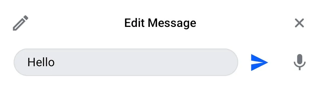 |  |  |
If you want to fully replace the default composer header implementations, you can do to that by overriding the ChatComponentFactory#MessageComposerHeader. The method provides the current state of the composer, which you can use to build your own implementation of the header. It also provides the onCancel and onLinkPreviewClick lambdas, which you can call if you want to dismiss the header, or to open the currently visible link preview:
class CustomChatComponentFactory : ChatComponentFactory { @Composable override fun ColumnScope.MessageComposerHeaderContent( state: MessageComposerState, onCancel: () -> Unit, onLinkPreviewClick: ((LinkPreview) -> Unit)?, ) { // Your implementation of the composer header } }If you are using the bound/stateless component MessageComposer directly instead of the MessagesScreen, you can also customize this component by providing your implementation in the headerContent slot.
You can also customize the the different states of the composer header separately: Overriding the ChatComponentFactory#MessageComposerMessageInputOptions will result in changing the Edit/Reply message header content, while overriding the ChatComponentFactory#MessageComposerLinkPreview will result in changing the URL preview content:
class CustomChatComponentFactory : ChatComponentFactory { @Composable override fun MessageComposerMessageInputOptions( modifier: Modifier, activeAction: MessageAction, onCancel: () -> Unit, ) { // Your implementation of the Edit/Reply header } @Composable override fun MessageComposerLinkPreview( modifier: Modifier, linkPreview: LinkPreview, onClick: ((LinkPreview) -> Unit)?, ) { // Your implementation of the link preview } }Composer footer
The message composer footer is a component which only appears when the user replies in a thread, and it shows a checkbox that the user can toggle on, to send the message as a direct message as well.
| Thread reply |
|---|
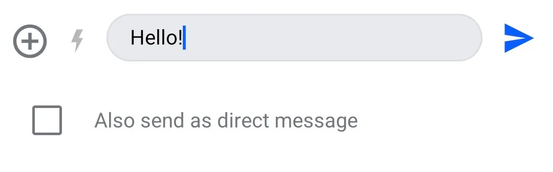 |
To customize this component, you can override the ChatComponentFactory#MessageComposerFooterContent method. The method provides the current state of the composer, which you can use to build your own implementation of the footer. It also provides a onAlsoSendToChannelSelected lambda, which is invoked when the checkmark is updated:
class CustomChatComponentFactory : ChatComponentFactory { @Composable override fun ColumnScope.MessageComposerFooterContent( state: MessageComposerState, onAlsoSendToChannelSelected: (Boolean) -> Unit, ) { // Your implementation of the footer content } }If you are using the bound/stateless component MessageComposer directly instead of the MessagesScreen, you can also customize this component by providing your implementation in the footerContent slot.
Quoted message
Another component that can be customized via the ChatComponentFactory is the quoted message which is shown in the composer when the user replies to a message:
| Quoted message |
|---|
 |
You can customize the appearance of the quoted message in the message composer by overriding the ChatComponentFactory#MessageComposerQuotedMessage:
class CustomChatComponentFactory : ChatComponentFactory { @Composable override fun MessageComposerQuotedMessage( modifier: Modifier, state: MessageComposerState, quotedMessage: Message, ) { // Your implementation of the quoted message } }Attachments Picker
The AttachmentsPicker is a component that allows the user to browse and select media files to be sent in a message. The type of attachments that it supports and its appearance can be customized via the ChatTheme#attachmentsPickerTabFactories property, with which you can provide a list of custom AttachmentsPickerTabFactory instances (see: Attachments Picker).
The ChatComponentFactory provides some additional customizations that you can apply to the default attachments picker, such as modifying the Add (>) button in the picker header:
| Attachments picker |
|---|
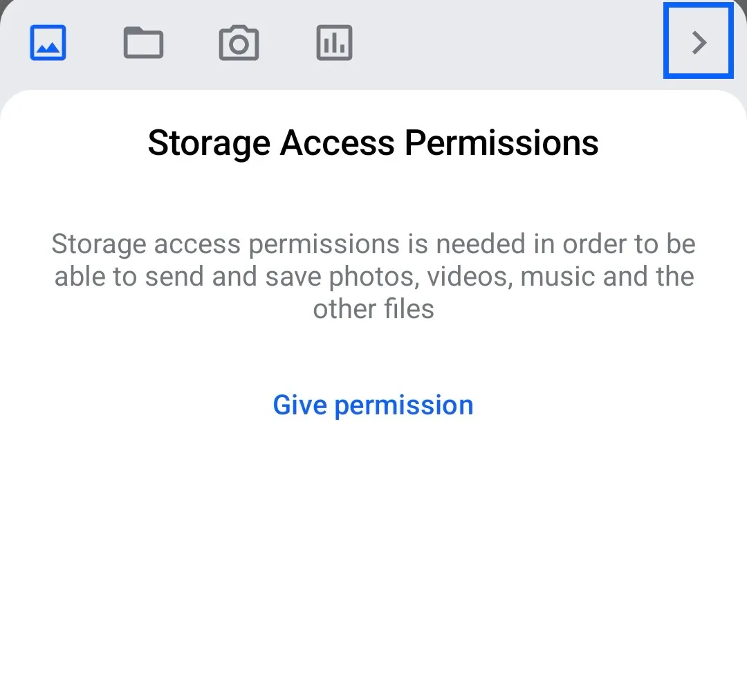 |
You can customize the appearance of the “Add” button in the attachments picker by overriding the ChatComponentFactory#AttachmentsPickerAddButton method. The method provides two arguments:
hasPickedAttachments- flag indicating if the user has selected any attachmentsonClick- the action to be taken when the button is clicked. By default, calling this method will result in closing the attachments picker and sending the selected attachments to the message composer.
class CustomChatComponentFactory : ChatComponentFactory { @Composable override fun AttachmentsPickerSendButton( hasPickedAttachments: Boolean, onClick: () -> Unit, ) { // Your implementation for the "Add" button in the attachments picker } }Menus
The ChatComponentFactory provides a way to customize different menus used in the Chat screens:
- Channel options menu
- Message options menu
- Reactions menu
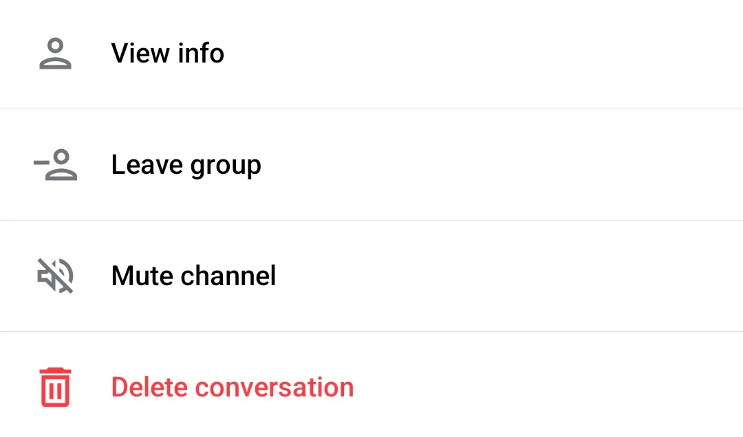
Channel menu
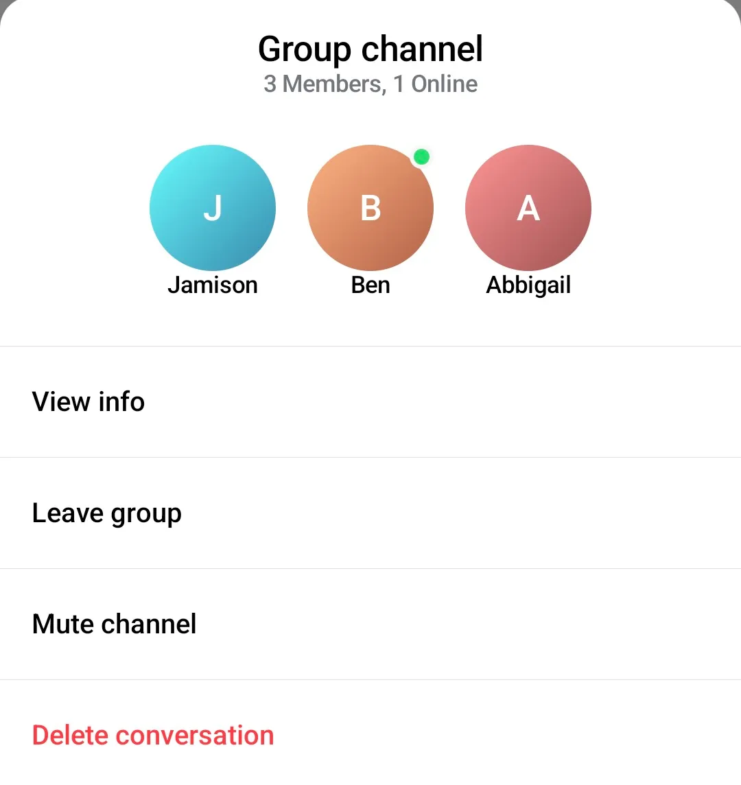
The channel menu provides actions that the user can perform over a given channel.
| Channel menu |
|---|
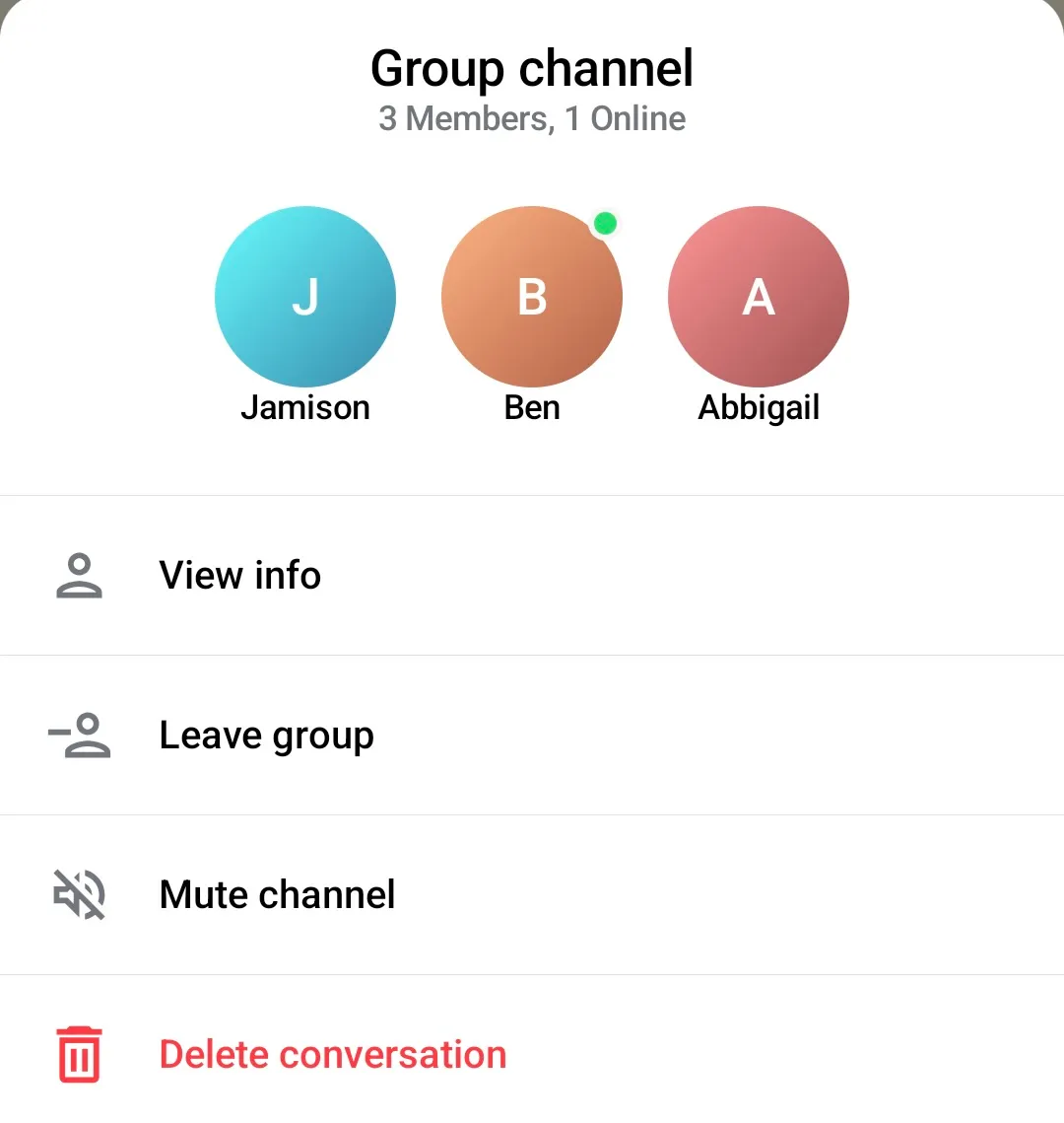 |
To provide a custom implementation of the channel menu, you need to override the ChatComponentFactory#ChannelMenu method:
class CustomChatComponentFactory : ChatComponentFactory { @Composable override fun ChannelMenu( modifier: Modifier, selectedChannel: Channel, isMuted: Boolean, currentUser: User?, onChannelOptionClick: (ChannelAction) -> Unit, onDismiss: () -> Unit ) { // Your implementation of the channel menu } }The ChatComponentFactory also provides a way for more granular customization of this menu. You can separately override/customize the header of the menu:
| Channel menu header |
|---|
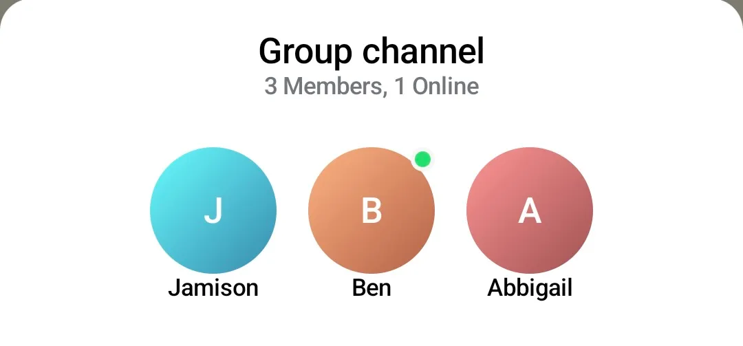 |
by overriding the ChatComponentFactory#ChannelMenuHeaderContent:
class CustomChatComponentFactory : ChatComponentFactory { @Composable override fun ChannelMenuHeaderContent(modifier: Modifier, selectedChannel: Channel, currentUser: User?) { // Your implementation for the channel menu header } }Similarly, you can customize the main content of the menu - the actual channel options:
| Channel menu options |
|---|
 |
by overriding the ChatComponentFactory#ChannelMenuOptions:
class CustomChatComponentFactory : ChatComponentFactory { @Composable override fun ChannelMenuOptions( modifier: Modifier, onChannelOptionClick: (ChannelAction) -> Unit, channelOptions: List<ChannelOptionState> ) { // Your implementation for the channel menu options } }Additionally, if you want to keep the default channel menu layout and content, but want to only modify the appearance of the option items, you can do that by overriding the ChatComponentFactory#ChannelOptionsItem method. This method provides the ChannelOptionState, which you can use to retrieve the information about the item to be rendered, like the title, the icon, or the action:
class CustomChatComponentFactory : ChatComponentFactory { @Composable override fun ChannelOptionsItem(modifier: Modifier, option: ChannelOptionState, onClick: () -> Unit) { // Your implementation of the channel option item } }For an even more fine-grained customisation, there is also a method which allows customizing of the icons shown in the channel menu option items: ChatComponentFactory#ChannelOptionsItemLeadingIcon. By overriding this method you can provide custom icons for the items, change the icon for a different content, or even completely remove the icons from the items:
class CustomChatComponentFactory : ChatComponentFactory { @Composable override fun ChannelOptionsItemLeadingIcon(modifier: Modifier, option: ChannelOptionState) { // Your implementation for the leading icon } }Message menu
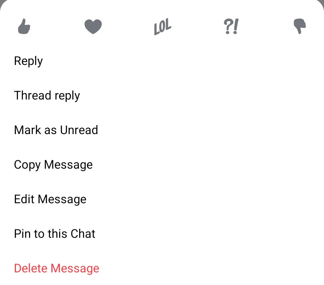
The message menu provides actions that the user can perform over a given message.
| Message menu |
|---|
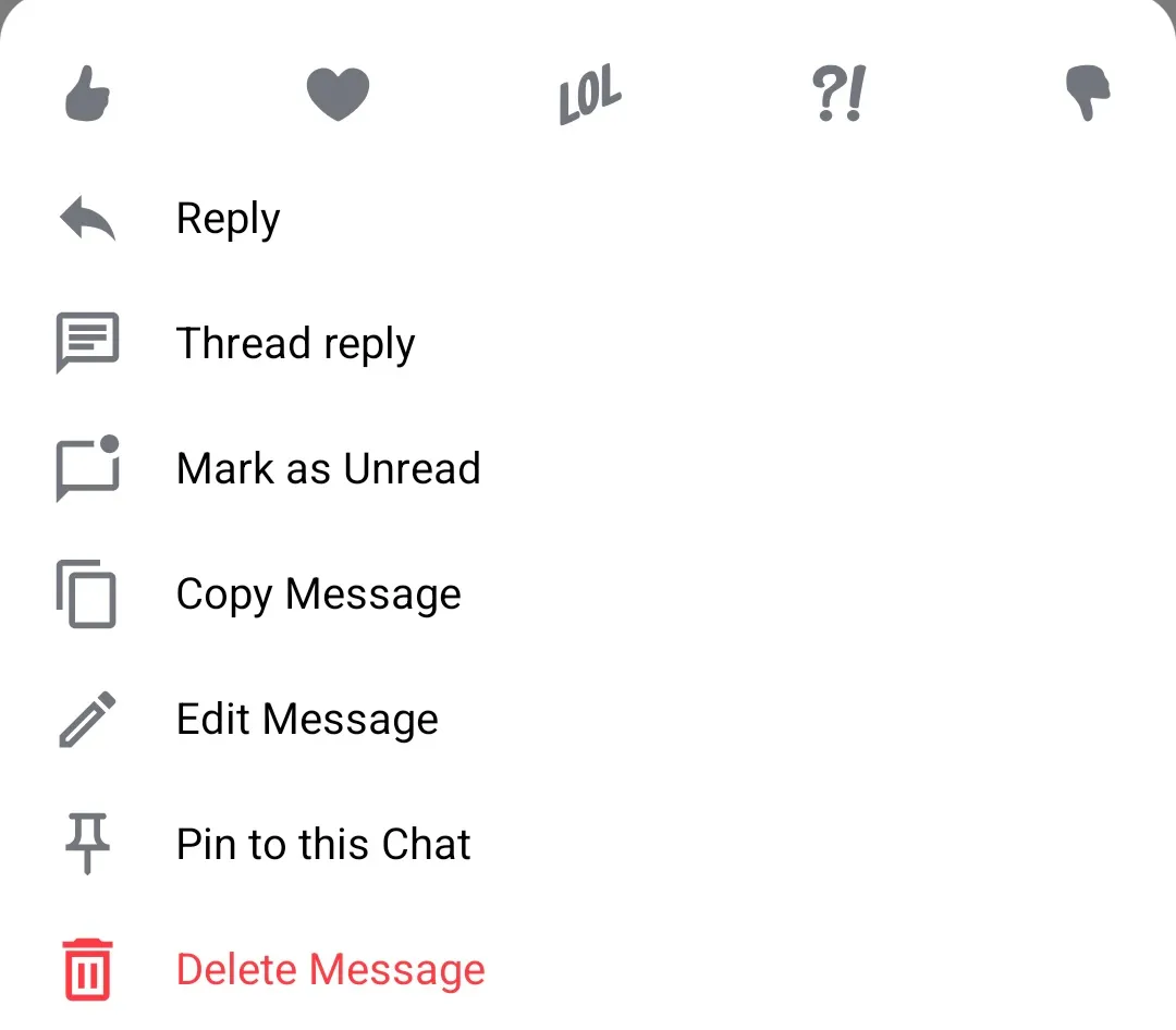 |
To provide a custom implementation of the message menu, you need to override the ChatComponentFactory#MessageMenu method:
class CustomChatComponentFactory : ChatComponentFactory { @Composable override fun MessageMenu( modifier: Modifier, message: Message, messageOptions: List<MessageOptionItemState>, ownCapabilities: Set<String>, onMessageAction: (MessageAction) -> Unit, onShowMore: () -> Unit, onDismiss: () -> Unit ) { // Your implementation of the message menu } }Similar to the channel menu, you can separately customize the header content of the message menu, which holds the available reactions:
| Message menu header |
|---|
 |
by overriding the ChatComponentFactory#MessageMenuHeaderContent:
class CustomChatComponentFactory : ChatComponentFactory { @Composable override fun MessageMenuHeaderContent( modifier: Modifier, message: Message, messageOptions: List<MessageOptionItemState>, onMessageAction: (MessageAction) -> Unit, ownCapabilities: Set<String>, onShowMore: () -> Unit, reactionTypes: Map<String, ReactionIcon>, showMoreReactionsIcon: Int ) { // Your implementation of the message menu header (reactions) } }Similarly, you can customize the main content of the menu - the actual message options:
| Message menu options |
|---|
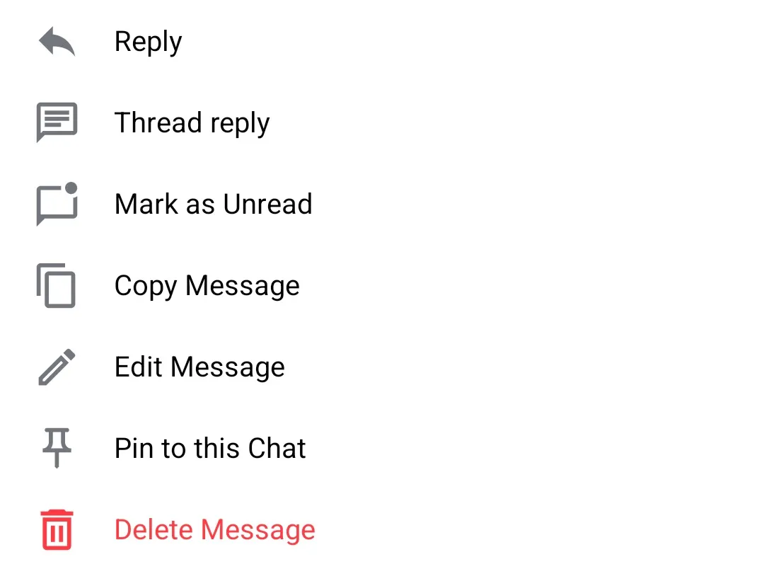 |
by overriding the ChatComponentFactory#MessageMenuOptions:
class CustomChatComponentFactory : ChatComponentFactory { @Composable override fun MessageMenuOptions( modifier: Modifier, message: Message, options: List<MessageOptionItemState>, onMessageOptionSelected: (MessageOptionItemState) -> Unit ) { // Your implementation of the message menu options } }Additionally, if you want to keep the default message menu layout and content, but want to only modify the appearance of the option items, you can do that by overriding the ChatComponentFactory#MessageMenuOptionsItem method. This method provides the MessageOptionItemState, which you can use to retrieve the information about the item to be rendered, like the title, the icon, or the action:
class CustomChatComponentFactory : ChatComponentFactory { @Composable override fun MessageMenuOptionsItem( modifier: Modifier, option: MessageOptionItemState, onMessageOptionSelected: (MessageOptionItemState) -> Unit ) { // Your implementation of the message option item } }For an even more fine-grained customisation, there is also a method which allows customizing of the icons shown in the message menu option items: ChatComponentFactory#MessageMenuOptionsItemLeadingContent. By overriding this method you can provide custom icons for the items, change the icon for a different content, or even completely remove the icons from the items:
class CustomChatComponentFactory : ChatComponentFactory { @Composable override fun MessageMenuOptionsItemLeadingContent(modifier: Modifier, option: MessageOptionItemState) { // Your implementation for the leading icon } }Channel and Message menu
In the previous sections, we demonstrated how to customize the channel and the message menus separately, using the ChatComponentFactory.
The component factory also provides a simpler way, to customize the option items for both the channel and message menu, by overriding the ChatComponentFactory#MessageMenuItem. For example, if you would like to remove the leading icons from the options items in both channel and message menus, you can do something like:
class CustomChatComponentFactory : ChatComponentFactory { @Composable override fun MenuOptionItem( modifier: Modifier, onClick: () -> Unit, leadingIcon: @Composable (RowScope.() -> Unit), title: String, titleColor: Color, style: TextStyle, itemHeight: Dp, verticalAlignment: Alignment.Vertical, horizontalArrangement: Arrangement.Horizontal ) { // Call super.MenuOptionItem, but override the leading icon composable super.MenuOptionItem( modifier = modifier, onClick = onClick, leadingIcon = { // Remove leading icon Spacer(modifier = Modifier.width(16.dp)) }, title = title, titleColor = titleColor, style = style, itemHeight = itemHeight, verticalAlignment = verticalAlignment, horizontalArrangement = horizontalArrangement, ) } }This would result in menus like:
| Channel menu | Message menu |
|---|---|
 |  |
Reactions menu
The reactions menu appears when the user taps on the reaction icon in a message header. It shows an overview of all the reactions for a given message and provides the option for adding/changing/removing the current user’s reaction.
| Reactions menu |
|---|
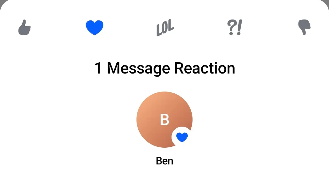 |
To customize the reactions menu, you need to override the ChatComponentFactory#ReactionsMenu method:
class CustomChatComponentFactory : ChatComponentFactory { @Composable override fun ReactionsMenu( modifier: Modifier, currentUser: User?, message: Message, onMessageAction: (MessageAction) -> Unit, onShowMoreReactionsSelected: () -> Unit, ownCapabilities: Set<String>, onDismiss: () -> Unit, ) { // Your implementation of the reactions menu } }Similar to the other menus, you can separately customize the header content of the reactions menu, which holds the available reactions:
| Reactions menu header |
|---|
 |
by overriding the ChatComponentFactory#ReactionsMenuHeaderContent:
class CustomChatComponentFactory : ChatComponentFactory { @Composable override fun ReactionsMenuHeaderContent( modifier: Modifier, message: Message, reactionTypes: Map<String, ReactionIcon>, onMessageAction: (MessageAction) -> Unit, onShowMoreReactionsSelected: () -> Unit, showMoreReactionsIcon: Int, ) { // Your implementation of the reactions menu header content } }Similarly, you can customize the main content of the menu - the overview of all reactions:
| Reactions menu overview |
|---|
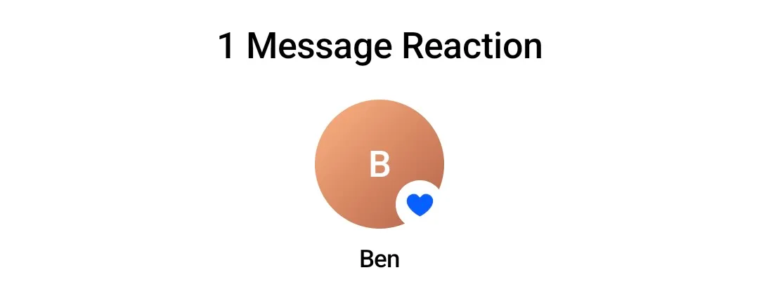 |
by overriding the ChatComponentFactory#ReactionsMenuCenterContent:
class CustomChatComponentFactory : ChatComponentFactory { @Composable override fun ReactionsMenuCenterContent( modifier: Modifier, userReactions: List<UserReactionItemState>, ) { // Your implementation of the reactions menu center content } }Reaction options
The previously described “Message menu” and “Reactions menu” reuse the same reactions header component, and the ChatComponentFactory provides a way to customize this component generally, without the need to customize both menus separately. You can achieve this by overriding the ChatComponentFactory#ReactionMenuOptions method:
class CustomChatComponentFactory : ChatComponentFactory { @Composable override fun ReactionMenuOptions( modifier: Modifier, message: Message, reactionTypes: Map<String, ReactionIcon>, onMessageAction: (MessageAction) -> Unit, onShowMoreReactionsSelected: () -> Unit, showMoreReactionsIcon: Int, ) { // Your implementation for the reactions menu options } }If you want to only customize the appearance of the individual reaction items you can override the ChatComponentFactory#ReactionMenuOptionItem method. This method provides the ReactionOptionItemState, which you can use to retrieve the information about the item to be rendered, and the onReactionSelected lambda, which you can call when the item is clicked:
class CustomChatComponentFactory : ChatComponentFactory { @Composable override fun ReactionMenuOptionItem( modifier: Modifier, option: ReactionOptionItemState, onReactionOptionSelected: (ReactionOptionItemState) -> Unit, ) { // Your implementation for the reaction menu item } }Extended reactions menu
The reactions picker menu by default shows up to 5 items. If there are more possible reactions to show, the “Show more” item is displayed:
| Reactions menu show more |
|---|
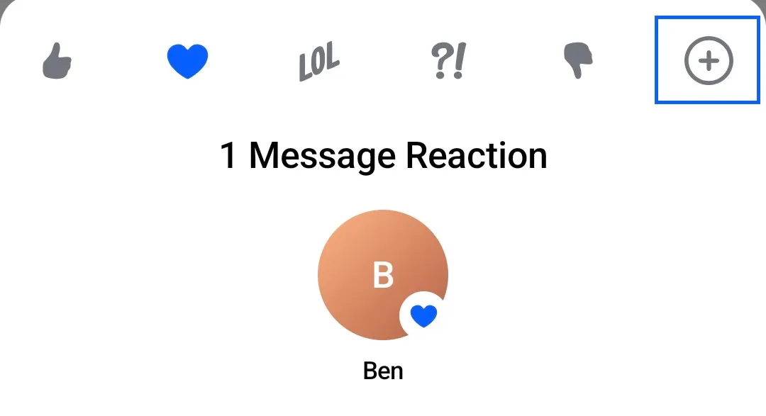 |
To customize the appearance of the “Show more” item in the reactions menu, you can override the ChatComponentFactory#ReactionsMenuShowMore method. The method provides the onShowMoreReactionsSelected lambda, which you can call to open the “Extended reactions menu”:
class CustomChatComponentFactory : ChatComponentFactory { @Composable override fun ReactionMenuShowMore( modifier: Modifier, onShowMoreReactionsSelected: () -> Unit, showMoreReactionsIcon: Int, ) { // Your implementation of the "Show more reactions" item } }Clicking on the “Show more” item will open the “Extended reactions menu”:
| Extended reactions menu |
|---|
 |
To customize the appearance of the “Extended reactions menu”, you can override the ChatComponentFactory#MessageReactionPicker method:
class CustomChatComponentFactory : ChatComponentFactory { @Composable override fun MessageReactionPicker( modifier: Modifier, message: Message, onMessageAction: (MessageAction) -> Unit, onDismiss: () -> Unit, ) { // Your implementation for the 'extended' reactions picker } }This extended reactions picker is built from 2 separate components which can be customized separately:
- The header content, which is empty by default.
- The center content, which displays the list of all reactions.
To customize (add) a header to the extended reactions picker, you can override the ChatComponentFactory#MessageReactionPickerHeaderContent method:
class CustomChatComponentFactory : ChatComponentFactory { @Composable override fun MessageReactionPickerHeaderContent( modifier: Modifier, message: Message, onMessageAction: (MessageAction) -> Unit, onDismiss: () -> Unit, ) { // Your implementation of the extended reactions picker header } }And to customize the content which displays the list of all reactions, you can override the ChatComponentFactory#MessageReactionPickerCenterContent method:
class CustomChatComponentFactory : ChatComponentFactory { @Composable override fun MessageReactionPickerCenterContent( modifier: Modifier, message: Message, onMessageAction: (MessageAction) -> Unit, reactionTypes: Map<String, ReactionIcon>, onDismiss: () -> Unit, ) { // Your implementation of the extended reactions picker content } }If you want to only customize the appearance of the individual reaction items you can override the ChatComponentFactory#ExtendedReactionMenuOptionItem method. This method provides the ReactionOptionItemState, which you can use to retrieve the information about the item to be rendered, and the onReactionOptionSelected lambda, which you can call when the item is clicked:
class CustomChatComponentFactory : ChatComponentFactory { @Composable override fun ExtendedReactionMenuOptionItem( modifier: Modifier, option: ReactionOptionItemState, onReactionOptionSelected: (ReactionOptionItemState) -> Unit, ) { // Your implementation of the reaction menu item } }The ExtendedReactionMenuOptionItem internally uses the ReactionMenuOptionItem, so overriding the ReactionMenuOptionItem will also result in overriding the ExtendedReactionMenuOptionItem.
Thread List
The ThreadList component is used to display a list of all threads for a given user (See Thread List).
| Thread list |
|---|
 |
As an alternative to using the composable slot parameters provided by the ThreadList component, you can also customize the appearance of the threads via the ChatComponentFactory.
To customize the “New threads” banner which displays the number of new unseen threads, you can override the ChatComponentFactory#ThreadListUnreadThreadsBanner method:
class CustomChatComponentFactory : ChatComponentFactory { @Composable override fun ThreadListUnreadThreadsBanner( unreadThreads: Int, onClick: () -> Unit, ) { // Your implementation of the unread threads banner } }Overriding the ThreadListUnreadThreadsBanner is the same as passing a custom implementation for the ThreadList#unreadThreadsBanner slot.
To customize the items in the thread list, you can override the ChatComponentFactory#ThreadListItem method. This method provides the Thread data which you can use to build your own implementation of the thread item, and the onThreadClick lambda which you can call when the item is clicked:
class CustomChatComponentFactory : ChatComponentFactory { @Composable override fun ThreadListItem( thread: Thread, currentUser: User?, onThreadClick: (Thread) -> Unit ) { // Your implementation of the thread item } }Overriding the ThreadListItem is the same as passing a custom implementation for the ThreadList#itemContent slot.
Similar to other list items, the ChatComponentFactory provides a way for a more granular customization of the thread list items. It provides methods for customization of the:
- Thread title - Shows the thread icon and the channel name in which the thread exists.
- Reply to - Shows a preview of the thread root message.
- Unread count indicator - Shows the number of unread messages in the thread.
- Latest reply - Shows the latest message in the thread.
To customize one or more of these parts of the thread list items, you can override any of the corresponding methods:
ThreadListItemTitleThreadListItemReplyToContentThreadListItemUnreadCountContentThreadListItemLatestReplyContent
class CustomChatComponentFactory : ChatComponentFactory { @Composable override fun ThreadListItemTitle(thread: Thread, channel: Channel, currentUser: User?) { // Your implementation of the thread title } @Composable override fun RowScope.ThreadListItemReplyToContent(thread: Thread) { // Your implementation of the thread root message content } @Composable override fun RowScope.ThreadListItemUnreadCountContent(unreadCount: Int) { // Your implementation of the unread count content } @Composable override fun ThreadListItemLatestReplyContent(thread: Thread, currentUser: User?) { // Your implementation of the latest reply content } }The ChatComponentFactory also provides a way for customizing the loading content of the thread list. You can customize the default loading indicator by overriding the ChatComponentFactory#ThreadListLoadingContent method:
class CustomChatComponentFactory : ChatComponentFactory { @Composable override fun ThreadListLoadingContent(modifier: Modifier) { // Your implementation of the loading content } }Overriding the ThreadListLoadingContent is the same as passing a custom implementation for the ThreadList#loadingContent slot.
You can also customize the empty content of the thread list. You can do that by overriding the ChatComponentFactory#ThreadListEmptyContent method:
class CustomChatComponentFactory : ChatComponentFactory { @Composable override fun ThreadListEmptyContent(modifier: Modifier) { // Your implementation for the empty state } }Overriding the ThreadListEmptyContent is the same as passing a custom implementation for the ThreadList#emptyContent slot.
Finally, using the ChatComponentFactory you can also customize the loading more indicator of the list, which is a loading indicator shown when a new page of threads is being loaded. You can do that by overriding the ChatComponentFactory#ThreadListLoadingMoreContent method:
class CustomChatComponentFactory : ChatComponentFactory { @Composable override fun ThreadListLoadingMoreContent() { // Your implementation of the loading more indicator } }Overriding the ThreadListLoadingMoreContent is the same as passing a custom implementation for the ThreadList#loadingMoreContent slot.
Pinned Message List
The PinnedMessageList component is used to display a list of all pinned messages in a given channel (See Pinned Message List).
| Pinned messages list |
|---|
 |
As an alternative to using the composable slot parameters provided by the PinnedMessageList component, you can also customize the appearance of the threads via the ChatComponentFactory.
To customize the items in the pinned message list, you can override the ChatComponentFactory#PinnedMessageListItem method. This method provides the Message data which you can use to build your own implementation of the pinned message item, and the onClick lambda which you can call when the item is clicked:
class CustomChatComponentFactory : ChatComponentFactory { @Composable override fun PinnedMessageListItem( message: Message, currentUser: User?, onClick: (Message) -> Unit, ) { // Your implementation of the pinned message list item } }Overriding the PinnedMessageListItem is the same as passing a custom implementation for the PinnedMessageList#itemContent slot.
Similar to other list items, the ChatComponentFactory provides a way for a more granular customization of the pinned message list items. It provides methods for customization of the:
- Loading content - Shows an avatar of the user who sent the pinned message.
- Center content - Shows the name of the sender, and a preview of the pinned message.
- Trailing content - Shows the timestamp when the message was sent.
To customize one or more of these parts of the pinned message list items, you can override any of the corresponding methods:
PinnedMessageListItemLeadingContentPinnedMessageListItemCenterContentPinnedMessageListItemTrailingContent
class CustomChatComponentFactory : ChatComponentFactory { @Composable override fun RowScope.PinnedMessageListItemLeadingContent( message: Message, currentUser: User?, ) { // Your implementation of the pinned message leading content } @Composable override fun RowScope.PinnedMessageListItemCenterContent( message: Message, currentUser: User?, ) { // Your implementation of the pinned message center content } @Composable override fun RowScope.PinnedMessageListItemTrailingContent( message: Message, ) { // Your implementation of the pinned message trailing content } }The ChatComponentFactory also provides a way for customizing the loading content of the pinned message list. You can customize the default loading indicator by overriding the ChatComponentFactory#PinnedMessageListLoadingContent method:
class CustomChatComponentFactory : ChatComponentFactory { @Composable override fun PinnedMessageListLoadingContent(modifier: Modifier) { // Your implementation of the loading content } }Overriding the PinnedMessageListLoadingContent is the same as passing a custom implementation for the PinnedMessageList#loadingContent slot.
You can also customize the empty content of the pinned message list. You can do that by overriding the ChatComponentFactory#PinnedMessageListEmptyContent method:
class CustomChatComponentFactory : ChatComponentFactory { @Composable override fun PinnedMessageListEmptyContent(modifier: Modifier) { // Your implementation for the empty state } }Overriding the PinnedMessageListEmptyContent is the same as passing a custom implementation for the PinnedMessageList#emptyContent slot.
Finally, using the ChatComponentFactory you can also customize the loading more indicator of the list, which is a loading indicator shown when a new page of pinned messages is being loaded. You can do that by overriding the ChatComponentFactory#PinnedMessageListLoadingMoreContent method:
class CustomChatComponentFactory : ChatComponentFactory { @Composable override fun PinnedMessageListLoadingMoreContent() { // Your implementation of the loading more indicator } }Overriding the PinnedMessageListLoadingMoreContent is the same as passing a custom implementation for the PinnedMessageList#loadingMoreContent slot.
Compound factory
You can also compose multiple factories together. This is useful when you want to customize a specific UI component in the chain of your composable components, without overriding the entire factories, for example:
ChatTheme( // Let's say you have a component factory which provides a custom implementation // for a few components, and you want to use it as a base factory. componentFactory = MyCustomChatComponentFactory() ) { // Given you have a big chain of composable components, // and you want to customize the message footer status indicator // only for a particular screen. // You can use LocalComponentFactory to get the current component factory. val currentComponentFactory = LocalComponentFactory.current // Then you create a new component factory, val myCustomMessageFooterStatusIndicator = remember { // Delegating the rest of the components to the current component factory, object : ChatComponentFactory by currentComponentFactory { // Overriding the specific component which you want to customize. @Composable override fun MessageFooterStatusIndicator( modifier: Modifier, message: Message, isMessageRead: Boolean, readCount: Int, ) { MyAwesomeMessageReadStatusIndicator() } } } // Finally, you can use a local composition to provide the new compound factory. CompositionLocalProvider(LocalComponentFactory provides myCustomMessageFooterStatusIndicator) { MessageList() } }Scoped components
Compound factory is also useful when you want to reuse the default component implementation but it is an extension of a scope, for example:
Let’s say you want to wrap the default channel list item content in a box with a blue border:
@Composable override fun LazyItemScope.ChannelListItemContent( channelItem: ItemState.ChannelItemState, currentUser: User?, onChannelClick: (Channel) -> Unit, onChannelLongClick: (Channel) -> Unit, ) { Box( modifier = Modifier .background(color = Color.Blue) .padding(5.dp) .background(color = ChatTheme.colors.appBackground) ) { super.ChannelListItemContent( // ❌ It does not compile channelItem = channelItem, currentUser = currentUser, onChannelClick = onChannelClick, onChannelLongClick = onChannelLongClick ) } }It doesn’t compile because ChannelListItemContent is an extension of the LazyItemScope.
To achieve this, you need create a new factory which delegates the call to the original function using the with operator:
class CompoundComponentFactory( // Create a delegate which will be used to call the original function private val delegate: ChatComponentFactory = object : ChatComponentFactory {}, ) : ChatComponentFactory by delegate { @Composable override fun LazyItemScope.ChannelListItemContent( channelItem: ItemState.ChannelItemState, currentUser: User?, onChannelClick: (Channel) -> Unit, onChannelLongClick: (Channel) -> Unit, ) { // Expose the scope from the delegate with(delegate) { // Wrap the original function in your custom UI Box( modifier = Modifier .background(color = Color.Blue) .padding(5.dp) .background(color = ChatTheme.colors.appBackground) ) { // Call the original function ChannelListItemContent( channelItem = channelItem, currentUser = currentUser, onChannelClick = onChannelClick, onChannelLongClick = onChannelLongClick ) } } } } Summary
The ChatComponentFactory interface provides a powerful way to customize the UI components of the Chat screens. By implementing this interface and overriding the desired methods, developers can precisely customize specific components, without the need to re-implement big parts of the composable UI.