Righe e pile di pagine
Una riga di pagine
We have seen so far that one of the core components of a Kirigami window is a Kirigami.Page. A single page can envelop the whole screen of the application, or it can be shown together with other pages at the same time, if there is space.
Whenever a page gets added, or pushed, it appears to the right of the existing page(s), forming a row. This row of pages can be managed with the fittingly named Kirigami.PageRow.
A minimal page row with a single page could look like this:
import QtQuick import org.kde.kirigami as Kirigami Kirigami.ApplicationWindow { title: "Single Page" width: 500 height: 200 Kirigami.PageRow { anchors.fill: parent Kirigami.Page { id: mainPage anchors.fill: parent Rectangle { anchors.fill: parent color: "lightblue" } } } }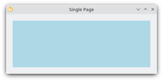
A single page with light blue color to show the page's dimensions
There are two improvements that can be done here. The first is that, with initialPage, we can both set mainPage to be the first page that appears in the page row, and have its dimensions be managed by the page row instead of via manual anchors, positioners or layouts. The second is to have a toolbar, which can be set by defining a toolbar style with globalToolBar.style. There are a few styles we can choose from, but we'll go with Kirigami.ApplicationHeaderStyle.Auto for now.
import QtQuick import org.kde.kirigami as Kirigami Kirigami.ApplicationWindow { title: "With globalToolBar and initialPage" width: 500 height: 200 Kirigami.PageRow { anchors.fill: parent globalToolBar.style: Kirigami.ApplicationHeaderStyle.Auto initialPage: Kirigami.Page { Rectangle { anchors.fill: parent color: "lightblue" } } } }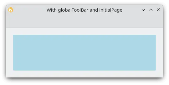
A single page with toolbar and light blue color to show the page's dimensions
There are only two ways of adding pages to a page row: by setting its initialPage (which can optionally take an array of pages) or by using push(). To delete a page from the page row, you should use pop(), whereas goBack() or goForward() can be used to navigate between pages.
import QtQuick import QtQuick.Controls as Controls import org.kde.kirigami as Kirigami Kirigami.ApplicationWindow { title: "Multiple pages in a row" width: 700 height: 300 Kirigami.PageRow { id: mainRow anchors.fill: parent globalToolBar.style: Kirigami.ApplicationHeaderStyle.Auto initialPage: Kirigami.Page { id: firstPage Rectangle { anchors.fill: parent color: "lightblue" Controls.Button { anchors.centerIn: parent text: "Push!" onClicked: mainRow.push(secondPage) } } } Component { id: secondPage Kirigami.Page { Rectangle { anchors.fill: parent color: "lightgreen" Controls.Button { anchors.centerIn: parent text: "Pop!" onClicked: mainRow.pop() } } } } } }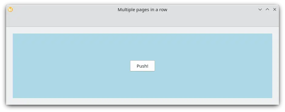
Initial page with light blue color
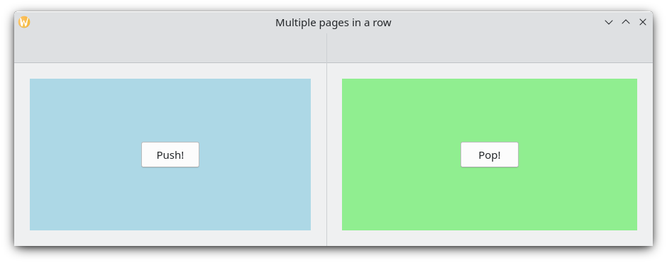
Upon clicking "Push!", a second page with light green color shows up
The application's stack of pages
If a Kirigami.PageRow with a toolbar looks familiar to you, that is because you have seen it before. An ApplicationWindow.pageStack is nothing more than a very convenient, global page row. Every function available to a PageRow is also available to the pageStack.
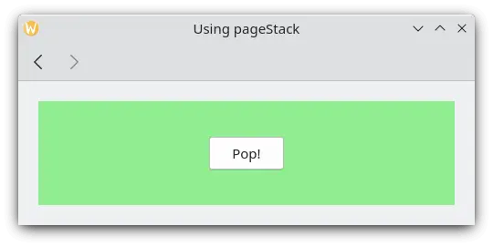
The previous example can be reduced significantly with a pageStack, with the added bonus of navigation actions:
import QtQuick import QtQuick.Controls as Controls import org.kde.kirigami as Kirigami Kirigami.ApplicationWindow { title: "Using the pageStack" width: 500 height: 200 pageStack.initialPage: Kirigami.Page { id: firstPage Rectangle { anchors.fill: parent color: "lightblue" Controls.Button { anchors.centerIn: parent text: "Push!" onClicked: pageStack.push(secondPage) } } } Component { id: secondPage Kirigami.Page { Rectangle { anchors.fill: parent color: "lightgreen" Controls.Button { anchors.centerIn: parent text: "Pop!" onClicked: pageStack.pop() } } } } }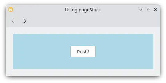
In general you'll want to use a pageStack rather than implement your own PageRow, especially when your application gets bigger and you need your components living in separate files. If you create your window in your Main.qml using a Kirigami.ApplicationWindow, a component residing in another file can still directly invoke the global pageStack by means of a call to the applicationWindow():
// "Main.qml" import org.kde.kirigami as Kirigami Kirigami.ApplicationWindow { title: "Pushing a Page from a different QML file" width: 700 height: 400 pageStack.initialPage: BasicPage {} }e
// "BasicPage.qml" import QtQuick import QtQuick.Controls as Controls import org.kde.kirigami as Kirigami Kirigami.Page { Controls.Button { anchors.centerIn: parent text: "This pushes page1 from BasicPage\ninto the pageStack from Main.qml!" onClicked: { applicationWindow().pageStack.push(page1) } Component { id: page1 Kirigami.Page { Controls.Label { anchors.centerIn: parent text: "page1 was pushed!" } } } } }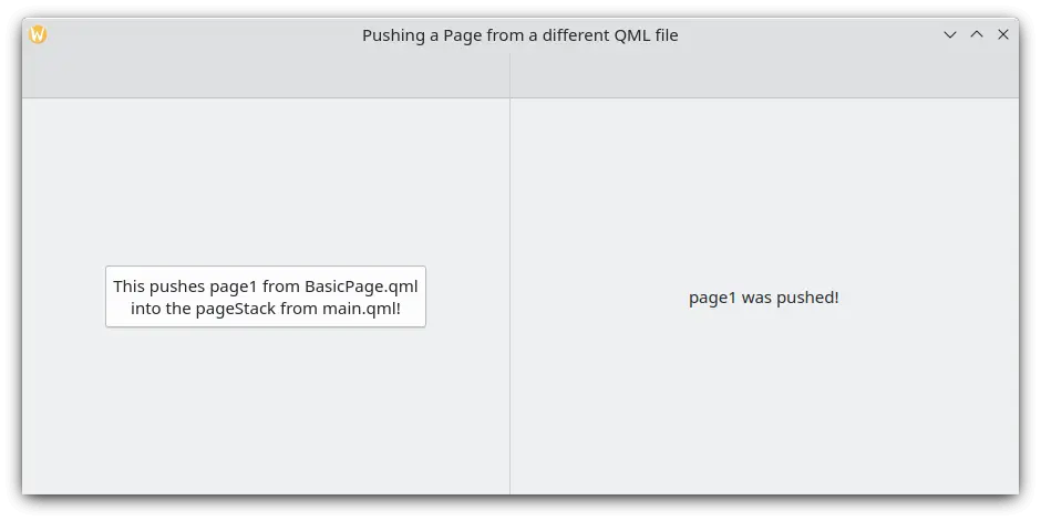
Clicking the button pushes a new page with help of applicationWindow