Controlli ed elementi interattivi
Kirigami makes use of a wide selection of different interactive elements from Qt that you can use in your applications. Each different type has slightly different interaction styles, visual styles, and functionality. Using the right type of control in your application can help make your user interface more responsive and intuitive.
Pulsanti
In Kirigami apps, we use the QtQuick Controls Button. Using them is pretty straightforward: we set the text property and any action we want it to perform is set to the onClicked property.
import QtQuick import QtQuick.Layouts import QtQuick.Controls as Controls import org.kde.kirigami as Kirigami Kirigami.ApplicationWindow { title: "Controls.Button" width: 400 height: 400 pageStack.initialPage: Kirigami.Page { ColumnLayout { anchors.fill: parent Controls.Button { Layout.alignment: Qt.AlignCenter text: "Beep!" onClicked: showPassiveNotification("Boop!") } } } }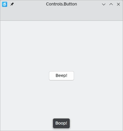
Pulsanti attivabili
The behavior of buttons can be changed to make them toggleable: in this mode, they will stay pressed until clicked on once more. This mode can be activated by setting their checkable property to true; we can also set buttons to be toggled on by default by setting checked to true.
We can get the most out of toggleable buttons by using the onCheckedChanged signal handler which is automatically generated from the checked signal. It works similarly to onClicked, except here the assigned action will be executed when the button's state changes. It is a boolean property, which can come in handy for specific use cases.
In this example, we set the visibility of an inline drawer according to the status of a toggleable button:
import QtQuick import QtQuick.Layouts import QtQuick.Controls as Controls import org.kde.kirigami as Kirigami Kirigami.ApplicationWindow { title: "Controls.Button (toggleable version)" width: 400 height: 400 pageStack.initialPage: Kirigami.Page { ColumnLayout { anchors.fill: parent Controls.Button { Layout.alignment: Qt.AlignCenter text: "Hide inline drawer" checkable: true checked: true onCheckedChanged: myDrawer.visible = checked } Kirigami.OverlayDrawer { id: myDrawer edge: Qt.BottomEdge modal: false contentItem: Controls.Label { text: "Peekaboo!" } } } } }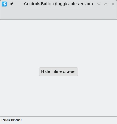
Nota
Con lo stile predefinito di KDE Plasma, Brezza, può essere difficile capire se un pulsante è attivato o meno: i pulsanti su cui si è fatto clic vengono infatti colorati di blu. Assicurati di tener conto di questo fatto mentre progetti la tua applicazione: un controllo diverso potrebbe risultare più amichevole.Pulsanti della barra degli strumenti
There is a specific button type meant for use in toolbars, Controls.ToolButton. The most obvious difference between this and a conventional Button is the styling, with toolbuttons being flat (though this is alterable with the boolean property flat).
import QtQuick import QtQuick.Layouts import QtQuick.Controls as Controls import org.kde.kirigami as Kirigami Kirigami.ApplicationWindow { title: "Controls.ToolButton" width: 600 height: 600 header: Controls.ToolBar { RowLayout { anchors.fill: parent Controls.ToolButton { icon.name: "application-menu-symbolic" onClicked: showPassiveNotification("Kirigami Pages and Actions are better!") } Controls.Label { text: "Global ToolBar" horizontalAlignment: Qt.AlignHCenter verticalAlignment: Qt.AlignVCenter Layout.fillWidth: true } Controls.ToolButton { text: "Beep!" onClicked: showPassiveNotification("ToolButton boop!") } } } }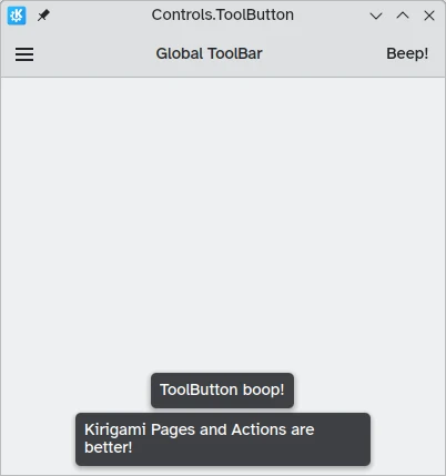
Controlli di selezione
I controlli di selezione permetto all'utente di fare una scelta o di scegliere un'opzione. Ne esistono di vari tipi, che meglio si adattano alle varie situazioni.
Caselle
A Controls.CheckBox is meant for options where the choices are non-exclusive and where each option has a clear alternative.
import QtQuick import QtQuick.Layouts import QtQuick.Controls as Controls import org.kde.kirigami as Kirigami Kirigami.ApplicationWindow { title: "Controls.CheckBox" width: 400 height: 400 pageStack.initialPage: Kirigami.Page { ColumnLayout { anchors.left: parent.left anchors.right: parent.right Controls.CheckBox { Layout.alignment: Qt.AlignHCenter text: "This checkbox is checked!" checked: true } Controls.CheckBox { Layout.alignment: Qt.AlignHCenter text: "This checkbox is not checked!" checked: false } } } }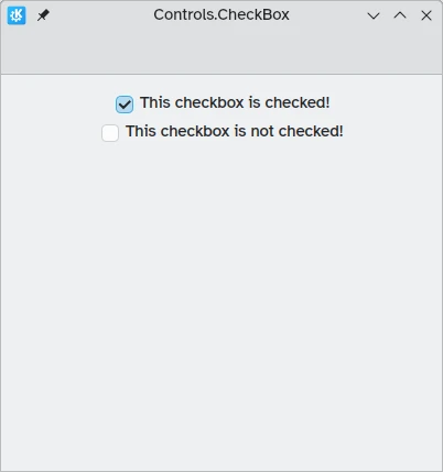
As you can see, they are simple to use. The checked property holds a boolean value determining whether or not they have been checked.
Pulsanti a scelta singola
A Controls.RadioButton is designed for situations where the user must choose one option from a set of several options.
I pulsanti a scelta singola sono esclusivi per impostazione predefinita: può essere selezionato solo un pulsante nello stesso elemento genitore.
Come per le caselle, essi possono essere selezionato o no per impostazione predefinita grazie alla proprietà checked.
import QtQuick import QtQuick.Layouts import QtQuick.Controls as Controls import org.kde.kirigami as Kirigami Kirigami.ApplicationWindow { title: "Controls.RadioButton" width: 400 height: 400 pageStack.initialPage: Kirigami.Page { ColumnLayout { anchors.left: parent.left anchors.right: parent.right Controls.RadioButton { Layout.alignment: Qt.AlignCenter text: "Tick!" checked: true } Controls.RadioButton { Layout.alignment: Qt.AlignCenter text: "Tock!" checked: false } } } }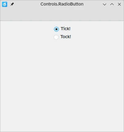
Interruttori
On the desktop, changing settings usually involves changing the setting and then applying it by clicking on an "Apply" or "OK" button. On mobile, we can use a Controls.Switch instead.
Switches can be toggled between an on and off state. They can be toggled by clicking or tapping on them, or they can be dragged towards the on or off position. Once again, switches can be set to be on or off by default with the checked property.
import QtQuick import QtQuick.Layouts import QtQuick.Controls as Controls import org.kde.kirigami as Kirigami Kirigami.ApplicationWindow { title: "Controls.Switch" width: 400 height: 400 pageStack.initialPage: Kirigami.Page { ColumnLayout { anchors.fill: parent Controls.Switch { Layout.alignment: Qt.AlignCenter text: "Switchy" checked: true } Controls.Switch { Layout.alignment: Qt.AlignCenter text: "Swootchy" checked: false } } } }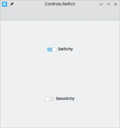
Cursori
Sliders allow users to select certain values by sliding a handle along a track. There are several types that you can choose from depending on the values you'd like your users to choose in your application.
Cursori standard e graduati
Un Controls.Slider fornisce all'utente un controllo molto preciso sulla selezione che desidera effettuare.
In Left to Right mode, sliders go left to right to increase when in horizontal orientation, while in Right to Left mode they go in the reverse direction. In both modes, sliders in vertical orientation go from the bottom up.
The coloration provides a visual indicator of how large the value you are selecting is.
I cursori hanno poche proprietà importanti alle quali devi prestare attenzione:
- value: contains the value at which the handle is placed, and can also be set manually to provide a default starting value
- to: defines the range of the slider by specifying the maximum value it can go to
- orientation: allows the slider to be set to a vertical orientation with Qt.Vertical
import QtQuick import QtQuick.Layouts import QtQuick.Controls as Controls import org.kde.kirigami as Kirigami Kirigami.ApplicationWindow { title: "Controls.Slider" width: 400 height: 400 pageStack.initialPage: Kirigami.Page { ColumnLayout { anchors.fill: parent Controls.Slider { id: normalSlider Layout.alignment: Qt.AlignHCenter Layout.fillHeight: true orientation: Qt.Vertical value: 60 to: 100 } Controls.Label { Layout.alignment: Qt.AlignHCenter text: Math.round(normalSlider.value) } } } }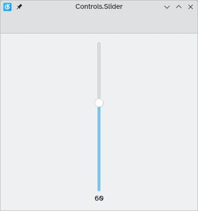
Another useful property we can use is stepSize. Setting this to a numerical value allows us to create a slider that snaps onto values that are multiples of the specified stepSize, with these multiples being indicated by tickmarks. Therefore if we set this property to 2.0, when the user drags the slider handle, they will only be able to select 0.0, 2.0, 4.0, etc. up to the value specified in the to property.
import QtQuick import QtQuick.Layouts import QtQuick.Controls as Controls import org.kde.kirigami as Kirigami Kirigami.ApplicationWindow { title: "Controls.Slider (with steps)" width: 400 height: 400 pageStack.initialPage: Kirigami.Page { ColumnLayout { anchors.fill: parent Controls.Slider { id: tickmarkedSlider Layout.alignment: Qt.AlignHCenter Layout.fillWidth: true orientation: Qt.Horizontal snapMode: Controls.Slider.SnapAlways value: 6.0 to: 10.0 stepSize: 2.0 } Controls.Label { Layout.alignment: Qt.AlignHCenter text: tickmarkedSlider.value } } } }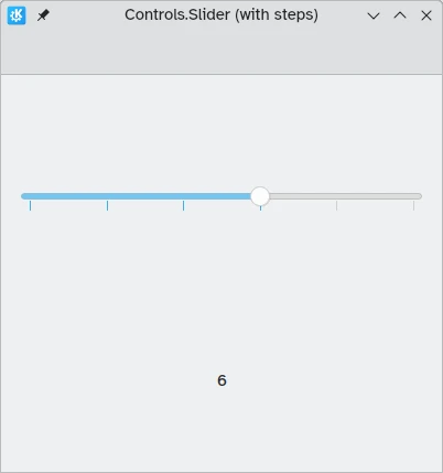
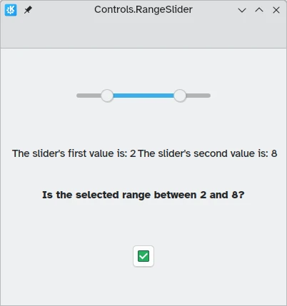
Range sliders
QtQuick Controls also provides Controls.RangeSliders. These have two handles, hence allowing you to define a range of numbers between the two handles.
Two new properties are important to keep in mind: first.value and second.value, which hold the values of the two handles. Like the value property of the standard sliders, these can be pre-set.
import QtQuick import QtQuick.Layouts import QtQuick.Controls as Controls import org.kde.kirigami as Kirigami Kirigami.ApplicationWindow { title: "Controls.RangeSlider" width: 400 height: 400 pageStack.initialPage: Kirigami.Page { ColumnLayout { anchors.fill: parent Controls.RangeSlider { id: rangeSlider Layout.alignment: Qt.AlignHCenter to: 10.0 first.value: 2.0 second.value: 8.0 stepSize: 1.0 snapMode: Controls.Slider.SnapAlways } RowLayout { Layout.alignment: Qt.AlignHCenter Layout.fillWidth: true Controls.Label { Layout.fillWidth: true text: "The slider's first value is: " + Math.round(rangeSlider.first.value) } Controls.Label { Layout.fillWidth: true text: "The slider's second value is: " + Math.round(rangeSlider.second.value) } } Controls.Label { Layout.alignment: Qt.AlignHCenter font.bold: true text: "Is the selected range between 2 and 8?" } Controls.Button { Layout.alignment: Qt.AlignHCenter icon.name: { if (rangeSlider.first.value >= 2 && rangeSlider.second.value <= 8) return "emblem-checked" else return "emblem-error" } } } } }