Cards
The Kirigami types AbstractCard and Card are used to implement the popular card component used on many mobile and web platforms. Cards can be used to display a collection of information or actions in an attractive and distinctive way.
Kirigami also offers 3 kinds of views and positioners to aid you in presenting your cards with beautiful and responsive layouts.
AbstractCard
A Kirigami.AbstractCard is the simplest type of card. It's just a rectangle with a shadow, which can contain any Item in it. It can also have Items assigned to its header or footer properties. In this case a Kirigami.Heading is its header and a Controls.Label is the card's contentItem.
Kirigami.AbstractCard { Layout.fillHeight: true header: Kirigami.Heading { text: qsTr("AbstractCard") level: 2 } contentItem: Controls.Label { wrapMode: Text.WordWrap text: "..." } }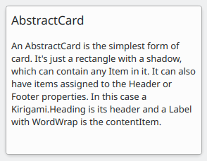
Card
A Kirigami.Card inherits from AbstractCard and provides more features out of the box. Cards inherit the same header and footer from an Abstract Card, but you are encouraged to use a banner and a set of Kirigami.Action in the actions group instead.
Kirigami.Card { actions: [ Kirigami.Action { text: qsTr("Action1") icon.name: "add-placemark" }, Kirigami.Action { text: qsTr("Action2") icon.name: "address-book-new-symbolic" }, // ... ] banner { source: "../banner.jpg" title: "Title Alignment" // Il titolo può essere posizionato nello striscione titleAlignment: Qt.AlignLeft | Qt.AlignBottom } contentItem: Controls.Label { wrapMode: Text.WordWrap text: "My Text" } }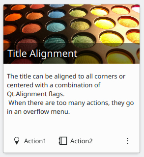
CardsLayout
A Kirigami.CardsLayout is most useful when the cards being presented are either not instantiated by a model or are instantiated by a model that always has very few items. They are presented as a grid of two columns which will remain centered if the application is really wide, or become a single column if there is not enough space for two columns, such as a mobile phone screen.
Nota
CardsListView is better suited for larger models.A card can optionally be oriented horizontally. In this case it will be wider than tall, and is better suited to being placed in a ColumnLayout. If you must put it in a CardsLayout, it will have a maximumColumns of 2 by default.
ColumnLayout { Kirigami.CardsLayout { Kirigami.Card { contentItem: Controls.Label { wrapMode: Text.WordWrap text: "My Text2" } } Kirigami.AbstractCard { contentItem: Controls.Label { wrapMode: Text.WordWrap text: "My Text" } } Kirigami.Card { headerOrientation: Qt.Horizontal contentItem: Controls.Label { wrapMode: Text.WordWrap text: "My Text2" } } } }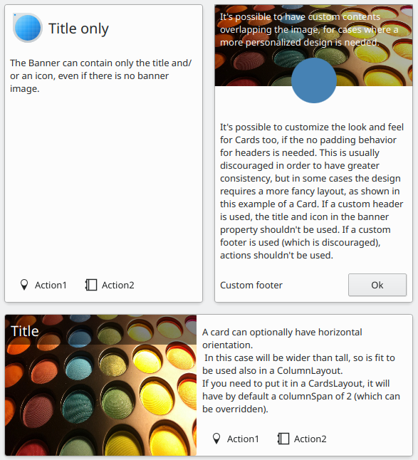
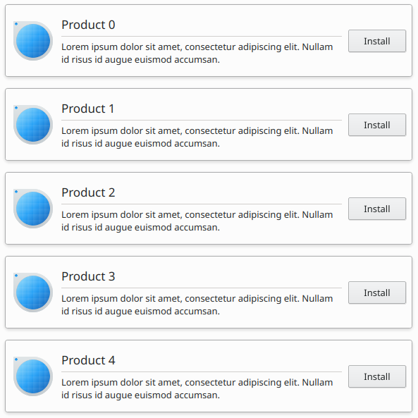
CardsListView
A Kirigami.CardsListView is a list view that can be used with AbstractCard components.
A CardsListView will stretch child cards to its own width. This component should therefore only be used with cards which will look good at any horizontal size. Use of a Card component inside it is discouraged, unless it has Qt.Horizontal as its headerOrientation property.
Kirigami.CardsListView { id: view model: 100 delegate: Kirigami.AbstractCard { //NOTE: never put a Layout as contentItem as it will cause binding loops contentItem: Item { implicitWidth: delegateLayout.implicitWidth implicitHeight: delegateLayout.implicitHeight GridLayout { id: delegateLayout anchors { left: parent.left top: parent.top right: parent.right //IMPORTANTE: non mettergli mai il margine inferiore } rowSpacing: Kirigami.Units.largeSpacing columnSpacing: Kirigami.Units.largeSpacing columns: width > Kirigami.Units.gridUnit * 20 ? 4 : 2 Kirigami.Icon { source: "applications-graphics" Layout.fillHeight: true Layout.maximumHeight: Kirigami.Units.iconSizes.huge Layout.preferredWidth: height } Kirigami.Heading { level: 2 text: qsTr("Product ")+ modelData } Controls.Button { Layout.alignment: Qt.AlignRight Layout.columnSpan: 2 text: qsTr("Install") } } } } }