Table view
The table view pattern is a collection of resources in a tabular format. It's effective for quickly identifying categories or comparing values in a large text and numerical data set.
The table view pattern is a collection of resources in a tabular format. It's effective for quickly identifying categories or comparing values in a large text and numerical data set.
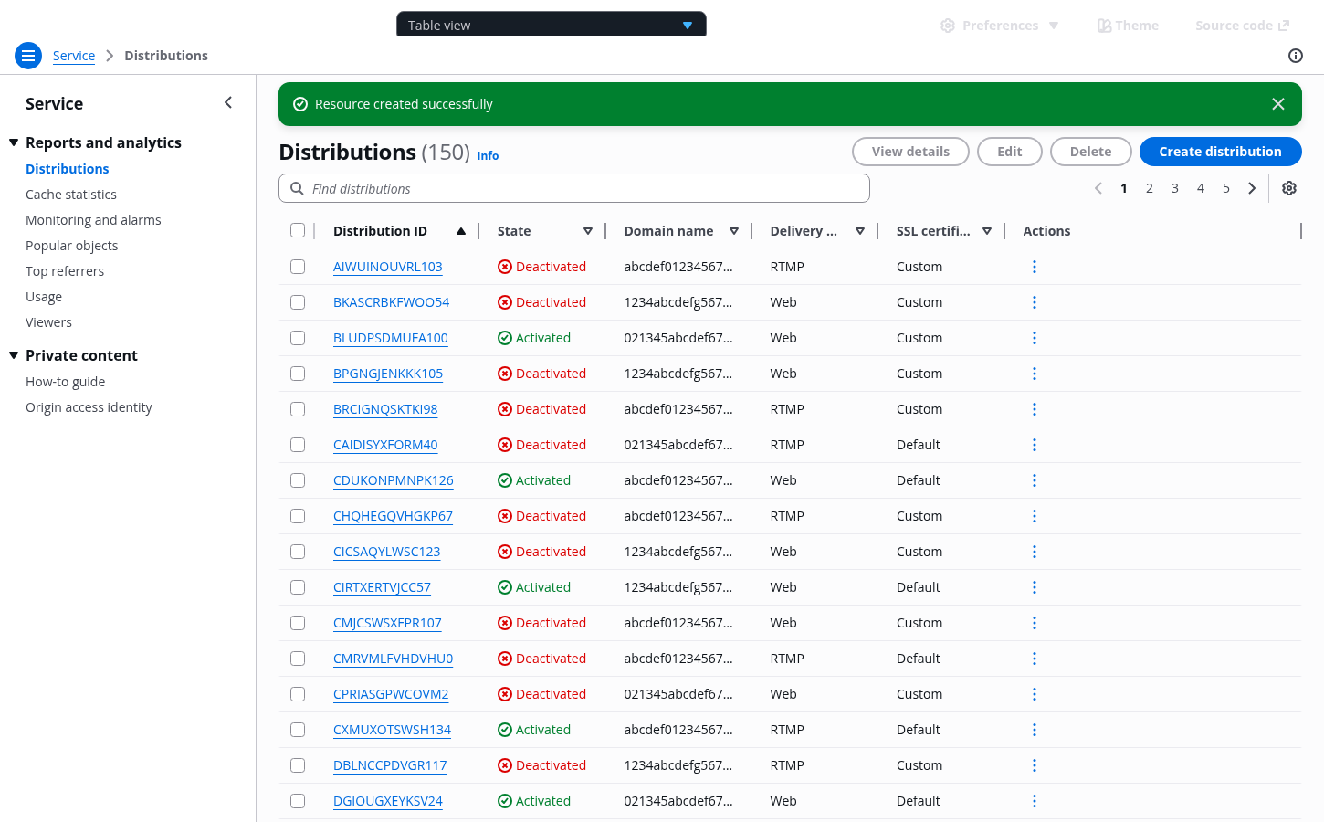
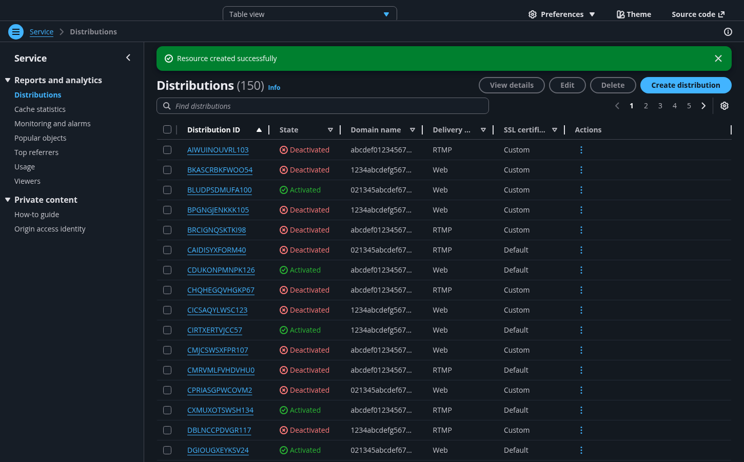
Table view of all user resources within the service.
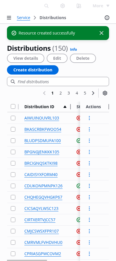
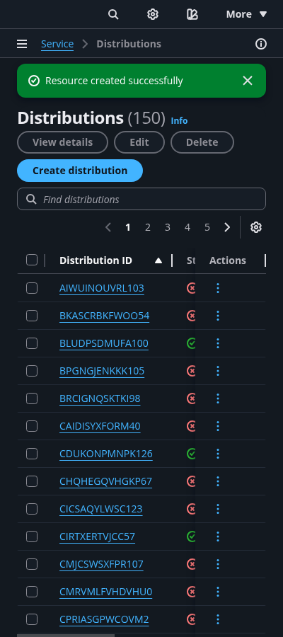
Table view of all user resources displayed with more or less entries per page, set by the user view preferences.
Table view of all user resources sorted on a certain data set by the user. Each individual table column can be sorted in ascending or descending order.
Reduction of the list of user resources by a specific query set by the user.
Table view in a state of when data has been successfully fetched, and the table contains no resources. When there are no matched results for the applied filters, show a zero results state. Follow the guidelines for empty states.
When a table encounters an issue, the table should reflect an error state. Common table error types and the remediation include:
Table actions failures: use flashbar to notify users.
Data fetching error or access permission error: display an alert as part of the table empty state.
Refreshing error: follow the guidelines for loading and refreshing.
Progressive loading error: follow the guidelines for loading and refreshing and table with expandable rows.
Inline table cell editing error: follow the guidelines for inline edit and form field validation.
Variable name | Current value | Description |
|---|---|---|
There are two ways to show additional data in tables: pagination and progressive loading. Use pagination for organizing large datasets into manageable chunks, making it easier to navigate to specific sections. Pagination provides the ability to jump to specific pages making it easier to keep track of where they are, return to a specific section, and provide an accurate representation of the size of the data set. Use progressive loading when your user needs to see all the data in one view, to compare large data sets, and where context switching between pages creates a cognitive load and prevents easy comparison. For example, loading more child rows in a table with expandable rows.
Use a flash message to notify the user about the progress and outcome (success or failure) of the actions taken upon the resources.
Use the service name for the root page in the breadcrumbs, and make it a link. Follow it with the page title, which is usually the category name of the service items (For example: Resources, Distributions, Instances).
Enabling a sticky header is optional, but recommended, for these potentially lengthy list pages. If enabled, use the "awsui-h1-sticky" header variant so the title reduces its size on scroll.
Actions in the header: For more information on actions, refer to global actions.
Actions in table cells: For more information on actions, refer to in-context actions.
Text filter helps users with an extensive number of table rows to quickly find one or several resources with a matching query. The entire set of columns are used as a base for the filter.
We recommend building in a custom message, with a clear call to action to clear the filter, when the query doesn’t match with any resources.
Pagination helps users with an extensive number of resources to navigate through them across multiple pages. Users can change the default number of table rows per view on Resources preferences.
Display the pagination even if the resources set fits in one page.
Navigating via the pagination functionality overwrites any selection.
Use preferences to allow users to view and change their display configuration. User configurations in preferences affect the following settings of the table view:
Number of rows displayed per page (Pagination)
Which columns are visible or set to hidden
Order of the columns displayed
Change of view pattern: from table view to card view, and vice versa
Which columns are sticky
Table rows can be selected individually or in bulk (multiple selection) via the checkboxes mechanism. The parent checkbox, living on the table header, only selects rows visible on the page.
Any actions triggered after selection only affects the selected visible rows. Selection is overwritten by:
Table sorting
Pagination
Preferences
And as soon as they are no longer visible on the page
Navigation is open by default on view pages. For more information about structuring side navigation content, follow the guidelines for side navigation.
variant of the table component to implement this pattern.Use sentence case, but continue to capitalize proper nouns and brand names correctly in context.
Use end punctuation, except in headers and buttons. Don’t use exclamation points.
Use present-tense verbs and active voice.
Don't use please, thank you, ellipsis (...), ampersand (&), e.g., i.e., or etc. in writing.
Avoid directional language.
For example: use previous not above, use following not below.
Use device-independent language.
For example: use choose or select not click.
Use sentence case.
Don’t use end punctuation.
Use active voice wherever possible. Use passive voice only to avoid blaming the users.
Avoid excessive words, such as please.
Avoid uppercase text and exclamation points.
The goal of this message is to inform the user that data has been successfully fetched, and the table contains no resources. Consider incorporating:
A clear identification of the state.
For example: Empty resources.
A descriptive explanation of the reasons why the state is displayed.
For example: No resources to display or You have no resources created.
The message can be extended by adding a call to action.
For example: Create a resource.
Make sure to inform the user in concise and clear language, that the system encountered an error retrieving resources. Consider incorporating:
A clear identification of the state.
For example: Could not retrieve resources.
A descriptive explanation on the reasons why the state is being displayed.
For example: Could not access your resources.
A single call to action to recover from this state.
For example: Refresh or Contact support
Use concise and clear language for your custom message in cases of zero results resulting from the text filter. Consider incorporating:
A clear identification of the state.
For example: Zero results or No results
A descriptive explanation of the reasons why the state is displayed.
For example: No resources match your search.
A single call to action to recover from this state.
For example: Clear filter or Go back to default.
Follow the guidelines on alternative text and Accessible Rich Internet Applications (ARIA) regions for each component.
Make sure to define ARIA labels aligned with the language context of your application.
Don't add unnecessary markup for roles and landmarks. Follow the guidelines for each component.
Provide keyboard functionality to all available content in a logical and predictable order. The flow of information should make sense.
Every table cell should have a logical column header or row header.
Users should be able to access and move the active state using their keyboard (arrow keys). Each single resource has focus on the navigation (links) and on the selection mechanism (checkbox).
Table must be visible in screen reader list of tables.