DataTable class
A data table that follows the Material 2 design specification.
Performance considerations
Columns are sized automatically based on the table's contents. It's expensive to display large amounts of data with this widget, since it must be measured twice: once to negotiate each column's dimensions, and again when the table is laid out.
A SingleChildScrollView mounts and paints the entire child, even when only some of it is visible. For a table that effectively handles large amounts of data, here are some other options to consider:
TableView, a widget from the two_dimensional_scrollables package.- PaginatedDataTable, which automatically splits the data into multiple pages.
- CustomScrollView, for greater control over scrolling effects.
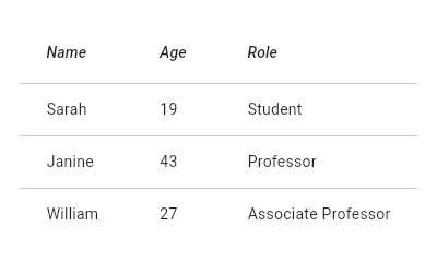
To create a local project with this code sample, run:
flutter create --sample=material.DataTable.1 mysample
To create a local project with this code sample, run:
flutter create --sample=material.DataTable.2 mysample
DataTable can be sorted on the basis of any column in columns in ascending or descending order. If sortColumnIndex is non-null, then the table will be sorted by the values in the specified column. The boolean sortAscending flag controls the sort order.
See also:
- DataColumn, which describes a column in the data table.
- DataRow, which contains the data for a row in the data table.
- DataCell, which contains the data for a single cell in the data table.
- PaginatedDataTable, which shows part of the data in a data table and provides controls for paging through the remainder of the data.
TableViewfrom the two_dimensional_scrollables package, for displaying large amounts of data without pagination.- material.io/go/design-data-tables
- Inheritance
-
- Object
- DiagnosticableTree
- Widget
- StatelessWidget
- DataTable
Constructors
- DataTable.new({Key? key, required List<
DataColumn> columns, int? sortColumnIndex, bool sortAscending = true, ValueSetter<bool?> ? onSelectAll, Decoration? decoration, MaterialStateProperty<Color?> ? dataRowColor, @Deprecated('Migrate to use dataRowMinHeight and dataRowMaxHeight instead. ' 'This feature was deprecated after v3.7.0-5.0.pre.') double? dataRowHeight, double? dataRowMinHeight, double? dataRowMaxHeight, TextStyle? dataTextStyle, MaterialStateProperty<Color?> ? headingRowColor, double? headingRowHeight, TextStyle? headingTextStyle, double? horizontalMargin, double? columnSpacing, bool showCheckboxColumn = true, bool showBottomBorder = false, double? dividerThickness, required List<DataRow> rows, double? checkboxHorizontalMargin, TableBorder? border, Clip clipBehavior = Clip.none}) - Creates a widget describing a data table.
Properties
- border → TableBorder?
- The style to use when painting the boundary and interior divisions of the table. final
- checkboxHorizontalMargin → double?
- Horizontal margin around the checkbox, if it is displayed. final
- clipBehavior → Clip
- The content will be clipped (or not) according to this option. final
- columns → List<
DataColumn> - The configuration and labels for the columns in the table. final
- columnSpacing → double?
- The horizontal margin between the contents of each data column. final
- dataRowColor → MaterialStateProperty<
Color?> ? - The background color for the data rows. final
- dataRowHeight → double?
- The height of each row (excluding the row that contains column headings). no setter
- dataRowMaxHeight → double?
- The maximum height of each row (excluding the row that contains column headings). final
- dataRowMinHeight → double?
- The minimum height of each row (excluding the row that contains column headings). final
- dataTextStyle → TextStyle?
- The text style for data rows. final
- decoration → Decoration?
- The background and border decoration for the table. final
- dividerThickness → double?
- The width of the divider that appears between TableRows. final
- hashCode → int
- The hash code for this object. no setterinherited
- headingRowColor → MaterialStateProperty<
Color?> ? - The background color for the heading row. final
- headingRowHeight → double?
- The height of the heading row. final
- headingTextStyle → TextStyle?
- The text style for the heading row. final
- horizontalMargin → double?
- The horizontal margin between the edges of the table and the content in the first and last cells of each row. final
- key → Key?
- Controls how one widget replaces another widget in the tree. finalinherited
- onSelectAll → ValueSetter<
bool?> ? - Invoked when the user selects or unselects every row, using the checkbox in the heading row. final
- rows → List<
DataRow> - The data to show in each row (excluding the row that contains the column headings). final
- runtimeType → Type
- A representation of the runtime type of the object. no setterinherited
- showBottomBorder → bool
- Whether a border at the bottom of the table is displayed. final
- showCheckboxColumn → bool
- Whether the widget should display checkboxes for selectable rows. final
- sortAscending → bool
- Whether the column mentioned in sortColumnIndex, if any, is sorted in ascending order. final
- sortColumnIndex → int?
- The current primary sort key's column. final
Methods
- build(
BuildContext context) → Widget - Describes the part of the user interface represented by this widget. override
- createElement(
) → StatelessElement - Creates a StatelessElement to manage this widget's location in the tree. inherited
- debugDescribeChildren(
) → List< DiagnosticsNode> - Returns a list of DiagnosticsNode objects describing this node's children. inherited
- debugFillProperties(
DiagnosticPropertiesBuilder properties) → void - Add additional properties associated with the node. inherited
- noSuchMethod(
Invocation invocation) → dynamic - Invoked when a nonexistent method or property is accessed. inherited
- toDiagnosticsNode(
{String? name, DiagnosticsTreeStyle? style}) → DiagnosticsNode - Returns a debug representation of the object that is used by debugging tools and by DiagnosticsNode.toStringDeep. inherited
- toString(
{DiagnosticLevel minLevel = DiagnosticLevel.info}) → String - A string representation of this object. inherited
- toStringDeep(
{String prefixLineOne = '', String? prefixOtherLines, DiagnosticLevel minLevel = DiagnosticLevel.debug, int wrapWidth = 65}) → String - Returns a string representation of this node and its descendants. inherited
- toStringShallow(
{String joiner = ', ', DiagnosticLevel minLevel = DiagnosticLevel.debug}) → String - Returns a one-line detailed description of the object. inherited
- toStringShort(
) → String - A short, textual description of this widget. inherited
Operators
- operator ==(
Object other) → bool - The equality operator. inherited